


![[Free Webinar] Guide to Securing Your Entire Identity Lifecycle Against AI-Powered Threats](https://blogger.googleusercontent.com/img/b/R29vZ2xl/AVvXsEjqbZf4bsDp6ei3fmQ8swm7GB5XoRrhZSFE7ZNhRLFO49KlmdgpIDCZWMSv7rydpEShIrNb9crnH5p6mFZbURzO5HC9I4RlzJazBBw5aHOTmI38sqiZIWPldRqut4bTgegipjOk5VgktVOwCKF_ncLeBX-pMTO_GMVMfbzZbf8eAj21V04y_NiOaSApGkM/s1600/webinar-play.jpg?#)


![[The AI Show Episode 145]: OpenAI Releases o3 and o4-mini, AI Is Causing “Quiet Layoffs,” Executive Order on Youth AI Education & GPT-4o’s Controversial Update](https://www.marketingaiinstitute.com/hubfs/ep%20145%20cover.png)


![Google Home app fixes bug that repeatedly asked to ‘Set up Nest Cam features’ for Nest Hub Max [U]](https://i0.wp.com/9to5google.com/wp-content/uploads/sites/4/2022/08/youtube-premium-music-nest-hub-max.jpg?resize=1200%2C628&quality=82&strip=all&ssl=1)


![Epic Games Wins Major Victory as Apple is Ordered to Comply With App Store Anti-Steering Injunction [Updated]](https://images.macrumors.com/t/Z4nU2dRocDnr4NPvf-sGNedmPGA=/2250x/article-new/2022/01/iOS-App-Store-General-Feature-JoeBlue.jpg)


Peer Review 1: Poland's Real Estate Market Dashboards and Insights with Streamlit (Part 2)
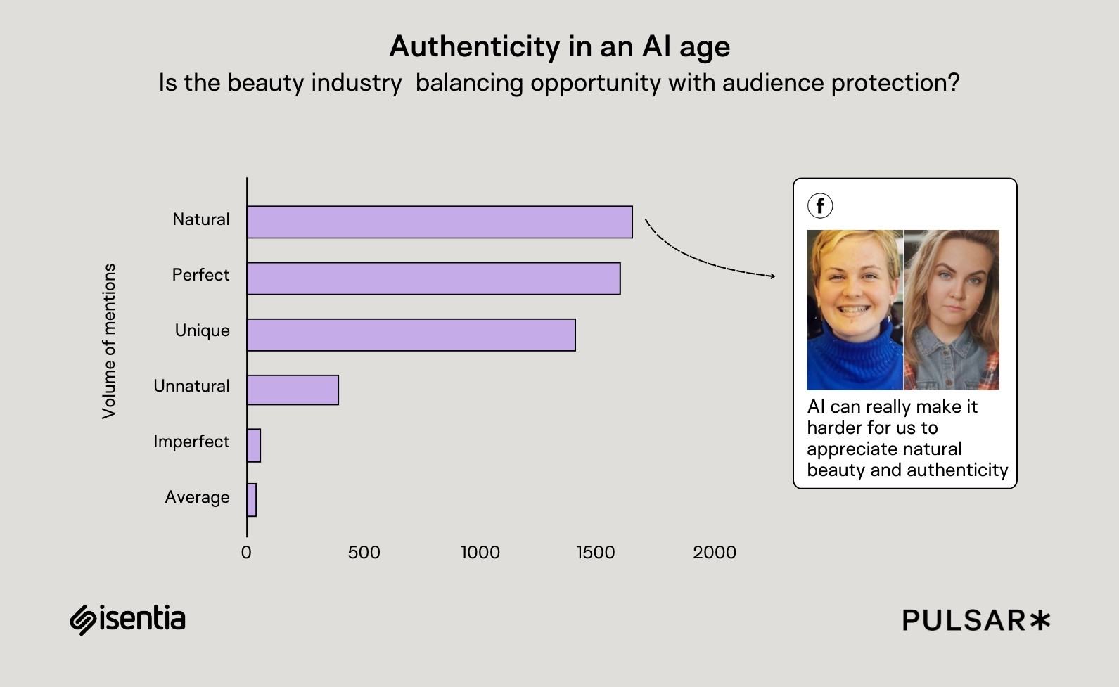
Introduction Welcome to the second part of Peer Review 1, where we continue exploring the data engineering project focused on analyzing Poland's real estate market. In the first post, we reviewed the problem description, batch data ingestion pipeline, and cloud setup using Kestra, BigQuery, and dbt Cloud. In this post, we’ll dive into the Streamlit dashboard, data transformations, and the insights derived from the project. We'll also discuss future improvements and potential optimizations to enhance the project further. Dashboard Implementation: Streamlit at the Forefront Streamlit Overview Streamlit is used to create a static dashboard that visualizes data trends and insights. The dashboard provides a clear overview of Poland's real estate market, focusing on rental and sales trends across various cities. It includes features such as: Visualizations of market trends: Median and 95th percentile prices, city-wise activity, and price distributions. Static data integration: Pre-processed CSV files are used to power the dashboard. Transition to a Dynamic Dashboard (Planned) While the current implementation is static, the project owner plans to enhance the dashboard by integrating dynamic and interactive features. This would allow users to: Filter data by city, price range, and transaction type (rent/sale). Interact with visualizations dynamically to explore trends and insights in real-time. Data Transformations with dbt Transforming Raw Data into Insights The project uses dbt Cloud to transform raw data into analysis-ready tables. These transformations include: Cleaning and standardizing raw CSV data. Aggregating data by city, transaction type, and time period. Calculating metrics like median prices, percentiles, and total listings. Example SQL Models Here’s an example of a dbt model that calculates city-level rental price trends: WITH city_prices AS ( SELECT city, transaction_type, price, COUNT(*) AS total_listings FROM {{ ref('raw_data') }} WHERE transaction_type = 'rent' GROUP BY city, transaction_type, price ) SELECT city, AVG(price) AS avg_price, PERCENTILE_CONT(0.5) WITHIN GROUP (ORDER BY price) AS median_price, PERCENTILE_CONT(0.95) WITHIN GROUP (ORDER BY price) AS percentile_95_price, SUM(total_listings) AS total_rental_listings FROM city_prices GROUP BY city This model ensures that the data used in the dashboard is well-structured and consistent. Key Insights from the Data 1. Rental and Sales Trends High-Activity Cities: Warsaw and Kraków consistently show higher rental and sales activity compared to smaller cities like Bydgoszcz and Szczecin. Price Distributions: Median prices are significantly lower in smaller cities, while the 95th percentile prices indicate luxury market trends in larger cities. 2. Percentile-Based Trends A line chart in the static dashboard compares median and 95th percentile prices for each city. The data highlights percentile trends in the real estate market, with rental activity peaking by the 95th percentile. 3. Total Listings vs Average Price Comparisons These charts provide a visual representation of cities with high activity levels relative to average prices. Rental prices exhibit smaller fluctuations compared to total listings, which tend to be more volatile. Future Improvements 1. Transition to a Dynamic Dashboard The planned upgrade to an interactive and dynamic dashboard will provide users with real-time filtering and visualization capabilities. 2. Dynamic Data Updates Integrating a streaming data pipeline could enable real-time updates for the dashboard, keeping it current with the latest market data. 3. Advanced Filtering Adding more advanced filters (e.g., by property type, number of rooms) could enhance the user experience. 4. Predictive Analytics Incorporating time-series forecasting models could provide users with future price trends and market predictions. 5. Optimization in BigQuery Partitioning and clustering the BigQuery tables could significantly improve query performance for larger datasets. Conclusion This post reviewed the current static Streamlit dashboard, data transformations with dbt, and key insights derived from the project. While the static dashboard provides clear visualizations, the planned interactive upgrade will make it more dynamic and user-friendly. Additionally, future improvements like real-time updates and predictive analytics can further enhance the project's impact. Related Posts Peer Review 1: Analyzing Poland's Real Estate Market (Part 1) Thanks for this learning opportunity DataTalks Club
Introduction
Welcome to the second part of Peer Review 1, where we continue exploring the data engineering project focused on analyzing Poland's real estate market. In the first post, we reviewed the problem description, batch data ingestion pipeline, and cloud setup using Kestra, BigQuery, and dbt Cloud.
In this post, we’ll dive into the Streamlit dashboard, data transformations, and the insights derived from the project. We'll also discuss future improvements and potential optimizations to enhance the project further.
Dashboard Implementation: Streamlit at the Forefront
Streamlit Overview
Streamlit is used to create a static dashboard that visualizes data trends and insights. The dashboard provides a clear overview of Poland's real estate market, focusing on rental and sales trends across various cities. It includes features such as:
- Visualizations of market trends: Median and 95th percentile prices, city-wise activity, and price distributions.
- Static data integration: Pre-processed CSV files are used to power the dashboard.
Transition to a Dynamic Dashboard (Planned)
While the current implementation is static, the project owner plans to enhance the dashboard by integrating dynamic and interactive features. This would allow users to:
- Filter data by city, price range, and transaction type (rent/sale).
- Interact with visualizations dynamically to explore trends and insights in real-time.
Data Transformations with dbt
Transforming Raw Data into Insights
The project uses dbt Cloud to transform raw data into analysis-ready tables. These transformations include:
- Cleaning and standardizing raw CSV data.
- Aggregating data by city, transaction type, and time period.
- Calculating metrics like median prices, percentiles, and total listings.
Example SQL Models
Here’s an example of a dbt model that calculates city-level rental price trends:
WITH city_prices AS (
    SELECT
        city,
        transaction_type,
        price,
        COUNT(*) AS total_listings
    FROM {{ ref('raw_data') }}
    WHERE transaction_type = 'rent'
    GROUP BY city, transaction_type, price
)
SELECT
    city,
    AVG(price) AS avg_price,
    PERCENTILE_CONT(0.5) WITHIN GROUP (ORDER BY price) AS median_price,
    PERCENTILE_CONT(0.95) WITHIN GROUP (ORDER BY price) AS percentile_95_price,
    SUM(total_listings) AS total_rental_listings
FROM city_prices
GROUP BY city
This model ensures that the data used in the dashboard is well-structured and consistent.
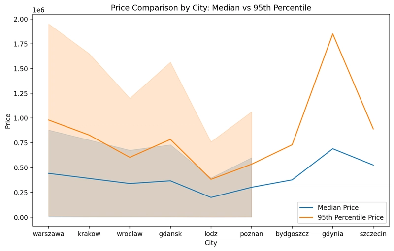
Key Insights from the Data
1. Rental and Sales Trends
- High-Activity Cities: Warsaw and Kraków consistently show higher rental and sales activity compared to smaller cities like Bydgoszcz and Szczecin.
- Price Distributions: Median prices are significantly lower in smaller cities, while the 95th percentile prices indicate luxury market trends in larger cities.

2. Percentile-Based Trends
A line chart in the static dashboard compares median and 95th percentile prices for each city. The data highlights percentile trends in the real estate market, with rental activity peaking by the 95th percentile.

3. Total Listings vs Average Price Comparisons
These charts provide a visual representation of cities with high activity levels relative to average prices. Rental prices exhibit smaller fluctuations compared to total listings, which tend to be more volatile.

Future Improvements
1. Transition to a Dynamic Dashboard
The planned upgrade to an interactive and dynamic dashboard will provide users with real-time filtering and visualization capabilities.
2. Dynamic Data Updates
Integrating a streaming data pipeline could enable real-time updates for the dashboard, keeping it current with the latest market data.
3. Advanced Filtering
Adding more advanced filters (e.g., by property type, number of rooms) could enhance the user experience.
4. Predictive Analytics
Incorporating time-series forecasting models could provide users with future price trends and market predictions.
5. Optimization in BigQuery
Partitioning and clustering the BigQuery tables could significantly improve query performance for larger datasets.
Conclusion
This post reviewed the current static Streamlit dashboard, data transformations with dbt, and key insights derived from the project. While the static dashboard provides clear visualizations, the planned interactive upgrade will make it more dynamic and user-friendly. Additionally, future improvements like real-time updates and predictive analytics can further enhance the project's impact.
Related Posts
- Peer Review 1: Analyzing Poland's Real Estate Market (Part 1)
- Thanks for this learning opportunity DataTalks Club