


![[The AI Show Episode 145]: OpenAI Releases o3 and o4-mini, AI Is Causing “Quiet Layoffs,” Executive Order on Youth AI Education & GPT-4o’s Controversial Update](https://www.marketingaiinstitute.com/hubfs/ep%20145%20cover.png)


![[DEALS] Microsoft 365: 1-Year Subscription (Family/Up to 6 Users) (23% off) & Other Deals Up To 98% Off – Offers End Soon!](https://www.javacodegeeks.com/wp-content/uploads/2012/12/jcg-logo.jpg)


![From Art School Drop-out to Microsoft Engineer with Shashi Lo [Podcast #170]](https://cdn.hashnode.com/res/hashnode/image/upload/v1746203291209/439bf16b-c820-4fe8-b69e-94d80533b2df.png?#)


![Re-designing a Git/development workflow with best practices [closed]](https://i.postimg.cc/tRvBYcrt/branching-example.jpg)


(1).jpg?#)


![The Material 3 Expressive redesign of Google Clock leaks out [Gallery]](https://i0.wp.com/9to5google.com/wp-content/uploads/sites/4/2024/03/Google-Clock-v2.jpg?resize=1200%2C628&quality=82&strip=all&ssl=1)


_Inge_Johnsson-Alamy.jpg?width=1280&auto=webp&quality=80&disable=upscale#)


![What Google Messages features are rolling out [May 2025]](https://i0.wp.com/9to5google.com/wp-content/uploads/sites/4/2023/12/google-messages-name-cover.png?resize=1200%2C628&quality=82&strip=all&ssl=1)


![New Apple iPad mini 7 On Sale for $399! [Lowest Price Ever]](https://www.iclarified.com/images/news/96096/96096/96096-640.jpg)
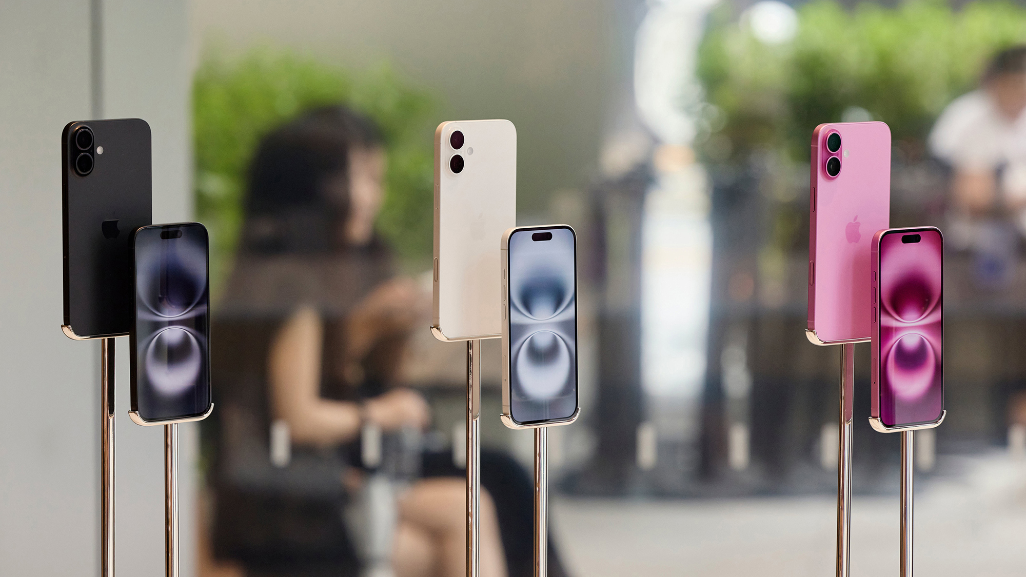
![Apple to Split iPhone Launches Across Fall and Spring in Major Shakeup [Report]](https://www.iclarified.com/images/news/97211/97211/97211-640.jpg)
![Apple to Move Camera to Top Left, Hide Face ID Under Display in iPhone 18 Pro Redesign [Report]](https://www.iclarified.com/images/news/97212/97212/97212-640.jpg)
![Apple Developing Battery Case for iPhone 17 Air Amid Battery Life Concerns [Report]](https://www.iclarified.com/images/news/97208/97208/97208-640.jpg)


How to Properly Use Flexbox for a Responsive Header
If you're struggling to create a site header using Flexbox, you’re not alone. Many developers face challenges when trying to align elements in a responsive manner, especially when it comes to placing the website title on the left and the menu on the right. In this article, we'll explore why Flexbox might not be giving you the results you desire and how to fix it step by step. Why Your Flexbox Header Might Not be Working It sounds like you've set the base structure correctly, but there could be several reasons why your header layout isn't functioning as expected. Common issues with Flexbox include: 1. Incorrect Class Selectors In the HTML snippet you provided, the class for your header is declared with a dot in front: ".site-header". In HTML, you should not include the dot in the class attribute when using it in the class declaration. 2. Missing Flex Properties Your Flexbox container might not have the required properties to control alignment effectively, which can lead to clumping. Without proper alignment rules, Flexbox won’t position elements as you intend. 3. Styles Overriding Your Flexbox Settings If there are any other CSS files or styles that aren't mentioned, they may interfere with your header's styles. Always check to ensure that your styles are not being overridden. Let's Fix Your Header Here’s a revised version of your code that should help align the website title on the left with the menu items on the right. HTML Structure Make sure your HTML structure is correct first: MyWebsite Contact About CSS Styles Next, update your CSS as follows: .site-header { display: flex; justify-content: space-between; align-items: center; /* Align vertically */ width: 100%; /* Full width */ padding: 10px; /* Add some padding */ background-color: rgb(255, 255, 255); /* Optional background color */ } .info-menus { color: rgb(0,0,0); font-family: Newsreader; font-weight: bold; margin-left: 20px; /* Space between menu items */ text-decoration: none; } .info-menus:hover { text-decoration: underline; /* Add hover effect for user experience */ } .site-footer { position: fixed; left: 0; bottom: 0; width: 100%; background-color: rgb(0, 0, 0); color: white; text-align: center; font-family: Newsreader; font-weight: bold; } Explanation of Changes Layout Structure: Removed the dot from the class name where it shouldn't be used, making it appropriate for HTML class attributes. Flex Properties: Added align-items: center; to vertically center content. Spacing and Padding: Included padding for the header to give some breathing room to the elements, making it visually appealing. Hover Effect: A simple hover effect on the menu items enhances user interactivity. Final Remarks Make sure to clear your browser cache or use incognito mode to test your changes. This ensures you are viewing the most recent version of your site. Flexbox is a powerful tool, and once you get the hang of its properties, creating layouts like headers and footers will become seamless. FAQs What if my header still looks clumped together? Ensure that there are no overriding styles from other CSS files or styles that are conflicting with your Flexbox settings. Check the browser's Developer Tools for insight. Can I use Flexbox for layout in private projects? Absolutely! Flexbox is widely supported across modern browsers and is a great choice for responsive design in both personal and professional web projects. Is Flexbox the best option for all layouts? While Flexbox is excellent for one-dimensional layouts (either rows or columns), consider using CSS Grid for two-dimensional layouts where you need more control over both dimensions. With these adjustments, your header should now display correctly with the website title on the left and the menu items on the right, improving the overall design and layout of your site.
If you're struggling to create a site header using Flexbox, you’re not alone. Many developers face challenges when trying to align elements in a responsive manner, especially when it comes to placing the website title on the left and the menu on the right. In this article, we'll explore why Flexbox might not be giving you the results you desire and how to fix it step by step.
Why Your Flexbox Header Might Not be Working
It sounds like you've set the base structure correctly, but there could be several reasons why your header layout isn't functioning as expected. Common issues with Flexbox include:
1. Incorrect Class Selectors
In the HTML snippet you provided, the class for your header Your Flexbox container might not have the required properties to control alignment effectively, which can lead to clumping. Without proper alignment rules, Flexbox won’t position elements as you intend.
If there are any other CSS files or styles that aren't mentioned, they may interfere with your header's styles. Always check to ensure that your styles are not being overridden.
Here’s a revised version of your code that should help align the website title on the left with the menu items on the right.
Make sure your HTML structure is correct first:
Next, update your CSS as follows:
Make sure to clear your browser cache or use incognito mode to test your changes. This ensures you are viewing the most recent version of your site. Flexbox is a powerful tool, and once you get the hang of its properties, creating layouts like headers and footers will become seamless.
Ensure that there are no overriding styles from other CSS files or styles that are conflicting with your Flexbox settings. Check the browser's Developer Tools for insight.
Absolutely! Flexbox is widely supported across modern browsers and is a great choice for responsive design in both personal and professional web projects.
While Flexbox is excellent for one-dimensional layouts (either rows or columns), consider using CSS Grid for two-dimensional layouts where you need more control over both dimensions.
With these adjustments, your header should now display correctly with the website title on the left and the menu items on the right, improving the overall design and layout of your site. class attribute when using it in the class declaration.
2. Missing Flex Properties
3. Styles Overriding Your Flexbox Settings
Let's Fix Your Header
HTML Structure
CSS Styles
Explanation of Changes
align-items: center; to vertically center content.Final Remarks
FAQs
What if my header still looks clumped together?
Can I use Flexbox for layout in private projects?
Is Flexbox the best option for all layouts?