


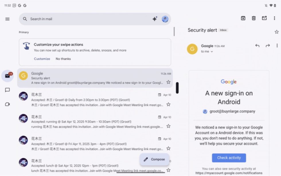
.jpg)


![[The AI Show Episode 145]: OpenAI Releases o3 and o4-mini, AI Is Causing “Quiet Layoffs,” Executive Order on Youth AI Education & GPT-4o’s Controversial Update](https://www.marketingaiinstitute.com/hubfs/ep%20145%20cover.png)


![[The AI Show Episode 143]: ChatGPT Revenue Surge, New AGI Timelines, Amazon’s AI Agent, Claude for Education, Model Context Protocol & LLMs Pass the Turing Test](https://www.marketingaiinstitute.com/hubfs/ep%20143%20cover.png)


.jpg?#)


.png?width=1920&height=1920&fit=bounds&quality=70&format=jpg&auto=webp#)
.png?width=1920&height=1920&fit=bounds&quality=70&format=jpg&auto=webp#)


_Muhammad_R._Fakhrurrozi_Alamy.jpg?width=1280&auto=webp&quality=80&disable=upscale#)


![AirPods Pro 2 With USB-C Back On Sale for Just $169! [Deal]](https://www.iclarified.com/images/news/96315/96315/96315-640.jpg)
![Apple Releases iOS 18.5 Beta 4 and iPadOS 18.5 Beta 4 [Download]](https://www.iclarified.com/images/news/97145/97145/97145-640.jpg)
![Apple Seeds watchOS 11.5 Beta 4 to Developers [Download]](https://www.iclarified.com/images/news/97147/97147/97147-640.jpg)
![Apple Seeds visionOS 2.5 Beta 4 to Developers [Download]](https://www.iclarified.com/images/news/97150/97150/97150-640.jpg)


![Apple Seeds Fourth Beta of iOS 18.5 to Developers [Update: Public Beta Available]](https://images.macrumors.com/t/uSxxRefnKz3z3MK1y_CnFxSg8Ak=/2500x/article-new/2025/04/iOS-18.5-Feature-Real-Mock.jpg)


Building an Accessible Navigation Menu
Navigation menus are one of the most important parts of a website. They help people move around and find what they need. But here’s the thing, many navigation menus are not accessible. If a user cannot access your navigation, they might not be able to use your website at all. This is especially true for people using a keyboard, screen reader, or other assistive technologies. In this post, I’ll walk you through the basics of building an accessible navigation menu. Whether you’re new to accessibility or already have some experience, this guide will help you spot what matters and what to avoid. Why Accessibility in Navigation Matters When we talk about accessibility, we mean making sure everyone can use your website, including people with disabilities. For example: A person who cannot use a mouse should be able to navigate your site using a keyboard. A screen reader user should be able to hear clear labels and menu states. Focus indicators should be visible so users can see where they are on the page. If your navigation is not built with this in mind, you risk leaving people behind. Common Issues with Navigation Menus Here are a few mistakes I often come across: Using or elements instead of proper HTML tags. No keyboard support to open or close dropdown menus. Focus styles being removed for design reasons. These might not seem like big issues during development, but for users depending on assistive tech, they can make your site unusable. How to Build an Accessible Navigation Menu Let’s break this down. 1. Use Semantic HTML Always start with the right HTML structure. This helps browsers and assistive tech understand your content. Home About Services Use the element to define navigation. Add an aria-label when you have more than one navigation area on a page, like a main menu or a sidebar menu. This gives screen reader users extra context about what each navigation section is for. Stick to , , and tags for the menu items. 2. Make It Keyboard-Friendly An accessible menu should work with the keyboard alone. Here’s what to check: Can you use Tab to move through the links? Can you use Enter or Space to open a dropdown? Can you use Esc to close it? Are focus indicators visible as you move? If any of these are missing, your menu isn’t fully accessible. 3. Add ARIA Where It’s Needed ARIA helps fill the gaps when native HTML doesn’t cover everything, but it should be used carefully. For dropdown buttons: Services Consulting Development aria-haspopup="true" tells assistive tech this button opens a menu. aria-expanded="false" indicates whether the menu is open or closed. aria-controls="services-menu" connects the button to the dropdown list. Don’t overuse ARIA when native HTML can do the job. Helpful Tools & Resources A few tools and resources you can use to test your navigation: WAVE by WebAIM Google Lighthouse Harvard Getting Started Testing with NVDA Harvard Getting Started Testing with VoiceOver They can help you catch common issues quickly. Conclusion Remember accessibility is not about perfection. It is about making thoughtful, practical improvements that help real people use your site. If you have not built an accessible navigation menu before, try updating one of your existing projects. You’ll learn a lot just by testing and tweaking.
Navigation menus are one of the most important parts of a website. They help people move around and find what they need. But here’s the thing, many navigation menus are not accessible. If a user cannot access your navigation, they might not be able to use your website at all. This is especially true for people using a keyboard, screen reader, or other assistive technologies.
In this post, I’ll walk you through the basics of building an accessible navigation menu. Whether you’re new to accessibility or already have some experience, this guide will help you spot what matters and what to avoid.
Why Accessibility in Navigation Matters
When we talk about accessibility, we mean making sure everyone can use your website, including people with disabilities.
For example:
- A person who cannot use a mouse should be able to navigate your site using a keyboard.
- A screen reader user should be able to hear clear labels and menu states.
- Focus indicators should be visible so users can see where they are on the page.
If your navigation is not built with this in mind, you risk leaving people behind.
Common Issues with Navigation Menus
Here are a few mistakes I often come across:
- Using or
elements instead of proper HTML tags.- No keyboard support to open or close dropdown menus.
- Focus styles being removed for design reasons.
These might not seem like big issues during development, but for users depending on assistive tech, they can make your site unusable.
How to Build an Accessible Navigation Menu
Let’s break this down.
1. Use Semantic HTML
Always start with the right HTML structure. This helps browsers and assistive tech understand your content.
- Use the
element to define navigation. - Add an
aria-labelwhen you have more than one navigation area on a page, like a main menu or a sidebar menu. This gives screen reader users extra context about what each navigation section is for. - Stick to
, andtags for the menu items.
2. Make It Keyboard-Friendly
An accessible menu should work with the keyboard alone. Here’s what to check:
- Can you use
Tabto move through the links? - Can you use
EnterorSpaceto open a dropdown? - Can you use
Escto close it? - Are focus indicators visible as you move?
If any of these are missing, your menu isn’t fully accessible.
3. Add ARIA Where It’s Needed
ARIA helps fill the gaps when native HTML doesn’t cover everything, but it should be used carefully.
For dropdown buttons:
-
aria-haspopup="true"tells assistive tech this button opens a menu. -
aria-expanded="false"indicates whether the menu is open or closed. -
aria-controls="services-menu"connects the button to the dropdown list.
Don’t overuse ARIA when native HTML can do the job.
Helpful Tools & Resources
A few tools and resources you can use to test your navigation:
- WAVE by WebAIM
- Google Lighthouse
- Harvard Getting Started Testing with NVDA
- Harvard Getting Started Testing with VoiceOver
They can help you catch common issues quickly.
Conclusion
Remember accessibility is not about perfection. It is about making thoughtful, practical improvements that help real people use your site.
If you have not built an accessible navigation menu before, try updating one of your existing projects. You’ll learn a lot just by testing and tweaking.