


![[The AI Show Episode 145]: OpenAI Releases o3 and o4-mini, AI Is Causing “Quiet Layoffs,” Executive Order on Youth AI Education & GPT-4o’s Controversial Update](https://www.marketingaiinstitute.com/hubfs/ep%20145%20cover.png)


_Andreas_Prott_Alamy.jpg?width=1280&auto=webp&quality=80&disable=upscale#)


![Severance-inspired keyboard could cost up to $699 – have your say [Video]](https://i0.wp.com/9to5mac.com/wp-content/uploads/sites/6/2025/05/Severance-inspired-keyboard-could-cost-up-to-699-%E2%80%93-have-your-say-Video.jpg?resize=1200%2C628&quality=82&strip=all&ssl=1)


![Apple Ships 55 Million iPhones, Claims Second Place in Q1 2025 Smartphone Market [Report]](https://www.iclarified.com/images/news/97185/97185/97185-640.jpg)


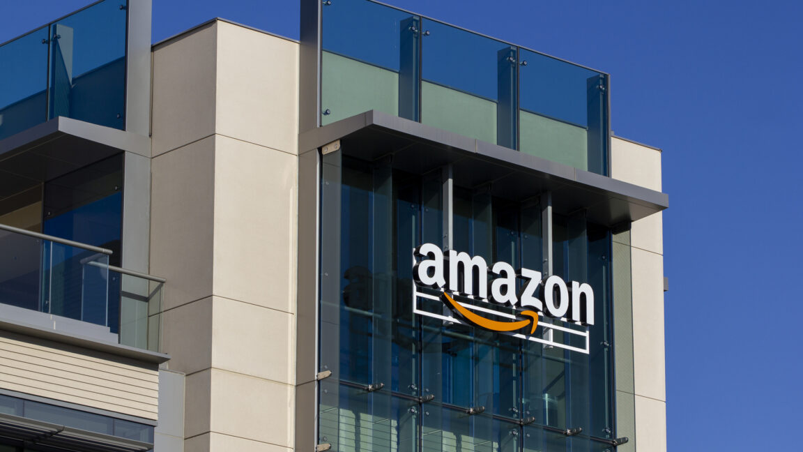
Amazon overhauls a whopping 50 logos in global brand refresh
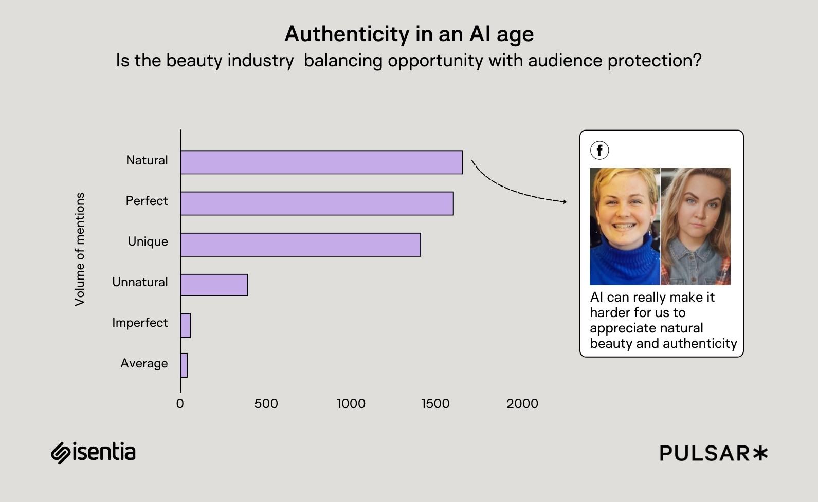
For the first time in more than 20 years, Amazon’s logo got a touch-up. In fact, all of its logos got a touch-up. The small but subtle changes are part of a company-wide brand system refinement, bringing together more than 50 Amazon sub-brands across categories like pharmacy, groceries, and on-demand streaming under a single brand umbrella. Typography was key to making it all work.A pair of bespoke fonts, Amazon Logo Sans and Ember Modern, tie Amazon products and services together with a unified brand voice that has flexibility for different contexts. This is a brand that’s everywhere, from cardboard boxes to music to prescriptions, and needed to adapt to convey boldness and excitement in use cases like entertainment, but trustworthiness in its healthcare divisions.[Image: Amazon]Koto Studio, the creative agency that worked on the brand system and refresh, started the endeavor by thinking of Amazon’s master brand logo as a type specimen, not just a mark. (Though they did plump up its arrow to give it a deeper “smile.”) The team refined the letterforms in the logo, which eventually became the foundation for a font.“The biggest challenge was the sheer scale,” Koto New York executive creative director Arthur Foliard tells Fast Company of the Amazon brand refresh. “Amazon’s brand had become visually fragmented. Every product or service seemed to have its own logo. It was a sea of arrows with no clear system or structure.”Under the new brand system, the Amazon family of sub-brands, house brands, and core services, from Amazon Basics to Amazon Kids, now have a unified logo system set in the new proprietary Amazon Logo Sans.[Image: Amazon]Ember Modern is a new version of the typeface Amazon originally designed for Kindle screen. Koto updated it with characters for 366 languages and seven weights so it can be used globally in instances like high-impact headlines or for text-heavy, long-form reading. It’s a typeface designed for versatility.They also updated the company’s color palette to standardize its main brand color, Smile Orange; tweak its blue to a more saturated, digital-friendly shade; and give each sub-brand its own bright, expressive color scheme. Amazon Fresh, its grocery delivery business, uses shades of green to communicate freshness, while Amazon One Medical, its primary care provider, uses a turquoise green reminiscent of scrubs.“Historically, Amazon teams moved fast, spinning up businesses and logos on the fly to meet customer demand,” Foliard says. “That agility was great, but it sometimes led to brand fragmentation.” [Image: Amazon]Going forward, the agency left the company with an automated “[amazon]:name” command to generate future consistent logos instantly, plus a full logo architecture to define what needs a logo and what doesn’t.With its new brand system and font book, Amazon is better positioned to express its brand and sub-brands across a growing number of categories. If Alexa is the audible voice of Amazon the brand, Amazon Logo Sans and Ember Modern are the brand’s voice in print.

For the first time in more than 20 years, Amazon’s logo got a touch-up. In fact, all of its logos got a touch-up. The small but subtle changes are part of a company-wide brand system refinement, bringing together more than 50 Amazon sub-brands across categories like pharmacy, groceries, and on-demand streaming under a single brand umbrella. Typography was key to making it all work.
A pair of bespoke fonts, Amazon Logo Sans and Ember Modern, tie Amazon products and services together with a unified brand voice that has flexibility for different contexts. This is a brand that’s everywhere, from cardboard boxes to music to prescriptions, and needed to adapt to convey boldness and excitement in use cases like entertainment, but trustworthiness in its healthcare divisions.
Koto Studio, the creative agency that worked on the brand system and refresh, started the endeavor by thinking of Amazon’s master brand logo as a type specimen, not just a mark. (Though they did plump up its arrow to give it a deeper “smile.”) The team refined the letterforms in the logo, which eventually became the foundation for a font.
“The biggest challenge was the sheer scale,” Koto New York executive creative director Arthur Foliard tells Fast Company of the Amazon brand refresh. “Amazon’s brand had become visually fragmented. Every product or service seemed to have its own logo. It was a sea of arrows with no clear system or structure.”
Under the new brand system, the Amazon family of sub-brands, house brands, and core services, from Amazon Basics to Amazon Kids, now have a unified logo system set in the new proprietary Amazon Logo Sans.
Ember Modern is a new version of the typeface Amazon originally designed for Kindle screen. Koto updated it with characters for 366 languages and seven weights so it can be used globally in instances like high-impact headlines or for text-heavy, long-form reading. It’s a typeface designed for versatility.
They also updated the company’s color palette to standardize its main brand color, Smile Orange; tweak its blue to a more saturated, digital-friendly shade; and give each sub-brand its own bright, expressive color scheme. Amazon Fresh, its grocery delivery business, uses shades of green to communicate freshness, while Amazon One Medical, its primary care provider, uses a turquoise green reminiscent of scrubs.
“Historically, Amazon teams moved fast, spinning up businesses and logos on the fly to meet customer demand,” Foliard says. “That agility was great, but it sometimes led to brand fragmentation.”
Going forward, the agency left the company with an automated “[amazon]:name” command to generate future consistent logos instantly, plus a full logo architecture to define what needs a logo and what doesn’t.
With its new brand system and font book, Amazon is better positioned to express its brand and sub-brands across a growing number of categories. If Alexa is the audible voice of Amazon the brand, Amazon Logo Sans and Ember Modern are the brand’s voice in print.