


![[The AI Show Episode 146]: Rise of “AI-First” Companies, AI Job Disruption, GPT-4o Update Gets Rolled Back, How Big Consulting Firms Use AI, and Meta AI App](https://www.marketingaiinstitute.com/hubfs/ep%20146%20cover.png)


![|ー ▶︎ [ Wouldn't it be easier if you could trace your data structure with lines? ] ー,ー,ー;](https://media2.dev.to/dynamic/image/width%3D1000,height%3D500,fit%3Dcover,gravity%3Dauto,format%3Dauto/https:%2F%2Fdev-to-uploads.s3.amazonaws.com%2Fuploads%2Farticles%2F2k02ska8tyhhnijercgq.png)


_Brian_Jackson_Alamy.jpg?width=1280&auto=webp&quality=80&disable=upscale#)


 Stolen 884,000 Credit Card Details on 13 Million Clicks from Users Worldwide.webp?#)


![Apple Shares Official Teaser for 'Highest 2 Lowest' Starring Denzel Washington [Video]](https://www.iclarified.com/images/news/97221/97221/97221-640.jpg)

![Under-Display Face ID Coming to iPhone 18 Pro and Pro Max [Rumor]](https://www.iclarified.com/images/news/97215/97215/97215-640.jpg)


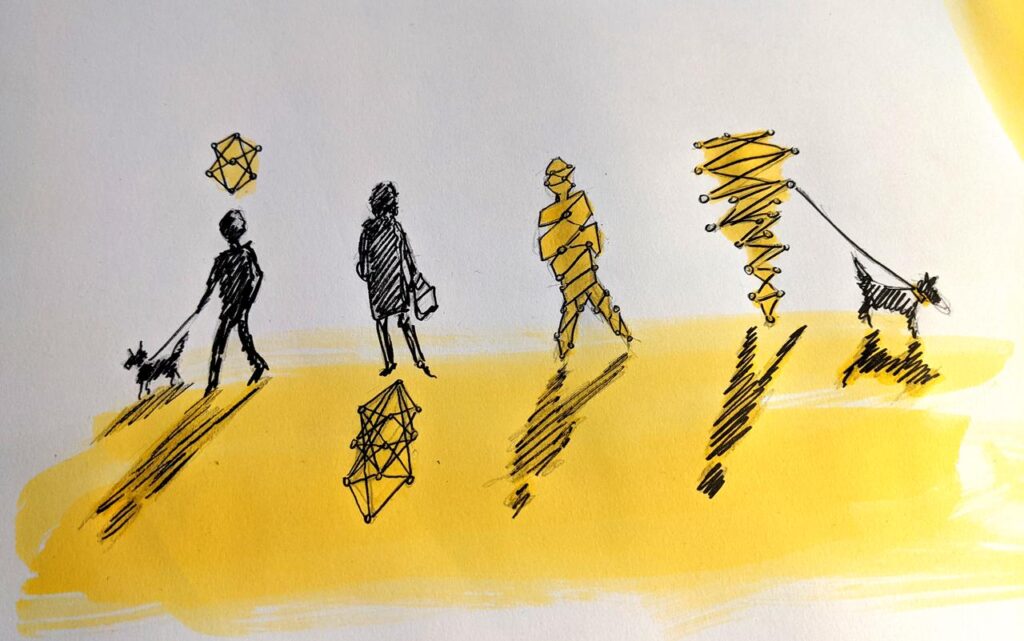
Synesthetic Data Interfaces: Turning Code into Color, Sound, and Touch
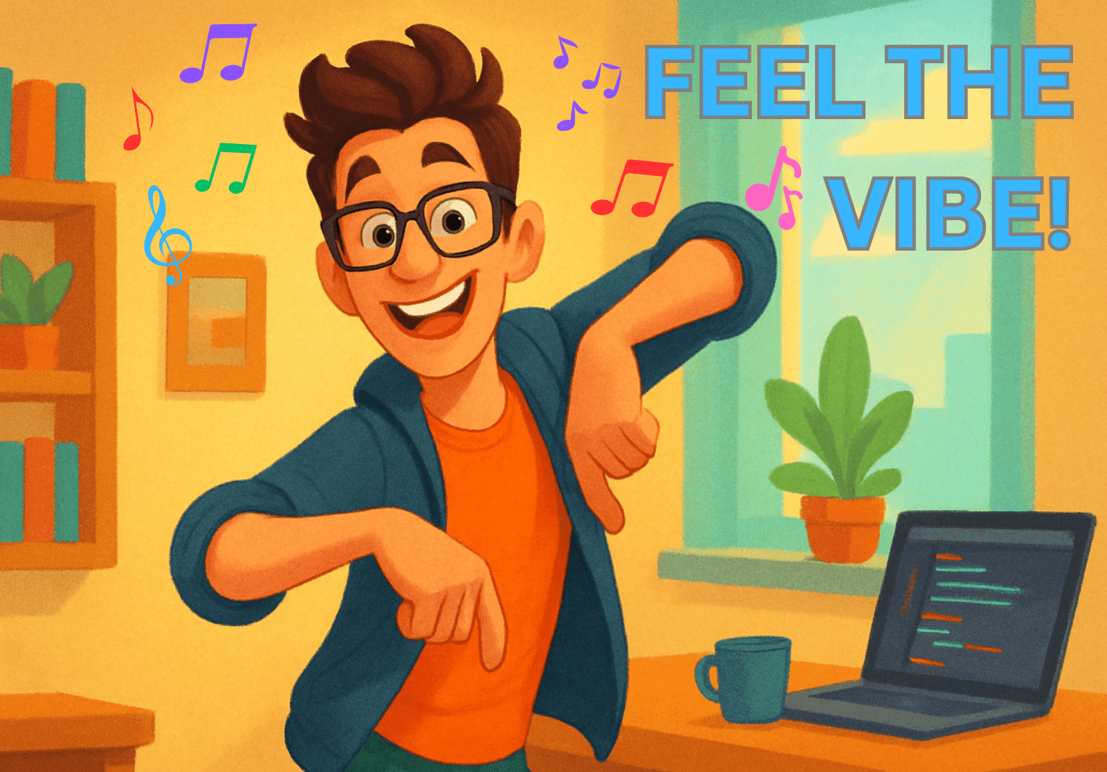
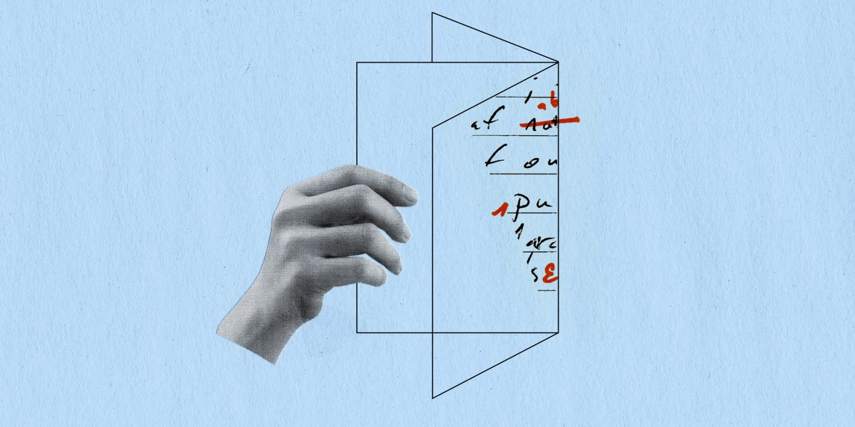
What If You Could Feel Data? Let’s imagine you’re in your classroom, and your teacher shows you a big chart full of numbers. Some kids understand it, but others just see a bunch of dots, bars, and lines. Now imagine if those numbers were music. Higher numbers made higher sounds, and lower numbers made deep drum beats. Or maybe the numbers changed the colors on the screen or made your tablet vibrate softly when something important happened. Wouldn’t that be fun and easier to understand? This amazing idea is becoming real through something called synesthetic data interfaces. That’s a big name, but it simply means using your senses—like hearing, sight, or touch—to understand data. It’s like turning code or information into a song, a rainbow, or even a feeling in your hand. Why is this important? Because everyone learns differently. Some people understand pictures better, while others learn better by hearing or touching things. Synesthetic data interfaces help people understand hard things in their own way. And guess what? It’s not just for learning. These tools can help doctors, scientists, game designers, and even artists see their work in a brand-new light. In this blog, we will go on a fun journey to learn how this new technology works, how it’s changing the world, and how it might one day help you in school or while playing your favorite game. Let’s begin! What Are Synesthetic Data Interfaces? Let’s break the words down. “Synesthetic” comes from “synesthesia,” a condition where people naturally see sounds, taste colors, or feel music. It’s very rare, but for those who have it, their senses work together in a unique way. A “data interface” is a tool that helps us understand or work with data. Data is everywhere—on your phone, in school, at the doctor’s office, or even inside your smartwatch. But most of the time, data comes in boring forms like numbers, spreadsheets, and charts. So, a synesthetic data interface is a smart system that turns data into something you can see, hear, or feel, like colors, music, or vibrations. These tools help people connect with data in a more fun and useful way. How It Works These systems use sensors, computer programs, and special devices to change data into different sensory forms. For example: A weather app might turn temperature changes into sound effects. A health monitor might make your smartwatch vibrate if your heart rate gets too high. A data analysis tool could turn different trends into shifting colors to help you “see” the story of the numbers. Why It’s Important These tools are helpful because: They make it easier for people who have trouble reading charts or numbers. They help people who are blind or have vision problems. They make learning more fun for kids and adults. It’s like using your whole body and all your senses to understand the world! Why Our Senses Matter When Learning Have you ever noticed that you learn better when you watch a video instead of reading a textbook? Or maybe when you sing a song about something, you remember it faster? That’s because your brain likes to use different senses to take in information. Let’s talk about how each sense helps us: Eyes (sight): Helps us learn through pictures, diagrams, colors, and videos. Ears (hearing): Helps us understand through voice, music, and sounds. Hands (touch): Helps us learn by doing things, like writing or building with blocks. Now imagine if all of those senses worked together to help you understand something complicated—like how your favorite game app works, or how plants grow under different weather. That’s what synesthetic data interfaces try to do. They make learning exciting, easy, and more natural. This is also helpful for people who have learning challenges. For example, a child who cannot see well can still understand a map if it makes sounds. Or a student with reading trouble might understand math better through touch or music. This technology is not just cool—it’s powerful. Turning Code into Music and Sound One of the most exciting things about synesthetic data is data sonification—turning numbers into sound. Let’s say a scientist is studying ocean waves. The waves go up and down, and that movement can be turned into different pitches or beats. The higher the wave, the higher the sound! This helps people “hear” patterns and changes in data. Here are some real examples: In space research, sounds are made from data collected from stars and galaxies. In hospitals, heartbeats are turned into beeps that doctors listen to. In art shows, artists make music using data from cities or even brainwaves. This is not just for fun. Scientists say that people can notice small changes in sound faster than in a graph. That means they can find problems quicker and make better decisions. Even apps for learning music or math use sound-based data to teach students. It’s like mixing fun and education together! Seeing Numbers as Colors: Data Visualization Reimagined You may have
What If You Could Feel Data?
Let’s imagine you’re in your classroom, and your teacher shows you a big chart full of numbers. Some kids understand it, but others just see a bunch of dots, bars, and lines. Now imagine if those numbers were music. Higher numbers made higher sounds, and lower numbers made deep drum beats. Or maybe the numbers changed the colors on the screen or made your tablet vibrate softly when something important happened. Wouldn’t that be fun and easier to understand?
This amazing idea is becoming real through something called synesthetic data interfaces. That’s a big name, but it simply means using your senses—like hearing, sight, or touch—to understand data. It’s like turning code or information into a song, a rainbow, or even a feeling in your hand.
Why is this important? Because everyone learns differently. Some people understand pictures better, while others learn better by hearing or touching things. Synesthetic data interfaces help people understand hard things in their own way. And guess what? It’s not just for learning. These tools can help doctors, scientists, game designers, and even artists see their work in a brand-new light.
In this blog, we will go on a fun journey to learn how this new technology works, how it’s changing the world, and how it might one day help you in school or while playing your favorite game. Let’s begin!
What Are Synesthetic Data Interfaces?
Let’s break the words down. “Synesthetic” comes from “synesthesia,” a condition where people naturally see sounds, taste colors, or feel music. It’s very rare, but for those who have it, their senses work together in a unique way.
A “data interface” is a tool that helps us understand or work with data. Data is everywhere—on your phone, in school, at the doctor’s office, or even inside your smartwatch. But most of the time, data comes in boring forms like numbers, spreadsheets, and charts.
So, a synesthetic data interface is a smart system that turns data into something you can see, hear, or feel, like colors, music, or vibrations. These tools help people connect with data in a more fun and useful way.
How It Works
These systems use sensors, computer programs, and special devices to change data into different sensory forms. For example:
A weather app might turn temperature changes into sound effects.
A health monitor might make your smartwatch vibrate if your heart rate gets too high.
A data analysis tool could turn different trends into shifting colors to help you “see” the story of the numbers.
Why It’s Important
These tools are helpful because:
They make it easier for people who have trouble reading charts or numbers.
They help people who are blind or have vision problems.
They make learning more fun for kids and adults.
It’s like using your whole body and all your senses to understand the world!
Why Our Senses Matter When Learning
Have you ever noticed that you learn better when you watch a video instead of reading a textbook? Or maybe when you sing a song about something, you remember it faster? That’s because your brain likes to use different senses to take in information.
Let’s talk about how each sense helps us:
Eyes (sight): Helps us learn through pictures, diagrams, colors, and videos.
Ears (hearing): Helps us understand through voice, music, and sounds.
Hands (touch): Helps us learn by doing things, like writing or building with blocks.
Now imagine if all of those senses worked together to help you understand something complicated—like how your favorite game app works, or how plants grow under different weather.
That’s what synesthetic data interfaces try to do. They make learning exciting, easy, and more natural.
This is also helpful for people who have learning challenges. For example, a child who cannot see well can still understand a map if it makes sounds. Or a student with reading trouble might understand math better through touch or music.
This technology is not just cool—it’s powerful.
Turning Code into Music and Sound
One of the most exciting things about synesthetic data is data sonification—turning numbers into sound.
Let’s say a scientist is studying ocean waves. The waves go up and down, and that movement can be turned into different pitches or beats. The higher the wave, the higher the sound! This helps people “hear” patterns and changes in data.
Here are some real examples:
In space research, sounds are made from data collected from stars and galaxies.
In hospitals, heartbeats are turned into beeps that doctors listen to.
In art shows, artists make music using data from cities or even brainwaves.
This is not just for fun. Scientists say that people can notice small changes in sound faster than in a graph. That means they can find problems quicker and make better decisions.
Even apps for learning music or math use sound-based data to teach students. It’s like mixing fun and education together!
Seeing Numbers as Colors: Data Visualization Reimagined
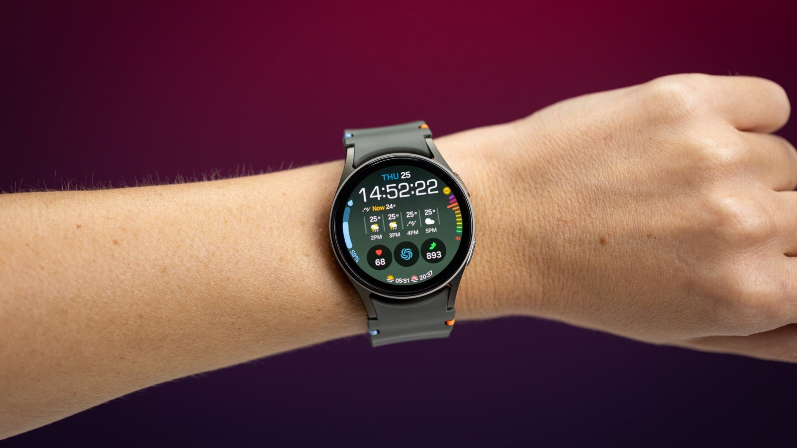
You may have seen charts with bars, lines, or pie slices. These are visual ways to show data. But synesthetic interfaces go even further. They change numbers into moving images, flashing lights, or colors that grow and shift.
Let’s say your smartwatch is tracking your steps. Instead of showing only numbers, it might:
Glow green when you're active.
Pulse red when you've been still too long.
Flash blue when you meet your step goal.
Another great example is how artists and designers are now using data to create moving art. These pieces of art respond to:
Traffic data
Air quality
Social media activity
As the data changes, the art changes, too! This makes information beautiful and easier to understand.
Data visuals are also being used in classrooms. For example, when a teacher shows how temperature changes during the day, the board might turn from blue (cold) to orange (warm) to red (hot). It becomes a game of color that teaches you while you watch.
Touching Data: The Power of Haptics
The sense of touch is very powerful. We use it to feel heat, cold, sharpness, and softness. But what if you could feel data with your hands?
Some smart devices now use haptic feedback. This means they vibrate or press against your skin to give you information. For example:
A phone might buzz in a certain pattern to tell you that you got a message.
A glove could gently press your fingers to tell you which direction to go.
A smartwatch could pulse faster if your heart rate goes up.
Now, imagine wearing a vest while playing a learning game. As the data changes, the vest lightly taps your back or arms. It becomes a new way to understand what’s happening.
Touch interfaces are also very useful for people who are blind or cannot hear. They can still feel the patterns of the data and respond in real time.
This technology is helping make the world more inclusive and fun for everyone.
When Apps Bring Data to Life
At a recent tech conference, a group of game designers showed off a new type of board game. It wasn’t just any game—it combined storytelling, data, and senses in a clever way.
Players went on adventures in a fantasy world, and the choices they made changed the story in real time. But here’s the fun part: the game used a companion app that transformed numbers and game outcomes into music, glowing lights, and tiny vibrations through smart bracelets.
One of the designers explained how they tested different sensory features using a mobile app developed by app creators in London. These developers worked closely with the game team to make sure the sound, colors, and touches matched the story perfectly. The result? A game that felt alive—one that you didn’t just play, but also heard, saw, and felt.
It was a small peek into how synesthetic interfaces are not just for science—they’re now part of fun, creativity, and play!
How This Helps in Science, Education, and More
Synesthetic data interfaces are not just for fun. They are useful in many areas:
Science: Researchers can hear chemical reactions or see DNA patterns as art.
Medicine: Doctors can feel a patient’s health data through smart tools.
Education: Students can learn history through music, or math through color games.
Safety: Firefighters can feel temperature alerts on their suits in emergencies.
Smart Cities: Citizens can see real-time pollution data as color lights on buildings.
This helps people make better, faster decisions. It also allows more people to access data, especially those with disabilities.
Actionable Tips for Young Explorers
If you're curious and want to explore more, here’s how:
Try apps that change music or light using code, like Scratch or Tynker.
Build small projects with sensors using beginner kits like Arduino or Micro:bit.
Use colors or music to learn math—many free websites do this.
Ask your teacher if you can make a classroom project that shows your science data as a song or art.
You don’t have to be a genius to get started—just be curious!
The Future Is Full of Color, Sound, and Wonder
We’ve come a long way from boring charts and dull data. Today, with synesthetic data interfaces, we can see, hear, and feel information like never before. These tools make learning fun, science exciting, and life more inclusive.
Whether you’re a student, a teacher, an artist, or just someone who loves tech, this new way of connecting with data can open up a world of possibilities. It’s not just about making data easier—it’s about making it come alive.
One day, you might design a school project, a video game, or even a life-saving app that uses colors, sounds, and touch to share important stories. With the right tools and imagination, anything is possible.
So go ahead—feel the future, one sense at a time.