


![[The AI Show Episode 145]: OpenAI Releases o3 and o4-mini, AI Is Causing “Quiet Layoffs,” Executive Order on Youth AI Education & GPT-4o’s Controversial Update](https://www.marketingaiinstitute.com/hubfs/ep%20145%20cover.png)


![Re-designing a Git/development workflow with best practices [closed]](https://i.postimg.cc/tRvBYcrt/branching-example.jpg)


![[DEALS] Microsoft 365: 1-Year Subscription (Family/Up to 6 Users) (23% off) & Other Deals Up To 98% Off – Offers End Soon!](https://www.javacodegeeks.com/wp-content/uploads/2012/12/jcg-logo.jpg)


![From Art School Drop-out to Microsoft Engineer with Shashi Lo [Podcast #170]](https://cdn.hashnode.com/res/hashnode/image/upload/v1746203291209/439bf16b-c820-4fe8-b69e-94d80533b2df.png?#)


(1).jpg?#)


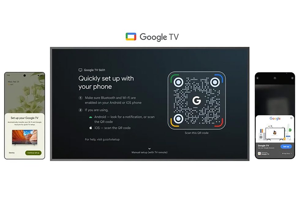
![What Google Messages features are rolling out [May 2025]](https://i0.wp.com/9to5google.com/wp-content/uploads/sites/4/2023/12/google-messages-name-cover.png?resize=1200%2C628&quality=82&strip=all&ssl=1)


_Inge_Johnsson-Alamy.jpg?width=1280&auto=webp&quality=80&disable=upscale#)


![New Apple iPad mini 7 On Sale for $399! [Lowest Price Ever]](https://www.iclarified.com/images/news/96096/96096/96096-640.jpg)
![Apple to Split iPhone Launches Across Fall and Spring in Major Shakeup [Report]](https://www.iclarified.com/images/news/97211/97211/97211-640.jpg)
![Apple to Move Camera to Top Left, Hide Face ID Under Display in iPhone 18 Pro Redesign [Report]](https://www.iclarified.com/images/news/97212/97212/97212-640.jpg)
![Apple Developing Battery Case for iPhone 17 Air Amid Battery Life Concerns [Report]](https://www.iclarified.com/images/news/97208/97208/97208-640.jpg)


Rendering Tooltips with React Portals (Without Breaking Layout)
While React Portals are commonly used for modals, they’re just as valuable for lightweight UI elements like tooltips and popovers. Tooltips often need to escape container boundaries (like overflow: hidden) and stack correctly above all other content. That’s exactly where React Portals shine. In this article, we’ll use a portal to render a tooltip outside the parent component’s DOM tree — avoiding layout bugs and z-index conflicts. Step 1: Set Up a Portal Root Just like with modals, create a separate DOM node for your tooltip content in public/index.html: This is where the tooltip will be mounted via a portal. Step 2: Create the Tooltip Component Let’s build a tooltip that renders via ReactDOM.createPortal and positions itself near a target element using getBoundingClientRect(). import React, { useEffect, useRef, useState } from "react"; import ReactDOM from "react-dom"; const tooltipRoot = document.getElementById("tooltip-root"); export default function Tooltip({ targetRef, text, visible }) { const [position, setPosition] = useState({ top: 0, left: 0 }); const tooltipRef = useRef(null); useEffect(() => { if (visible && targetRef.current) { const rect = targetRef.current.getBoundingClientRect(); setPosition({ top: rect.bottom + window.scrollY + 8, left: rect.left + window.scrollX + rect.width / 2, }); } }, [visible, targetRef]); if (!visible) return null; return ReactDOM.createPortal( {text} , tooltipRoot ); } Step 3: Style the Tooltip Add basic styles for the floating tooltip: .tooltip { position: absolute; transform: translateX(-50%); background: #222; color: #fff; padding: 6px 10px; border-radius: 4px; font-size: 0.875rem; white-space: nowrap; pointer-events: none; z-index: 1000; } This ensures the tooltip is small, centered above the target, and doesn't block pointer events. Step 4: Use the Tooltip Now let’s use it in a component: import React, { useRef, useState } from "react"; import Tooltip from "./Tooltip"; function TooltipExample() { const btnRef = useRef(); const [hovered, setHovered] = useState(false); return ( setHovered(true)} onMouseLeave={() => setHovered(false)} > Hover me ); } When the button is hovered, the tooltip appears — positioned outside the normal DOM flow, thanks to the portal. ✅ Why Use Portals for Tooltips:

While React Portals are commonly used for modals, they’re just as valuable for lightweight UI elements like tooltips and popovers. Tooltips often need to escape container boundaries (like overflow: hidden) and stack correctly above all other content. That’s exactly where React Portals shine.
In this article, we’ll use a portal to render a tooltip outside the parent component’s DOM tree — avoiding layout bugs and z-index conflicts.
Step 1: Set Up a Portal Root
Just like with modals, create a separate DOM node for your tooltip content in public/index.html:
This is where the tooltip will be mounted via a portal.
Step 2: Create the Tooltip Component
Let’s build a tooltip that renders via ReactDOM.createPortal and positions itself near a target element using getBoundingClientRect().
import React, { useEffect, useRef, useState } from "react";
import ReactDOM from "react-dom";

const tooltipRoot = document.getElementById("tooltip-root");

export default function Tooltip({ targetRef, text, visible }) {
  const [position, setPosition] = useState({ top: 0, left: 0 });
  const tooltipRef = useRef(null);

  useEffect(() => {
    if (visible && targetRef.current) {
      const rect = targetRef.current.getBoundingClientRect();
      setPosition({
        top: rect.bottom + window.scrollY + 8,
        left: rect.left + window.scrollX + rect.width / 2,
      });
    }
  }, [visible, targetRef]);

  if (!visible) return null;

  return ReactDOM.createPortal(

      {text}
    ,
    tooltipRoot
  );
}
Step 3: Style the Tooltip
Add basic styles for the floating tooltip:
.tooltip {
  position: absolute;
  transform: translateX(-50%);
  background: #222;
  color: #fff;
  padding: 6px 10px;
  border-radius: 4px;
  font-size: 0.875rem;
  white-space: nowrap;
  pointer-events: none;
  z-index: 1000;
}
This ensures the tooltip is small, centered above the target, and doesn't block pointer events.
Step 4: Use the Tooltip
Now let’s use it in a component:
import React, { useRef, useState } from "react";
import Tooltip from "./Tooltip";
function TooltipExample() {
const btnRef = useRef();
const [hovered, setHovered] = useState(false);
return (
When the button is hovered, the tooltip appears — positioned outside the normal DOM flow, thanks to the portal.
✅ Why Use Portals for Tooltips: