


![[The AI Show Episode 145]: OpenAI Releases o3 and o4-mini, AI Is Causing “Quiet Layoffs,” Executive Order on Youth AI Education & GPT-4o’s Controversial Update](https://www.marketingaiinstitute.com/hubfs/ep%20145%20cover.png)


![[DEALS] Microsoft 365: 1-Year Subscription (Family/Up to 6 Users) (23% off) & Other Deals Up To 98% Off – Offers End Soon!](https://www.javacodegeeks.com/wp-content/uploads/2012/12/jcg-logo.jpg)


.jpg?#)
.jpg?#)


_Inge_Johnsson-Alamy.jpg?width=1280&auto=webp&quality=80&disable=upscale#)


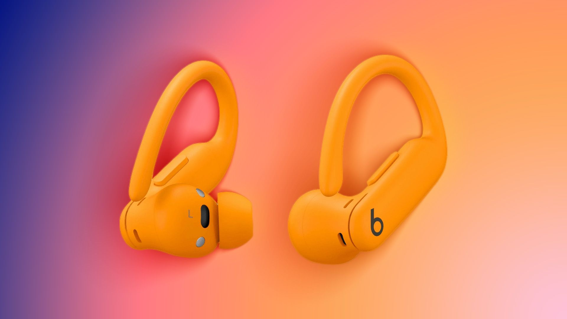
![New Powerbeats Pro 2 Wireless Earbuds On Sale for $199.95 [Lowest Price Ever]](https://www.iclarified.com/images/news/97217/97217/97217-640.jpg)
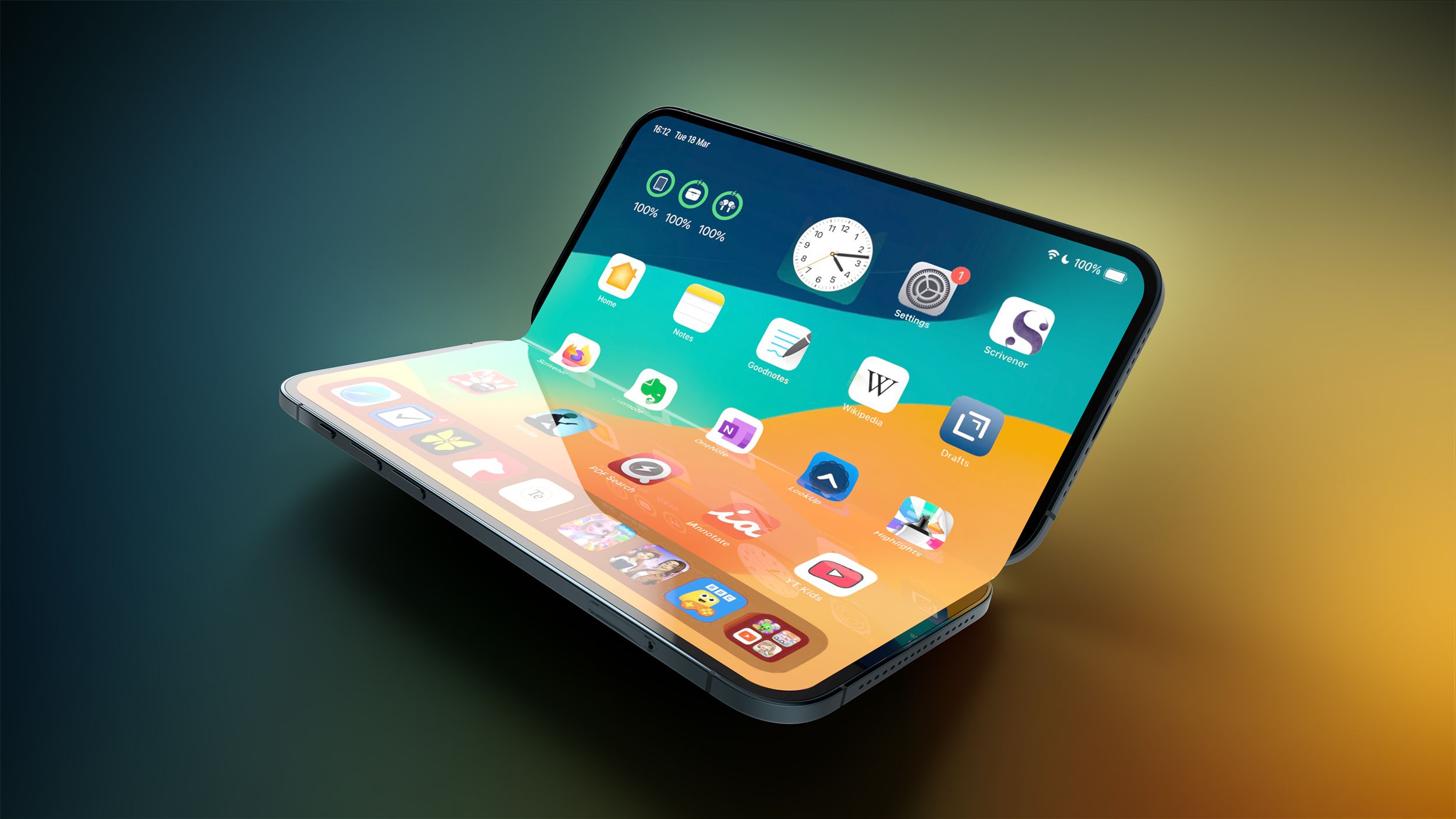
![Alleged iPhone 17-19 Roadmap Leaked: Foldables and Spring Launches Ahead [Kuo]](https://www.iclarified.com/images/news/97214/97214/97214-640.jpg)

![New Apple iPad mini 7 On Sale for $399! [Lowest Price Ever]](https://www.iclarified.com/images/news/96096/96096/96096-640.jpg)


How to Show a DatePickerDialog in Jetpack Compose Kotlin?
Creating a Date of Birth (DOB) picker using Jetpack Compose can be straightforward if you understand the integration between your UI components and the DatePickerDialog. Let's solve the issue you're facing where the DatePickerDialog isn't displayed when clicking on the OutlinedTextField. We'll delve into why this might happen and provide a clear solution to enable date selection effectively. Why Isn't the DatePickerDialog Appearing? The common reason behind the DatePickerDialog not displaying is usually tied to how the UI handles state and composition. Since Compose leverages a reactive programming model, it's essential that the state-related changes are managed correctly. In your code, while you set up the DatePickerDialog correctly, there might be room for optimization. Implementing the ChooseDob Composable To address the issue, let’s refine your ChooseDob Composable function. Here's the revised code: @Composable fun ChooseDob( onDobSelected: (String) -> Unit ) { val context = LocalContext.current var dob by remember { mutableStateOf("") } // Use a Calendar instance to fetch current date val calendar = Calendar.getInstance() Column( modifier = Modifier .fillMaxSize() .padding(32.dp), verticalArrangement = Arrangement.Center, horizontalAlignment = Alignment.CenterHorizontally ) { Text( text = "Select your Date of Birth", style = MaterialTheme.typography.headlineMedium, color = Color.Black, fontSize = 24.sp, fontWeight = FontWeight.Bold, modifier = Modifier.align(Alignment.Start) ) Spacer(modifier = Modifier.height(16.dp)) OutlinedTextField( value = dob, onValueChange = { }, // Prevent user input directly modifier = Modifier .fillMaxWidth() .clickable { // Create the DatePickerDialog DatePickerDialog( context, { _, year, month, dayOfMonth -> val selectedCalendar = Calendar.getInstance().apply { set(Calendar.YEAR, year) set(Calendar.MONTH, month) set(Calendar.DAY_OF_MONTH, dayOfMonth) } val formatter = SimpleDateFormat("yyyy-MM-dd", Locale.US) dob = formatter.format(selectedCalendar.time) }, calendar.get(Calendar.YEAR), calendar.get(Calendar.MONTH), calendar.get(Calendar.DAY_OF_MONTH) ).show() }, readOnly = true, placeholder = { Text("Tap to select DOB") } ) Spacer(modifier = Modifier.height(16.dp)) Button( onClick = { onDobSelected(dob) }, enabled = dob.isNotBlank(), modifier = Modifier.align(Alignment.End), colors = ButtonDefaults.buttonColors( containerColor = if (dob.isNotBlank()) Color(0xFF2196F3) else Color.Gray ) ) { Row(verticalAlignment = Alignment.CenterVertically) { Icon( imageVector = Icons.AutoMirrored.Filled.ArrowForward, contentDescription = "Next", tint = Color.White ) } } } } Breakdown of the Code State Management: We maintain the selected DOB in a mutable state variable dob. This enables Compose to recompose the UI whenever this variable updates. Clickable Modifier: The clickable modifier is correctly applied to the OutlinedTextField. This modifier triggers the DatePickerDialog on tap, ensuring that user input is managed appropriately, preventing direct input. DatePickerDialog Creation: The dialog is created each time the field is clicked, and once a date is picked, it formats this date to yyyy-MM-dd and updates the dob variable. This action will naturally refresh the state of the OutlinedTextField. Button Enable Logic: The button is enabled only when dob is not blank, providing a visual guideline for the user. Conclusion By ensuring the OutlinedTextField correctly interacts with the DatePickerDialog, and by managing its state with remember, you make the user experience seamless. Now, users can easily select their date of birth, enabling the 'Next' button when appropriate. Frequently Asked Questions Why is my DatePickerDialog not working? It may not work due to state management issues or incorrect implementation of UI elements. Ensure that all components are correctly linked and responding to state changes. Can I use a different Date Format? Yes, you can modify the date format in the SimpleDateFormat constructor to customize how dates appear in

Creating a Date of Birth (DOB) picker using Jetpack Compose can be straightforward if you understand the integration between your UI components and the DatePickerDialog. Let's solve the issue you're facing where the DatePickerDialog isn't displayed when clicking on the OutlinedTextField. We'll delve into why this might happen and provide a clear solution to enable date selection effectively.
Why Isn't the DatePickerDialog Appearing?
The common reason behind the DatePickerDialog not displaying is usually tied to how the UI handles state and composition. Since Compose leverages a reactive programming model, it's essential that the state-related changes are managed correctly. In your code, while you set up the DatePickerDialog correctly, there might be room for optimization.
Implementing the ChooseDob Composable
To address the issue, let’s refine your ChooseDob Composable function. Here's the revised code:
@Composable
fun ChooseDob(
    onDobSelected: (String) -> Unit
) {
    val context = LocalContext.current
    var dob by remember { mutableStateOf("") }

    // Use a Calendar instance to fetch current date
    val calendar = Calendar.getInstance()

    Column(
        modifier = Modifier
            .fillMaxSize()
            .padding(32.dp),
        verticalArrangement = Arrangement.Center,
        horizontalAlignment = Alignment.CenterHorizontally
    ) {
        Text(
            text = "Select your Date of Birth",
            style = MaterialTheme.typography.headlineMedium,
            color = Color.Black,
            fontSize = 24.sp,
            fontWeight = FontWeight.Bold,
            modifier = Modifier.align(Alignment.Start)
        )

        Spacer(modifier = Modifier.height(16.dp))

        OutlinedTextField(
            value = dob,
            onValueChange = { }, // Prevent user input directly
            modifier = Modifier
                .fillMaxWidth()
                .clickable {
                    // Create the DatePickerDialog
                    DatePickerDialog(
                        context,
                        { _, year, month, dayOfMonth ->
                            val selectedCalendar = Calendar.getInstance().apply {
                                set(Calendar.YEAR, year)
                                set(Calendar.MONTH, month)
                                set(Calendar.DAY_OF_MONTH, dayOfMonth)
                            }

                            val formatter = SimpleDateFormat("yyyy-MM-dd", Locale.US)
                            dob = formatter.format(selectedCalendar.time)
                        },
                        calendar.get(Calendar.YEAR),
                        calendar.get(Calendar.MONTH),
                        calendar.get(Calendar.DAY_OF_MONTH)
                    ).show()
                },
            readOnly = true,
            placeholder = { Text("Tap to select DOB") }
        )

        Spacer(modifier = Modifier.height(16.dp))

        Button(
            onClick = { onDobSelected(dob) },
            enabled = dob.isNotBlank(),
            modifier = Modifier.align(Alignment.End),
            colors = ButtonDefaults.buttonColors(
                containerColor = if (dob.isNotBlank()) Color(0xFF2196F3) else Color.Gray
            )
        ) {
            Row(verticalAlignment = Alignment.CenterVertically) {
                Icon(
                    imageVector = Icons.AutoMirrored.Filled.ArrowForward,
                    contentDescription = "Next",
                    tint = Color.White
                )
            }
        }
    }
}
Breakdown of the Code
-
State Management: We maintain the selected DOB in a mutable state variable
dob. This enables Compose to recompose the UI whenever this variable updates. -
Clickable Modifier: The
clickablemodifier is correctly applied to theOutlinedTextField. This modifier triggers the DatePickerDialog on tap, ensuring that user input is managed appropriately, preventing direct input. -
DatePickerDialog Creation: The dialog is created each time the field is clicked, and once a date is picked, it formats this date to
yyyy-MM-ddand updates thedobvariable. This action will naturally refresh the state of the OutlinedTextField. -
Button Enable Logic: The button is enabled only when
dobis not blank, providing a visual guideline for the user.
Conclusion
By ensuring the OutlinedTextField correctly interacts with the DatePickerDialog, and by managing its state with remember, you make the user experience seamless. Now, users can easily select their date of birth, enabling the 'Next' button when appropriate.
Frequently Asked Questions
Why is my DatePickerDialog not working?
It may not work due to state management issues or incorrect implementation of UI elements. Ensure that all components are correctly linked and responding to state changes.
Can I use a different Date Format?
Yes, you can modify the date format in the SimpleDateFormat constructor to customize how dates appear in your app.
How to handle date validation?
You could implement additional logic in the onClick method of the button to check the validity of the selected date, ensuring that it meets business rules or constraints.
With this enhanced implementation, your Date of Birth selection should function properly, allowing users to proceed as intended!