


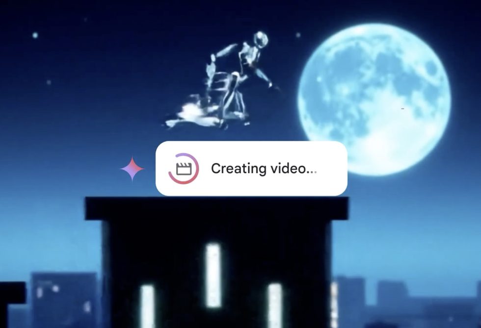
![[The AI Show Episode 144]: ChatGPT’s New Memory, Shopify CEO’s Leaked “AI First” Memo, Google Cloud Next Releases, o3 and o4-mini Coming Soon & Llama 4’s Rocky Launch](https://www.marketingaiinstitute.com/hubfs/ep%20144%20cover.png)


![Blue Archive tier list [April 2025]](https://media.pocketgamer.com/artwork/na-33404-1636469504/blue-archive-screenshot-2.jpg?#)


.png?#)


-Baldur’s-Gate-3-The-Final-Patch---An-Animated-Short-00-03-43.png?width=1920&height=1920&fit=bounds&quality=70&format=jpg&auto=webp#)


![Alleged Pixel 10 series wallpapers leak with vibrant colors and a strange new theme [Gallery]](https://i0.wp.com/9to5google.com/wp-content/uploads/sites/4/2025/04/pixel-10-wallpaper-leak-1.jpg?resize=1200%2C628&quality=82&strip=all&ssl=1)


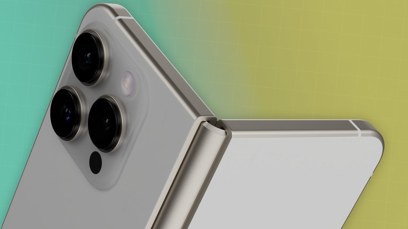
![Apple's Foldable iPhone May Cost Between $2100 and $2300 [Rumor]](https://www.iclarified.com/images/news/97028/97028/97028-640.jpg)
![Apple Releases Public Betas of iOS 18.5, iPadOS 18.5, macOS Sequoia 15.5 [Download]](https://www.iclarified.com/images/news/97024/97024/97024-640.jpg)
![Apple to Launch In-Store Recycling Promotion Tomorrow, Up to $20 Off Accessories [Gurman]](https://www.iclarified.com/images/news/97023/97023/97023-640.jpg)


How to build a carousel using Bootstrap
Here we shall build a carousel using bootstrap. For the full code: https://github.com/BryanArapKoech/A-carousel. This is what the carousel should finally look like: There are 5 images in the carousel. We want the carousel to autoscroll every 5 seconds so we shall implement that using javascript. We start by the general structure. We wrap all the carousel section inside "carousel-container". We wrap all the code inside the "carousel-container" inside a div with id="portfCarousel" class="carousel slide" data-bs-ride="carousel". id="portfCarousel" is a Unique ID for the entire carousel component. The class="carousel slide" is a bootstrap classes that enables carousel functionality. The data-bs-ride="carousel" tells Bootstrap to automatically start cycling the carousel on page load. Add code here Add code here Add code here Add code here Add code here Add code here Add code here Add code here Add code here Add code here Add code here Add code here Add code here Next, we write code for the Indicators, Carousel items, Controls and the Play/Pause buttons. Indicators: The .carousel-indicators buttons () allow jumping to a specific slide. data-bs-target points to the carousel ID, data-bs-slide-to specifies the slide index (0-based), class="active" marks the currently visible slide's indicator. Items (.carousel-inner) contains the individual slides (.carousel-item). Only one item should have the class="active" initially. Each item contains an and an optional .carousel-caption. The carousel items: Lorem, ipsum. Lorem ipsum dolor sit amet. Lorem, ipsum. Lorem ipsum dolor sit amet consectetur. Lorem, ipsum dolor. Lorem ipsum dolor sit amet consectetur adipisicing elit. Lorem, ipsum. Lorem ipsum dolor sit amet consectetur. Lorem, ipsum. Lorem ipsum dolor sit. The code for the controls of the carousel. The controls (.carousel-control-prev, .carousel-control-next) build buttons for navigating slides. The data-bs-target points to the carousel ID, data-bs-slide="prev" or "next" tells Bootstrap what action to perform. The elements inside provide the visual icons. Previous Next The play/pause button for the carousel is a custom button #carouselPlayPause that JavaScript uses to control the pause() and cycle() methods of the Bootstrap carousel instance. This is the final code: Lorem, ipsum. Lorem ipsum dolor sit amet. Lorem, ipsum. Lorem ipsum dolor sit amet consectetur. Lorem, ipsum dolor. Lorem ipsum dolor sit amet consectetur adipisicing elit. Lorem, ipsum. Lorem ipsum dolor sit amet consectetur.
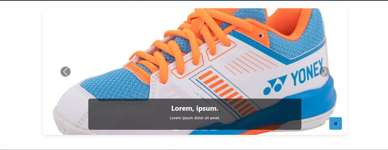
Here we shall build a carousel using bootstrap. For the full code: https://github.com/BryanArapKoech/A-carousel.
This is what the carousel should finally look like:
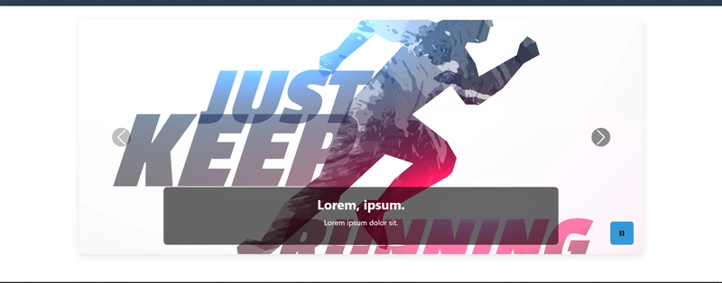
There are 5 images in the carousel. We want the carousel to autoscroll every 5 seconds so we shall implement that using javascript.
We start by the general structure. We wrap all the carousel section inside "carousel-container". We wrap all the code inside the "carousel-container" inside a div with id="portfCarousel" class="carousel slide" data-bs-ride="carousel". id="portfCarousel" is a Unique ID for the entire carousel component. The class="carousel slide" is a bootstrap classes that enables carousel functionality. The data-bs-ride="carousel" tells Bootstrap to automatically start cycling the carousel on page load.
Next, we write code for the Indicators, Carousel items, Controls and the Play/Pause buttons.
Indicators:
The .carousel-indicators buttons () allow jumping to a specific slide. data-bs-target points to the carousel ID, data-bs-slide-to specifies the slide index (0-based), class="active" marks the currently visible slide's indicator.
Items (.carousel-inner) contains the individual slides (.carousel-item). Only one item should have the class="active" initially. Each item contains an and an optional .carousel-caption.
The carousel items:

                    Lorem, ipsum.
                    Lorem ipsum dolor sit amet.


                    Lorem, ipsum.
                    Lorem ipsum dolor sit amet consectetur.


                    Lorem, ipsum dolor.
                    Lorem ipsum dolor sit amet consectetur adipisicing elit.


                    Lorem, ipsum.
                    Lorem ipsum dolor sit amet consectetur.


                    Lorem, ipsum.
                    Lorem ipsum dolor sit.
The code for the controls of the carousel. The controls (.carousel-control-prev, .carousel-control-next) build buttons for navigating slides. The data-bs-target points to the carousel ID, data-bs-slide="prev" or "next" tells Bootstrap what action to perform. The elements inside provide the visual icons.
The play/pause button for the carousel is a custom button #carouselPlayPause that JavaScript uses to control the pause() and cycle() methods of the Bootstrap carousel instance.
This is the final code:
Lorem, ipsum.
Lorem ipsum dolor sit amet.
Lorem, ipsum.
Lorem ipsum dolor sit amet consectetur.
Lorem, ipsum dolor.
Lorem ipsum dolor sit amet consectetur adipisicing elit.
Lorem, ipsum.
Lorem ipsum dolor sit amet consectetur.
Lorem, ipsum.
Lorem ipsum dolor sit.
Ensure to add the scripts at the end of the carousel section.
The javascript code:
// Carousel
document.addEventListener('DOMContentLoaded', function() {
    // Make sure Bootstrap is loaded
    if (typeof bootstrap !== 'undefined') {
      // Initialize the carousel with auto-scroll
      const carousel = new bootstrap.Carousel(document.getElementById('portfCarousel'), {
        interval: 5000, // Time between slides in milliseconds
        wrap: true,//Makes the carousel loop back to the beginning after the last slide.
        pause: 'hover' //Pauses the autoscroll when the mouse cursor is over the carousel.
      });

      // Handle play/pause button
      const playPauseBtn = document.getElementById('carouselPlayPause');
      if (playPauseBtn) {
        let isPlaying = true;

        playPauseBtn.addEventListener('click', function() {
          if (isPlaying) {
            // Pause the carousel
            carousel.pause();
            playPauseBtn.innerHTML = '';
            isPlaying = false;
          } else {
            // Resume the carousel
            carousel.cycle();
            playPauseBtn.innerHTML = '';
            isPlaying = true;
          }
        });
      } else {
        console.error('Play/pause button not found');
      }
    } else {
      console.error('Bootstrap not loaded');
    }
  });
For JS code, ensure the getElementById targets portfCarousel.
Css code:
/* carousel */

.carousel-container {
    margin: 30px auto;
    max-width: 1200px;
    position: relative;
}

.carousel-inner {
    border-radius: 8px;
    overflow: hidden;
    box-shadow: 0 5px 15px rgba(0, 0, 0, 0.1);
}

.carousel-item img {
    height: 500px;
    object-fit: cover;
}

.carousel-caption {
    background-color: rgba(0, 0, 0, 0.6);
    border-radius: 8px;
    padding: 20px;
    bottom: 40px;
}

.carousel-caption h3 {
    font-weight: 700;
    margin-bottom: 10px;
}

.carousel-play-pause {
    position: absolute;
    bottom: 20px;
    right: 20px;
    background-color: rgba(0, 0, 0, 0.7);
    color: white;
    border-radius: 50%;
    width: 50px;
    height: 50px;
    display: flex;
    align-items: center;
    justify-content: center;
    z-index: 15;
    border: 2px solid white;
}

.carousel-play-pause:hover {
    background-color: rgba(0, 0, 0, 0.9);
}

/* prev icon more visible */
.carousel-control-prev-icon,
.carousel-control-next-icon {
  background-color: rgba(0, 0, 0, 0.5);
  padding: 20px;
  border-radius: 50%;
}

.carousel-control-prev,
.carousel-control-next {
  width: 10%;
  opacity: 0.8;
}

.carousel-control-prev:hover,
.carousel-control-next:hover {
  opacity: 1;
}

/* carousel indicators more visible */
.carousel-indicators {
    margin-bottom: 10px;
    z-index: 10;
  }

  .carousel-indicators button {
    width: 12px;
    height: 12px;
    border-radius: 50%;
    margin: 0 5px;
    background-color: rgba(255, 255, 255, 0.5);
    border: 1px solid rgba(0, 0, 0, 0.3) !important;
  }

  .carousel-indicators button.active {
    background-color: white;
    transform: scale(1.2);
  }

/* Responsive adjustments */
@media (max-width: 768px) {
    .carousel-item img {
        height: 350px;
    }

    .carousel-caption {
        display: block !important;
        padding: 10px;
        bottom: 20px;
    }

    .carousel-caption h3 {
        font-size: 1.2rem;
    }

    .carousel-caption p {
        font-size: 0.9rem;
    }

    .carousel-control-prev-icon,
    .carousel-control-next-icon {
      padding: 15px;
    }

    .carousel-play-pause {
      width: 40px;
      height: 40px;
      bottom: 15px;
      right: 15px;
    }

    .carousel-indicators button {
      width: 8px;
      height: 8px;
    }
  }
For the full code: https://github.com/BryanArapKoech/A-carousel.
Thanks for reading!