


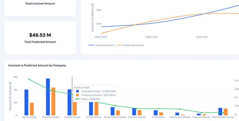
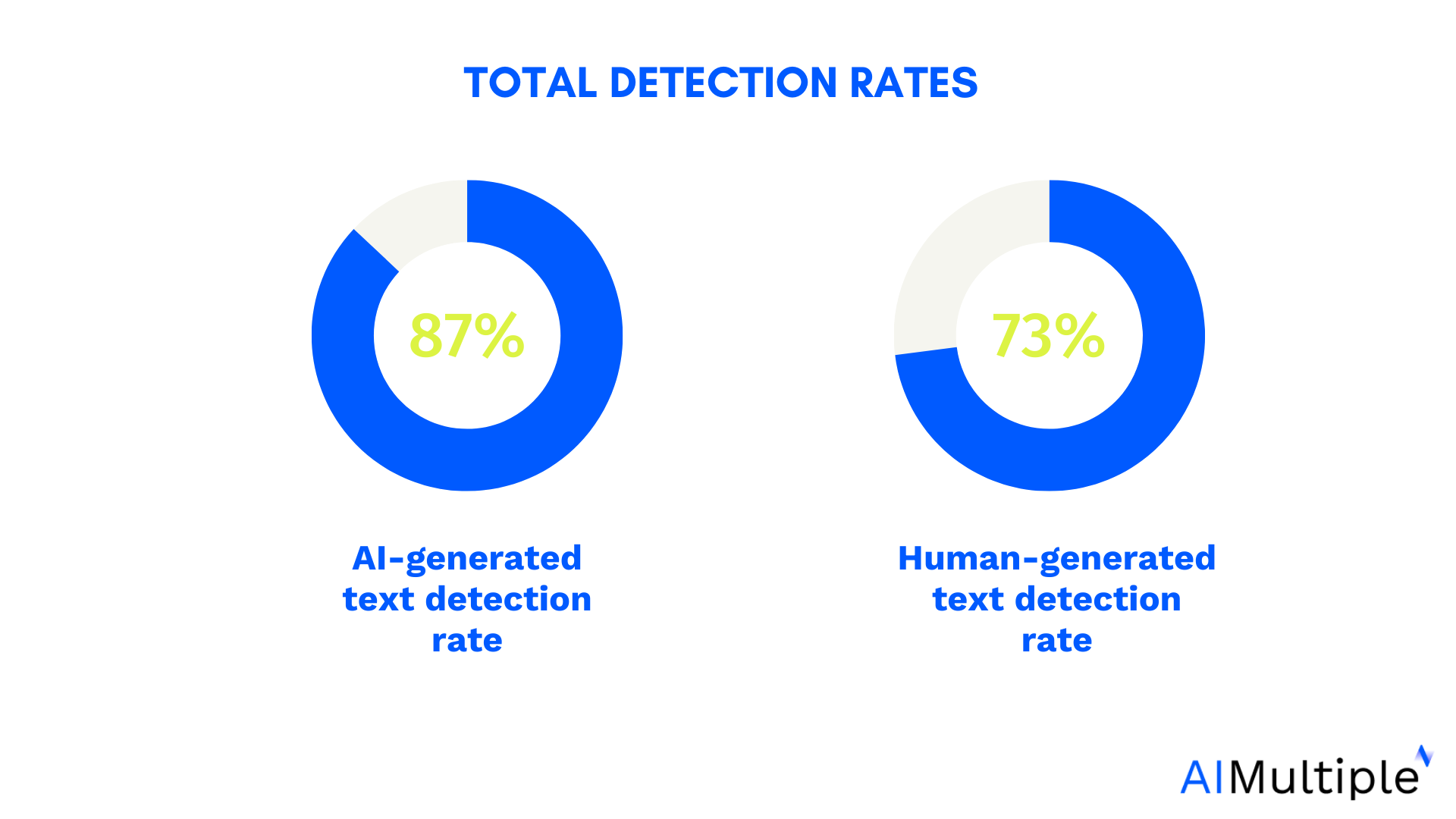
![[The AI Show Episode 145]: OpenAI Releases o3 and o4-mini, AI Is Causing “Quiet Layoffs,” Executive Order on Youth AI Education & GPT-4o’s Controversial Update](https://www.marketingaiinstitute.com/hubfs/ep%20145%20cover.png)


![Ditching a Microsoft Job to Enter Startup Purgatory with Lonewolf Engineer Sam Crombie [Podcast #171]](https://cdn.hashnode.com/res/hashnode/image/upload/v1746753508177/0cd57f66-fdb0-4972-b285-1443a7db39fc.png?#)


_Piotr_Adamowicz_Alamy.jpg?width=1280&auto=webp&quality=80&disable=upscale#)


-xl-xl-xl.jpg)


![Walmart’s $30 Google TV streamer is now in stores and it supports USB-C hubs [Video]](https://i0.wp.com/9to5google.com/wp-content/uploads/sites/4/2025/05/onn-4k-plus-store-reddit.jpg?resize=1200%2C628&quality=82&strip=all&ssl=1)


![Apple to Launch AI-Powered Battery Saver Mode in iOS 19 [Report]](https://www.iclarified.com/images/news/97309/97309/97309-1280.jpg)

![Apple Officially Releases macOS Sequoia 15.5 [Download]](https://www.iclarified.com/images/news/97308/97308/97308-640.jpg)


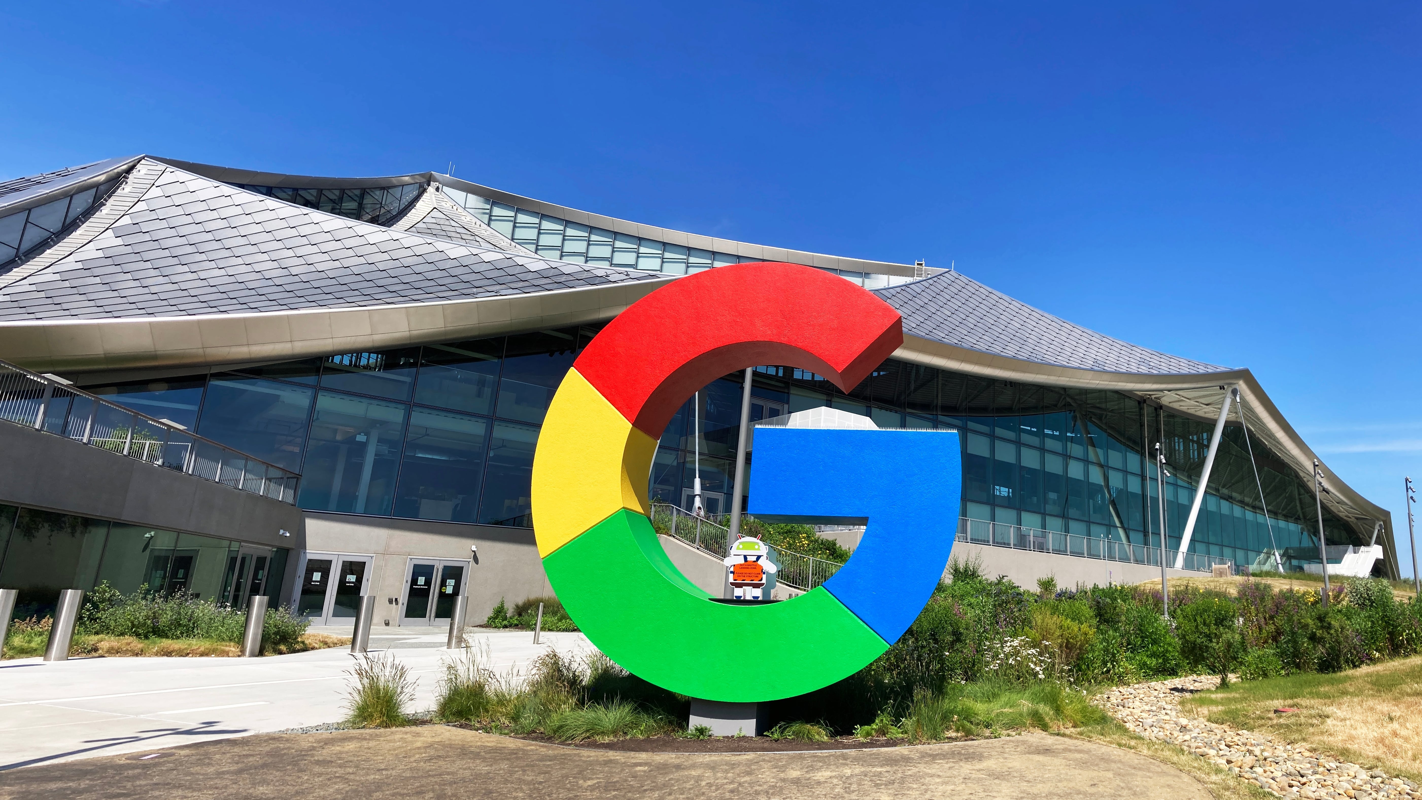
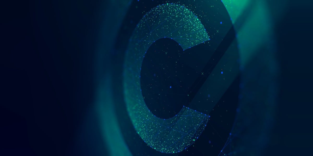
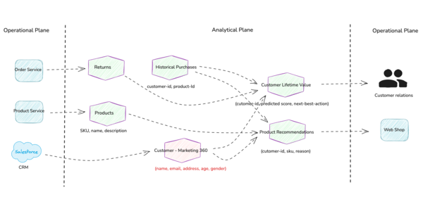
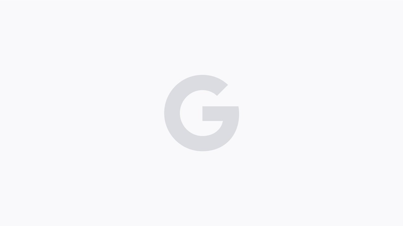
Google’s ‘G’ logo just got prettier
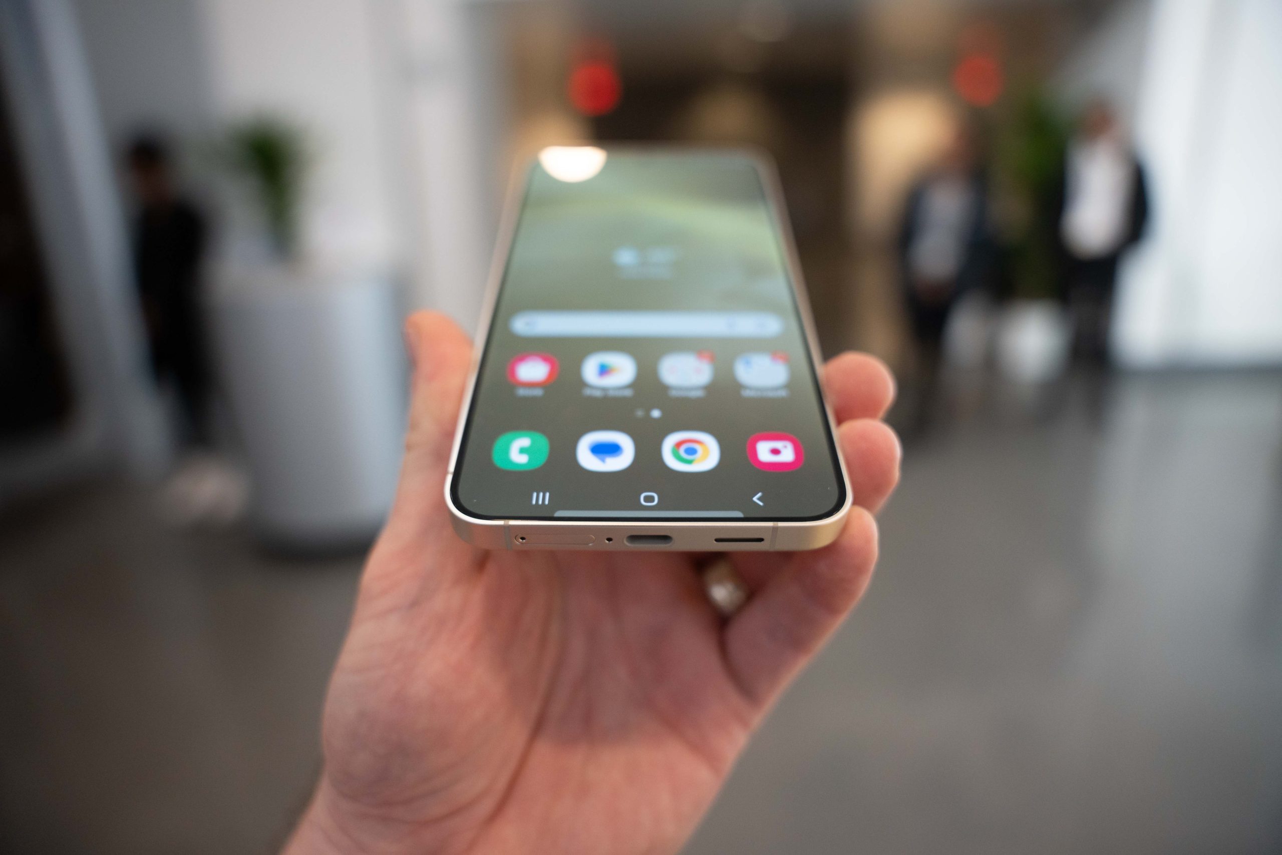
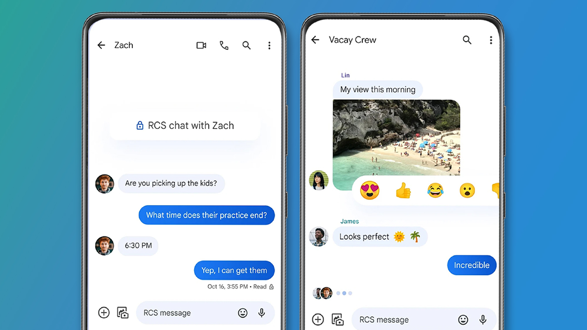
Google’s logo just got a little bit blurrier. In a new logo quietly rolled out across iOS and Pixel, the search giant ditches its color blocked “G” for gradients. Google’s new logo keeps the same letterform, as well as the bright red-yellow-green-blue color sequence, but now those colors blur into each other. The new “G” is Google’s biggest update to its visual identity since retiring serfs for its current sans-serif font, Product Sans, in 2015. [Images: Google] Why a gradient? In 2013, Google was among the first tech companies to move from skeuomorphic, dimensional lettering to a flat logo design. It arguably ushered in the “blanding” era—a moment when companies embraced simpler, sans-serif logos. This was both an aesthetic and utilitarian choice: simple, flat design conveyed the sense of efficient functionality that underpins modern technology. It also made it easier for companies to show up across the many screens and media required in the current media landscape. Google’s “G” took this idea even further, reducing the company’s famous wordmark down to a single letter icon in 2015. That first “G” was playful enough with is color blocking. But a decade on, it’s easy to see how it feels representative of a different moment on the internet. A gradient is a safe choice for the new “G.” Tech has long been a fan of using gradients in its logos, apps, and branding, with platforms like Instagram and Apple Music tapping into the effect a decade ago. Still today, gradients remain popular, owing to their middle-ground approach to design. They’re safe but visually interesting; soft but defined. They basically go with anything thanks to their color wheel aesthetic. Other Google-owned products have already embraced gradients. YouTube is now using a new red-to-magenta gradient in its UI, and Gemini, Google’s AI tool, also uses them. Now it’s bringing the design element to its flagship Google app. The change to Google’s logo is so subtle some users might not immediately notice the difference in a small size on their phones, and the effect hasn’t shown up in other applications like Gmail or Google Maps, where it will be more identifiable. Still, it’s not a small change for a behemoth of a company. We’ll never knows how many meetings, iterations, and deliberations went into making that little blur effect, but we can safely guess it was many.
Google’s logo just got a little bit blurrier. In a new logo quietly rolled out across iOS and Pixel, the search giant ditches its color blocked “G” for gradients.
Google’s new logo keeps the same letterform, as well as the bright red-yellow-green-blue color sequence, but now those colors blur into each other. The new “G” is Google’s biggest update to its visual identity since retiring serfs for its current sans-serif font, Product Sans, in 2015.
![]()
Why a gradient?
In 2013, Google was among the first tech companies to move from skeuomorphic, dimensional lettering to a flat logo design. It arguably ushered in the “blanding” era—a moment when companies embraced simpler, sans-serif logos. This was both an aesthetic and utilitarian choice: simple, flat design conveyed the sense of efficient functionality that underpins modern technology. It also made it easier for companies to show up across the many screens and media required in the current media landscape.
Google’s “G” took this idea even further, reducing the company’s famous wordmark down to a single letter icon in 2015. That first “G” was playful enough with is color blocking. But a decade on, it’s easy to see how it feels representative of a different moment on the internet.
A gradient is a safe choice for the new “G.” Tech has long been a fan of using gradients in its logos, apps, and branding, with platforms like Instagram and Apple Music tapping into the effect a decade ago. Still today, gradients remain popular, owing to their middle-ground approach to design. They’re safe but visually interesting; soft but defined. They basically go with anything thanks to their color wheel aesthetic.
Other Google-owned products have already embraced gradients. YouTube is now using a new red-to-magenta gradient in its UI, and Gemini, Google’s AI tool, also uses them. Now it’s bringing the design element to its flagship Google app.
The change to Google’s logo is so subtle some users might not immediately notice the difference in a small size on their phones, and the effect hasn’t shown up in other applications like Gmail or Google Maps, where it will be more identifiable. Still, it’s not a small change for a behemoth of a company. We’ll never knows how many meetings, iterations, and deliberations went into making that little blur effect, but we can safely guess it was many.