


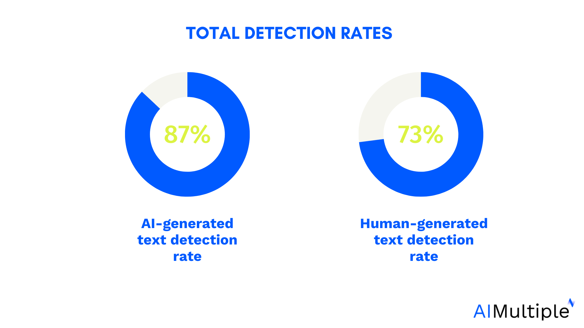
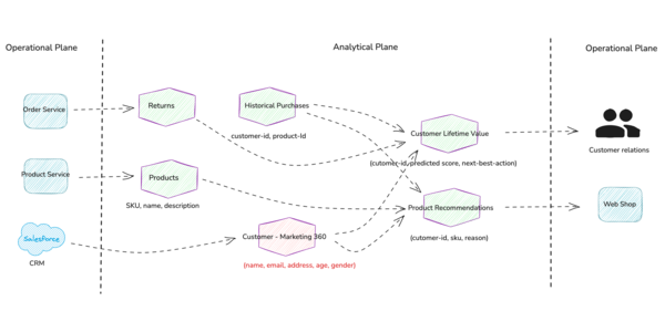
![[The AI Show Episode 145]: OpenAI Releases o3 and o4-mini, AI Is Causing “Quiet Layoffs,” Executive Order on Youth AI Education & GPT-4o’s Controversial Update](https://www.marketingaiinstitute.com/hubfs/ep%20145%20cover.png)


![Ditching a Microsoft Job to Enter Startup Purgatory with Lonewolf Engineer Sam Crombie [Podcast #171]](https://cdn.hashnode.com/res/hashnode/image/upload/v1746753508177/0cd57f66-fdb0-4972-b285-1443a7db39fc.png?#)


_Piotr_Adamowicz_Alamy.jpg?width=1280&auto=webp&quality=80&disable=upscale#)


-xl-xl-xl.jpg)


![Walmart’s $30 Google TV streamer is now in stores and it supports USB-C hubs [Video]](https://i0.wp.com/9to5google.com/wp-content/uploads/sites/4/2025/05/onn-4k-plus-store-reddit.jpg?resize=1200%2C628&quality=82&strip=all&ssl=1)


![Apple to Launch AI-Powered Battery Saver Mode in iOS 19 [Report]](https://www.iclarified.com/images/news/97309/97309/97309-1280.jpg)

![Apple Officially Releases macOS Sequoia 15.5 [Download]](https://www.iclarified.com/images/news/97308/97308/97308-640.jpg)


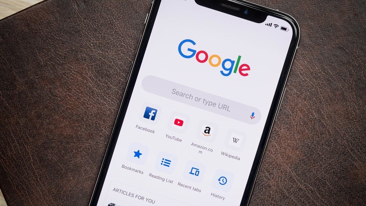


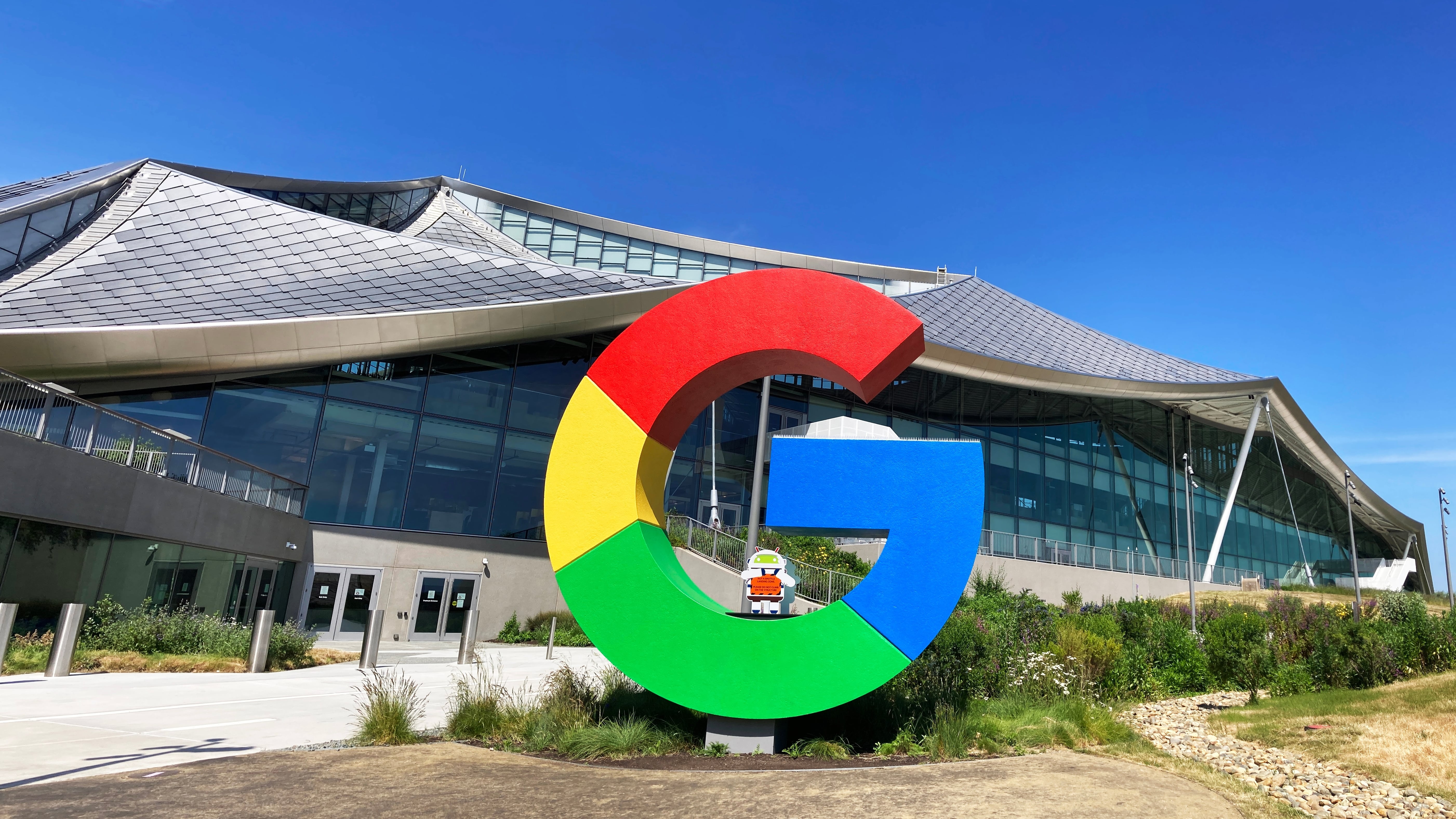
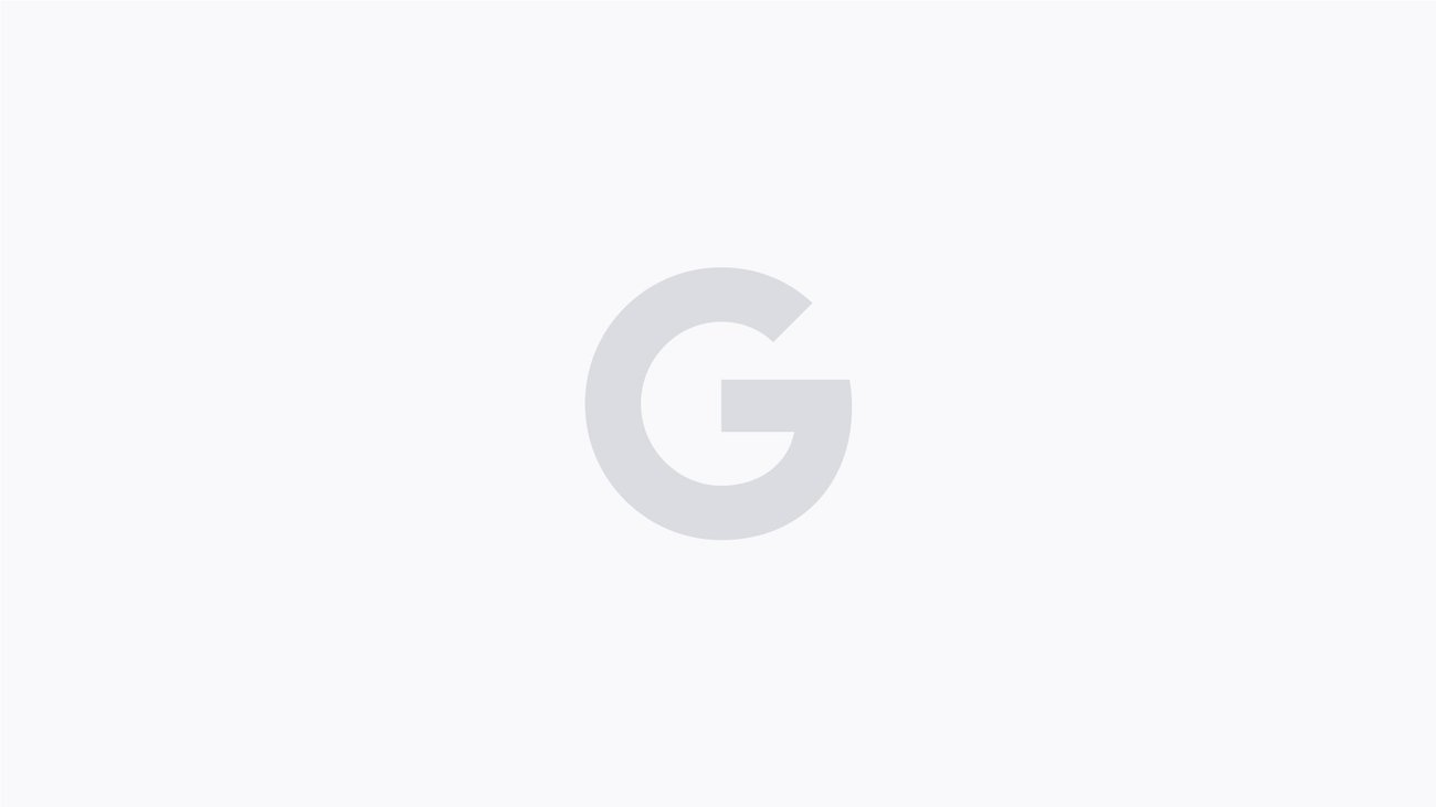
Google Updated Its Logo and You Didn’t Even Notice
The post Google Updated Its Logo and You Didn’t Even Notice appeared first on Android Headlines.
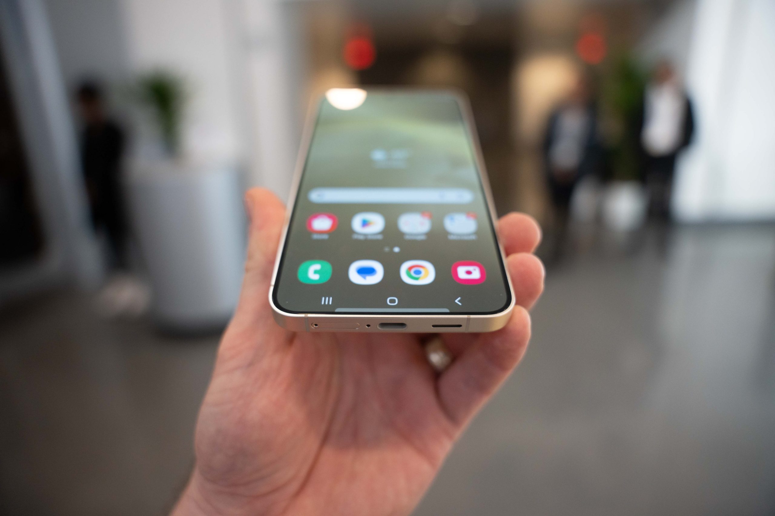
Google just updated its logo for the first time in almost a decade, and it barely changed.
To the designers out there, you probably noticed the change right away, but there are two major changes here. The radius has changed a bit, but perhaps more importantly, is the colors blending into each other, instead of having lines between them.
This change does make it look more like the Gemini logo, and provides Google with a more cohesive logo design across its brands.
The update is not yet visible everywhere. Though we can see it on iOS and Pixel phones right now, on the Google app. It will likely roll out to other platforms, apps, and services over the coming hours. As a change like this does need to go through numerous servers around the world.
Google originally changed its logo to incorporated all of its colors
When Google originally changed its logo from the word “Google” to the simply “G”, it was done to incorporate all of its colors. From the dawn of time, or the dawn of Google, the company has been known for using Red, yellow, green and blue in its logo. Now, that’s still here, but it does look slightly different.
It’s unclear right now why this change was done to blend the colors together, but it does definitely look better. It also doesn’t appear to be updating its main six-letter logo today, just the simple “G” logo.
Now, what Google needs to do is to update all of their app icons. Originally Google changed these app logos so that they would all have the Google colors, but it made them harder to tell apart. Especially the Google Home app. So while the designers are still on payroll, Google, have them redesign the icons for different Google products as well.
The post Google Updated Its Logo and You Didn’t Even Notice appeared first on Android Headlines.
