


.jpg)


![[The AI Show Episode 144]: ChatGPT’s New Memory, Shopify CEO’s Leaked “AI First” Memo, Google Cloud Next Releases, o3 and o4-mini Coming Soon & Llama 4’s Rocky Launch](https://www.marketingaiinstitute.com/hubfs/ep%20144%20cover.png)


.png?width=1920&height=1920&fit=bounds&quality=70&format=jpg&auto=webp#)


![Blue Archive tier list [April 2025]](https://media.pocketgamer.com/artwork/na-33404-1636469504/blue-archive-screenshot-2.jpg?#)


.png?#)


.webp?#)


![Alleged Pixel 10 series wallpapers leak with vibrant colors and a strange new theme [Gallery]](https://i0.wp.com/9to5google.com/wp-content/uploads/sites/4/2025/04/pixel-10-wallpaper-leak-1.jpg?resize=1200%2C628&quality=82&strip=all&ssl=1)


![Apple to Split Enterprise and Western Europe Roles as VP Exits [Report]](https://www.iclarified.com/images/news/97032/97032/97032-640.jpg)
![Nanoleaf Announces New Pegboard Desk Dock With Dual-Sided Lighting [Video]](https://www.iclarified.com/images/news/97030/97030/97030-640.jpg)

![Apple's Foldable iPhone May Cost Between $2100 and $2300 [Rumor]](https://www.iclarified.com/images/news/97028/97028/97028-640.jpg)


Contact Form | Frontend Project #1
A responsive static contact form built with HTML, CSS, and React This is the very first project I built using React, focusing on static page rendering. The app is a single-page contact form that accepts user input. For this project, I concentrated on building a solid foundation for structuring the form and rendering components effectively in React. Table of Contents Project Requirements Tech Stack Features What I learned Continued Development Resources Author Project Requirements Users should be able to provide contact details in the input fields so they can submit the form Name, email, message, and consent for contact fields must be filled to submit the form Tech Stack Framework: React 19.0.0 Build Tool: Vite 6.2.0 Styling: CSS Deployment: GitHub Pages Features A form containing text, email, checkbox, and dropdown input fields Responsive form layout switching from a single-column on mobile to two-column on desktop using a grid An achored background image using the pseudo element ::before Custom dropdown arrow for element Accessible text and elements that scales with default font size of browsers using a relative unit rem What I learned 1. Accessibility from the Perspective of Browser Default Font Size Misunderstanding One misconception I had in accessibility is that using rem units alone makes elements scalable to the screen sizes and therefore accessible. However, rem only adapts to the default font size settings of the browser - it does not inherently adjust to screen size unless you specify to do so with media queries. Responsiveness ≠ Accessibility There are many requirements to making website accessible for people with different needs, ranging from screen reading to keyboard navigation. While creating a responsive website that adapts its layout to different device sizes can help improve accessibility, it’s only one part of the process and not enough on its own. A responsive website responds to screen size whereas an accessible website responds to a users’ access needs. In this context, using rem is more about accessibility, as it allows text to scale based on the user’s preferred default size. Browser Default Font Sizes Vary For accessibility, it’s essential to consider that users may increase their browser’s default font size for better readability. Accessible designs maintain a solid layout that doesn't break even when the font size is scaled up significantly. Why Use rem Instead of px for Accessibility The rem unit is based on the root font size, so if users increase the default font size on the browser, elements sized in rem will adjust accordingly. In contrast, px remains fixed, regardless of user settings. rem is generally better for font sizes and layout elements that need to be flexible to match user preferences. rem Isn't a One-Size-Fits-All Solution There are cases where px is still useful, such as for borders or padding, where scaling with font size isn’t necessary and beneficial to users. Before applying rem to everything, it’s important to consider whether a value actually needs to scale when a user increases their browser’s default font size. Testing these choices by adjusting the browser font size can help determine when to use rem versus px. No room for padding to be scaled up here. As large paddings don't add value when the space is already limited, padding stays in px. 2. Grid vs. Flexbox Both CSS Grid and Flexbox could be used to achieve this form layout, but each serves different purposes: Grid: Ideal for two-dimensional layouts (rows and columns), equal-sized areas, and larger page structures Flexbox: Best for one-dimensional layouts (row or column), dynamic content alignment, and layouts where content size drives positioning Choosing the Right Layout for the The form in this project switches between: Single-column layout on mobile, where all items take full width. Two-column layout on desktop, where some items remain full-width while others take up half of the form container. To achieve this with flexbox, you would need to assign flex values to control the width of each form item: /* flex-basis determines the item's base width, while flex-grow and flex-shrink allow the items to adjust dynamically. */ .desktop-form { flex-wrap: wrap; } .half-width-item { flex: 1 1 48%; } .full-width-item { flex: 1 1 100%; } The same layout can be implemented with grid: .desktop-form { grid-template-columns: 1fr 1fr; } .half-width-item { grid-column: span 1; } .full-width-item { grid-column: span 2; } For this project, I chose Grid because: It provides a simpler system with span, making it easier to control column spans. The grid system is more intuitive to understand the structure The form layout is not dynamical
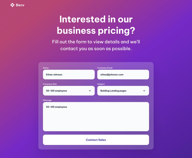
A responsive static contact form built with HTML, CSS, and React
This is the very first project I built using React, focusing on static page rendering. The app is a single-page contact form that accepts user input. For this project, I concentrated on building a solid foundation for structuring the form and rendering components effectively in React.
Table of Contents
- Project Requirements
- Tech Stack
- Features
- What I learned
- Continued Development
- Resources
- Author
Project Requirements
- Users should be able to provide contact details in the input fields so they can submit the form
- Name, email, message, and consent for contact fields must be filled to submit the form
Tech Stack
- Framework: React 19.0.0
- Build Tool: Vite 6.2.0
- Styling: CSS
- Deployment: GitHub Pages
Features
- A form containing text, email, checkbox, and dropdown input fields
- Responsive form layout switching from a single-column on mobile to two-column on desktop using a grid
- An achored background image using the pseudo element
::before - Custom dropdown arrow for
element - Accessible text and elements that scales with default font size of browsers using a relative unit rem
What I learned
1. Accessibility from the Perspective of Browser Default Font Size
Misunderstanding
One misconception I had in accessibility is that using rem units alone makes elements scalable to the screen sizes and therefore accessible. However, rem only adapts to the default font size settings of the browser - it does not inherently adjust to screen size unless you specify to do so with media queries.
Responsiveness ≠ Accessibility
There are many requirements to making website accessible for people with different needs, ranging from screen reading to keyboard navigation. While creating a responsive website that adapts its layout to different device sizes can help improve accessibility, it’s only one part of the process and not enough on its own. A responsive website responds to screen size whereas an accessible website responds to a users’ access needs. In this context, using rem is more about accessibility, as it allows text to scale based on the user’s preferred default size.
Browser Default Font Sizes Vary
For accessibility, it’s essential to consider that users may increase their browser’s default font size for better readability. Accessible designs maintain a solid layout that doesn't break even when the font size is scaled up significantly.
Why Use rem Instead of px for Accessibility
The rem unit is based on the root font size, so if users increase the default font size on the browser, elements sized in rem will adjust accordingly. In contrast, px remains fixed, regardless of user settings. rem is generally better for font sizes and layout elements that need to be flexible to match user preferences.
rem Isn't a One-Size-Fits-All Solution
There are cases where px is still useful, such as for borders or padding, where scaling with font size isn’t necessary and beneficial to users. Before applying rem to everything, it’s important to consider whether a value actually needs to scale when a user increases their browser’s default font size. Testing these choices by adjusting the browser font size can help determine when to use rem versus px.

No room for padding to be scaled up here. As large paddings don't add value when the space is already limited, padding stays in px.
2. Grid vs. Flexbox
Both CSS Grid and Flexbox could be used to achieve this form layout, but each serves different purposes:
- Grid: Ideal for two-dimensional layouts (rows and columns), equal-sized areas, and larger page structures
- Flexbox: Best for one-dimensional layouts (row or column), dynamic content alignment, and layouts where content size drives positioning
Choosing the Right Layout for the
The form in this project switches between:
- Single-column layout on mobile, where all items take full width.
- Two-column layout on desktop, where some items remain full-width while others take up half of the form container.
To achieve this with flexbox, you would need to assign flex values to control the width of each form item:
/*
flex-basis determines the item's base width,
while flex-grow and flex-shrink allow the items to adjust dynamically.
*/

.desktop-form {
    flex-wrap: wrap;
}

.half-width-item {
    flex: 1 1 48%;
}

.full-width-item {
    flex: 1 1 100%;
}
The same layout can be implemented with grid:
.desktop-form {
    grid-template-columns: 1fr 1fr;
}

.half-width-item {
    grid-column: span 1;
}

.full-width-item {
    grid-column: span 2;
}
For this project, I chose Grid because:
- It provides a simpler system with
span, making it easier to control column spans. - The grid system is more intuitive to understand the structure
- The form layout is not dynamically determined by content size—it has just two fixed types: half-width or full-width.
Aligning Form Items
While the overall form layout benefits from grid, individual form elements like , , and require one-dimensional vertical alignment. For this, I used flexbox as a quick and effective solution.
3. Checklist for Form
- Add a
for each input field. - Use appropriate type attributes for different input fields.
- Set minimum/maximum values for number inputs and define patterns for password inputs.
- Assign
type,name,id, andvalueattributes where needed. - Use the required attribute for mandatory fields.
- Ensure the
