


![[The AI Show Episode 143]: ChatGPT Revenue Surge, New AGI Timelines, Amazon’s AI Agent, Claude for Education, Model Context Protocol & LLMs Pass the Turing Test](https://www.marketingaiinstitute.com/hubfs/ep%20143%20cover.png)


_Muhammad_R._Fakhrurrozi_Alamy.jpg?width=1280&auto=webp&quality=80&disable=upscale#)
_NicoElNino_Alamy.jpg?width=1280&auto=webp&quality=80&disable=upscale#)


![Apple Releases iOS 18.5 Beta 4 and iPadOS 18.5 Beta 4 [Download]](https://www.iclarified.com/images/news/97145/97145/97145-640.jpg)
![Apple Seeds watchOS 11.5 Beta 4 to Developers [Download]](https://www.iclarified.com/images/news/97147/97147/97147-640.jpg)
![Apple Seeds visionOS 2.5 Beta 4 to Developers [Download]](https://www.iclarified.com/images/news/97150/97150/97150-640.jpg)
![Apple Seeds tvOS 18.5 Beta 4 to Developers [Download]](https://www.iclarified.com/images/news/97153/97153/97153-640.jpg)


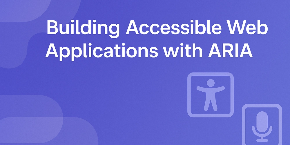
Introduction Accessibility is not a luxury — it’s a requirement for inclusive web development. ARIA (Accessible Rich Internet Applications) attributes allow developers to make their applications usable for people who rely on assistive technologies like screen readers. Today, we'll dive deep into how ARIA enhances accessibility and how you can start applying it correctly. Why Accessibility Matters 1 in 6 people worldwide live with some form of disability. Making your app accessible widens your audience and improves SEO. Accessibility is increasingly enforced by legal regulations (ADA, WCAG). What is ARIA? ARIA is a set of attributes that can be added to HTML to: Convey meaning and roles Communicate state and properties Help screen readers interpret dynamic content Important! ARIA should only be used when native HTML elements (like , , ) are insufficient. Use semantic HTML first. Common ARIA Roles ARIA Role Description role="button" Defines an element as a button role="dialog" Marks a popup dialog window role="navigation" Identifies major navigation links Common ARIA Attributes Attribute Purpose aria-label Defines an accessible name aria-hidden="true" Hides content from assistive tech aria-expanded="false" States whether an element is expanded or collapsed Practical Examples Example 1: Accessible Custom Button alert('Clicked!')} onKeyDown={(e) => { if (e.key === 'Enter' || e.key === ' ') { alert('Clicked!'); } }} > Custom Button ✅ Adds role="button", keyboard support, and focusability (tabIndex="0"). Example 2: Collapsible Panel with ARIA const [isOpen, setIsOpen] = useState(false); return ( setIsOpen(!isOpen)} > Toggle Details Here are more details... ); ✅ Updates aria-expanded dynamically, improving screen reader announcements. Best Practices When Using ARIA Use semantic HTML first. Test with screen readers (VoiceOver, NVDA, JAWS). Avoid ARIA where not necessary — unnecessary ARIA can break accessibility. Keep ARIA attributes synchronized with UI changes. Conclusion Building accessible applications is not optional; it’s critical. ARIA is a powerful tool when used thoughtfully and sparingly, helping ensure your app can be used by everyone. Start simple, test often, and always prefer semantic HTML when possible!
Introduction
Accessibility is not a luxury — it’s a requirement for inclusive web development. ARIA (Accessible Rich Internet Applications) attributes allow developers to make their applications usable for people who rely on assistive technologies like screen readers. Today, we'll dive deep into how ARIA enhances accessibility and how you can start applying it correctly.
Why Accessibility Matters
- 1 in 6 people worldwide live with some form of disability.
- Making your app accessible widens your audience and improves SEO.
- Accessibility is increasingly enforced by legal regulations (ADA, WCAG).
What is ARIA?
ARIA is a set of attributes that can be added to HTML to:
- Convey meaning and roles
- Communicate state and properties
- Help screen readers interpret dynamic content
Important!
ARIA should only be used when native HTML elements (like , , ) are insufficient. Use semantic HTML first.
Common ARIA Roles
| ARIA Role | Description |
|---|---|
role="button" |
Defines an element as a button |
role="dialog" |
Marks a popup dialog window |
role="navigation" |
Identifies major navigation links |
Common ARIA Attributes
| Attribute | Purpose |
|---|---|
aria-label |
Defines an accessible name |
aria-hidden="true" |
Hides content from assistive tech |
aria-expanded="false" |
States whether an element is expanded or collapsed |
Practical Examples
Example 1: Accessible Custom Button
<div
  role="button"
  tabIndex="0"
  aria-pressed="false"
  onClick={() => alert('Clicked!')}
  onKeyDown={(e) => {
    if (e.key === 'Enter' || e.key === ' ') {
      alert('Clicked!');
    }
  }}
>
  Custom Button
div>
✅ Adds role="button", keyboard support, and focusability (tabIndex="0").
Example 2: Collapsible Panel with ARIA
const [isOpen, setIsOpen] = useState(false);

return (
  <div>
    <button
      aria-expanded={isOpen}
      aria-controls="collapseSection"
      onClick={() => setIsOpen(!isOpen)}
    >
      Toggle Details
    button>
    <div id="collapseSection" hidden={!isOpen}>
      <p>Here are more details...p>
    div>
  div>
);
✅ Updates aria-expanded dynamically, improving screen reader announcements.
Best Practices When Using ARIA
- Use semantic HTML first.
- Test with screen readers (VoiceOver, NVDA, JAWS).
- Avoid ARIA where not necessary — unnecessary ARIA can break accessibility.
- Keep ARIA attributes synchronized with UI changes.
Conclusion
Building accessible applications is not optional; it’s critical. ARIA is a powerful tool when used thoughtfully and sparingly, helping ensure your app can be used by everyone. Start simple, test often, and always prefer semantic HTML when possible!