


![[The AI Show Episode 146]: Rise of “AI-First” Companies, AI Job Disruption, GPT-4o Update Gets Rolled Back, How Big Consulting Firms Use AI, and Meta AI App](https://www.marketingaiinstitute.com/hubfs/ep%20146%20cover.png)


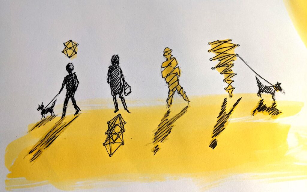
![|ー ▶︎ [ Wouldn't it be easier if you could trace your data structure with lines? ] ー,ー,ー;](https://media2.dev.to/dynamic/image/width%3D1000,height%3D500,fit%3Dcover,gravity%3Dauto,format%3Dauto/https:%2F%2Fdev-to-uploads.s3.amazonaws.com%2Fuploads%2Farticles%2F2k02ska8tyhhnijercgq.png)


_Brian_Jackson_Alamy.jpg?width=1280&auto=webp&quality=80&disable=upscale#)


 Stolen 884,000 Credit Card Details on 13 Million Clicks from Users Worldwide.webp?#)


![Google pokes fun at Apple copying Pixel features ahead of iPhone 17 redesign [Video]](https://i0.wp.com/9to5google.com/wp-content/uploads/sites/4/2025/05/google-pixel-iphone-17-ad-joke-1.jpg?resize=1200%2C628&quality=82&strip=all&ssl=1)


![Apple Shares Official Teaser for 'Highest 2 Lowest' Starring Denzel Washington [Video]](https://www.iclarified.com/images/news/97221/97221/97221-640.jpg)

![Under-Display Face ID Coming to iPhone 18 Pro and Pro Max [Rumor]](https://www.iclarified.com/images/news/97215/97215/97215-640.jpg)


Building a Responsive and Customizable Sidebar for E-commerce with Tailwind CSS
A sidebar is an essential component in modern e-commerce websites, providing easy access to product categories, filters, and other useful information. In this guide, we'll create a clean and responsive sidebar using Tailwind CSS that’s perfect for e-commerce stores. Step 1: Basic Sidebar Structure We'll start by creating the basic structure for the sidebar, which will contain links to product categories, filters, and other navigation items. On larger screens, the sidebar will be visible at all times, while on smaller screens, it will be toggleable. Shop By Category Electronics Clothing Home & Kitchen Beauty Product Name Category $99.99 Add to Cart Step 2: Making the Sidebar Toggleable on Mobile On smaller screens, it’s best to hide the sidebar and allow users to toggle it. We’ll use a button to open or close the sidebar, which will slide in and out from the left. ☰ Menu function toggleSidebar() { document.querySelector(".sidebar").classList.toggle("hidden"); } This script toggles the sidebar's visibility when the "Menu" button is clicked on mobile. The sidebar will slide in from the left and remain hidden when closed. Step 3: Styling the Sidebar We’ll add a few Tailwind classes to style the sidebar, ensuring it’s clean and visually appealing. By using fixed and transform, the sidebar is positioned off-screen by default (-translate-x-full) and only becomes visible when toggled. The lg:translate-x-0 ensures that the sidebar is always visible on larger screens. Step 4: Adding More Sidebar Features You can enhance your sidebar by adding extra functionality such as: Search bar: Add a search input at the top of the sidebar for users to quickly search products. Filters: Include a section with checkboxes to filter products by category, price, etc. Special offers: Display a “Deals of the Day” section for promotions or discounts. Search Products Step 5: Making the Sidebar Fully Responsive The sidebar is now mobile-friendly. It will remain visible on larger screens (lg:block), and on smaller screens, users can toggle its visibility. ✅ Pros:

A sidebar is an essential component in modern e-commerce websites, providing easy access to product categories, filters, and other useful information. In this guide, we'll create a clean and responsive sidebar using Tailwind CSS that’s perfect for e-commerce stores.
Step 1: Basic Sidebar Structure
We'll start by creating the basic structure for the sidebar, which will contain links to product categories, filters, and other navigation items. On larger screens, the sidebar will be visible at all times, while on smaller screens, it will be toggleable.

Product Name
Category
$99.99
Step 2: Making the Sidebar Toggleable on Mobile
On smaller screens, it’s best to hide the sidebar and allow users to toggle it. We’ll use a button to open or close the sidebar, which will slide in and out from the left.
This script toggles the sidebar's visibility when the "Menu" button is clicked on mobile. The sidebar will slide in from the left and remain hidden when closed.
Step 3: Styling the Sidebar
We’ll add a few Tailwind classes to style the sidebar, ensuring it’s clean and visually appealing.
By using fixed and transform, the sidebar is positioned off-screen by default (-translate-x-full) and only becomes visible when toggled. The lg:translate-x-0 ensures that the sidebar is always visible on larger screens.
Step 4: Adding More Sidebar Features
You can enhance your sidebar by adding extra functionality such as:
- Search bar: Add a search input at the top of the sidebar for users to quickly search products.
- Filters: Include a section with checkboxes to filter products by category, price, etc.
- Special offers: Display a “Deals of the Day” section for promotions or discounts.
Search Products
Step 5: Making the Sidebar Fully Responsive
The sidebar is now mobile-friendly. It will remain visible on larger screens (lg:block), and on smaller screens, users can toggle its visibility.
✅ Pros: