


![[The AI Show Episode 145]: OpenAI Releases o3 and o4-mini, AI Is Causing “Quiet Layoffs,” Executive Order on Youth AI Education & GPT-4o’s Controversial Update](https://www.marketingaiinstitute.com/hubfs/ep%20145%20cover.png)


![[FREE EBOOKS] Learn Computer Forensics — 2nd edition, AI and Business Rule Engines for Excel Power Users & Four More Best Selling Titles](https://www.javacodegeeks.com/wp-content/uploads/2012/12/jcg-logo.jpg)


![From Art School Drop-out to Microsoft Engineer with Shashi Lo [Podcast #170]](https://cdn.hashnode.com/res/hashnode/image/upload/v1746203291209/439bf16b-c820-4fe8-b69e-94d80533b2df.png?#)


(1).jpg?#)


![AirPods 4 On Sale for $99 [Lowest Price Ever]](https://www.iclarified.com/images/news/97206/97206/97206-640.jpg)


_Inge_Johnsson-Alamy.jpg?width=1280&auto=webp&quality=80&disable=upscale#)


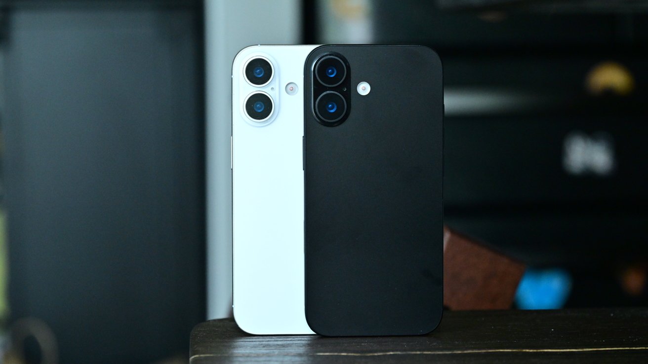
![Apple Developing AI 'Vibe-Coding' Assistant for Xcode With Anthropic [Report]](https://www.iclarified.com/images/news/97200/97200/97200-640.jpg)
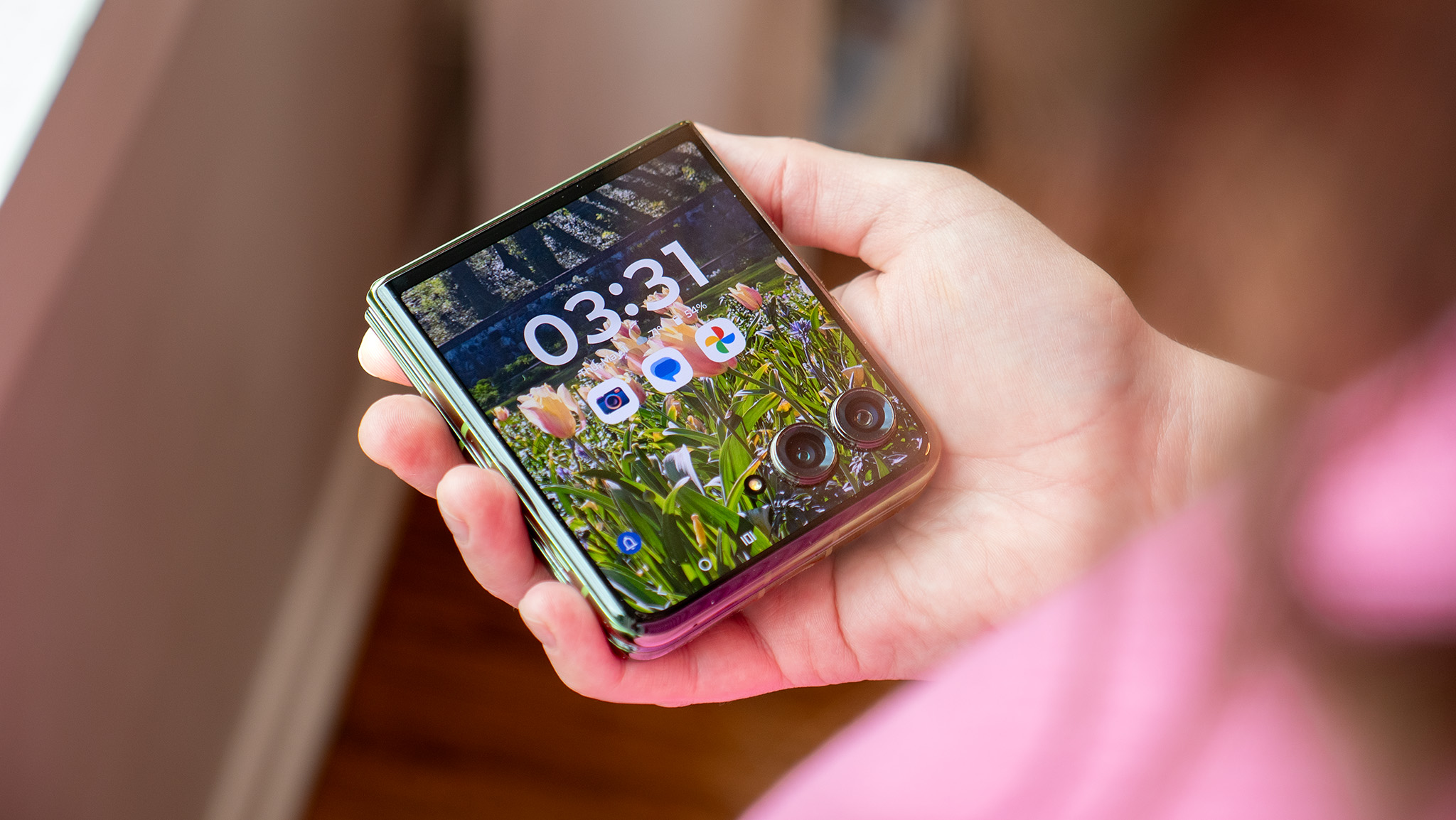
![Apple's New Ads Spotlight Apple Watch for Kids [Video]](https://www.iclarified.com/images/news/97197/97197/97197-640.jpg)


Turn Any Angular Component Into a Powerhouse with This Trick!
In this tutorial, we're going to enhance a simple Angular button component by applying custom directives, and then we’ll combine these directives into the component directly using Angular's Directive Composition API feature. Let’s get started! The Starting Point: A Simple Signup Form Here's the base app we're starting with — it's just a simple sign-up form with "name" and "email address" inputs, and a plain old "save" button: Nothing fancy yet, but that’s about to change. I’ve already created some example directives for this tutorial and what we want to do is apply all of these to this button to enhance the functionality: Controlling Focus with the Auto-Focus Directive for Better UX The first directive we’ll be adding is the auto focus directive: import { Directive, ElementRef, afterNextRender } from "@angular/core"; @Directive({ selector: "[appAutoFocus]", }) export class AutoFocusDirective { constructor(private elementRef: ElementRef) { afterNextRender(() => { this.elementRef.nativeElement.focus(); }); } } It uses the afterNextRender function to focus the host element as soon as it's rendered. This is handy for forms where you want the user to land right on the first interactive element. To add this directive, let’s open up the root app component. Here, we’ve got the form markup in the template: Sign Up Hello! Welcome to the family. Name Email Address Save There’s a "name" input, an "email address" input, and our "save" button at the bottom. This save button is actually using our form button component which we can see with the "appFormButton" attribute selector on the button itself: Save Let’s enhance the functionality of this button. To add the directive, let’s add the "appAutoFocus" attribute right on the button: Save Then, in order for this to be added to the button properly, we need to add the directive to the imports array of the component: import { AutoFocusDirective } from './directives/auto-focus.directive'; @Component({ selector: 'app-root', ..., imports: [..., AutoFocusDirective], }) Ok, now let’s save and see if this works: Nice, now the button is focused automatically! The pink-ish color and the blue-green outline are styles that are applied to the button when it’s focused. Monitoring Hover with the Hover Tracker Directive Next, we have the track hover directive. This one listens for pointerenter and pointerleave events using the host metadata, and injects a little “Hovering!" message when you hover over the element: import { Directive, ElementRef, inject, Renderer2, signal, } from "@angular/core"; @Directive({ selector: "[appTrackHover]", host: { "(pointerenter)": "this.showHoverMessage()", "(pointerleave)": "this.removeHoverMessage()", }, }) export class TrackHoverDirective { private elementRef = inject(ElementRef); private renderer = inject(Renderer2); private tooltip?: HTMLElement; private showHoverMessage() { this.tooltip = this.renderer.createElement("span"); this.renderer.addClass(this.tooltip, "hovering"); this.tooltip!.textContent = "

In this tutorial, we're going to enhance a simple Angular button component by applying custom directives, and then we’ll combine these directives into the component directly using Angular's Directive Composition API feature. Let’s get started!
The Starting Point: A Simple Signup Form
Here's the base app we're starting with — it's just a simple sign-up form with "name" and "email address" inputs, and a plain old "save" button:
Nothing fancy yet, but that’s about to change.
I’ve already created some example directives for this tutorial and what we want to do is apply all of these to this button to enhance the functionality:

Controlling Focus with the Auto-Focus Directive for Better UX
The first directive we’ll be adding is the auto focus directive:
import { Directive, ElementRef, afterNextRender } from "@angular/core";

@Directive({
  selector: "[appAutoFocus]",
})
export class AutoFocusDirective {
  constructor(private elementRef: ElementRef<HTMLElement>) {
    afterNextRender(() => {
      this.elementRef.nativeElement.focus();
    });
  }
}
It uses the afterNextRender function to focus the host element as soon as it's rendered.
This is handy for forms where you want the user to land right on the first interactive element.
To add this directive, let’s open up the root app component.
Here, we’ve got the form markup in the template:
type="text" autocomplete="off" />
Email Address
type="email" autocomplete="off" />
appFormButton>Save
There’s a "name" input, an "email address" input, and our "save" button at the bottom.
This save button is actually using our form button component which we can see with the "appFormButton" attribute selector on the button itself:
appFormButton>Save
Let’s enhance the functionality of this button.
To add the directive, let’s add the "appAutoFocus" attribute right on the button:
appFormButton appAutoFocus>Save
Then, in order for this to be added to the button properly, we need to add the directive to the imports array of the component:
import { AutoFocusDirective } from './directives/auto-focus.directive';

@Component({
  selector: 'app-root',
  ...,
  imports: [..., AutoFocusDirective],
})
Ok, now let’s save and see if this works:

Nice, now the button is focused automatically!
The pink-ish color and the blue-green outline are styles that are applied to the button when it’s focused.
Monitoring Hover with the Hover Tracker Directive
Next, we have the track hover directive.
This one listens for pointerenter and pointerleave events using the host metadata, and injects a little “Hovering!" message when you hover over the element:
import {
  Directive,
  ElementRef,
  inject,
  Renderer2,
  signal,
} from "@angular/core";

@Directive({
  selector: "[appTrackHover]",
  host: {
    "(pointerenter)": "this.showHoverMessage()",
    "(pointerleave)": "this.removeHoverMessage()",
  },
})
export class TrackHoverDirective {
  private elementRef = inject(ElementRef<HTMLElement>);
  private renderer = inject(Renderer2);
  private tooltip?: HTMLElement;

  private showHoverMessage() {
    this.tooltip = this.renderer.createElement("span");
    this.renderer.addClass(this.tooltip, "hovering");
    this.tooltip!.textContent = "