


![[The AI Show Episode 144]: ChatGPT’s New Memory, Shopify CEO’s Leaked “AI First” Memo, Google Cloud Next Releases, o3 and o4-mini Coming Soon & Llama 4’s Rocky Launch](https://www.marketingaiinstitute.com/hubfs/ep%20144%20cover.png)


![[DEALS] The All-in-One Microsoft Office Pro 2019 for Windows: Lifetime License + Windows 11 Pro Bundle (89% off) & Other Deals Up To 98% Off](https://www.javacodegeeks.com/wp-content/uploads/2012/12/jcg-logo.jpg)


![Is this too much for a modular monolith system? [closed]](https://i.sstatic.net/pYL1nsfg.png)


_Andreas_Prott_Alamy.jpg?width=1280&auto=webp&quality=80&disable=upscale#)


![What features do you get with Gemini Advanced? [April 2025]](https://i0.wp.com/9to5google.com/wp-content/uploads/sites/4/2024/02/gemini-advanced-cover.jpg?resize=1200%2C628&quality=82&strip=all&ssl=1)


![Apple Shares Official Trailer for 'Long Way Home' Starring Ewan McGregor and Charley Boorman [Video]](https://www.iclarified.com/images/news/97069/97069/97069-640.jpg)
![Apple Watch Series 10 Back On Sale for $299! [Lowest Price Ever]](https://www.iclarified.com/images/news/96657/96657/96657-640.jpg)
![EU Postpones Apple App Store Fines Amid Tariff Negotiations [Report]](https://www.iclarified.com/images/news/97068/97068/97068-640.jpg)
![Apple Slips to Fifth in China's Smartphone Market with 9% Decline [Report]](https://www.iclarified.com/images/news/97065/97065/97065-640.jpg)


React Components Explained: A 2025 Guide for Developers
Even if you weren't aware of it, you have already worked with React components if you have ever used React for front-end development or to build a web app. Every React application is built on top of these elements. Components assist you in breaking things down into manageable, reusable parts, whether you're designing a basic button or organising a whole user interface. React components continue to be at the core of contemporary UI architecture in 2025 as frontend development demands faster, scalable, and more maintainable solutions. Everything you need to know will be covered in this guide, including how components function, how to build and organize them, and how to avoid common pitfalls. What is a React Component? A React component is essentially a standalone code segment that represents a portion of the user interface. Comparable to a Lego block, you can use one to create a small object or combine several to create a much larger one. This modular design is precisely what gives React components their strength and popularity. Every visible element of your user interface (UI), including buttons, forms, navigation bars, and cards, can be constructed using components in a React application. They receive props (data input), control their own state (if necessary), and output JSX (which resembles HTML) that specifies what ought to show on the screen. React JS components come in two primary varieties: class-based and functional. Despite having different syntaxes and capacities, both have the same function. We’ll dive deeper into those in the next section. In the end, components assist programmers in creating larger, more manageable, and scalable applications by enabling them to write cleaner, reusable code. It is essential to comprehend React components, regardless of your level of experience as a frontend developer. Read about the latest version of React here. The Basic Structure of React Components Before you start building complex interfaces, it's important to understand how a typical React component is structured. Whether it’s a small button or an entire page layout, every component follows a similar foundational format. Here’s what a basic functional component looks like: function Greeting(props) { return Hello, {props.name}!; } export default Greeting; Let’s break it down: Function Declaration – Components can be created using functions (or classes, which we’ll get to later). Props – These are input values passed into the component so it can render dynamic content. JSX Return – JSX is a syntax extension that lets you write HTML-like code inside JavaScript. Exporting – Components are usually exported so they can be reused across different files or imported as part of Reactjs modules. Components are usually arranged into folders according to screens or features in larger projects. This modular design, also known as the use of Reactjs modules, facilitates navigating, updating, and scaling your codebase. Types of React Components Components are usually arranged into folders according to screens or features in larger projects. This modular design, also known as the use of Reactjs modules, facilitates navigating, updating, and scaling your codebase. 1. Functional Components JavaScript functions that return JSX are considered functional components. They are lightweight, easy to use, and becoming more and more popular for the majority of use cases. Here's a simple illustration: function Welcome(props) { return Welcome, {props.name}!; } However, the addition of React Hooks in version 16.8 made functional components even more potent. Functional components can manage state, handle side effects, and access context without writing class-based code thanks to hooks like useState, useEffect, and useContext. Here’s an example using a hook: import { useState } from 'react'; function Counter() { const [count, setCount] = useState(0); return ( setCount(count + 1)}> You clicked {count} times ); } Functional components are now the preferred approach for creating contemporary React JS components because of hooks. 2. Class Components Class components were the only means of managing state and lifecycle in React components prior to the invention of hooks. They tend to be more verbose and employ syntax from the ES6 class: import React, { Component } from 'react'; class Greeting extends Component { render() { return Hello, {this.props.name}; } } Class components are common in legacy codebases and are still functional. To manage a component's lifecycle, they make use of built-in functions like shouldComponentUpdate() and componentDidMount(). How to Create React Components Another aspect that makes React so appealing, aside from its features, is how easy it is to create a component. The procedure is the same whether you're designing a whole interface or just a single feature. 1. Creating a Functional Component Here’s how you’d cre
Even if you weren't aware of it, you have already worked with React components if you have ever used React for front-end development or to build a web app. Every React application is built on top of these elements. Components assist you in breaking things down into manageable, reusable parts, whether you're designing a basic button or organising a whole user interface.
React components continue to be at the core of contemporary UI architecture in 2025 as frontend development demands faster, scalable, and more maintainable solutions. Everything you need to know will be covered in this guide, including how components function, how to build and organize them, and how to avoid common pitfalls.
What is a React Component?
A React component is essentially a standalone code segment that represents a portion of the user interface. Comparable to a Lego block, you can use one to create a small object or combine several to create a much larger one. This modular design is precisely what gives React components their strength and popularity.
Every visible element of your user interface (UI), including buttons, forms, navigation bars, and cards, can be constructed using components in a React application. They receive props (data input), control their own state (if necessary), and output JSX (which resembles HTML) that specifies what ought to show on the screen.
React JS components come in two primary varieties: class-based and functional. Despite having different syntaxes and capacities, both have the same function. We’ll dive deeper into those in the next section.
In the end, components assist programmers in creating larger, more manageable, and scalable applications by enabling them to write cleaner, reusable code. It is essential to comprehend React components, regardless of your level of experience as a frontend developer.
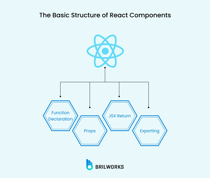
The Basic Structure of React Components
Before you start building complex interfaces, it's important to understand how a typical React component is structured. Whether it’s a small button or an entire page layout, every component follows a similar foundational format.
Here’s what a basic functional component looks like:
function Greeting(props) {
return Hello, {props.name}!
;
}
export default Greeting;
Let’s break it down:
Function Declaration – Components can be created using functions (or classes, which we’ll get to later).
Props – These are input values passed into the component so it can render dynamic content.
JSX Return – JSX is a syntax extension that lets you write HTML-like code inside JavaScript.
Exporting – Components are usually exported so they can be reused across different files or imported as part of Reactjs modules.
Components are usually arranged into folders according to screens or features in larger projects. This modular design, also known as the use of Reactjs modules, facilitates navigating, updating, and scaling your codebase.
Types of React Components
Components are usually arranged into folders according to screens or features in larger projects. This modular design, also known as the use of Reactjs modules, facilitates navigating, updating, and scaling your codebase.
1. Functional Components
JavaScript functions that return JSX are considered functional components. They are lightweight, easy to use, and becoming more and more popular for the majority of use cases. Here's a simple illustration:
function Welcome(props) {
return Welcome, {props.name}!
;
}
However, the addition of React Hooks in version 16.8 made functional components even more potent. Functional components can manage state, handle side effects, and access context without writing class-based code thanks to hooks like useState, useEffect, and useContext.
Here’s an example using a hook:
import { useState } from 'react';
function Counter() {
const [count, setCount] = useState(0);
return (
);
}
Functional components are now the preferred approach for creating contemporary React JS components because of hooks.
2. Class Components
Class components were the only means of managing state and lifecycle in React components prior to the invention of hooks. They tend to be more verbose and employ syntax from the ES6 class:
import React, { Component } from 'react';
class Greeting extends Component {
render() {
return Hello, {this.props.name}
;
}
}
Class components are common in legacy codebases and are still functional. To manage a component's lifecycle, they make use of built-in functions like shouldComponentUpdate() and componentDidMount().
How to Create React Components
Another aspect that makes React so appealing, aside from its features, is how easy it is to create a component. The procedure is the same whether you're designing a whole interface or just a single feature.
1. Creating a Functional Component
Here’s how you’d create a basic functional component in React:
{props.text};function Message(props) {
return
}
export default Message;
You can then import and use it like this:
import Message from './Message';
function App() {
return
}
Functional components are concise and work seamlessly with hooks, making them the preferred choice for most modern projects.
2. Creating a Class Component
Class components use the Component class from React and include a render() method:
{this.props.text};import React, { Component } from 'react';
class Message extends Component {
render() {
return
}
}
Class components are primarily utilised in older codebases, though they are still supported. Functional components are more prevalent these days, particularly when paired with hooks for extra functionality.
Top React Component Libraries Developers Love
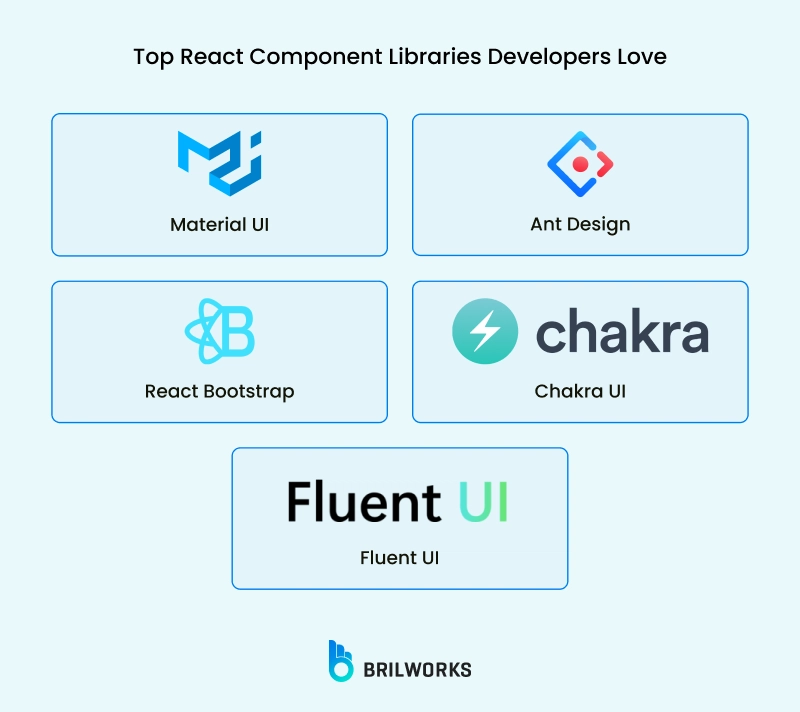
In a recent blog, we mentioned the nine best React frameworks. Although learning React by creating your own components from scratch is a great way to get started, it's not always the most effective approach, particularly for larger projects. React component libraries can help with that. These libraries provide pre-made, editable user interface components that help you save time and keep your app consistent.
Here are some of the most popular libraries developers are using in 2025:
1. Material UI
In a recent blog, we listed the nine best ReactJS frameworks. Material UI was in 5th position. One of the most popular React JS component libraries.. It is based on Google's Material Design system and provides a wide range of elements, including buttons, sliders, cards, and modals, all of which have responsive design and consistent styling right out of the box.
Key features:
- Extensive collection of pre-built components
- Highly customizable theming system
- Active community and regular updates
- Excellent documentation
- Built-in accessibility features
MUI is particularly well-suited for projects that aim to adhere to Material Design guidelines or require a modern, clean aesthetic.
2. Ant Design
Another stronghold in the React ecosystem is Ant Design, which is particularly useful for creating intricate admin interfaces. It is renowned for its intricate components and integrated internationalisation support, and it is created and maintained by Alibaba.
Highlights:
- 50+ high-quality components
- Enterprise-focused design system
- Extensive theming capabilities
- Strong TypeScript support
- Internationalization features
AntD is an excellent choice for large-scale applications that require a comprehensive set of components and a consistent design language.
3. React Bootstrap
React Bootstrap is a logical progression for anyone who is already familiar with Bootstrap. You can use the Bootstrap look and feel without depending on jQuery because it rebuilds Bootstrap components as pure React components.
Key aspects:
- Built on top of Bootstrap CSS
- No dependency on Bootstrap JavaScript or jQuery
- Easy integration with existing Bootstrap themes
- Responsive design out of the box
This library is ideal for quickly bootstrapping projects or for teams transitioning from Bootstrap to React.
4. Chakra UI
Chakra UI is a contemporary library with an emphasis on ease of use, accessibility, and modularity. Developers can style components directly without ever leaving the JSX thanks to its style prop system.
Notable features:
- Modular and composable components
- Built-in dark mode support
- Strong focus on accessibility (WAI-ARIA compliant)
- Themeable and customizable
- Excellent documentation
Chakra UI is particularly well-suited for projects that prioritize accessibility and require a modern, clean design.
5. Fluent UI
Microsoft created Fluent UI, the design system that powers Office and Teams, among other products. Fluent UI is the best option if you're creating something that adheres to Microsoft's standards or aesthetic.
Key benefits:
- Consistent with Microsoft products
- High-performance components
- Extensive accessibility features
- Cross-browser compatibility
- Integration with Microsoft services
Fluent UI is an excellent choice for applications that need to integrate seamlessly with Microsoft's ecosystem.
Having these resources at your disposal can expedite development and enhance consistency, regardless of whether you're utilising React JS components from these libraries or combining them with your own custom-built ones.
Common Mistakes to Avoid with React Components
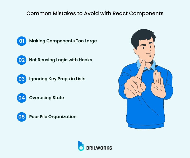
When working with React components, even seasoned developers can make some mistakes, particularly if they are rushing through a project or are juggling tight deadlines. The good news, though? Once you know what to look for, most mistakes are easy to avoid.
Here are some of the most common issues (and how to dodge them):
1. Making Components Too Large
When you're first starting out, it can be tempting to combine all of your JSX, logic, and styling into a single, enormous component. However, components that do too much quickly become difficult to debug, maintain, and reuse.
Fix: Divide your code into more manageable, targeted React JS parts. It's a good idea to divide your component if it manages several tasks, such as managing state, retrieving data, and rendering user interface. Ideally, each part should address a single issue. Comparable to building blocks, components are easier to use throughout your application if they are smaller and simpler.
2. Not Reusing Logic with Hooks
Have you ever had to duplicate the logic for a state or effect across multiple components? Your code becomes cluttered by that repetition, which also raises the possibility of errors.
Fix: To address this, React hooks were created. Extract repetitive logic into a custom hook (such as useAuth or useToggle) when you see it. It keeps your logic centralised and your components tidy. When it comes to preserving consistency across various React components, custom hooks are revolutionary.
3. Ignoring Key Props in Lists
You'll probably encounter rendering bugs and performance problems if you render a list of items in React without giving each element a unique key. At first, using array indices as keys might function, but when list items are added, removed, or rearranged, it breaks down.
Fix: As the key, always enter a distinct, consistent value, typically an ID from your data. This enhances performance and prevents bugs by assisting React in determining which items have changed.
4. Overusing State
Here’s a truth: not everything needs to be in state. Overcomplication may result from throwing all values into useState. Data that never truly changes or doesn't require a re-render can occasionally be stored in this state.
Fix: Ask yourself, "Does this need to trigger a UI update?" before utilising useState. Keep it out of state if not. The component state may contain derived values, constants, or props that don't change. Using state strategically will improve the efficiency and manageability of your React JS components.
5. Poor File Organization
Many developers begin with a flat structure, combining all of the logic into one large file or all of the components into one folder. Finding files, monitoring changes, and onboarding new developers get more challenging over time.
Fix: To organise related files by feature rather than file type, use Reactjs modules. Keep the components, styles, and hooks of a chat feature, for instance, consistent. As your app expands, a feature-based structure maintains organisation and scalability.
By avoiding these errors, you can increase reusability, optimise performance, and maintain the maintainability of your entire codebase. React provides the tools, but how you use them is crucial.
Best Practices for React Components in 2025
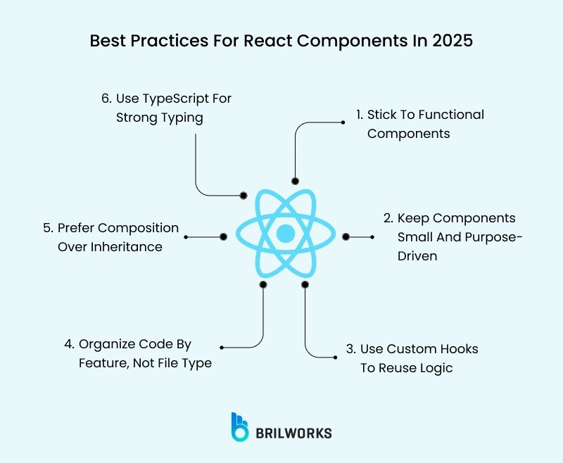
It's a good thing that the React ecosystem has changed. Class-based components have given way to functional ones in recent years, hooks have become widely used, and new standards for file structure, performance, and testing have been established.
Here's how to build with React components in 2025 in a clean, scalable, and future-proof manner.
1. Stick to Functional Components
Do you recall the era of class-based components with lifecycle methods like shouldComponentUpdate and componentDidMount? They are now mostly a thing of the past. For the majority of use cases, the React community has fully embraced functional components by 2025.
Why It Matters:
Functional components integrate easily with hooks like useState, useEffect, and useContext, are lighter to write, and are simpler to test.
2. Keep Components Small and Purpose-Driven
It’s easy to keep adding logic to one file until it balloons into a 300-line monstrosity. But that’s not what React JS components are meant for.
Best practice:
Assign a single task to each component. It's time to deconstruct your Dashboard component if it is simultaneously retrieving data, displaying charts, handling filters, and managing state. It is simpler to test, debug, and reuse smaller components.
How to break it down:
- Data fetching → useDashboardData hook
- Chart rendering → Chart component
- Filter panel → FilterControls component
3. Use Custom Hooks to Reuse Logic
Custom hooks are one of React's greatest features, but you're losing out if you're copying and pasting the same useEffect or useState blocks across several components.
You can abstract reusable logic into basic functions by using hooks. It keeps all the messy logic out of your components and keeps them focused on rendering.
Example:
// useAuth.js
export const useAuth = () => {

  const [user, setUser] = useState(null);

  useEffect(() => {

    const fetchUser = async () => {

      const res = await getCurrentUser();

      setUser(res.data);

    };

    fetchUser();

  }, []);

  return user;

};
Now you can use const user = useAuth(); in any component. This keeps your Reactjs modules clean and consistent.
4. Organize Code by Feature, Not File Type
The classic approach:
src/
components/
styles/
utils/
The modern, scalable approach:
src/
dashboard/
Dashboard.jsx

dashboard.module.css

useDashboardData.js

Dashboard.test.js
Why this matters:
As your app expands, it will be simpler to locate and manage your code if you group related files together. There is only one place to look, not three, to understand how the Dashboard functions.
Most Reactjs modules now have this feature-based structure by default, especially in large apps.
5. Prefer Composition Over Inheritance
React is designed for composition. That means instead of creating a single bloated component with all the bells and whistles, you compose it out of smaller building blocks.
Real-world scenario:
Let’s say you have a Card component. You could pass children or even named props like header, body, and footer.
This is the body text}
body={
footer={}
/>
This pattern gives you flexibility and keeps your code modular.
6. Use TypeScript for Strong Typing
With TypeScript, you’ll catch bugs before they hit the browser. And if you’re building React JS components for teams or clients, strong typing is a huge help for collaboration.
type ButtonProps = {
label: string;
onClick: () => void;
};
const Button: React.FC
);
Conclusion
Despite the abundance of JavaScript frameworks and libraries, React remains a formidable presence. Why? because it is adaptable, strong, and based on the straightforward concept of components. With the help of these building blocks, developers can produce user interfaces (UIs) that are quick, scalable, and simpler to maintain as projects expand.
But React is more than just its components.
It is surrounded by a thriving ecosystem with hundreds of libraries created to increase its functionality as well as tools like Next.js and Redux. It's the adoption of hook-based functional programming and its continuous evolution to meet the demands of contemporary web and mobile development. And it's the enormous developer community that never stops expanding the library's capabilities.
Want to Build Better with React? Let’s Make It Happen.
Our team specialises in transforming concepts into high-performing React applications, from scalable design systems to lightning-fast frontends. We can assist you whether you're starting from scratch, improving your user interface, or implementing contemporary best practices.
Let’s bring your next big thing to life with React — reach out to us today.