


![[The AI Show Episode 144]: ChatGPT’s New Memory, Shopify CEO’s Leaked “AI First” Memo, Google Cloud Next Releases, o3 and o4-mini Coming Soon & Llama 4’s Rocky Launch](https://www.marketingaiinstitute.com/hubfs/ep%20144%20cover.png)


.jpg?#)


![Apple to Shift Robotics Unit From AI Division to Hardware Engineering [Report]](https://www.iclarified.com/images/news/97128/97128/97128-640.jpg)

![Apple Shares New Ad for iPhone 16: 'Trust Issues' [Video]](https://www.iclarified.com/images/news/97125/97125/97125-640.jpg)


Laziest tailwind guide to build almost any UI without touching a single line of raw CSS.
CSS sure feels intimidating, but it’s also the backbone of every web design. If you’re learning Tailwind, don’t try to master every class, only 20% of properties are used to build 80% of designs. Its much better to mater only these 20% properties rather than skimming through every other property that tailwind provides(trust me there are a lot). Now I won’t waste more of your time because its a lazy guide after all. 1. Layout: Flexbox and Grid This is the heart of all the layouts. If you master these, you can create any layout existing. — flex, flex-row, flex-col — justify- (center, between, etc.) — items- (center, start, end) — gap-4 for spacing between — grid, grid-cols-3, col-span-2 2. Box Model: Spacing & Sizing Its used to position and align elements in your layout. — m-, p- (margin & padding) — w-, h- (width & height) — max-w-, min-h- — box-border 3. Colors & Styling Quickly apply color schemes and basic visuals. — bg-{color}-{shade} / text-{color}-{shade} — rounded, rounded-lg, rounded-full — shadow, shadow-md — opacity-70 etc. 4. Typography I mean font are pretty important, so….Don’t skip these: — text-sm (small text), text-xl (large headings) — leading-snug / leading-loose (line height control) — text-left / text-center / text-right 5. Positioning For layering and pinning elements where you need them — relative / absolute / fixed / sticky — top-0, left-4, etc. — z-10 to layer stuff 6. Interaction & Motion For that satisfying UX. — hover:bg-gray-200 — hover:text-blue-600 — transition, duration-300, ease-in-out — cursor-pointer, select-none 7. Responsive Design — Prefix any class with sm:, md:, lg:, xl:, 2xl: Uses a mobile-first breakpoint system. Meaning that unprefixed utilities take effect on all screen sizes, while prefixed utilities (like md:…) only take effect at the specified breakpoint and above. Conclusion Master these, and you’ll cover 80% of UI needs in Tailwind. That’s it. If there are any other important classes that I didn’t mention, let me know in the replies. resources: https://tailwindcss.com/docs
CSS sure feels intimidating, but it’s also the backbone of every web design.
If you’re learning Tailwind, don’t try to master every class, only 20% of properties are used to build 80% of designs.
Its much better to mater only these 20% properties rather than skimming through every other property that tailwind provides(trust me there are a lot).
Now I won’t waste more of your time because its a lazy guide after all.
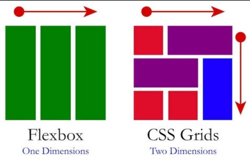
1. Layout: Flexbox and Grid
This is the heart of all the layouts. If you master these, you can create any layout existing.
— flex, flex-row, flex-col
— justify- (center, between, etc.)
— items- (center, start, end)
— gap-4 for spacing between
— grid, grid-cols-3, col-span-2
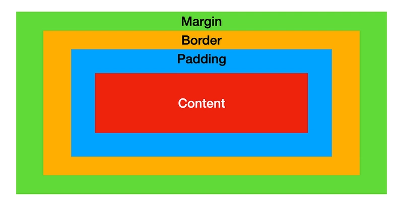
2. Box Model: Spacing & Sizing
Its used to position and align elements in your layout.
— m-, p- (margin & padding)
— w-, h- (width & height)
— max-w-, min-h-
— box-border
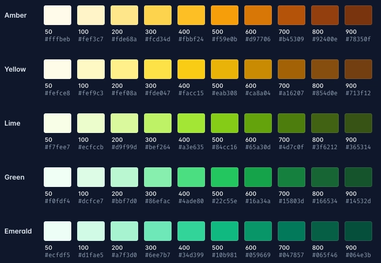
3. Colors & Styling
Quickly apply color schemes and basic visuals.
— bg-{color}-{shade} / text-{color}-{shade}
— rounded, rounded-lg, rounded-full
— shadow, shadow-md
— opacity-70 etc.
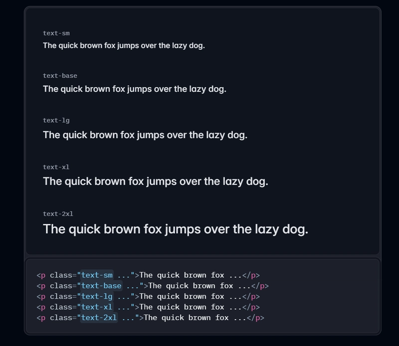
4. Typography
I mean font are pretty important, so….Don’t skip these:
— text-sm (small text), text-xl (large headings)
— leading-snug / leading-loose (line height control)
— text-left / text-center / text-right
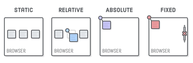
5. Positioning
For layering and pinning elements where you need them
— relative / absolute / fixed / sticky
— top-0, left-4, etc.
— z-10 to layer stuff
6. Interaction & Motion
For that satisfying UX.
— hover:bg-gray-200
— hover:text-blue-600
— transition, duration-300, ease-in-out
— cursor-pointer, select-none
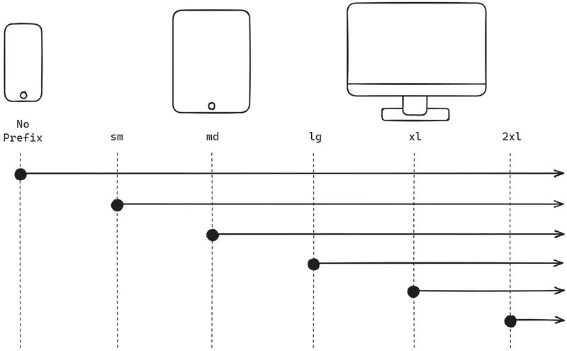
7. Responsive Design
— Prefix any class with sm:, md:, lg:, xl:, 2xl:
Uses a mobile-first breakpoint system. Meaning that unprefixed utilities take effect on all screen sizes, while prefixed utilities (like md:…) only take effect at the specified breakpoint and above.
Conclusion
Master these, and you’ll cover 80% of UI needs in Tailwind. That’s it.
If there are any other important classes that I didn’t mention, let me know in the replies.
resources: https://tailwindcss.com/docs