


![[The AI Show Episode 142]: ChatGPT’s New Image Generator, Studio Ghibli Craze and Backlash, Gemini 2.5, OpenAI Academy, 4o Updates, Vibe Marketing & xAI Acquires X](https://www.marketingaiinstitute.com/hubfs/ep%20142%20cover.png)


![[DEALS] The Premium Learn to Code Certification Bundle (97% off) & Other Deals Up To 98% Off – Offers End Soon!](https://www.javacodegeeks.com/wp-content/uploads/2012/12/jcg-logo.jpg)

![From drop-out to software architect with Jason Lengstorf [Podcast #167]](https://cdn.hashnode.com/res/hashnode/image/upload/v1743796461357/f3d19cd7-e6f5-4d7c-8bfc-eb974bc8da68.png?#)


.png?#)


.webp?#)


_Christophe_Coat_Alamy.jpg?#)
 (1).webp?#)


![Apple Considers Delaying Smart Home Hub Until 2026 [Gurman]](https://www.iclarified.com/images/news/96946/96946/96946-640.jpg)
![iPhone 17 Pro Won't Feature Two-Toned Back [Gurman]](https://www.iclarified.com/images/news/96944/96944/96944-640.jpg)
![Tariffs Threaten Apple's $999 iPhone Price Point in the U.S. [Gurman]](https://www.iclarified.com/images/news/96943/96943/96943-640.jpg)


Introducing the Supabase UI Library
We're excited to release an official Supabase UI Library—a collection of ready-to-use components built on top of shadcn/ui. Designed for flexibility, these components can be dropped into any Next.js, React Router, TanStack Start, or plain React app. ⚡️ More on Launch Week Installing components from the Supabase UI Library is as easy as installing a component from shadcn/ui. The library is 100% shadcn/ui compatible by leveraging the component registry feature. It follows the conventions for theming and reuses existing components like buttons and inputs. Our UI registry is a collection of reusable components designed for use in several popular React frameworks. Components are styled with shadcn/ui and Tailwind CSS and are completely customizable. It's designed to take both the time and the pain out of building complex functionality like user sign-up in your apps. All components work with new or existing projects. What's included? Supabase client initialization for client-side and server-side use Password-based authentication File Upload Dropzone Realtime Cursor Sharing Current User Avatar Realtime Avatar Stack Realtime Chat We intend to release more Supabase UI Library components, and we'd love to get your feedback. Got a favorite component you want for your applications? Let us know on X or Discord, or we'd be happy to get a pull request. Let's look at some of the components. Password-based authentication Setting up authentication in your projects can be complicated and time-consuming. The Password-Based Authentication block provides all the necessary components and pages to implement a secure, user-friendly authentication flow in your projects in seconds. It includes everything you need to get started—fully built components for signing up, signing in, resetting a password, and handling forgotten passwords. These components are styled, responsive, and production-ready out of the box, so you don't have to worry about the design or flow. Just drop them into your project, and you're ready to sign up users. Easy file uploads The File Upload Dropzone component lets you add file upload and storage in your application in seconds. It features drag-and-drop support, multiple file uploads, file size and count limits, image previews, and MIME type restrictions. File upload components are often complicated to set up. Spend your time working on what happens after the files are on the server. Realtime cursor sharing The Realtime Cursor component gets you started building multiplayer experiences in your applications. You can just drop this component into your project and you're ready to use Realtime in seconds. See who's online With the User Avatar and Realtime Avatar Stack components, you can add Realtime Presence to your apps in a few minutes. See who's online in your collaborative apps, just like in Notion or Figma. Realtime Chat The Realtime Chat component is a complete chat interface, letting users exchange messages in real-time within a shared room. It features real-time, low-latency updates, message synchronization, message persistence support, customizable message appearance, automatic scroll-to-bottom on new messages, and more. Rules for AI Code Editors for Supabase Alongside our UI components, we're also shipping a curated set of LLM rules tailored for Supabase and Postgres. These rules help AI code editors understand and work with features like Row Level Security (RLS), Postgres functions, RLS policies, and Supabase Edge Functions. These rules help guide models toward best practices and valid syntax, improving your developer experience. Install them all in a single command. Why build on shadcn/ui? Shadcn/ui has been the top project on JavaScript Rising Stars for two years running—and for good reason. It offers a unique approach: instead of installing a component library as a dependency, you copy and paste the actual component code into your project. You get complete control over customization, styling, and behavior, with components that feel like part of your project. Get started today Skip the boilerplate and long setup times—focus on what really matters: building and shipping fast. Explore the Supabase UI Component Library, drop it into your projects, and let us know what you think. Be sure to submit components you want to see next! Visit the Supabase UI Library. Launch Week 14 Main Stage Day 1 - Supabase UI Library Day 2 - Supabase Edge Functions: Deploy from the Dashboard + Deno 2.1 Build Stage 01 -Postgres Language Server 02 -Supabase Auth: Bring Your Own Clerk 03 -Automatic Embeddings in Postgres Community Meetups
We're excited to release an official Supabase UI Library—a collection of ready-to-use components built on top of shadcn/ui. Designed for flexibility, these components can be dropped into any Next.js, React Router, TanStack Start, or plain React app.
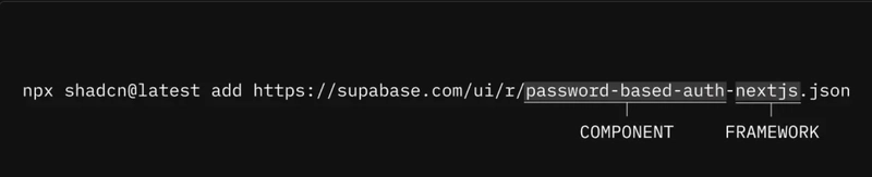
Installing components from the Supabase UI Library is as easy as installing a component from shadcn/ui.
The library is 100% shadcn/ui compatible by leveraging the component registry feature. It follows the conventions for theming and reuses existing components like buttons and inputs.
Our UI registry is a collection of reusable components designed for use in several popular React frameworks. Components are styled with shadcn/ui and Tailwind CSS and are completely customizable.

It's designed to take both the time and the pain out of building complex functionality like user sign-up in your apps. All components work with new or existing projects.
What's included?
- Supabase client initialization for client-side and server-side use
- Password-based authentication
- File Upload Dropzone
- Realtime Cursor Sharing
- Current User Avatar
- Realtime Avatar Stack
- Realtime Chat
We intend to release more Supabase UI Library components, and we'd love to get your feedback. Got a favorite component you want for your applications? Let us know on X or Discord, or we'd be happy to get a pull request.
Let's look at some of the components.
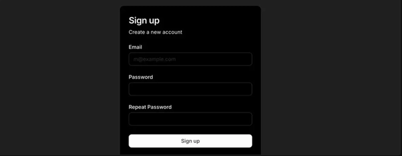
Password-based authentication
Setting up authentication in your projects can be complicated and time-consuming. The Password-Based Authentication block provides all the necessary components and pages to implement a secure, user-friendly authentication flow in your projects in seconds.
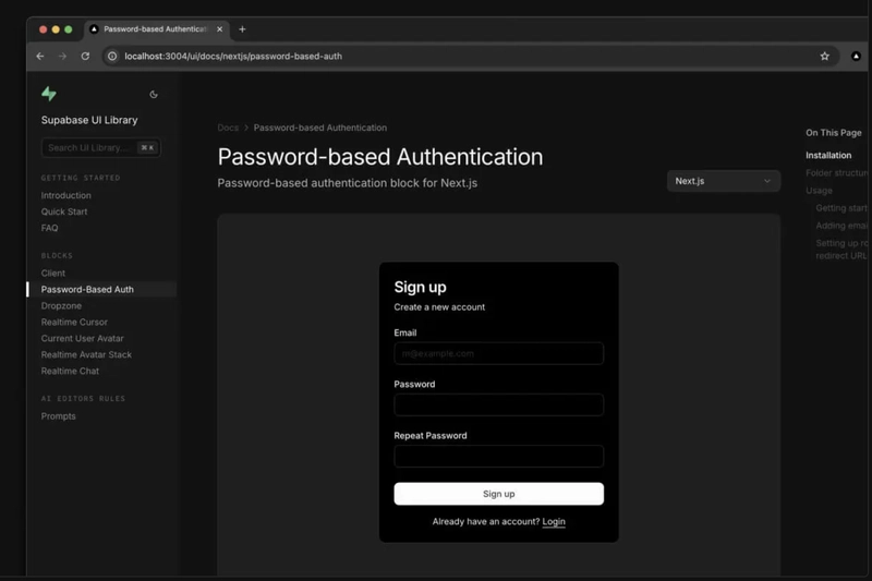
It includes everything you need to get started—fully built components for signing up, signing in, resetting a password, and handling forgotten passwords. These components are styled, responsive, and production-ready out of the box, so you don't have to worry about the design or flow. Just drop them into your project, and you're ready to sign up users.
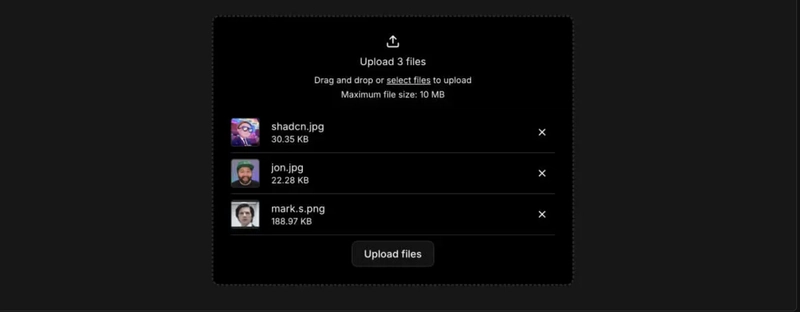
Easy file uploads
The File Upload Dropzone component lets you add file upload and storage in your application in seconds. It features drag-and-drop support, multiple file uploads, file size and count limits, image previews, and MIME type restrictions.
File upload components are often complicated to set up. Spend your time working on what happens after the files are on the server.
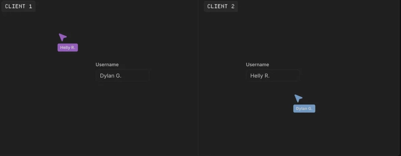
Realtime cursor sharing
The Realtime Cursor component gets you started building multiplayer experiences in your applications. You can just drop this component into your project and you're ready to use Realtime in seconds.
See who's online
With the User Avatar and Realtime Avatar Stack components, you can add Realtime Presence to your apps in a few minutes. See who's online in your collaborative apps, just like in Notion or Figma.

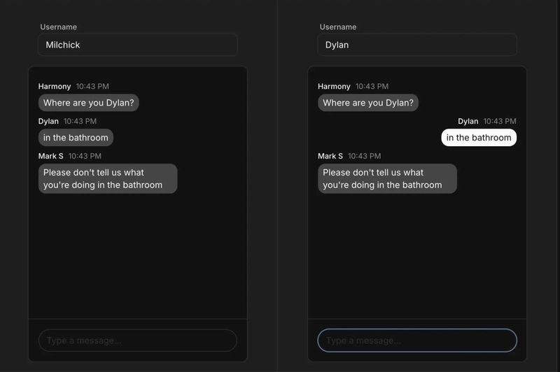
Realtime Chat
The Realtime Chat component is a complete chat interface, letting users exchange messages in real-time within a shared room. It features real-time, low-latency updates, message synchronization, message persistence support, customizable message appearance, automatic scroll-to-bottom on new messages, and more.
Rules for AI Code Editors for Supabase
Alongside our UI components, we're also shipping a curated set of LLM rules tailored for Supabase and Postgres. These rules help AI code editors understand and work with features like Row Level Security (RLS), Postgres functions, RLS policies, and Supabase Edge Functions. These rules help guide models toward best practices and valid syntax, improving your developer experience. Install them all in a single command.
Why build on shadcn/ui?
Shadcn/ui has been the top project on JavaScript Rising Stars for two years running—and for good reason. It offers a unique approach: instead of installing a component library as a dependency, you copy and paste the actual component code into your project. You get complete control over customization, styling, and behavior, with components that feel like part of your project.
Get started today
Skip the boilerplate and long setup times—focus on what really matters: building and shipping fast. Explore the Supabase UI Component Library, drop it into your projects, and let us know what you think. Be sure to submit components you want to see next!
Visit the Supabase UI Library.
Launch Week 14
Main Stage
Day 1 - Supabase UI Library
Day 2 - Supabase Edge Functions: Deploy from the Dashboard + Deno 2.1
Build Stage
01 -Postgres Language Server
02 -Supabase Auth: Bring Your Own Clerk
03 -Automatic Embeddings in Postgres