


![[The AI Show Episode 145]: OpenAI Releases o3 and o4-mini, AI Is Causing “Quiet Layoffs,” Executive Order on Youth AI Education & GPT-4o’s Controversial Update](https://www.marketingaiinstitute.com/hubfs/ep%20145%20cover.png)


![[FREE EBOOKS] Learn Computer Forensics — 2nd edition, AI and Business Rule Engines for Excel Power Users & Four More Best Selling Titles](https://www.javacodegeeks.com/wp-content/uploads/2012/12/jcg-logo.jpg)


![From Art School Drop-out to Microsoft Engineer with Shashi Lo [Podcast #170]](https://cdn.hashnode.com/res/hashnode/image/upload/v1746203291209/439bf16b-c820-4fe8-b69e-94d80533b2df.png?#)


(1).jpg?#)


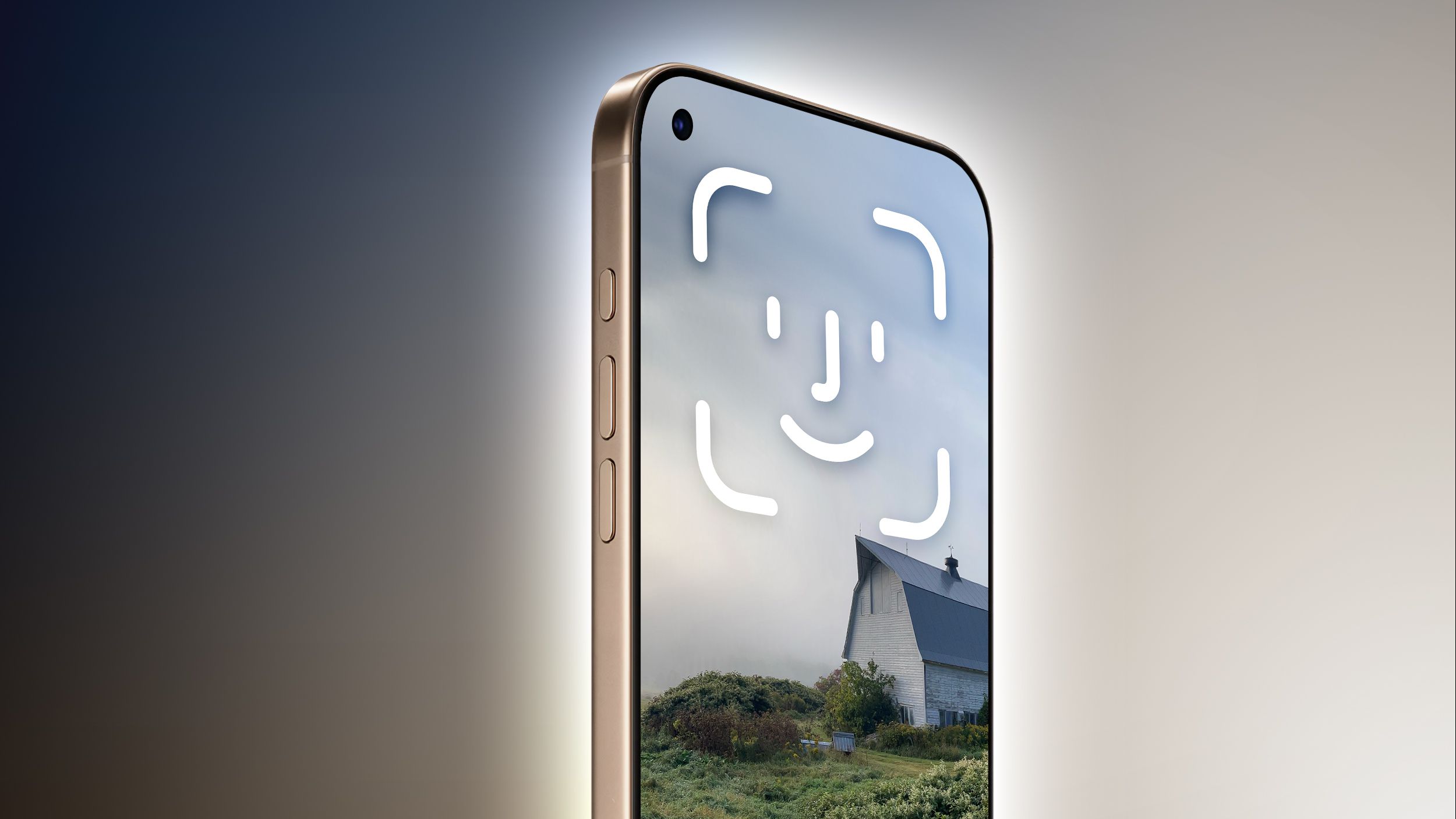
![Apple to Split iPhone Launches Across Fall and Spring in Major Shakeup [Report]](https://www.iclarified.com/images/news/97211/97211/97211-640.jpg)
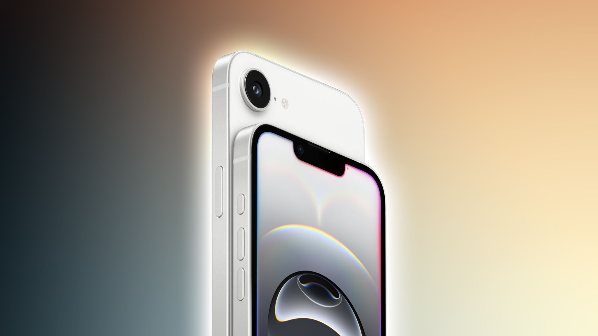
![Apple to Move Camera to Top Left, Hide Face ID Under Display in iPhone 18 Pro Redesign [Report]](https://www.iclarified.com/images/news/97212/97212/97212-640.jpg)


_Inge_Johnsson-Alamy.jpg?width=1280&auto=webp&quality=80&disable=upscale#)


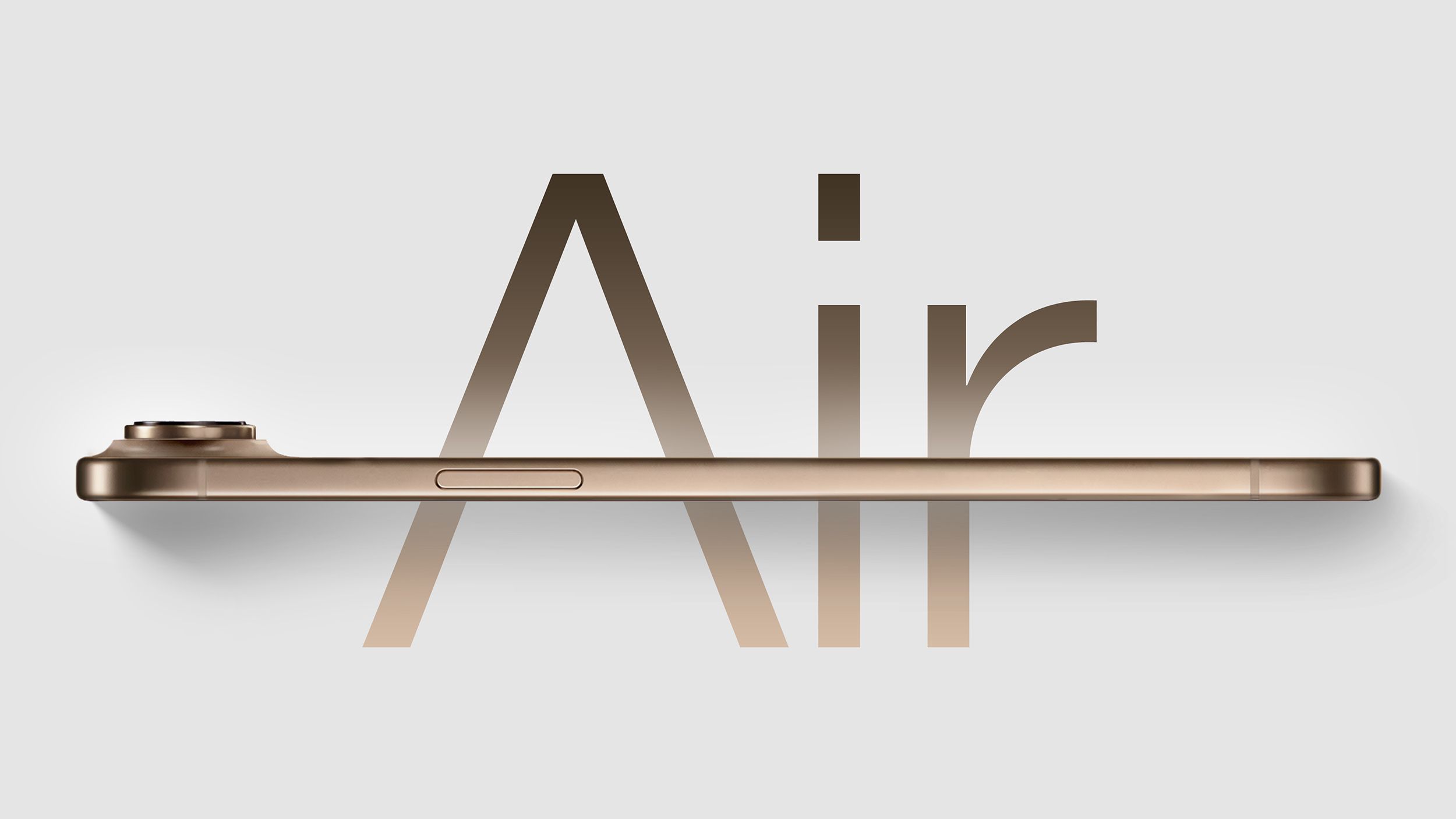
![Apple Developing Battery Case for iPhone 17 Air Amid Battery Life Concerns [Report]](https://www.iclarified.com/images/news/97208/97208/97208-640.jpg)
![AirPods 4 On Sale for $99 [Lowest Price Ever]](https://www.iclarified.com/images/news/97206/97206/97206-640.jpg)


How to Create a Reusable Modal Component in React
Modals are common UI elements in modern web applications, often used for displaying content in an overlay that requires user interaction. In this tutorial, we'll create a simple and reusable modal component in React. Step 1: Set Up the Project First, create a new React project if you haven't already: npx create-react-app react-modal-example cd react-modal-example npm start Step 2: Create the Modal Component Create a new file called Modal.js in the src folder. This component will represent the modal overlay and the content inside it. import React from "react"; import "./Modal.css"; const Modal = ({ show, handleClose, children }) => { if (!show) return null; return ( e.stopPropagation()}> × {children} ); }; export default Modal; Step 3: Styling the Modal Create a file called Modal.css and add the following styles to make the modal look like an overlay: /* Modal Overlay */ .modal-overlay { position: fixed; top: 0; left: 0; width: 100%; height: 100%; background-color: rgba(0, 0, 0, 0.7); display: flex; justify-content: center; align-items: center; z-index: 1000; } /* Modal Content */ .modal-content { background-color: white; padding: 20px; border-radius: 8px; width: 500px; position: relative; } /* Close Button */ .close-btn { position: absolute; top: 10px; right: 10px; background: none; border: none; font-size: 24px; cursor: pointer; } Step 4: Use the Modal in the Main App Now, let's use this modal in the main App.js file to demonstrate how it works. We'll create a button to trigger the modal visibility and show some content inside the modal. import React, { useState } from "react"; import Modal from "./Modal"; import "./App.css"; const App = () => { const [showModal, setShowModal] = useState(false); const toggleModal = () => setShowModal(!showModal); return ( Show Modal React Modal Example This is a simple modal component created in React! Close Modal ); }; export default App; Step 5: Run the Application Now, run your app and click the "Show Modal" button. The modal will appear on top of the page, and you can close it by clicking the close button or anywhere outside the modal overlay. npm start ✅ Pros:

Modals are common UI elements in modern web applications, often used for displaying content in an overlay that requires user interaction. In this tutorial, we'll create a simple and reusable modal component in React.
Step 1: Set Up the Project
First, create a new React project if you haven't already:
npx create-react-app react-modal-example
cd react-modal-example
npm start
Step 2: Create the Modal Component
Create a new file called Modal.js in the src folder. This component will represent the modal overlay and the content inside it.
import React from "react";
import "./Modal.css";

const Modal = ({ show, handleClose, children }) => {
  if (!show) return null;

  return (

       e.stopPropagation()}>

          ×

        {children}


  );
};

export default Modal;
Step 3: Styling the Modal
Create a file called Modal.css and add the following styles to make the modal look like an overlay:
/* Modal Overlay */
.modal-overlay {
  position: fixed;
  top: 0;
  left: 0;
  width: 100%;
  height: 100%;
  background-color: rgba(0, 0, 0, 0.7);
  display: flex;
  justify-content: center;
  align-items: center;
  z-index: 1000;
}

/* Modal Content */
.modal-content {
  background-color: white;
  padding: 20px;
  border-radius: 8px;
  width: 500px;
  position: relative;
}

/* Close Button */
.close-btn {
  position: absolute;
  top: 10px;
  right: 10px;
  background: none;
  border: none;
  font-size: 24px;
  cursor: pointer;
}
Step 4: Use the Modal in the Main App
Now, let's use this modal in the main App.js file to demonstrate how it works. We'll create a button to trigger the modal visibility and show some content inside the modal.
import React, { useState } from "react";
import Modal from "./Modal";
import "./App.css";

const App = () => {
  const [showModal, setShowModal] = useState(false);

  const toggleModal = () => setShowModal(!showModal);

  return (

      Show Modal


        React Modal Example
        This is a simple modal component created in React!
        Close Modal


  );
};

export default App;
Step 5: Run the Application
Now, run your app and click the "Show Modal" button. The modal will appear on top of the page, and you can close it by clicking the close button or anywhere outside the modal overlay.
npm start
✅ Pros: