


![[The AI Show Episode 145]: OpenAI Releases o3 and o4-mini, AI Is Causing “Quiet Layoffs,” Executive Order on Youth AI Education & GPT-4o’s Controversial Update](https://www.marketingaiinstitute.com/hubfs/ep%20145%20cover.png)


![From Art School Drop-out to Microsoft Engineer with Shashi Lo [Podcast #170]](https://cdn.hashnode.com/res/hashnode/image/upload/v1746203291209/439bf16b-c820-4fe8-b69e-94d80533b2df.png?#)


![Re-designing a Git/development workflow with best practices [closed]](https://i.postimg.cc/tRvBYcrt/branching-example.jpg)


(1).jpg?#)


_Inge_Johnsson-Alamy.jpg?width=1280&auto=webp&quality=80&disable=upscale#)


![The Material 3 Expressive redesign of Google Clock leaks out [Gallery]](https://i0.wp.com/9to5google.com/wp-content/uploads/sites/4/2024/03/Google-Clock-v2.jpg?resize=1200%2C628&quality=82&strip=all&ssl=1)
![What Google Messages features are rolling out [May 2025]](https://i0.wp.com/9to5google.com/wp-content/uploads/sites/4/2023/12/google-messages-name-cover.png?resize=1200%2C628&quality=82&strip=all&ssl=1)


![New Apple iPad mini 7 On Sale for $399! [Lowest Price Ever]](https://www.iclarified.com/images/news/96096/96096/96096-640.jpg)
![Apple to Split iPhone Launches Across Fall and Spring in Major Shakeup [Report]](https://www.iclarified.com/images/news/97211/97211/97211-640.jpg)
![Apple to Move Camera to Top Left, Hide Face ID Under Display in iPhone 18 Pro Redesign [Report]](https://www.iclarified.com/images/news/97212/97212/97212-640.jpg)
![Apple Developing Battery Case for iPhone 17 Air Amid Battery Life Concerns [Report]](https://www.iclarified.com/images/news/97208/97208/97208-640.jpg)


Cut the Crap: Ship Better-Looking Websites (Fast)
Alright, let's be real. That UI/UX stuff? It's pretty much the only thing your users actually see and interact with. It's the front door to whatever awesome thing you've built. If you put 20% of your efforts into this, it will give you 80% of the results regarding users. The 80/20 of a product. But if you're a code-first dev like me, staring at a blank design canvas feels… directionless. Like, where do you even start? I've been there. I tried building components and designing from scratch. But no matter how much I tried, the results were mediocre at best. The usual advice? "You'll get good eventually." Yeah, thanks. Super helpful when you're trying to ship something quickly. I used to watch these long tutorials on YouTube. All they do is teach design fundamentals and make you learn Figma anyway. "Figma? What's that? Why? It's hard enough to manage state, fetches, APIs, auth, schema, and whatnot. I don't wanna learn graphic design on top of that." Now, there is nothing wrong with being willing to learn design properly. It's a valuable skill. But if your goal is to ship an MVP fast, build side projects, or just get your ideas out there, mastering another discipline first isn't sustainable. It takes tons of time and practice. Enough said, let's dive into the 3-layer system I use to ship decent-looking UI, fast: Layer 1: Steal the Structure The structure is everything. You can't build anything solid without a decent blueprint. And the good news? You don't have to invent it. Steal Like an Artist — Austin Kleon 1. Define Your Bones First Before looking at pretty pictures, know what you're building. Outline: What are the key features/sections? Flow: How does a user get from A to B? Sketch a simple flowchart (yes, pen and paper works!). Or use some tool like Excalidraw, or if you are super lazy like me, just sketch it in your mind. Data: What info needs to be shown/collected? (Think basic schema). Why bother? Designing is 10x easier when you know the purpose and flow. 2. Research & "Borrow" Now, find your visual inspiration. Why? Think about it, these brands have spent thousands perfecting UI patterns. Learning from them will give you that unseen leverage. Some useful resources for research: Niche Leaders: Look at the top websites or apps in your space. What works? What doesn't? Curated Galleries: Dive into Mobbin (great for app flows) and Dribbble (great for visual flair and components). Screenshot liberally. Analyze why you like certain layouts or elements. Secret Resource (for Flair): Portfolio websites. Seriously. These are a collection of some of the most impressive-looking websites you will find on the web. It's just developers flexing their skills. Usefulness 3/10, Creativity 10/10. Good for grabbing specific ideas. 3. AI Kickstart Got your outline, flow, and a folder full of inspiration screenshots? Let's get a concrete starting point without touching that scary tool called Figma. Prompt the Prompter: Open ChatGPT (or your LLM of choice). Feed it your outline, and flow, and describe the key layouts or components you liked from your research (or even better, if the tool allows image input, use them!). Ask it: "Generate a detailed prompt for an AI UI generator like Vercel's v0.dev, Lovable.ai, Galileo AI, etc., to create an initial design concept for a [your app type] based on these features, this user flow, and inspired by these visual styles [describe/show references]." Generate & Iterate: Paste the generated prompt into a tool like v0.dev or Lovable. Let it spit out some ideas. CRUCIAL AI Note: As mentioned, AI is great at creating initial stuff but often clumsy at updating an existing design via prompts. If the first result is way off, don't waste time trying to tweak it with 50 follow-up prompts. Start a new chat, refine your initial prompt based on what you learned, and generate it again. It's often faster. Goal: This is a hit-or-miss step. Sometimes it's garbage. But sometimes? It nails a solid layout or component structure you can directly use (copy the code if available!) or iterate on. This saves hours of "where does the button go?" agony. Layer 2: Assemble the Building Blocks Now that you've got a structural direction from Layer 1. It's time to assemble the actual UI quickly and consistently. 1. Styling Foundation Now, don't go wandering off on YouTube trying to master CSS from scratch, we might never hear from you again! I don't want you to get stuck in the CSS rabbit hole. Look, there are hundreds of CSS properties, but honestly? You probably only need to grasp maybe 20-ish core ones. With those, you can build almost any UI layout, especially when using modern tools. You can check this very brief article. Or if you want to get on track quickly, focus on understanding essentials like: Box Model (margin, padding, border) Layout (display: flex, display: grid, gap) Positioning (po

Alright, let's be real. That UI/UX stuff? It's pretty much the only thing your users actually see and interact with. It's the front door to whatever awesome thing you've built.
If you put 20% of your efforts into this, it will give you 80% of the results regarding users.
The 80/20 of a product.
But if you're a code-first dev like me, staring at a blank design canvas feels… directionless. Like, where do you even start?
I've been there. I tried building components and designing from scratch. But no matter how much I tried, the results were mediocre at best.
The usual advice? "You'll get good eventually."
Yeah, thanks. Super helpful when you're trying to ship something quickly.
I used to watch these long tutorials on YouTube. All they do is teach design fundamentals and make you learn Figma anyway. "Figma? What's that? Why? It's hard enough to manage state, fetches, APIs, auth, schema, and whatnot. I don't wanna learn graphic design on top of that."

Now, there is nothing wrong with being willing to learn design properly. It's a valuable skill.
But if your goal is to ship an MVP fast, build side projects, or just get your ideas out there, mastering another discipline first isn't sustainable. It takes tons of time and practice.
Enough said, let's dive into the 3-layer system I use to ship decent-looking UI, fast:
Layer 1: Steal the Structure
The structure is everything. You can't build anything solid without a decent blueprint. And the good news? You don't have to invent it.

Steal Like an Artist — Austin Kleon
1. Define Your Bones First
Before looking at pretty pictures, know what you're building.
Outline: What are the key features/sections?
Flow: How does a user get from A to B? Sketch a simple flowchart (yes, pen and paper works!). Or use some tool like Excalidraw, or if you are super lazy like me, just sketch it in your mind.
Data: What info needs to be shown/collected? (Think basic schema).
Why bother? Designing is 10x easier when you know the purpose and flow.
2. Research & "Borrow"
Now, find your visual inspiration. Why?
Think about it, these brands have spent thousands perfecting UI patterns. Learning from them will give you that unseen leverage.
Some useful resources for research:
Niche Leaders: Look at the top websites or apps in your space. What works? What doesn't?
Curated Galleries: Dive into Mobbin (great for app flows) and Dribbble (great for visual flair and components). Screenshot liberally. Analyze why you like certain layouts or elements.

- Secret Resource (for Flair): Portfolio websites. Seriously. These are a collection of some of the most impressive-looking websites you will find on the web. It's just developers flexing their skills. Usefulness 3/10, Creativity 10/10. Good for grabbing specific ideas.
3. AI Kickstart
Got your outline, flow, and a folder full of inspiration screenshots? Let's get a concrete starting point without touching that scary tool called Figma.
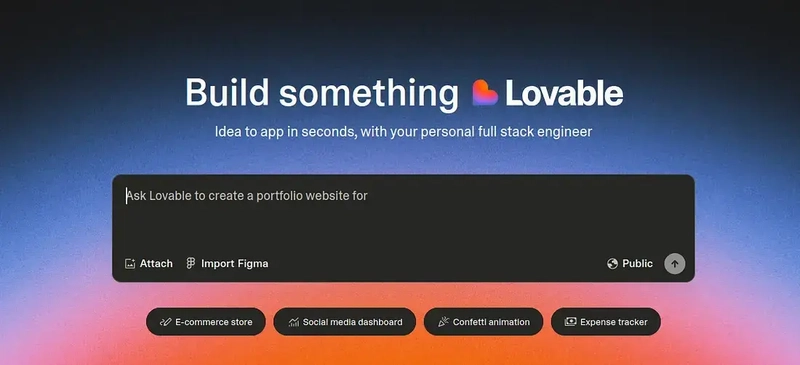
Prompt the Prompter: Open ChatGPT (or your LLM of choice). Feed it your outline, and flow, and describe the key layouts or components you liked from your research (or even better, if the tool allows image input, use them!). Ask it: "Generate a detailed prompt for an AI UI generator like Vercel's v0.dev, Lovable.ai, Galileo AI, etc., to create an initial design concept for a [your app type] based on these features, this user flow, and inspired by these visual styles [describe/show references]."
Generate & Iterate: Paste the generated prompt into a tool like v0.dev or Lovable. Let it spit out some ideas.
CRUCIAL AI Note: As mentioned, AI is great at creating initial stuff but often clumsy at updating an existing design via prompts. If the first result is way off, don't waste time trying to tweak it with 50 follow-up prompts. Start a new chat, refine your initial prompt based on what you learned, and generate it again. It's often faster.
- Goal: This is a hit-or-miss step. Sometimes it's garbage. But sometimes? It nails a solid layout or component structure you can directly use (copy the code if available!) or iterate on. This saves hours of "where does the button go?" agony.
Layer 2: Assemble the Building Blocks
Now that you've got a structural direction from Layer 1. It's time to assemble the actual UI quickly and consistently.
1. Styling Foundation
Now, don't go wandering off on YouTube trying to master CSS from scratch, we might never hear from you again!
I don't want you to get stuck in the CSS rabbit hole. Look, there are hundreds of CSS properties, but honestly? You probably only need to grasp maybe 20-ish core ones.
With those, you can build almost any UI layout, especially when using modern tools.
You can check this very brief article. Or if you want to get on track quickly, focus on understanding essentials like:
- Box Model (margin, padding, border)
- Layout (display: flex, display: grid, gap)
- Positioning (position, top, left, right, bottom, z-index)
- Sizing (width, height, max-width)
- Typography (font-size, font-weight, color, line-height, text-align)
- Backgrounds (background-color, background-image)
- Basic Selectors (classes, IDs - though you'll use classes 99% of the time with utility-first approaches)
(If you already know this stuff cold or are a CSS wizard. Sorry to disrespect you, but I gotta do what I gotta do, to save people’s time.)
Understanding these basics gives you the foundation you need without derailing your project for weeks. You need this context to understand how the tools we'll use next work under the hood.
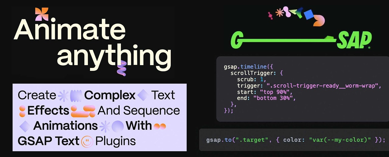
2. Tailwind

Yes, you need Tailwind in 2025.
Yes, raw CSS can be painful (naming things, managing files…).
Yes Tailwind CSS fixes this for many devs.
It's utility-first: you apply tiny classes directly in your HTML/JSX (className="pt-4 text-lg font-semibold").
On top of that it provides a consistent design system out-of-the-box, speeding things up.
But the biggest reason to use Tailwind is its Huge ecosystem around Component libraries.
3. Component Libraries (The Real Accelerator)
DO NOT REINVENT THE WHEEL.
Buttons, modals, forms, and cards are built faster and better by using pre-built components.
This is non-negotiable for speed. Forget building these from scratch (unless you really have to).
Do you know how much time I have wasted in building a popover menu from scratch? The countless bugs I encountered? The scary dream I had? (ok, maybe not that much.)
But the point is, now you can just copy it from Shadcn and customize it.
- Shadcn/UI: This isn't a traditional library you install as a dependency. Instead, you copy-paste beautifully crafted component code directly into your project. Unstyled (but themeable via Tailwind). Tbh, it's one of the biggest things that ever happened to front-end development.

Why you SHOULD use it?
- You Own the Code: So max control, max customization, max fun, and no fighting library internals, too.
- Flexibility: Only want to use this pretty card, but don't want countless dependencies? No problem, go ahead, use only what you need. No bloat.
- Tailwind Native: Remember when I asked you to learn Tailwind? Yup, you will thank me now, with Tailwind, you can work seamlessly with it for styling.
- Copy-Paste Simple: Pick a component, run a CLI command, and get the code. That's it, now build, it's so incredibly productive.
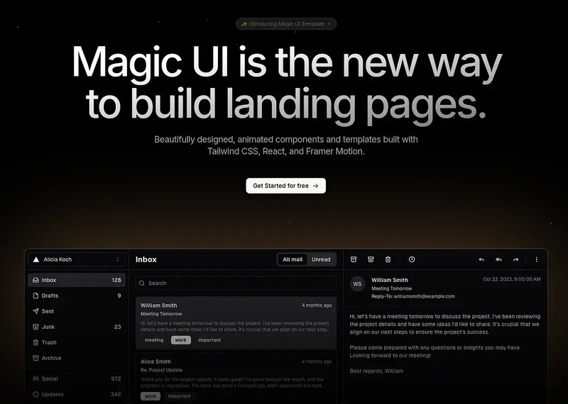
- The Growing Shadcn/Radix Ecosystem: That copy-paste, "own-the-code" approach you love from Shadcn? It's a whole ecosystem now. For more specialized or highly animated components built with the same philosophy (using Radix primitives and Tailwind), check out libraries like Magic UI or Aceternity UI. You integrate them the same way, no extra dependencies, just more cool building blocks for your project.
Other Tailwind Libraries: If the Shadcn approach isn't your jam, there are libraries like Flowbite or DaisyUI. They offer ready-made components styled with Tailwind, often installed as dependencies. Providing similar speed benefits for common patterns.
Here is a huge collection of UI libraries, more than you would ever need.
4. Font Sanity:
Font is also something you should keep in mind. Some people don't even touch it, and some people get insano-style with it.
Keep it simple. Pick one, maybe two readable fonts that align with your application's feel. Use different weights (light, regular, bold) and sizes for hierarchy. Google Fonts is great.

Configure them in your tailwind.config.js (if using Tailwind) for easy use (font-sans, font-headings). Done.
Layer 2 is about setting up your core toolkit. Understanding fundamental CSS properties, leveraging killer component libraries. (Seriously, look at Magic UI.) You can build a complex UI fast with it.
Layer 3: Make it Pretty
You have the structure (Layer 1) and the functional building blocks, which already look good in their own regard (Layer 2).
Layer 3 is purely about adding that visual polish, the stuff that makes it look less like a wireframe and more like a finished product.
Now, I'll be honest here, at this point, this is a designer's job. Like, I don't know what gradient would complement which background, or what should be the optimal size of this button.
The better design skills you have, the better UI you'll be able to create.
Unfortunately, I am not that good. I wish I knew a designer whom I could ask for advice.
Wait, maybe I do know someone who can help. I think you know him too.
Yes! You got it right, it's our scary friend AI. He has analyzed countless designs, he can surely help.
These designers are vibe-coding applications in minutes, so why can't I vibe-design my application?
And believe me, with this you would be able to create really beautiful designs and components.
1. AI as Design Consultant
Use AI tools (Cursor, GitHub Copilot Chat, or even just ChatGPT). Describe a specific section or element from your current build and ask for aesthetic advice:
- "Suggest 3 ways to add subtle micro-interactions to my buttons using Tailwind/CSS."
- "Recommend a complementary accent color to go with my primary blue (#XXXXXX) for call-to-action elements."
- "How can I make this data table feel less dense? Suggest layout or styling tweaks."
- "Give me ideas for a visually interesting background for the hero section (e.g., subtle gradients, patterns)."
Ask any questions, doesn't matter how silly, it's not gonna judge you.

2. Agents
Now, this is the nuclear option. You can definitely build extremely "fast" using this approach.
Your imagination is the only thing stopping you here. And apparently some application-breaking bugs.
While it's true you can operate very fast, the question arises, "Who's in control?".
It totally depends on you how comfortable you are. If you don't care how it works, which is totally fine. Then, by all means, just make your imagination a reality.
But if you don't want to lose control of your codebase, then at least try to understand why and how things are working.
Example prompts:
- "Generate the Tailwind CSS classes for a linear gradient background going from blue-500 to purple-600."
- "Write the CSS keyframes and Tailwind classes for a button that subtly scales up on hover."
- "Show me how to implement a fade-in animation on scroll for sections using JavaScript and Tailwind."
- Feed a screenshot or code snippet to a visual-aware AI tool and ask: "Generate the code to refine the styling of this card to look more modern, like [reference image/description]."
Essentially, use AI first for ideas on polish, then use AI again to generate the code snippets or styling logic needed to achieve that polish within your Tailwind/Component structure.
The Takeaway
Stop trying to be a master designer and a master coder simultaneously, especially when starting out or aiming for speed.
- Steal structure and get AI to kickstart layouts.
- Assemble using Tailwind, sensible fonts, and crucially, powerful component libraries like Shadcn.
- Polish the aesthetics using AI for ideas and code implementation.
It's about leveraging the right tools and abstractions to get 80% of the visual impact with 20% of the traditional design effort.