


![[The AI Show Episode 143]: ChatGPT Revenue Surge, New AGI Timelines, Amazon’s AI Agent, Claude for Education, Model Context Protocol & LLMs Pass the Turing Test](https://www.marketingaiinstitute.com/hubfs/ep%20143%20cover.png)


![From drop-out to software architect with Jason Lengstorf [Podcast #167]](https://cdn.hashnode.com/res/hashnode/image/upload/v1743796461357/f3d19cd7-e6f5-4d7c-8bfc-eb974bc8da68.png?#)


.jpg?#)


_ArtemisDiana_Alamy.jpg?#)


 (1).webp?#)


![Yes, the Gemini icon is now bigger and brighter on Android [U]](https://i0.wp.com/9to5google.com/wp-content/uploads/sites/4/2025/02/Gemini-on-Galaxy-S25.jpg?resize=1200%2C628&quality=82&strip=all&ssl=1)


![New iOS 19 Leak Allegedly Reveals Updated Icons, Floating Tab Bar, More [Video]](https://www.iclarified.com/images/news/96958/96958/96958-640.jpg)


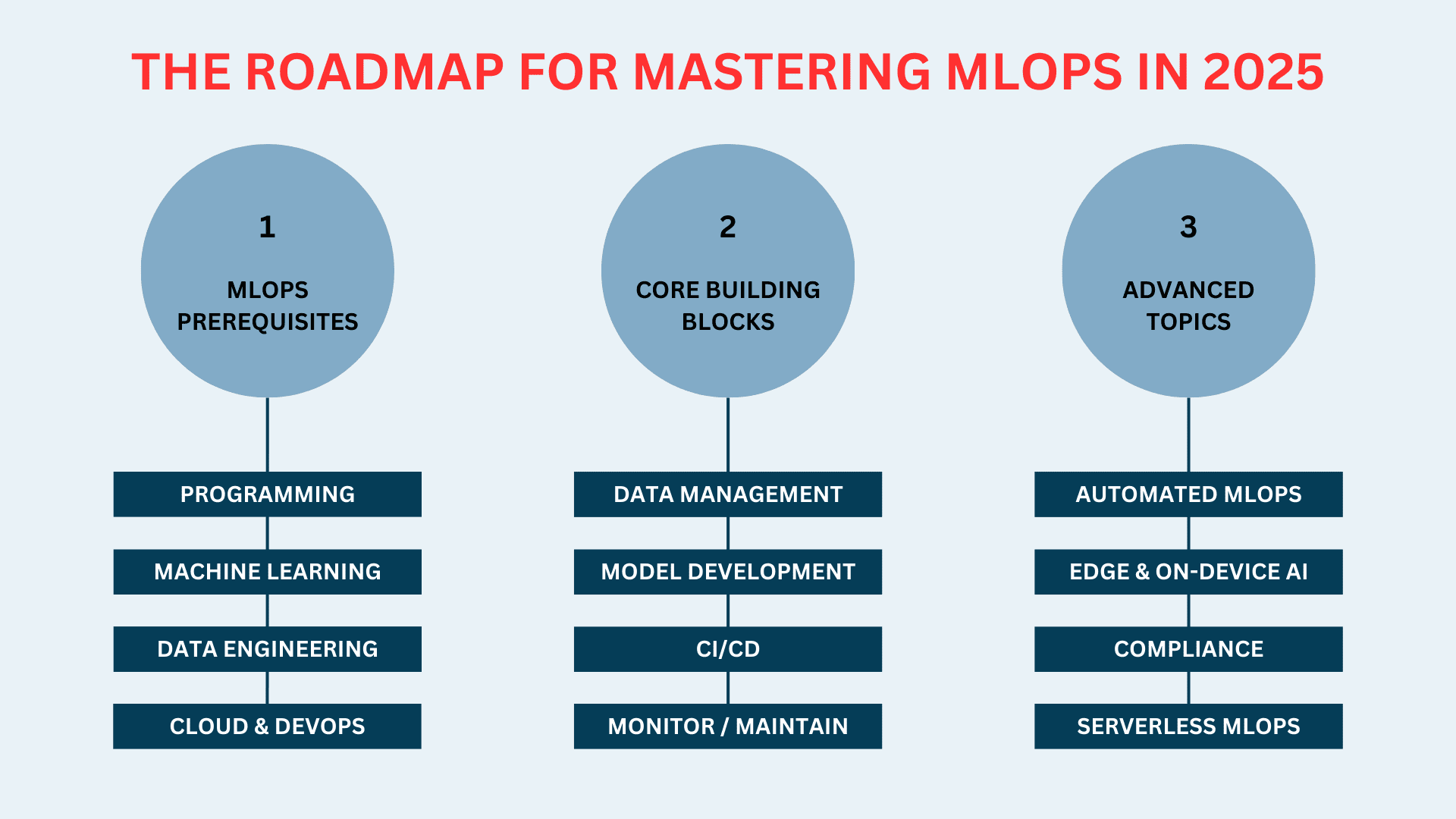
CSS Tutorial in 2 Minutes — The Ultimate Guide for Beginners
By Dhanian - CodeWithDhanian Grab my coding ebooks & resources → http://codewithdhanian.gumroad.com What is CSS? CSS stands for Cascading Style Sheets. It is used to style and design websites, making them visually appealing. While HTML gives a webpage structure, CSS adds beauty, color, layout, and responsiveness. Why Learn CSS? Build beautiful websites Customize layouts Make websites responsive Add animations & transitions Control every visual aspect of a webpage 1. CSS Syntax Overview selector { property: value; } Example: body { background-color: #ffffff; color: #000000; } 2. Types of CSS Inline CSS Hello World Internal CSS h1 { color: green; } External CSS 3. CSS Selectors Mastery Selector Example Meaning Universal * { } Targets everything Element p { } Targets tags Class .box { } Targets class="box" ID #header { } Targets id="header" Group h1, h2, p { } Targets multiple elements Descendant div p { } Targets inside 4. Colors in CSS color: red; color: #ff0000; color: rgb(255, 0, 0); color: hsl(0, 100%, 50%); 5. Text Styling p { font-size: 18px; font-family: 'Arial', sans-serif; font-weight: bold; text-align: justify; text-decoration: underline; text-transform: uppercase; line-height: 1.5; } 6. The CSS Box Model Content Padding Border Margin Example: .card { padding: 20px; border: 2px solid black; margin: 15px; } 7. Units in CSS px (pixels) % (percentage) em (relative to parent) rem (relative to root) vw / vh (viewport width/height) fr (fraction for grid) 8. Display Property div { display: block; } span { display: inline; } .box { display: inline-block; } .container { display: flex; } .grid-container { display: grid; } 9. Flexbox Complete Guide .container { display: flex; justify-content: space-between; align-items: center; gap: 20px; flex-wrap: wrap; } 10. CSS Grid Layout .grid { display: grid; grid-template-columns: repeat(3, 1fr); gap: 15px; } 11. Position Property .box { position: relative; top: 10px; left: 20px; } Types: static relative absolute fixed sticky 12. Media Queries for Responsive Design @media (max-width: 768px) { body { background-color: lightblue; } } 13. Pseudo-Classes & Pseudo-Elements a:hover { color: red; } input:focus { border: 2px solid green; } p::first-letter { font-size: 200%; } 14. CSS Variables :root { --primary-color: #3498db; } h1 { color: var(--primary-color); } 15. Animations & Transitions Transitions .button { background: blue; transition: background 0.3s ease; } .button:hover { background: darkblue; } Animations @keyframes slide { from { transform: translateX(0); } to { transform: translateX(100px); } } .box { animation: slide 2s infinite alternate; } 16. Shadows in CSS .box { box-shadow: 2px 2px 10px rgba(0,0,0,0.2); text-shadow: 1px 1px 5px black; } 17. CSS Best Practices Use External CSS Use Semantic HTML + CSS Use CSS Variables Mobile-first design Keep your code DRY (Don’t Repeat Yourself) Use comments for clarity 18. CSS Resources to Learn More MDN Web Docs CSS Tricks W3Schools FreeCodeCamp http://codewithdhanian.gumroad.com — My Coding Ebooks! Final Thoughts CSS is fun and powerful once you understand the core concepts. This 2-minute guide gives you a strong foundation to start building real-world projects. Ready to go deeper? Download my ebooks, guides, and coding resources here → http://codewithdhanian.gumroad.com
By Dhanian - CodeWithDhanian
Grab my coding ebooks & resources → http://codewithdhanian.gumroad.com
What is CSS?
CSS stands for Cascading Style Sheets. It is used to style and design websites, making them visually appealing. While HTML gives a webpage structure, CSS adds beauty, color, layout, and responsiveness.
Why Learn CSS?
- Build beautiful websites
- Customize layouts
- Make websites responsive
- Add animations & transitions
- Control every visual aspect of a webpage
1. CSS Syntax Overview
selector {
  property: value;
}
Example:
body {
  background-color: #ffffff;
  color: #000000;
}
2. Types of CSS
Inline CSS
style="color:blue;">Hello World
Internal CSS
External CSS
rel="stylesheet" href="style.css">
3. CSS Selectors Mastery
| Selector | Example | Meaning |
|---|---|---|
| Universal | * { } | Targets everything |
| Element | p { } | Targets |
| Class | .box { } | Targets class="box" |
| ID | #header { } | Targets id="header" |
| Group | h1, h2, p { } | Targets multiple elements |
| Descendant | div p { } | Targets |
4. Colors in CSS
color: red;
color: #ff0000;
color: rgb(255, 0, 0);
color: hsl(0, 100%, 50%);
5. Text Styling
p {
  font-size: 18px;
  font-family: 'Arial', sans-serif;
  font-weight: bold;
  text-align: justify;
  text-decoration: underline;
  text-transform: uppercase;
  line-height: 1.5;
}
6. The CSS Box Model
- Content
- Padding
- Border
- Margin
Example:
.card {
  padding: 20px;
  border: 2px solid black;
  margin: 15px;
}
7. Units in CSS
- px (pixels)
- % (percentage)
- em (relative to parent)
- rem (relative to root)
- vw / vh (viewport width/height)
- fr (fraction for grid)
8. Display Property
div {
  display: block;
}
span {
  display: inline;
}
.box {
  display: inline-block;
}
.container {
  display: flex;
}
.grid-container {
  display: grid;
}
9. Flexbox Complete Guide
.container {
  display: flex;
  justify-content: space-between;
  align-items: center;
  gap: 20px;
  flex-wrap: wrap;
}
10. CSS Grid Layout
.grid {
  display: grid;
  grid-template-columns: repeat(3, 1fr);
  gap: 15px;
}
11. Position Property
.box {
  position: relative;
  top: 10px;
  left: 20px;
}
Types:
- static
- relative
- absolute
- fixed
- sticky
12. Media Queries for Responsive Design
@media (max-width: 768px) {
  body {
    background-color: lightblue;
  }
}
13. Pseudo-Classes & Pseudo-Elements
a:hover { color: red; }
input:focus { border: 2px solid green; }
p::first-letter { font-size: 200%; }
14. CSS Variables
:root {
  --primary-color: #3498db;
}

h1 {
  color: var(--primary-color);
}
15. Animations & Transitions
Transitions
.button {
  background: blue;
  transition: background 0.3s ease;
}
.button:hover {
  background: darkblue;
}
Animations
@keyframes slide {
  from { transform: translateX(0); }
  to { transform: translateX(100px); }
}

.box {
  animation: slide 2s infinite alternate;
}
16. Shadows in CSS
.box {
  box-shadow: 2px 2px 10px rgba(0,0,0,0.2);
  text-shadow: 1px 1px 5px black;
}
17. CSS Best Practices
- Use External CSS
- Use Semantic HTML + CSS
- Use CSS Variables
- Mobile-first design
- Keep your code DRY (Don’t Repeat Yourself)
- Use comments for clarity
18. CSS Resources to Learn More
- MDN Web Docs
- CSS Tricks
- W3Schools
- FreeCodeCamp
- http://codewithdhanian.gumroad.com — My Coding Ebooks!
Final Thoughts
CSS is fun and powerful once you understand the core concepts. This 2-minute guide gives you a strong foundation to start building real-world projects.
Ready to go deeper?
Download my ebooks, guides, and coding resources here → http://codewithdhanian.gumroad.com