


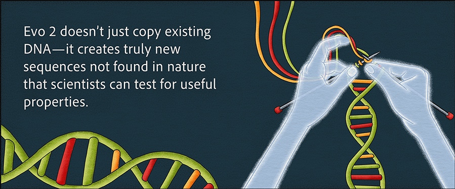
![[The AI Show Episode 144]: ChatGPT’s New Memory, Shopify CEO’s Leaked “AI First” Memo, Google Cloud Next Releases, o3 and o4-mini Coming Soon & Llama 4’s Rocky Launch](https://www.marketingaiinstitute.com/hubfs/ep%20144%20cover.png)


.jpg?#)


![Apple to Shift Robotics Unit From AI Division to Hardware Engineering [Report]](https://www.iclarified.com/images/news/97128/97128/97128-640.jpg)

![Apple Shares New Ad for iPhone 16: 'Trust Issues' [Video]](https://www.iclarified.com/images/news/97125/97125/97125-640.jpg)


Building a React Todo App: Learn to setup a complete UI structure
Building a React Todo App: From UI Structure to Functional Application Introduction Hello fellow developers! Today, I'd like to guide you through building a clean, well-structured Todo application using React. This tutorial is perfect for those learning React who want to understand component structure, styling, and how to set up a project that will eventually implement state management with hooks. We'll be building a todo list application called "Task Master" with a focus on good organization and design principles. This post will focus on setting up the UI components without functionality - making it perfect for those who want to understand React's component structure before diving into state management. Project Structure Let's start by creating a proper file structure. Organization is key to maintainable React applications, especially as they grow in complexity. task-master/ ├── public/ │ ├── index.html │ └── assets/ │ └── cover-image.jpg ├── src/ │ ├── components/ │ │ ├── Header.js │ │ ├── TodoForm.js │ │ ├── TodoList.js │ │ ├── TodoItem.js │ │ └── Footer.js │ ├── styles/ │ │ ├── Header.css │ │ ├── TodoForm.css │ │ ├── TodoList.css │ │ ├── TodoItem.css │ │ └── Footer.css │ ├── App.js │ ├── App.css │ └── index.js └── package.json This structure separates our components and their associated styles, making it easier to maintain and update each piece independently. Setting Up The Project Start by creating a new React application using Create React App: npx create-react-app task-master cd task-master Then, clean up the default files and create our component and style folders: mkdir -p src/components src/styles public/assets Now, let's create each of our component files and their associated stylesheets. Component Breakdown Our Todo app consists of 5 main components: Header - The app title and cover image TodoForm - The form for adding new tasks TodoList - Container for all Todo items with filtering options TodoItem - Individual task component Footer - Simple footer with copyright information Let's build each component one by one, starting with the main App component. App.js - The Container Component The App.js file serves as the main container that brings all our components together: // App.js import React from 'react'; import Header from './components/Header'; import TodoForm from './components/TodoForm'; import TodoList from './components/TodoList'; import Footer from './components/Footer'; import './App.css'; function App() { return ( ); } export default App; And the associated CSS: /* App.css */ * { margin: 0; padding: 0; box-sizing: border-box; } body { font-family: 'Segoe UI', Tahoma, Geneva, Verdana, sans-serif; background-color: #f5f7fa; color: #333; line-height: 1.6; } .app-container { display: flex; flex-direction: column; min-height: 100vh; } .main-content { flex: 1; padding: 2rem; max-width: 800px; margin: 0 auto; width: 100%; } .todo-container { background-color: #fff; border-radius: 8px; box-shadow: 0 5px 15px rgba(0, 0, 0, 0.1); padding: 1.5rem; } button { cursor: pointer; border: none; border-radius: 4px; padding: 0.5rem 1rem; font-size: 1rem; transition: all 0.3s ease; } button:hover { opacity: 0.9; } input, select { border: 1px solid #ddd; border-radius: 4px; padding: 0.75rem; font-size: 1rem; width: 100%; } input:focus, select:focus { outline: none; border-color: #4a90e2; } Header Component The header includes our app title and a cover image: // components/Header.js import React from 'react'; import '../styles/Header.css'; const Header = () => { return ( Task Master Organize your tasks efficiently ); }; export default Header; And its styling: /* styles/Header.css */ .header { background-color: #4a90e2; color: white; padding: 1rem 0; } .header-content { max-width: 800px; margin: 0 auto; text-align: center; } .cover-image { margin-bottom: 1rem; overflow: hidden; border-radius: 8px; } .cover-image img { width: 100%; height: 300px; object-fit: cover; border-radius: 8px; } .app-title { font-size: 2.5rem; margin-bottom: 0.5rem; font-weight: 700; } .app-subtitle { font-size: 1.2rem; font-weight: 300; margin-bottom: 1rem; } TodoForm Component The form allows users to add new tasks: // components/TodoForm.js import React from 'react'; import '../styles/TodoForm.css'; const TodoForm = () => { return ( Add New Task Select Priority Low Medium High
Building a React Todo App: From UI Structure to Functional Application
Introduction
Hello fellow developers! Today, I'd like to guide you through building a clean, well-structured Todo application using React. This tutorial is perfect for those learning React who want to understand component structure, styling, and how to set up a project that will eventually implement state management with hooks.
We'll be building a todo list application called "Task Master" with a focus on good organization and design principles. This post will focus on setting up the UI components without functionality - making it perfect for those who want to understand React's component structure before diving into state management.
Project Structure
Let's start by creating a proper file structure. Organization is key to maintainable React applications, especially as they grow in complexity.
task-master/
├── public/
│   ├── index.html
│   └── assets/
│       └── cover-image.jpg
├── src/
│   ├── components/
│   │   ├── Header.js
│   │   ├── TodoForm.js
│   │   ├── TodoList.js
│   │   ├── TodoItem.js
│   │   └── Footer.js
│   ├── styles/
│   │   ├── Header.css
│   │   ├── TodoForm.css
│   │   ├── TodoList.css
│   │   ├── TodoItem.css
│   │   └── Footer.css
│   ├── App.js
│   ├── App.css
│   └── index.js
└── package.json
This structure separates our components and their associated styles, making it easier to maintain and update each piece independently.
Setting Up The Project
Start by creating a new React application using Create React App:
npx create-react-app task-master
cd task-master
Then, clean up the default files and create our component and style folders:
mkdir -p src/components src/styles public/assets
Now, let's create each of our component files and their associated stylesheets.
Component Breakdown
Our Todo app consists of 5 main components:
- Header - The app title and cover image
- TodoForm - The form for adding new tasks
- TodoList - Container for all Todo items with filtering options
- TodoItem - Individual task component
- Footer - Simple footer with copyright information
Let's build each component one by one, starting with the main App component.
App.js - The Container Component
The App.js file serves as the main container that brings all our components together:
// App.js
import React from 'react';
import Header from './components/Header';
import TodoForm from './components/TodoForm';
import TodoList from './components/TodoList';
import Footer from './components/Footer';
import './App.css';

function App() {
  return (
    <div className="app-container">
      <Header />
      <main className="main-content">
        <div className="todo-container">
          <TodoForm />
          <TodoList />
        div>
      main>
      <Footer />
    div>
  );
}

export default App;
And the associated CSS:
/* App.css */
* {
  margin: 0;
  padding: 0;
  box-sizing: border-box;
}

body {
  font-family: 'Segoe UI', Tahoma, Geneva, Verdana, sans-serif;
  background-color: #f5f7fa;
  color: #333;
  line-height: 1.6;
}

.app-container {
  display: flex;
  flex-direction: column;
  min-height: 100vh;
}

.main-content {
  flex: 1;
  padding: 2rem;
  max-width: 800px;
  margin: 0 auto;
  width: 100%;
}

.todo-container {
  background-color: #fff;
  border-radius: 8px;
  box-shadow: 0 5px 15px rgba(0, 0, 0, 0.1);
  padding: 1.5rem;
}

button {
  cursor: pointer;
  border: none;
  border-radius: 4px;
  padding: 0.5rem 1rem;
  font-size: 1rem;
  transition: all 0.3s ease;
}

button:hover {
  opacity: 0.9;
}

input, select {
  border: 1px solid #ddd;
  border-radius: 4px;
  padding: 0.75rem;
  font-size: 1rem;
  width: 100%;
}

input:focus, select:focus {
  outline: none;
  border-color: #4a90e2;
}
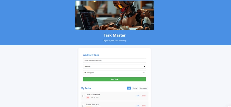
Header Component
The header includes our app title and a cover image:

// components/Header.js
import React from 'react';
import '../styles/Header.css';

const Header = () => {
  return (
    <header className="header">
      <div className="header-content">
        <div className="cover-image">
          <img src="/assets/cover-image.jpg" alt="Todo App Cover" />
        div>
        <h1 className="app-title">Task Masterh1>
        <p className="app-subtitle">Organize your tasks efficientlyp>
      div>
    header>
  );
};

export default Header;
And its styling:
/* styles/Header.css */
.header {
  background-color: #4a90e2;
  color: white;
  padding: 1rem 0;
}

.header-content {
  max-width: 800px;
  margin: 0 auto;
  text-align: center;
}

.cover-image {
  margin-bottom: 1rem;
  overflow: hidden;
  border-radius: 8px;
}

.cover-image img {
  width: 100%;
  height: 300px;
  object-fit: cover;
  border-radius: 8px;
}

.app-title {
  font-size: 2.5rem;
  margin-bottom: 0.5rem;
  font-weight: 700;
}

.app-subtitle {
  font-size: 1.2rem;
  font-weight: 300;
  margin-bottom: 1rem;
}
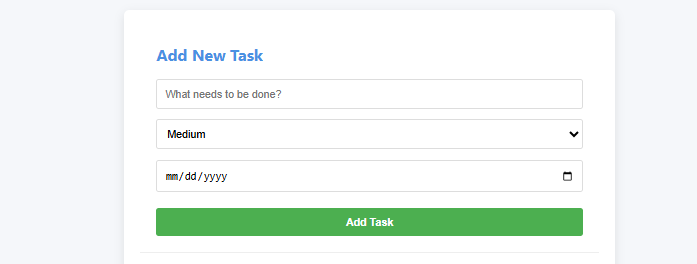
TodoForm Component
The form allows users to add new tasks:
// components/TodoForm.js
import React from 'react';
import '../styles/TodoForm.css';

const TodoForm = () => {
  return (
    <div className="todo-form-container">
      <h2>Add New Taskh2>
      <form className="todo-form">
        <div className="form-group">
          <input
            type="text"
            className="task-input"
            placeholder="What needs to be done?"
          />
        div>
        <div className="form-group">
          <select className="priority-select">
            <option value="">Select Priorityoption>
            <option value="low">Lowoption>
            <option value="medium">Mediumoption>
            <option value="high">Highoption>
          select>
        div>
        <div className="form-group">
          <input
            type="date"
            className="date-input"
          />
        div>
        <button type="submit" className="add-button">
          Add Task
        button>
      form>
    div>
  );
};

export default TodoForm;
With its CSS:
/* styles/TodoForm.css */
.todo-form-container {
  padding: 1.5rem;
  border-bottom: 1px solid #eee;
}

.todo-form-container h2 {
  margin-bottom: 1rem;
  color: #4a90e2;
}

.todo-form {
  display: flex;
  flex-direction: column;
  gap: 1rem;
}

.form-group {
  width: 100%;
}

.add-button {
  background-color: #4caf50;
  color: white;
  padding: 0.75rem;
  width: 100%;
  font-weight: 600;
  margin-top: 0.5rem;
}

.add-button:hover {
  background-color: #43a047;
}
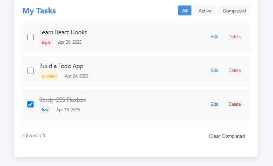
TodoList Component
This component will hold all our todo items and filter controls:
// components/TodoList.js
import React from 'react';
import TodoItem from './TodoItem';
import '../styles/TodoList.css';

const TodoList = () => {
  // This will be replaced with actual state management later
  const sampleTodos = [
    { id: 1, text: 'Learn React Hooks', completed: false, priority: 'high', dueDate: '2025-05-01' },
    { id: 2, text: 'Build a Todo App', completed: false, priority: 'medium', dueDate: '2025-04-25' },
    { id: 3, text: 'Study CSS Flexbox', completed: true, priority: 'low', dueDate: '2025-04-20' },
  ];

  return (
    <div className="todo-list-container">
      <div className="todo-list-header">
        <h2>My Tasksh2>
        <div className="filter-controls">
          <button className="filter-button active">Allbutton>
          <button className="filter-button">Activebutton>
          <button className="filter-button">Completedbutton>
        div>
      div>
      <div className="todo-list">
        {sampleTodos.map(todo => (
          <TodoItem
            key={todo.id}
            todo={todo}
          />
        ))}
      div>
      <div className="todo-stats">
        <span>{sampleTodos.filter(todo => !todo.completed).length} items leftspan>
        <button className="clear-completed-button">Clear Completedbutton>
      div>
    div>
  );
};

export default TodoList;
And its styles:
/* styles/TodoList.css */
.todo-list-container {
  padding: 1.5rem 0;
}

.todo-list-header {
  display: flex;
  justify-content: space-between;
  align-items: center;
  margin-bottom: 1rem;
}

.todo-list-header h2 {
  color: #4a90e2;
}

.filter-controls {
  display: flex;
  gap: 0.5rem;
}

.filter-button {
  background-color: #f5f7fa;
  color: #666;
  font-size: 0.9rem;
  padding: 0.4rem 0.8rem;
}

.filter-button.active {
  background-color: #4a90e2;
  color: white;
}

.todo-list {
  display: flex;
  flex-direction: column;
  gap: 0.75rem;
  margin-bottom: 1rem;
}

.todo-stats {
  display: flex;
  justify-content: space-between;
  align-items: center;
  padding-top: 1rem;
  border-top: 1px solid #eee;
  font-size: 0.9rem;
  color: #777;
}

.clear-completed-button {
  background: none;
  color: #777;
  font-size: 0.9rem;
}

.clear-completed-button:hover {
  color: #e74c3c;
  text-decoration: underline;
}
TodoItem Component
Each individual task is represented by this component:

// components/TodoItem.js
import React from 'react';
import '../styles/TodoItem.css';

const TodoItem = ({ todo }) => {
  const { text, completed, priority, dueDate } = todo;

  // Format date for display
  const formattedDate = new Date(dueDate).toLocaleDateString('en-US', {
    month: 'short',
    day: 'numeric',
    year: 'numeric'
  });

  return (
    <div className={`todo-item ${completed ? 'completed' : ''}`}>
      <div className="todo-checkbox">
        <input type="checkbox" checked={completed} readOnly />
        <span className="checkmark">span>
      div>
      <div className="todo-content">
        <div className="todo-text">{text}div>
        <div className="todo-meta">
          <span className={`priority-badge ${priority}`}>{priority}span>
          <span className="due-date">{formattedDate}span>
        div>
      div>
      <div className="todo-actions">
        <button className="edit-button">Editbutton>
        <button className="delete-button">Deletebutton>
      div>
    div>
  );
};

export default TodoItem;
With TodoItem styles:
/* styles/TodoItem.css */
.todo-item {
  display: flex;
  align-items: center;
  padding: 1rem;
  border-radius: 4px;
  background-color: #f9f9f9;
  box-shadow: 0 2px 4px rgba(0, 0, 0, 0.05);
  transition: all 0.3s ease;
}

.todo-item:hover {
  box-shadow: 0 4px 8px rgba(0, 0, 0, 0.1);
}

.todo-item.completed .todo-text {
  text-decoration: line-through;
  color: #888;
}

.todo-checkbox {
  position: relative;
  display: flex;
  align-items: center;
  margin-right: 1rem;
}

.todo-checkbox input {
  width: 20px;
  height: 20px;
}

.todo-content {
  flex-grow: 1;
}

.todo-text {
  font-size: 1.1rem;
  margin-bottom: 0.25rem;
}

.todo-meta {
  display: flex;
  align-items: center;
  gap: 1rem;
  font-size: 0.8rem;
  color: #777;
}

.priority-badge {
  padding: 0.2rem 0.5rem;
  border-radius: 12px;
  font-size: 0.75rem;
  font-weight: 600;
}

.priority-badge.low {
  background-color: #e3f2fd;
  color: #1976d2;
}

.priority-badge.medium {
  background-color: #fff3e0;
  color: #ff9800;
}

.priority-badge.high {
  background-color: #ffebee;
  color: #f44336;
}

.due-date {
  color: #777;
}

.todo-actions {
  display: flex;
  gap: 0.5rem;
}

.edit-button, .delete-button {
  padding: 0.35rem 0.75rem;
  font-size: 0.8rem;
}

.edit-button {
  background-color: #f5f7fa;
  color: #4a90e2;
}

.delete-button {
  background-color: #f5f7fa;
  color: #e74c3c;
}
Footer Component
Finally, our simple footer:
// components/Footer.js
import React from 'react';
import '../styles/Footer.css';

const Footer = () => {
  return (
    <footer className="footer">
      <div className="footer-content">
        <p>Task Master © {new Date().getFullYear()}p>
        <p>A React learning projectp>
      div>
    footer>
  );
};

export default Footer;
And its CSS:
/* styles/Footer.css */
.footer {
  background-color: #333;
  color: white;
  padding: 1.5rem 0;
  margin-top: 2rem;
}

.footer-content {
  max-width: 800px;
  margin: 0 auto;
  text-align: center;
}
Setting Up the Cover Image
Make sure to add a cover image to your public/assets folder. You can use any image you prefer, or create a placeholder with a service like Unsplash.
Testing the UI
After setting up all these components, run your React application:
npm start
You should now see a beautiful Todo application UI. At this point, it doesn't have any functionality - that's intentional! The goal is to understand the component structure and styling before implementing functionality.
What's Next?
In future tutorials, we'll implement functionality for this Todo app using React Hooks, including:
- State Management: Using useState and useEffect to track todos
- Form handling: Adding new tasks and validating input
- Filtering functionality: Showing all, active, or completed tasks
- Local Storage: Persisting todos between page reloads
- Task editing: Modifying existing tasks
Tips for Understanding This Code
- Component Structure: Notice how each component has a single responsibility, making the code more maintainable.
- CSS Organization: Styles are separated by component, allowing for easier management.
- Sample Data: We've included sample data to visualize how the app will look with real tasks.
- Design Principles: The app follows clean design principles with consistent spacing, typography, and color scheme.
Conclusion
Building a well-structured UI is the first step in creating a robust React application. By separating concerns into distinct components and organizing our styles appropriately, we've created a solid foundation that will make adding functionality much easier in the future.
This approach also makes the code more maintainable and easier to understand for teams working together or for educational purposes.
Feel free to clone this project and use it as a starting point for your own Todo application. In my next post, we'll implement state management using React Hooks to make this UI fully functional.
Happy coding!
What do you think of this component structure? Have suggestions for improvements? Let me know in the comments below!