


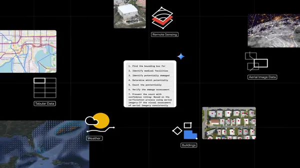
![[The AI Show Episode 143]: ChatGPT Revenue Surge, New AGI Timelines, Amazon’s AI Agent, Claude for Education, Model Context Protocol & LLMs Pass the Turing Test](https://www.marketingaiinstitute.com/hubfs/ep%20143%20cover.png)


![From drop-out to software architect with Jason Lengstorf [Podcast #167]](https://cdn.hashnode.com/res/hashnode/image/upload/v1743796461357/f3d19cd7-e6f5-4d7c-8bfc-eb974bc8da68.png?#)


.jpg?#)


_ArtemisDiana_Alamy.jpg?#)


 (1).webp?#)


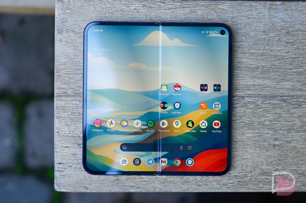
![Yes, the Gemini icon is now bigger and brighter on Android [U]](https://i0.wp.com/9to5google.com/wp-content/uploads/sites/4/2025/02/Gemini-on-Galaxy-S25.jpg?resize=1200%2C628&quality=82&strip=all&ssl=1)


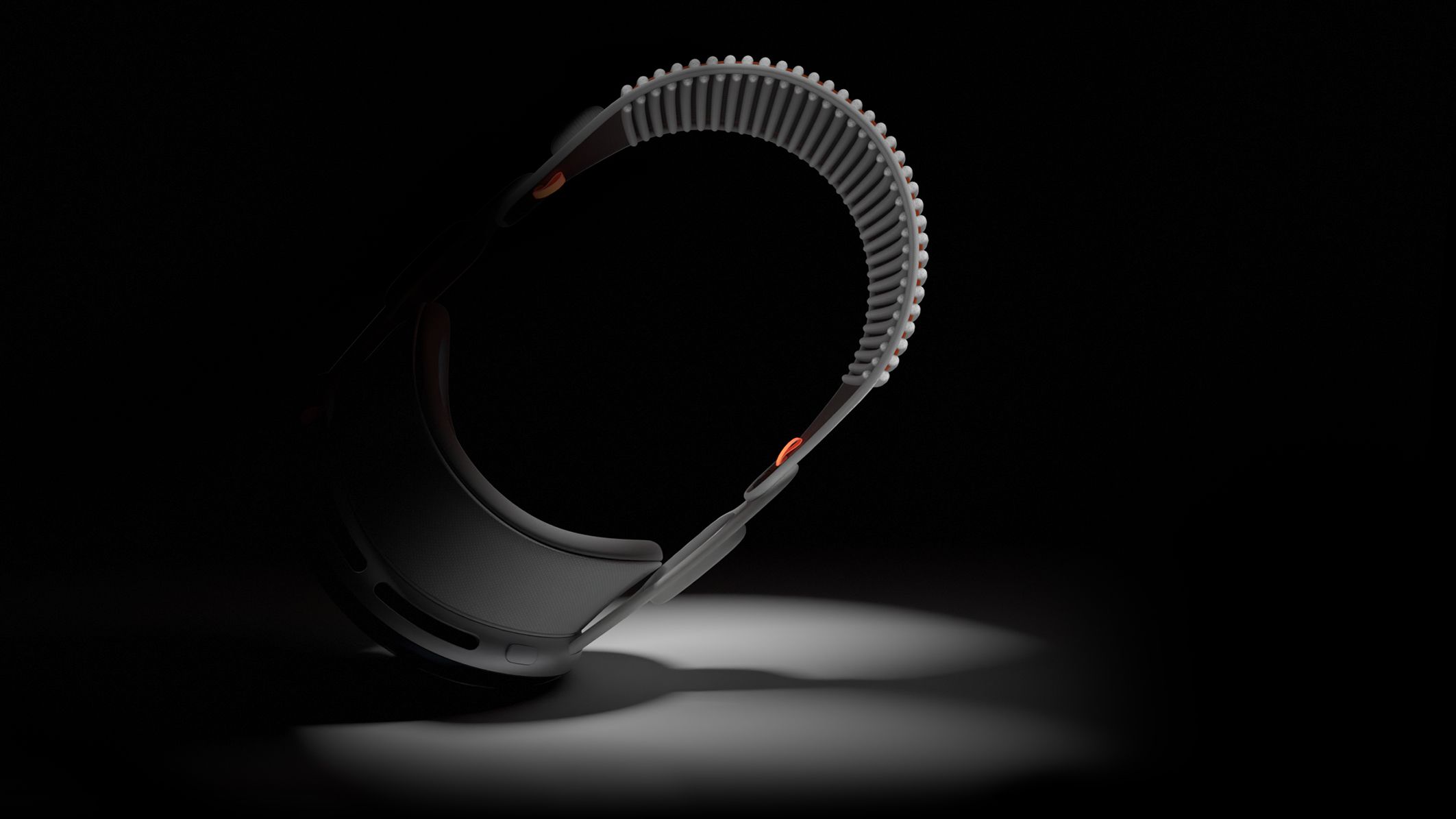
![Apple Vision Pro 2 Allegedly in Production Ahead of 2025 Launch [Rumor]](https://www.iclarified.com/images/news/96965/96965/96965-640.jpg)

![New iOS 19 Leak Allegedly Reveals Updated Icons, Floating Tab Bar, More [Video]](https://www.iclarified.com/images/news/96958/96958/96958-640.jpg)


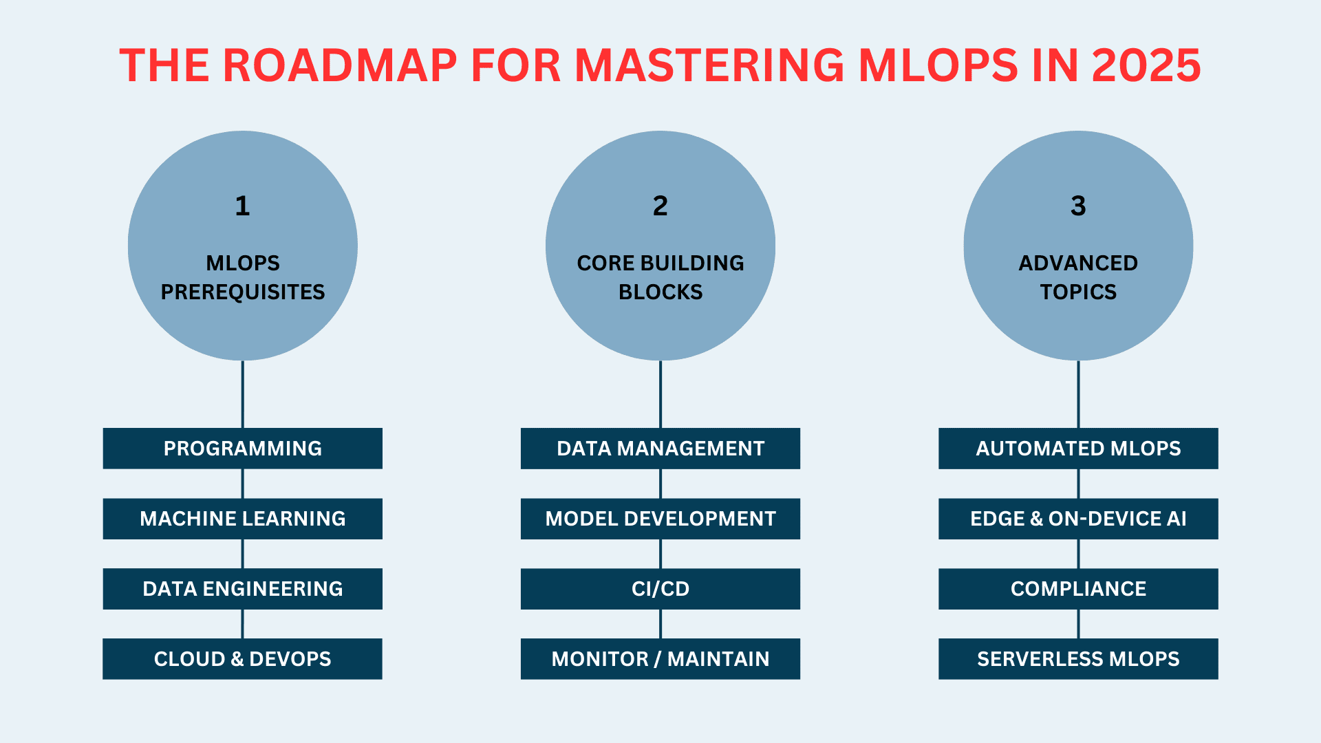
Block vs. Inline vs. Inline-Block in CSS
This post was originally published at thedevspace.io. Everything you need to master web development, all in one place. Let's consider the following example: Lorem ipsum dolor sit amet consectetur adipisicing elit. Fuga blanditiis delectus voluptatum molestias accusantium id repudiandae exercitationem! Labore ipsum blanditiis vero, doloremque, nisi vel molestiae ea odio tempore recusandae dicta? Lorem ipsum dolor sit amet consectetur adipisicing elit. Illum itaque eaque esse inventore incidunt delectus quia? Eos nam fuga sint obcaecati magnam. Fuga voluptatem doloremque quisquam eligendi libero. Deleniti, rerum. Notice that the element always starts on a new line and takes up as much horizontal space as possible. On the other hand, the element does not start on a new line and only takes up as much space as necessary. This is, in fact, the difference between the block elements and inline elements. Most of the elements we mentioned so far are block elements, such as , , to , , etc. Without extra styles defined, they will automatically take up as much horizontal space as possible. The element is an example of an inline element. It only takes up as much space as necessary when placed along side other elements. And the width and height attributes will have no effects on it. There are many other elements, both block and inline elements available in HTML. It is impossible to discuss all of them in one lesson, but here is a reference of all HTML elements from W3Schools if you are interested. Recall that we introduced the block and inline elements at the beginning of this chapter, where we explored the basics of HTML. Block elements are those that automatically take up all the horizontal space available, but you can define custom width and height. Inline elements, on the other hand, only take as much space as necessary, and defining width and height has no effect on these elements. Inline However, you sometimes need to be more flexible when working on real-life projects. For example, you are trying to build a navigation bar that sits on top of the page, and you have a list of links here: Link1 Link2 Link3 Link4 By default, is a block element occupying the horizontal line. This would waste a lot of vertical space. To fix this issue, you can change how the elements are displayed using the display property. li { display: inline; } And now, the will be displayed as an inline element. ➡️ View Code Demo Block You can also make an inline element behave like a block element in a similar way. #1#2 span { border: 2px solid black; display: block; } ➡️ View Code Demo Inline block If you need an inline element but you want to be able to customize its width and height, you can use inline-block instead. span { border: 2px solid black; display: inline-block; width: 100px; height: 50px; } ➡️ View Code Demo display vs. visibility display can also control whether or not an element is rendered on the webpage. If you set display to none, the element will not be displayed. This can create useful features when combined with JavaScript, allowing you to toggle the element on and off. This behavior is very similar to another CSS property called visibility. Their difference is that when visibility is set to hidden, the element is still on the webpage, just not displayed by the browser. It will take up the same space as before. When display is set to none, the element will be completely removed from the webpage. The display property is probably the most important CSS property we are going to cover in this chapter. It not only controls the display types of individual elements, but also the layout of its children. However, this requires a deeper understanding of CSS, so we will come back to this topic later. Read More CSS Functions & @ Rules A Comprehensive Guide to CSS Selectors Justify and Align in CSS Layout If you found this guide helpful, follow us on social media for more tips, tutorials, and updates on web development:

This post was originally published at thedevspace.io. Everything you need to master web development, all in one place.
Let's consider the following example:
  Lorem ipsum dolor sit amet consectetur adipisicing elit.
   href="/"
    >Fuga blanditiis delectus voluptatum molestias accusantium id repudiandae
    exercitationem!
  >
  Labore ipsum blanditiis vero, doloremque, nisi vel molestiae ea odio tempore
  recusandae dicta?


  Lorem ipsum dolor sit amet consectetur adipisicing elit. Illum itaque eaque
  esse inventore incidunt delectus quia? Eos nam fuga sint obcaecati magnam.
  Fuga voluptatem doloremque quisquam eligendi libero. Deleniti, rerum.
Notice that the
element always starts on a new line and takes up as much horizontal space as possible. On the other hand, the element does not start on a new line and only takes up as much space as necessary.
This is, in fact, the difference between the block elements and inline elements.
Most of the elements we mentioned so far are block elements, such as
,
The element is an example of an inline element. It only takes up as much space as necessary when placed along side other elements. And the width and height attributes will have no effects on it.
There are many other elements, both block and inline elements available in HTML. It is impossible to discuss all of them in one lesson, but here is a reference of all HTML elements from W3Schools if you are interested.
Recall that we introduced the block and inline elements at the beginning of this chapter, where we explored the basics of HTML.
Block elements are those that automatically take up all the horizontal space available, but you can define custom width and height. Inline elements, on the other hand, only take as much space as necessary, and defining width and height has no effect on these elements.
Inline
However, you sometimes need to be more flexible when working on real-life projects. For example, you are trying to build a navigation bar that sits on top of the page, and you have a list of links here:
   href="#">Link1
   href="#">Link2
   href="#">Link3
   href="#">Link4
By default,
This would waste a lot of vertical space. To fix this issue, you can change how the
display property.li {
display: inline;
}
And now, the
Block
You can also make an inline element behave like a block element in a similar way.
#1#2
span {
  border: 2px solid black;
  display: block;
}
Inline block
If you need an inline element but you want to be able to customize its width and height, you can use inline-block instead.
span {
  border: 2px solid black;
  display: inline-block;
  width: 100px;
  height: 50px;
}
display vs. visibility
display can also control whether or not an element is rendered on the webpage. If you set display to none, the element will not be displayed. This can create useful features when combined with JavaScript, allowing you to toggle the element on and off.
This behavior is very similar to another CSS property called visibility. Their difference is that when visibility is set to hidden, the element is still on the webpage, just not displayed by the browser. It will take up the same space as before. When display is set to none, the element will be completely removed from the webpage.
The display property is probably the most important CSS property we are going to cover in this chapter. It not only controls the display types of individual elements, but also the layout of its children. However, this requires a deeper understanding of CSS, so we will come back to this topic later.
Read More
If you found this guide helpful, follow us on social media for more tips, tutorials, and updates on web development: