


![[The AI Show Episode 143]: ChatGPT Revenue Surge, New AGI Timelines, Amazon’s AI Agent, Claude for Education, Model Context Protocol & LLMs Pass the Turing Test](https://www.marketingaiinstitute.com/hubfs/ep%20143%20cover.png)


![Apple Seeds Fourth Beta of iOS 18.5 to Developers [Update: Public Beta Available]](https://images.macrumors.com/t/uSxxRefnKz3z3MK1y_CnFxSg8Ak=/2500x/article-new/2025/04/iOS-18.5-Feature-Real-Mock.jpg)
![Apple Seeds Fourth Beta of macOS Sequoia 15.5 [Update: Public Beta Available]](https://images.macrumors.com/t/ne62qbjm_V5f4GG9UND3WyOAxE8=/2500x/article-new/2024/08/macOS-Sequoia-Night-Feature.jpg)


_Muhammad_R._Fakhrurrozi_Alamy.jpg?width=1280&auto=webp&quality=80&disable=upscale#)
_NicoElNino_Alamy.jpg?width=1280&auto=webp&quality=80&disable=upscale#)


![macOS 15.5 beta 4 now available for download [U]](https://i0.wp.com/9to5mac.com/wp-content/uploads/sites/6/2025/04/macOS-Sequoia-15.5-b4.jpg?resize=1200%2C628&quality=82&strip=all&ssl=1)


![AirPods Pro 2 With USB-C Back On Sale for Just $169! [Deal]](https://www.iclarified.com/images/news/96315/96315/96315-640.jpg)
![Apple Releases iOS 18.5 Beta 4 and iPadOS 18.5 Beta 4 [Download]](https://www.iclarified.com/images/news/97145/97145/97145-640.jpg)
![Apple Seeds watchOS 11.5 Beta 4 to Developers [Download]](https://www.iclarified.com/images/news/97147/97147/97147-640.jpg)
![Apple Seeds visionOS 2.5 Beta 4 to Developers [Download]](https://www.iclarified.com/images/news/97150/97150/97150-640.jpg)


Asia’s busiest restaurant is this McDonald’s in a Hong Kong subway station. It just got a vibey redesign
Every hour, the McDonald’s in Hong Kong’s crowded Admiralty Station sees more than 1,200 people bustle through its golden arches to grab a coffee or a burger. That’s one customer every three seconds. It’s the second-busiest McDonald’s in the world and the most-frequented restaurant in Asia—and now, it’s getting a makeover.To celebrate 50 years of McDonald’s in Hong Kong, the Admiralty Station has been renovated for the first time in 10 years. The design takes inspiration from the subway station itself, using a clever new installation to set a mood, evoke the excitement of travel, and, crucially, keep foot traffic moving through the bustling restaurant. It also takes a tentative step away from the millennial gray branding that’s dominated new McDonald’s locations over the past several years, embracing a slightly more nostalgia-powered look.[Photo: Andrew Meredith/courtesy Landini Associates]The Millennial gray-ification of McDonald’sThe new Admiralty Station McDonald’s design was led by the Sydney-based design agency Landini Associates. Back in 2015, Landini Associates also spearheaded “Project Ray,” an all-encompassing McDonald’s rebrand named for Ray Kroc, the businessman widely credited with turning McDonald’s from a small hamburger stand into a fast-food corporation. Project Ray included rethinking the chain’s interiors, modernizing its graphic design, and even changing employees’ uniforms, all in a bid to “make McDonald’s cool again” and re-attract millennials to the brand. The first Project Ray redesign originally debuted at Admiralty Station, introducing a sleeker, more minimalist McDonald’s model accented with concrete, glass, and stainless steel—quite the contrast to the bright red-and-yellow stores customers might remember from the ’80s and ’90s. Landini Associates’ idea of a modern McDonald’s quickly caught on at other locations in Chicago, New York, San Francisco, Beijing, and more.[Photo: Andrew Meredith/courtesy Landini Associates]“The energetic environments that have been the signature for McDonald’s are now replaced with a simpler, calmer, and more classic feel,” Mark Landini, creative director of Landini Associates, told Architectural Products of Project Ray in 2023. Ten years on, Project Ray is still expanding to new McDonald’s restaurants. Still, the concept’s millennial gray-ification of McDonald’s has perhaps become a bit of a relic of the mid-2010s, when many fast-food restaurants began stepping back from expressive design for a more standardized fast-casual look. In contrast, over the past several months, McDonald’s has been more broadly embracing its fans’ nostalgia for its ’80s and ’90s marketing, bringing back brand characters like Grimace, CosMc, and Uncle O’Grimacey. Landini Associates’ updated Admiralty Station, which it’s calling a “Ray-Naissance,” seems to lean into this new tack by incorporating a bit more color, energy, and a few classic callbacks into its design.[Photos: Andrew Meredith/courtesy Landini Associates]McDonald’s of the futureWhen visitors enter the new Admiralty Station McDonald’s, they’ll first be greeted with a gigantic, modernized version of the original golden arches, complete with a few subtle nods to the iconic branding of the very first McDonald’s restaurants. “As customers rise from the station below, they’re welcomed by a reflective double-canopy entrance—a contemporary homage to McDonald’s original roofline and a nod to Ray Kroc’s classic design,” a press release on the redesign reads. “Now framed by glowing feature walls in McDonald’s signature yellow, aimed at creating an unmissable beacon—just like the earliest restaurants once were.”[Photo: Andrew Meredith/courtesy Landini Associates]Past this bright yellow entryway is the new restaurant’s defining feature: a 70-foot-long curving digital screen called the “Mood Engine.” Shape-wise, it’s a bit reminiscent of the subway trains themselves, and its moving images also build on the idea that it’s a fantastical continuation of the station’s transit. According to the press release, it “pulses with curated animations, dynamic color transitions, and playful bursts of McDonaldland characters,” bringing in a bit of the classic McDonald’s character that might’ve been missing in the previous design.To be clear, the new Admiralty Station McDonald’s is a far cry from the fast-food restaurants of the ’80s, when McDonaldland characters abounded. The concept is clearly intended for customers of the future, including a fast-service lobby filled with digital kiosks that can serve those 1,200 customers per hour; a first-of-its-kind McCafé Bar space made entirely from recycled plastic; tabletops made with 100% recycled laminate pulp and coffee grounds; and a fully LED lighting system intended for energy efficiency (that includes the Mood Engine wall.) Still, the design provides a sneak peek into what McDonald’s might look like several years from now: slightly brighter, more personalized, and tied to the company’s roots.“
Every hour, the McDonald’s in Hong Kong’s crowded Admiralty Station sees more than 1,200 people bustle through its golden arches to grab a coffee or a burger. That’s one customer every three seconds. It’s the second-busiest McDonald’s in the world and the most-frequented restaurant in Asia—and now, it’s getting a makeover.
To celebrate 50 years of McDonald’s in Hong Kong, the Admiralty Station has been renovated for the first time in 10 years. The design takes inspiration from the subway station itself, using a clever new installation to set a mood, evoke the excitement of travel, and, crucially, keep foot traffic moving through the bustling restaurant. It also takes a tentative step away from the millennial gray branding that’s dominated new McDonald’s locations over the past several years, embracing a slightly more nostalgia-powered look.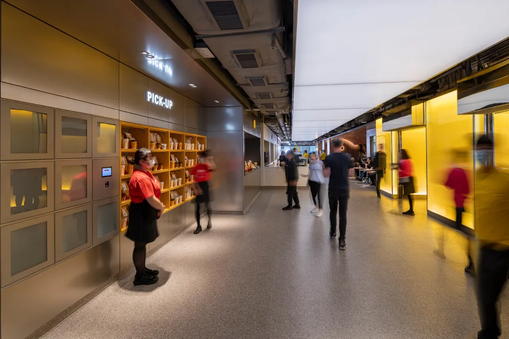
The Millennial gray-ification of McDonald’s
The new Admiralty Station McDonald’s design was led by the Sydney-based design agency Landini Associates. Back in 2015, Landini Associates also spearheaded “Project Ray,” an all-encompassing McDonald’s rebrand named for Ray Kroc, the businessman widely credited with turning McDonald’s from a small hamburger stand into a fast-food corporation. Project Ray included rethinking the chain’s interiors, modernizing its graphic design, and even changing employees’ uniforms, all in a bid to “make McDonald’s cool again” and re-attract millennials to the brand.
The first Project Ray redesign originally debuted at Admiralty Station, introducing a sleeker, more minimalist McDonald’s model accented with concrete, glass, and stainless steel—quite the contrast to the bright red-and-yellow stores customers might remember from the ’80s and ’90s. Landini Associates’ idea of a modern McDonald’s quickly caught on at other locations in Chicago, New York, San Francisco, Beijing, and more.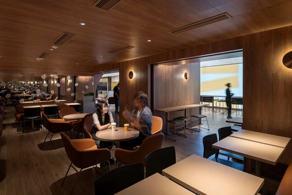
“The energetic environments that have been the signature for McDonald’s are now replaced with a simpler, calmer, and more classic feel,” Mark Landini, creative director of Landini Associates, told Architectural Products of Project Ray in 2023.
Ten years on, Project Ray is still expanding to new McDonald’s restaurants. Still, the concept’s millennial gray-ification of McDonald’s has perhaps become a bit of a relic of the mid-2010s, when many fast-food restaurants began stepping back from expressive design for a more standardized fast-casual look.
In contrast, over the past several months, McDonald’s has been more broadly embracing its fans’ nostalgia for its ’80s and ’90s marketing, bringing back brand characters like Grimace, CosMc, and Uncle O’Grimacey. Landini Associates’ updated Admiralty Station, which it’s calling a “Ray-Naissance,” seems to lean into this new tack by incorporating a bit more color, energy, and a few classic callbacks into its design.
McDonald’s of the future
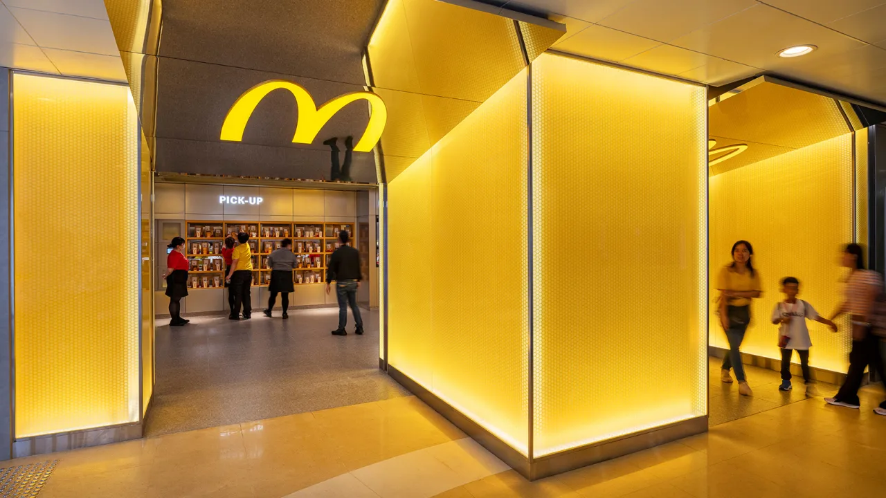
When visitors enter the new Admiralty Station McDonald’s, they’ll first be greeted with a gigantic, modernized version of the original golden arches, complete with a few subtle nods to the iconic branding of the very first McDonald’s restaurants.
“As customers rise from the station below, they’re welcomed by a reflective double-canopy entrance—a contemporary homage to McDonald’s original roofline and a nod to Ray Kroc’s classic design,” a press release on the redesign reads. “Now framed by glowing feature walls in McDonald’s signature yellow, aimed at creating an unmissable beacon—just like the earliest restaurants once were.”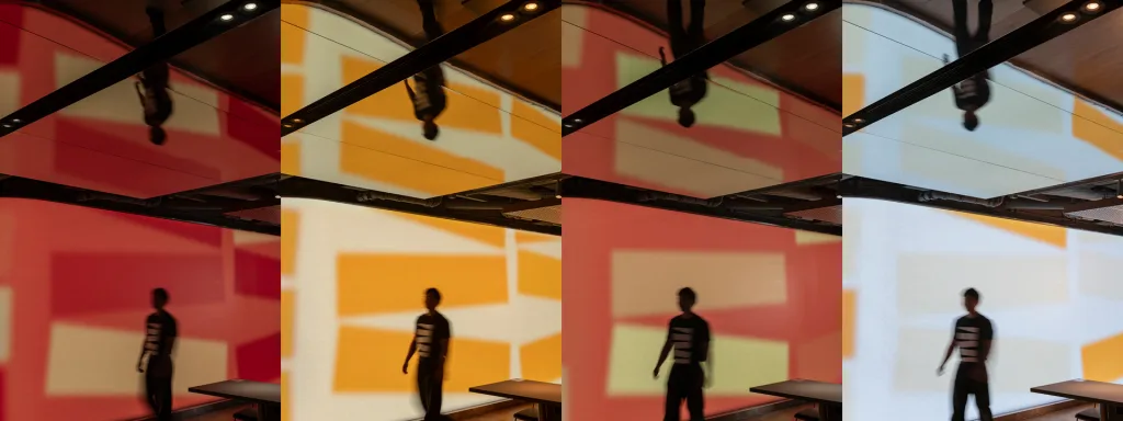
Past this bright yellow entryway is the new restaurant’s defining feature: a 70-foot-long curving digital screen called the “Mood Engine.” Shape-wise, it’s a bit reminiscent of the subway trains themselves, and its moving images also build on the idea that it’s a fantastical continuation of the station’s transit. According to the press release, it “pulses with curated animations, dynamic color transitions, and playful bursts of McDonaldland characters,” bringing in a bit of the classic McDonald’s character that might’ve been missing in the previous design.
To be clear, the new Admiralty Station McDonald’s is a far cry from the fast-food restaurants of the ’80s, when McDonaldland characters abounded. The concept is clearly intended for customers of the future, including a fast-service lobby filled with digital kiosks that can serve those 1,200 customers per hour; a first-of-its-kind McCafé Bar space made entirely from recycled plastic; tabletops made with 100% recycled laminate pulp and coffee grounds; and a fully LED lighting system intended for energy efficiency (that includes the Mood Engine wall.)
Still, the design provides a sneak peek into what McDonald’s might look like several years from now: slightly brighter, more personalized, and tied to the company’s roots.
“Our original design for Ray has proven its intent, to be a classically neutral and long-lasting space,” Landini said in the press release. “This ‘Ray-Naissance’ can now shift from calm to energetic, playfully branded to locally nuanced. . . . Like a chameleon, it responds to its environment.”