


![[The AI Show Episode 145]: OpenAI Releases o3 and o4-mini, AI Is Causing “Quiet Layoffs,” Executive Order on Youth AI Education & GPT-4o’s Controversial Update](https://www.marketingaiinstitute.com/hubfs/ep%20145%20cover.png)


![[DEALS] Microsoft 365: 1-Year Subscription (Family/Up to 6 Users) (23% off) & Other Deals Up To 98% Off – Offers End Soon!](https://www.javacodegeeks.com/wp-content/uploads/2012/12/jcg-logo.jpg)


![From Art School Drop-out to Microsoft Engineer with Shashi Lo [Podcast #170]](https://cdn.hashnode.com/res/hashnode/image/upload/v1746203291209/439bf16b-c820-4fe8-b69e-94d80533b2df.png?#)


(1).jpg?#)


_Inge_Johnsson-Alamy.jpg?width=1280&auto=webp&quality=80&disable=upscale#)


![Apple to Split iPhone Launches Across Fall and Spring in Major Shakeup [Report]](https://www.iclarified.com/images/news/97211/97211/97211-640.jpg)
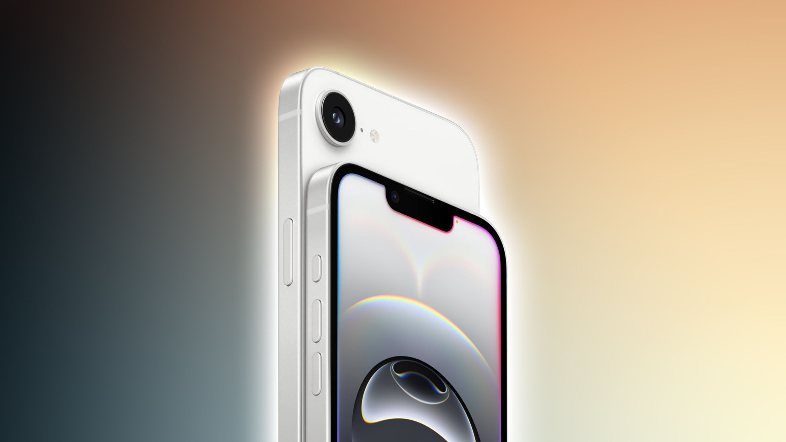
![Apple to Move Camera to Top Left, Hide Face ID Under Display in iPhone 18 Pro Redesign [Report]](https://www.iclarified.com/images/news/97212/97212/97212-640.jpg)
![Apple Developing Battery Case for iPhone 17 Air Amid Battery Life Concerns [Report]](https://www.iclarified.com/images/news/97208/97208/97208-640.jpg)
![AirPods 4 On Sale for $99 [Lowest Price Ever]](https://www.iclarified.com/images/news/97206/97206/97206-640.jpg)


![[Updated] Samsung’s 65-inch 4K Smart TV Just Crashed to $299 — That’s Cheaper Than an iPad](https://www.androidheadlines.com/wp-content/uploads/2025/05/samsung-du7200.jpg)


A responsive footer menu with social media icons
Lets start with the HTML Code: HTML: Responsive Footer Menu Terms & Conditions Privacy Policy Contact Us About Us Next up, time to add some CSS Styling CSS: * { box-sizing: border-box; margin: 0; padding: 0; font-family: Arial, sans-serif; } body { display: flex; flex-direction: column; min-height: 100vh; justify-content: space-between; } .footer { background-color: #333; color: white; padding: 20px 0; text-align: center; } .footer-container { display: flex; flex-direction: column; align-items: center; justify-content: center; } .footer-social { margin-bottom: 20px; } .footer-social-icon { margin: 0 10px; } .footer-social-icon img { width: 30px; height: 30px; } .footer-links { display: flex; flex-wrap: wrap; justify-content: center; } .footer-link { color: white; margin: 5px 15px; text-decoration: none; } .footer-link:hover { text-decoration: underline; } @media (min-width: 600px) { .footer-container { flex-direction: row; justify-content: space-between; align-items: center; } .footer-social { margin-bottom: 0; } .footer-links { justify-content: flex-end; } } Last but not least, lets add some JavaScript: JavaScript: // JavaScript code if needed for future enhancements document.addEventListener('DOMContentLoaded', function() { // Placeholder for any future JavaScript functionality console.log("Footer loaded"); }); Code Explanation: 1. HTML: We create a footer element with a class of footer. Inside the footer, there's a footer-container which contains two main sections: footer-social and footer-links. footer-social contains anchor tags () with links to WhatsApp, Facebook, and LinkedIn. Each anchor tag wraps an image representing the social media icon. footer-links contains anchor tags pointing to different pages such as Terms & Conditions, Privacy Policy, Contact Us, and About Us. 2. CSS: Basic styles are applied to all elements to ensure consistent box-sizing and remove default margins and paddings. The body is set to use flexbox to ensure the footer is positioned at the bottom of the viewport. The footer section has a dark background color and white text, with padding for spacing. The footer-container uses flexbox to align its children elements in a column on small screens and a row on larger screens. Social media icons are styled to have a specific size, and links are styled for better visibility and interactivity. 3. JavaScript: A basic JavaScript snippet is included to handle any future enhancements. Currently, it only logs a message when the footer is loaded. Tips & Tricks: Responsive Design: Use media queries to adjust the layout for different screen sizes. Here, we switch from column to row layout on screens wider than 600px. Flexbox: Utilizes flexbox for easy alignment and spacing of elements. External Links: Ensure social media links open in a new tab using target="_blank". Accessibility: Provide descriptive alt attributes for images to improve accessibility.
Lets start with the HTML Code:
HTML:
Responsive Footer Menu
Next up, time to add some CSS Styling
CSS:
* {
    box-sizing: border-box;
    margin: 0;
    padding: 0;
    font-family: Arial, sans-serif;
}

body {
    display: flex;
    flex-direction: column;
    min-height: 100vh;
    justify-content: space-between;
}

.footer {
    background-color: #333;
    color: white;
    padding: 20px 0;
    text-align: center;
}

.footer-container {
    display: flex;
    flex-direction: column;
    align-items: center;
    justify-content: center;
}

.footer-social {
    margin-bottom: 20px;
}

.footer-social-icon {
    margin: 0 10px;
}

.footer-social-icon img {
    width: 30px;
    height: 30px;
}

.footer-links {
    display: flex;
    flex-wrap: wrap;
    justify-content: center;
}

.footer-link {
    color: white;
    margin: 5px 15px;
    text-decoration: none;
}

.footer-link:hover {
    text-decoration: underline;
}

@media (min-width: 600px) {
    .footer-container {
        flex-direction: row;
        justify-content: space-between;
        align-items: center;
    }

    .footer-social {
        margin-bottom: 0;
    }

    .footer-links {
        justify-content: flex-end;
    }
}
Last but not least, lets add some JavaScript:
JavaScript:
// JavaScript code if needed for future enhancements
document.addEventListener('DOMContentLoaded', function() {
    // Placeholder for any future JavaScript functionality
    console.log("Footer loaded");
});
Code Explanation:
1. HTML:
We create a footer element with a class of footer.
Inside the footer, there's a footer-container which contains two main sections: footer-social and footer-links.
footer-social contains anchor tags () with links to WhatsApp, Facebook, and LinkedIn. Each anchor tag wraps an image representing the social media icon.
footer-links contains anchor tags pointing to different pages such as Terms & Conditions, Privacy Policy, Contact Us, and About Us.
2. CSS:
Basic styles are applied to all elements to ensure consistent box-sizing and remove default margins and paddings.
The body is set to use flexbox to ensure the footer is positioned at the bottom of the viewport.
The footer section has a dark background color and white text, with padding for spacing.
The footer-container uses flexbox to align its children elements in a column on small screens and a row on larger screens.
Social media icons are styled to have a specific size, and links are styled for better visibility and interactivity.
3. JavaScript:
A basic JavaScript snippet is included to handle any future enhancements. Currently, it only logs a message when the footer is loaded.
Tips & Tricks:
- Responsive Design: Use media queries to adjust the layout for different screen sizes. Here, we switch from column to row layout on screens wider than 600px.
- Flexbox: Utilizes flexbox for easy alignment and spacing of elements.
- External Links: Ensure social media links open in a new tab using
target="_blank". - Accessibility: Provide descriptive alt attributes for images to improve accessibility.