


![[The AI Show Episode 144]: ChatGPT’s New Memory, Shopify CEO’s Leaked “AI First” Memo, Google Cloud Next Releases, o3 and o4-mini Coming Soon & Llama 4’s Rocky Launch](https://www.marketingaiinstitute.com/hubfs/ep%20144%20cover.png)


![Is this too much for a modular monolith system? [closed]](https://i.sstatic.net/pYL1nsfg.png)


_Andreas_Prott_Alamy.jpg?width=1280&auto=webp&quality=80&disable=upscale#)


![What features do you get with Gemini Advanced? [April 2025]](https://i0.wp.com/9to5google.com/wp-content/uploads/sites/4/2024/02/gemini-advanced-cover.jpg?resize=1200%2C628&quality=82&strip=all&ssl=1)


![Apple Shares Official Trailer for 'Long Way Home' Starring Ewan McGregor and Charley Boorman [Video]](https://www.iclarified.com/images/news/97069/97069/97069-640.jpg)
![Apple Watch Series 10 Back On Sale for $299! [Lowest Price Ever]](https://www.iclarified.com/images/news/96657/96657/96657-640.jpg)
![EU Postpones Apple App Store Fines Amid Tariff Negotiations [Report]](https://www.iclarified.com/images/news/97068/97068/97068-640.jpg)
![Apple Slips to Fifth in China's Smartphone Market with 9% Decline [Report]](https://www.iclarified.com/images/news/97065/97065/97065-640.jpg)


Using Big Data Visualization to Drive Employee Performance Management
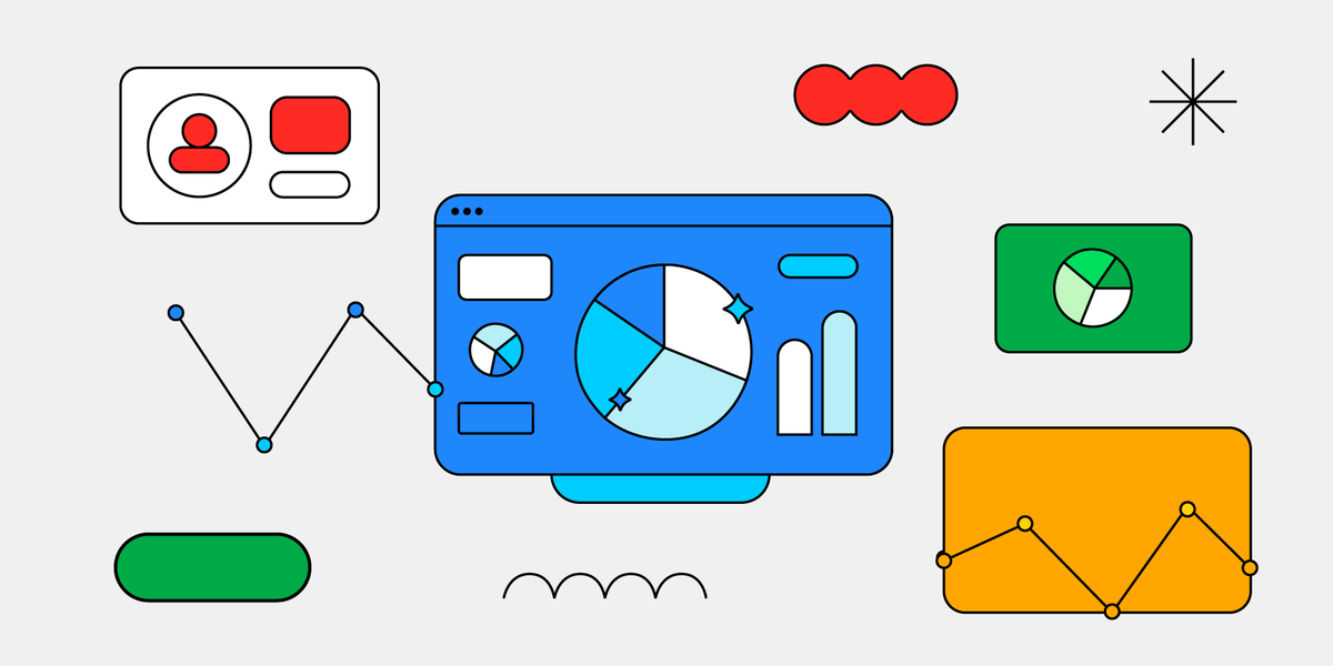
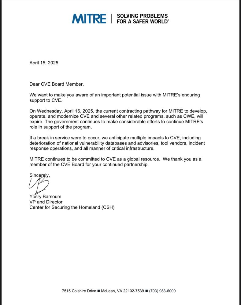
Modern businesses increasingly rely on data to improve internal efficiency, and big data visualization is now at the heart of optimizing employee performance. By transforming vast HR and operational datasets into intuitive visuals, managers gain actionable insights into productivity, engagement, and workforce development trends—helping teams perform at their best. Why Visualizing Employee Data Matters Traditional performance evaluations often rely on static reports and subjective assessments. In contrast, visual data dashboards present real-time, measurable insights into how individuals and teams are performing across KPIs like output, attendance, training completion, and peer feedback. This dynamic view allows leaders to spot both top talent and at-risk employees early, enabling proactive coaching and more effective workforce planning. Core Components of Performance-Focused Visualization To build meaningful employee performance dashboards, organizations first need structured data—from timesheets and project tracking tools to learning platforms and pulse surveys. Once clean and centralized, these inputs power visual elements like: Performance heatmaps: Reveal which departments or employees are excelling or underperforming. Trend lines: Show progression over time in output or goal achievement. Radar charts: Compare competencies across roles or individuals. Design best practices like consistent color usage, clear legends, and logical grouping improve readability and ensure decision-makers can act quickly on what they see. Benefits of Visual Performance Management Organizations using visual analytics for performance see stronger alignment between employee goals and company objectives. Dashboards reduce ambiguity, foster transparency, and shift performance discussions from opinion-based to data-informed. Managers can identify bottlenecks and reallocate tasks accordingly. HR teams can visualize engagement dips after policy changes or during onboarding phases. These insights allow for timely, targeted interventions—improving retention and morale. Top Tools for Visualizing Employee Performance The right platform depends on company size, HR tool integration, and analytical complexity. Below is an overview of platforms gaining traction in performance management: Visier People Visier focuses exclusively on people analytics. It brings together HRIS, payroll, and survey data into robust dashboards. The tool excels at highlighting workforce trends and identifying turnover risks. Pros: Designed for HR, predictive modeling Cons: Higher cost, enterprise focus Microsoft Power BI Power BI connects easily with HR tools like Workday and BambooHR, enabling custom dashboards that track KPIs across departments. Pros: Affordable, highly customizable Cons: Requires data modeling know-how Tableau Tableau offers rich visual capabilities, allowing organizations to build complex dashboards for executive-level performance monitoring. It supports blending data from multiple sources. Pros: Deep visualization power Cons: Steep learning curve, license cost Lattice Though primarily a performance management system, Lattice offers built-in dashboards for goal tracking, reviews, and engagement metrics. Pros: User-friendly, HR-focused Cons: Limited custom reporting How to Choose the Right Tool for Performance Data Below is a simplified comparison table to help align your needs with available tools: Tool Best For Strengths Drawbacks Visier Enterprise HR teams Deep people analytics Expensive, complex setup Power BI Mid-size businesses Flexibility + integrations Needs technical skill Tableau Data-rich environments Advanced visuals Steep learning curve Lattice HR process automation Built-in goal tracking Limited visual options Use Cases Across Industries Tech: Visual dashboards track developer output, sprint velocity, and code review participation. Retail: Store-level dashboards highlight sales performance and customer service feedback. Healthcare: Charts reveal training compliance and patient interaction quality by department. Each industry can tailor dashboards to the metrics that matter most—boosting both accountability and recognition efforts. Common Pitfalls to Avoid Data overload: More data isn’t always better. Focus on the KPIs that directly relate to business goals. Lack of context: Visuals without interpretation can mislead. Always pair dashboards with narrative or commentary. Neglecting privacy: Performance data must be handled carefully. Set access controls and anonymize where appropriate. Conclusion: Visualizing Growth and Performance Big data visualization empowers organizations to shift from reactive to proactive performance management. Whether identifying disengaged employees, recognizing top contributors, or forecasting team capacity, visual dashboards
Modern businesses increasingly rely on data to improve internal efficiency, and big data visualization is now at the heart of optimizing employee performance. By transforming vast HR and operational datasets into intuitive visuals, managers gain actionable insights into productivity, engagement, and workforce development trends—helping teams perform at their best.
Why Visualizing Employee Data Matters
Traditional performance evaluations often rely on static reports and subjective assessments. In contrast, visual data dashboards present real-time, measurable insights into how individuals and teams are performing across KPIs like output, attendance, training completion, and peer feedback.
This dynamic view allows leaders to spot both top talent and at-risk employees early, enabling proactive coaching and more effective workforce planning.
Core Components of Performance-Focused Visualization
To build meaningful employee performance dashboards, organizations first need structured data—from timesheets and project tracking tools to learning platforms and pulse surveys. Once clean and centralized, these inputs power visual elements like:
- Performance heatmaps: Reveal which departments or employees are excelling or underperforming.
- Trend lines: Show progression over time in output or goal achievement.
- Radar charts: Compare competencies across roles or individuals.
Design best practices like consistent color usage, clear legends, and logical grouping improve readability and ensure decision-makers can act quickly on what they see.
Benefits of Visual Performance Management
Organizations using visual analytics for performance see stronger alignment between employee goals and company objectives. Dashboards reduce ambiguity, foster transparency, and shift performance discussions from opinion-based to data-informed.
Managers can identify bottlenecks and reallocate tasks accordingly. HR teams can visualize engagement dips after policy changes or during onboarding phases. These insights allow for timely, targeted interventions—improving retention and morale.
Top Tools for Visualizing Employee Performance
The right platform depends on company size, HR tool integration, and analytical complexity. Below is an overview of platforms gaining traction in performance management:
Visier People
Visier focuses exclusively on people analytics. It brings together HRIS, payroll, and survey data into robust dashboards. The tool excels at highlighting workforce trends and identifying turnover risks.
Pros: Designed for HR, predictive modeling
Cons: Higher cost, enterprise focus
Microsoft Power BI
Power BI connects easily with HR tools like Workday and BambooHR, enabling custom dashboards that track KPIs across departments.
Pros: Affordable, highly customizable
Cons: Requires data modeling know-how
Tableau
Tableau offers rich visual capabilities, allowing organizations to build complex dashboards for executive-level performance monitoring. It supports blending data from multiple sources.
Pros: Deep visualization power
Cons: Steep learning curve, license cost
Lattice
Though primarily a performance management system, Lattice offers built-in dashboards for goal tracking, reviews, and engagement metrics.
Pros: User-friendly, HR-focused
Cons: Limited custom reporting
How to Choose the Right Tool for Performance Data
Below is a simplified comparison table to help align your needs with available tools:
| Tool | Best For | Strengths | Drawbacks |
|---|---|---|---|
| Visier | Enterprise HR teams | Deep people analytics | Expensive, complex setup |
| Power BI | Mid-size businesses | Flexibility + integrations | Needs technical skill |
| Tableau | Data-rich environments | Advanced visuals | Steep learning curve |
| Lattice | HR process automation | Built-in goal tracking | Limited visual options |
Use Cases Across Industries
- Tech: Visual dashboards track developer output, sprint velocity, and code review participation.
- Retail: Store-level dashboards highlight sales performance and customer service feedback.
- Healthcare: Charts reveal training compliance and patient interaction quality by department.
Each industry can tailor dashboards to the metrics that matter most—boosting both accountability and recognition efforts.
Common Pitfalls to Avoid
- Data overload: More data isn’t always better. Focus on the KPIs that directly relate to business goals.
- Lack of context: Visuals without interpretation can mislead. Always pair dashboards with narrative or commentary.
- Neglecting privacy: Performance data must be handled carefully. Set access controls and anonymize where appropriate.
Conclusion: Visualizing Growth and Performance
Big data visualization empowers organizations to shift from reactive to proactive performance management. Whether identifying disengaged employees, recognizing top contributors, or forecasting team capacity, visual dashboards provide the clarity leaders need to take confident action.
By choosing the right platform and integrating it with existing HR systems, companies can develop a performance management culture rooted in transparency, continuous improvement, and data-informed decision-making.