


![[The AI Show Episode 144]: ChatGPT’s New Memory, Shopify CEO’s Leaked “AI First” Memo, Google Cloud Next Releases, o3 and o4-mini Coming Soon & Llama 4’s Rocky Launch](https://www.marketingaiinstitute.com/hubfs/ep%20144%20cover.png)


![Is This Programming Paradigm New? [closed]](https://miro.medium.com/v2/resize:fit:1200/format:webp/1*nKR2930riHA4VC7dLwIuxA.gif)


(1).jpg?#)
.jpg?#)


-Classic-Nintendo-GameCube-games-are-coming-to-Nintendo-Switch-2!-00-00-13.png?width=1920&height=1920&fit=bounds&quality=70&format=jpg&auto=webp#)


_Olekcii_Mach_Alamy.jpg?width=1280&auto=webp&quality=80&disable=upscale#)


![M4 MacBook Air Drops to New All-Time Low of $912 [Deal]](https://www.iclarified.com/images/news/97108/97108/97108-640.jpg)
![New iPhone 17 Dummy Models Surface in Black and White [Images]](https://www.iclarified.com/images/news/97106/97106/97106-640.jpg)


The Art of Data Storytelling: What I Learned
We all know the pain of sitting through a presentation filled with charts that don’t tell us much or worse, confuse us more than clarify. I recently read Storytelling with Data and it completely shifted the way I think about communicating insights. This isn’t just about pretty visuals. It’s about clear, meaningful communication, especially when you're working with project sponsors, business users, or delivery teams. Know Your People First Before diving into dashboards or diagrams, pause and ask: Who is this for? That clarity changes everything. Project sponsors need confidence that your solution maps to the business goals. Business users want functionality that makes their lives easier. Delivery teams care about feasibility and handoffs. If you don’t know your audience’s goals, pain points, and decision power, it’s like planning a trip without a destination. Tailoring your message to each stakeholder group ensures your work stays relevant and actionable. Explanatory Analysis: Go from Messy to Meaningful This is where the rubber meets the road. Explanatory analysis is about refining raw input—data, conversations, assumptions into clear, prioritized requirements. Here’s a simple guide: Who? Which stakeholder or user group has this need? What? What specific outcome or capability are they after? How? In what process or context will they use this? You’re basically turning chaos into clarity. It’s detective work, really listening, translating, and simplifying. The 3-Minute Story: Nail the Essence Fast Imagine you're in a kickoff meeting, and time is tight. You’ve got just three minutes to explain a key requirement. What do you say? This is your 3-minute story. No fluff. No jargon. Start with the core need. What does this user or team absolutely need to succeed? Explain the benefit. How will this requirement improve things—faster workflow, reduced risk, better decision-making? This mini-story helps you (and everyone else) zoom in on what matters most. If you can’t explain it clearly in three minutes, you probably haven’t understood it well enough yet. Use a Storyboard Before You Get Fancy Before writing specs or building wireframes, sketch out the user flow—simple slides or diagrams that show how users interact with the solution. Think of it like mapping a journey: Where does the user start? What actions do they take? What results or outcomes do they expect? These early sketches make a huge difference. They force you to think logically and spot missing pieces before things get complex (and costly). Gestalt Principles: Design That Feels Right You don’t need to be a graphic designer to make your visuals work harder. Just use some basic Gestalt principles to help the eye make sense of things. Here’s what that looks like: Proximity: Group related items together—like listing all steps of a process close by. Similarity: Use consistent shapes or colors to show similar types of data or requirements. Alignment: Line things up neatly. Misaligned visuals distract and confuse. These are small tweaks, but they can make your requirements diagrams or dashboards instantly clearer. Tell the Whole Story, Step by Step When presenting your requirements—whether in a deck, a doc, or a meeting—follow a logical narrative: Context: What business goals and challenges are we trying to solve? Key Findings: What data or research tells us there’s a need? Requirements: What exactly do we need to build or deliver? Impact: What are the expected benefits or risks tied to these requirements? Next Steps: What’s the plan to validate, prioritize, and assign ownership? This flow keeps things grounded and moves the conversation forward. It’s not just “Here’s the data,” but “Here’s what it means, and what we’re doing next.” Final Thoughts Reading Storytelling with Data reminded me that clarity is everything—and that applies just as much to requirements as it does to analytics. Whether you’re writing user stories, building a roadmap, or presenting to the execs, the ability to tell a focused, visual, and human-centered story makes all the difference. Next time you’re knee-deep in a project, ask yourself: What story am I telling—and who needs to hear it?

We all know the pain of sitting through a presentation filled with charts that don’t tell us much or worse, confuse us more than clarify. I recently read Storytelling with Data and it completely shifted the way I think about communicating insights. This isn’t just about pretty visuals. It’s about clear, meaningful communication, especially when you're working with project sponsors, business users, or delivery teams.
Know Your People First
Before diving into dashboards or diagrams, pause and ask: Who is this for? That clarity changes everything.
- Project sponsors need confidence that your solution maps to the business goals.
- Business users want functionality that makes their lives easier.
- Delivery teams care about feasibility and handoffs.
If you don’t know your audience’s goals, pain points, and decision power, it’s like planning a trip without a destination. Tailoring your message to each stakeholder group ensures your work stays relevant and actionable.
Explanatory Analysis: Go from Messy to Meaningful
This is where the rubber meets the road. Explanatory analysis is about refining raw input—data, conversations, assumptions into clear, prioritized requirements.
Here’s a simple guide:

- Who? Which stakeholder or user group has this need?
- What? What specific outcome or capability are they after?
- How? In what process or context will they use this?
You’re basically turning chaos into clarity. It’s detective work, really listening, translating, and simplifying.
The 3-Minute Story: Nail the Essence Fast
Imagine you're in a kickoff meeting, and time is tight. You’ve got just three minutes to explain a key requirement. What do you say?
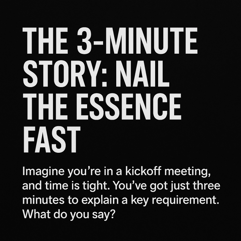
This is your 3-minute story. No fluff. No jargon.
- Start with the core need. What does this user or team absolutely need to succeed?
- Explain the benefit. How will this requirement improve things—faster workflow, reduced risk, better decision-making?
This mini-story helps you (and everyone else) zoom in on what matters most. If you can’t explain it clearly in three minutes, you probably haven’t understood it well enough yet.
Use a Storyboard Before You Get Fancy
Before writing specs or building wireframes, sketch out the user flow—simple slides or diagrams that show how users interact with the solution.
Think of it like mapping a journey:
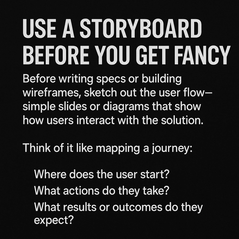
- Where does the user start?
- What actions do they take?
- What results or outcomes do they expect?
These early sketches make a huge difference. They force you to think logically and spot missing pieces before things get complex (and costly).
Gestalt Principles: Design That Feels Right
You don’t need to be a graphic designer to make your visuals work harder. Just use some basic Gestalt principles to help the eye make sense of things.
Here’s what that looks like:
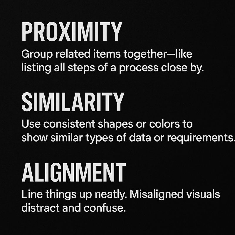
- Proximity: Group related items together—like listing all steps of a process close by.
- Similarity: Use consistent shapes or colors to show similar types of data or requirements.
- Alignment: Line things up neatly. Misaligned visuals distract and confuse.
These are small tweaks, but they can make your requirements diagrams or dashboards instantly clearer.
Tell the Whole Story, Step by Step
When presenting your requirements—whether in a deck, a doc, or a meeting—follow a logical narrative:
- Context: What business goals and challenges are we trying to solve?
- Key Findings: What data or research tells us there’s a need?
- Requirements: What exactly do we need to build or deliver?
- Impact: What are the expected benefits or risks tied to these requirements?
- Next Steps: What’s the plan to validate, prioritize, and assign ownership?
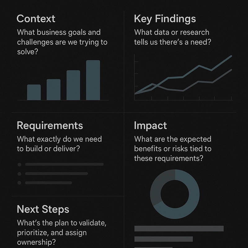
This flow keeps things grounded and moves the conversation forward. It’s not just “Here’s the data,” but “Here’s what it means, and what we’re doing next.”
Final Thoughts
Reading Storytelling with Data reminded me that clarity is everything—and that applies just as much to requirements as it does to analytics. Whether you’re writing user stories, building a roadmap, or presenting to the execs, the ability to tell a focused, visual, and human-centered story makes all the difference.
Next time you’re knee-deep in a project, ask yourself: What story am I telling—and who needs to hear it?