


![[The AI Show Episode 142]: ChatGPT’s New Image Generator, Studio Ghibli Craze and Backlash, Gemini 2.5, OpenAI Academy, 4o Updates, Vibe Marketing & xAI Acquires X](https://www.marketingaiinstitute.com/hubfs/ep%20142%20cover.png)


![[DEALS] The Premium Learn to Code Certification Bundle (97% off) & Other Deals Up To 98% Off – Offers End Soon!](https://www.javacodegeeks.com/wp-content/uploads/2012/12/jcg-logo.jpg)

![From drop-out to software architect with Jason Lengstorf [Podcast #167]](https://cdn.hashnode.com/res/hashnode/image/upload/v1743796461357/f3d19cd7-e6f5-4d7c-8bfc-eb974bc8da68.png?#)


.png?#)


_Christophe_Coat_Alamy.jpg?#)
.webp?#)
 (1).webp?#)


![Apple Considers Delaying Smart Home Hub Until 2026 [Gurman]](https://www.iclarified.com/images/news/96946/96946/96946-640.jpg)
![iPhone 17 Pro Won't Feature Two-Toned Back [Gurman]](https://www.iclarified.com/images/news/96944/96944/96944-640.jpg)
![Tariffs Threaten Apple's $999 iPhone Price Point in the U.S. [Gurman]](https://www.iclarified.com/images/news/96943/96943/96943-640.jpg)


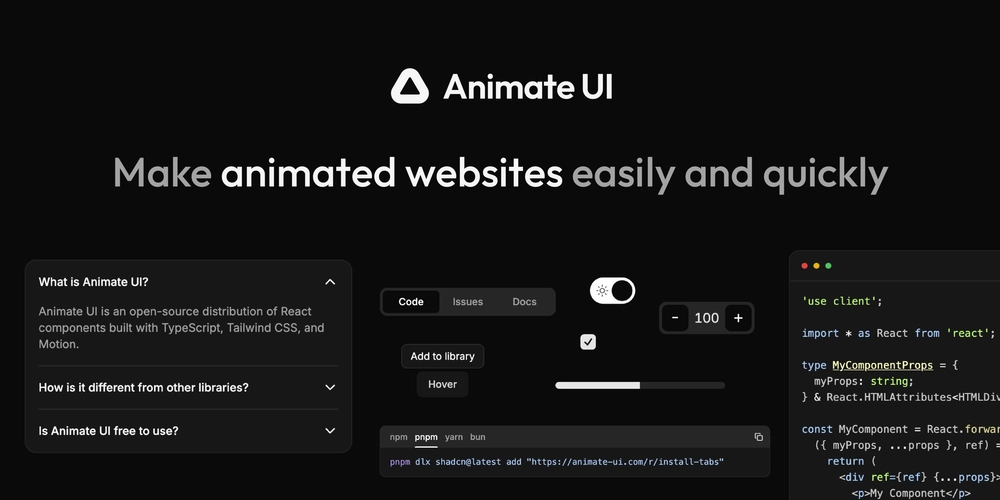
Shadcn Components Animated with Motion (and More!)
Are you looking to supercharge your Shadcn components with fluid, modern animations? Animate UI is an open-source distribution that animates Shadcn/ui with Motion—while retaining all the power and accessibility of Radix primitives. Shadcn Animated Components Animate UI elevates your Shadcn components by bringing smooth transitions and engaging micro-interactions to every element. Whether you’re working with an Accordion, Checkbox, or Dialog, each component feels more intuitive and responsive. The collection is constantly growing, and all components can be copied, customized, and dropped straight into your project. Beyond Shadcn In addition to Radix-based primitives, Animate UI offers a variety of other animated elements like text effects, background transitions, and more. These additions help you maintain a cohesive design language across your entire interface, creating a polished, on-trend experience for users. A Distribution, Not a Library Animate UI follows the Shadcn CLI approach, meaning you copy source files directly into your codebase rather than installing a package. This gives you full ownership—no hidden overrides or rigid constraints. It also integrates smoothly with other component distributions like Shadcn, Magic UI, and more, enhancing rather than replacing your existing setup. Get Started Ready to see your UI come alive? Visit animate-ui.com to explore the available components and discover how Animate UI can transform your React projects. Whether you love Shadcn or simply want top-notch animations, Animate UI offers a flexible, easy-to-adapt solution that makes every interaction stand out!
Are you looking to supercharge your Shadcn components with fluid, modern animations?
Animate UI is an open-source distribution that animates Shadcn/ui with Motion—while retaining all the power and accessibility of Radix primitives.
Shadcn Animated Components
Animate UI elevates your Shadcn components by bringing smooth transitions and engaging micro-interactions to every element. Whether you’re working with an Accordion, Checkbox, or Dialog, each component feels more intuitive and responsive. The collection is constantly growing, and all components can be copied, customized, and dropped straight into your project.
Beyond Shadcn
In addition to Radix-based primitives, Animate UI offers a variety of other animated elements like text effects, background transitions, and more. These additions help you maintain a cohesive design language across your entire interface, creating a polished, on-trend experience for users.
A Distribution, Not a Library
Animate UI follows the Shadcn CLI approach, meaning you copy source files directly into your codebase rather than installing a package. This gives you full ownership—no hidden overrides or rigid constraints. It also integrates smoothly with other component distributions like Shadcn, Magic UI, and more, enhancing rather than replacing your existing setup.
Get Started
Ready to see your UI come alive?
Visit animate-ui.com to explore the available components and discover how Animate UI can transform your React projects. Whether you love Shadcn or simply want top-notch animations, Animate UI offers a flexible, easy-to-adapt solution that makes every interaction stand out!