


![[The AI Show Episode 143]: ChatGPT Revenue Surge, New AGI Timelines, Amazon’s AI Agent, Claude for Education, Model Context Protocol & LLMs Pass the Turing Test](https://www.marketingaiinstitute.com/hubfs/ep%20143%20cover.png)


![[FREE EBOOKS] AI and Business Rule Engines for Excel Power Users, Machine Learning Hero & Four More Best Selling Titles](https://www.javacodegeeks.com/wp-content/uploads/2012/12/jcg-logo.jpg)


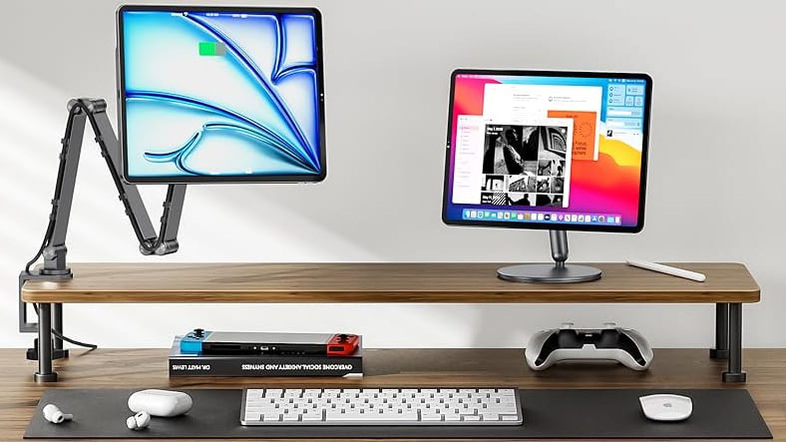
![Hostinger Horizons lets you effortlessly turn ideas into web apps without coding [10% off]](https://i0.wp.com/9to5mac.com/wp-content/uploads/sites/6/2025/04/IMG_1551.png?resize=1200%2C628&quality=82&strip=all&ssl=1)


![This new Google TV streaming dongle looks just like a Chromecast [Gallery]](https://i0.wp.com/9to5google.com/wp-content/uploads/sites/4/2025/04/thomson-cast-150-google-tv-1.jpg?resize=1200%2C628&quality=82&strip=all&ssl=1)


![Apple Drops New Immersive Adventure Episode for Vision Pro: 'Hill Climb' [Video]](https://www.iclarified.com/images/news/97133/97133/97133-640.jpg)
![Most iPhones Sold in the U.S. Will Be Made in India by 2026 [Report]](https://www.iclarified.com/images/news/97130/97130/97130-640.jpg)


SASS / SCSS in a Nutshell
SASS Notes on Marksheet's SASS chapter, with a few additions of my own: https://marksheet.io/sass-scss-less.html SASS Documentation: https://sass-lang.com/documentation/syntax/ CSS preprocessor that extends it; LESS is an alternative, so is SCSS These include variables, functions, reusable components, syntax enhancers in general that generate CSS We'll use SCSS, since it is very similar to CSS (basically a superset; all valid CSS is valid SCSS) Main difference between CSS and SASS is that SASS uses indentation-based syntax (no curly braces) SASS Features variables: instead of repeating #fce473 throughout your CSS file, just set $yellow: #fce473 once (prevents repeating values) nesting: CSS rules can be nested within each other (prevents repeating selectors) partials: import commonly used properties without extra requests or heavier than needed CSS files mixins: custom functions that can accept parameters and will prevent useless repetitions (prevents repeating properties) extensions: an easy way to inherit the same properties of another selector (also prevents repeating properties) operators: adding/substracting/multiplying/dividing values, like 960px / 4 or $space * 2 SASS Variables Variables can be defined and reused You can also define a set of variables and then point one variable to another, so say you want to change primary color from yellow to pink, just update $primary-color // Defining color values $yellow: #fce473; $pink: #c71585; $green: #32cd32; $blue: #1d90ff; // Defining color types $primary-color: $green; .quote{ border-left: 5px solid $primary-color;} .button{ background: $primary-color;} .sidebar a:hover{ border-bottom-color: $primary-color;} .footer a{ color: $primary-color;} It is possible to change any type of content with variables: // Colors $yellow: #fce473; $pink: #c71585; $green: #32cd32; $blue: #1d90ff; $primary-color: $blue; $secondary-color: $yellow; // Fonts $serif: "Lora", "Playfair Display", Georgia, serif; $sans-serif: "Roboto", "Source Sans Pro", "Open Sans", Arial, sans-serif; $monospace: "Inconsolata", monospace; $primary-font: $sans-serif; $secondary-font: $serif; // Spacing $mobile-space: 10px; $desktop-space: 35px; // Also possible to add built-in manipulations for easy color transition & others, for instance: $primary-blue: #1d90ff; button { background: $primary; &:hover { background: lighten($primary-blue, 10%); } &:active { background: darken($primary-blue, 15%); } } SASS Nesting Meant to reuse same parent selector Attempt to replicate HTML's nesting structure in CSS Rule of thumb is to avoid nesting deeper than 3 levels, which would lead to over-specificity and large CSS output For instance: //scss .parent{ .child{} } // becomes in css .parent .child{} So the nested .child element will be applied to elements nested withing elements with the .parent class. What about elements that must have both classes/states at once? Note that these generated CSS classes have no space between class names (so it only applies to elements with both classes) //scss .parent{ &:hover{} &.other-class{} } // becomes in css .parent:hover{} .parent.other-class{} For reference: Generated CSS alongside SCSS selectors: | CSS Selectors | SASS Selectors | |--------------------------------------|-------------------------------------| | `.post-content{}` | `.post-content {` | | `.post-content a{}` | ` a {` | | `.post-content a:hover{}` | ` &:hover {}` | | `.post-content aside{}` | ` aside {}` | | `.post-content blockquote{}` | ` blockquote {}` | | `.post-content code{}` | ` code {}` | | `.post-content h3{}` | ` h3 {` | | `.post-content h3 a{}` | ` a {}` | | `.post-content h4{}` | ` h4 {` | | `.post-content h4:before{}` | ` &:before {}` | | `.post-content h4:after{}` | ` &:after {}` | | `.post-content p{}` | ` p {` | | `.post-content p:first-child{}` | ` &:first-child {}` | | `.post-content p:last-child{}` | ` &:last-child {}` | | `.post-content ul{}` | ` ul {` | | `.post-content ul ul{}` | ` ul {` | | `.post-content ul ul ul{}` | ` ul {}` | | `.post-content dl{}` | ` dl {` |
SASS
- Notes on Marksheet's SASS chapter, with a few additions of my own: https://marksheet.io/sass-scss-less.html
- SASS Documentation: https://sass-lang.com/documentation/syntax/
- CSS preprocessor that extends it; LESS is an alternative, so is SCSS
- These include variables, functions, reusable components, syntax enhancers in general that generate CSS
- We'll use SCSS, since it is very similar to CSS (basically a superset; all valid CSS is valid SCSS)
- Main difference between CSS and SASS is that SASS uses indentation-based syntax (no curly braces)
SASS Features
- variables: instead of repeating #fce473 throughout your CSS file, just set $yellow: #fce473 once (prevents repeating values)
- nesting: CSS rules can be nested within each other (prevents repeating selectors)
- partials: import commonly used properties without extra requests or heavier than needed CSS files
- mixins: custom functions that can accept parameters and will prevent useless repetitions (prevents repeating properties)
- extensions: an easy way to inherit the same properties of another selector (also prevents repeating properties)
- operators: adding/substracting/multiplying/dividing values, like 960px / 4 or $space * 2
SASS Variables
- Variables can be defined and reused
- You can also define a set of variables and then point one variable to another, so say you want to change primary color from yellow to pink, just update $primary-color
// Defining color values
$yellow: #fce473;
$pink: #c71585;
$green: #32cd32;
$blue: #1d90ff;

// Defining color types
$primary-color: $green;

.quote{ border-left: 5px solid $primary-color;}
.button{ background: $primary-color;}
.sidebar a:hover{ border-bottom-color: $primary-color;}
.footer a{ color: $primary-color;}
It is possible to change any type of content with variables:
// Colors
$yellow:              #fce473;
$pink:                #c71585;
$green:               #32cd32;
$blue:                #1d90ff;

$primary-color:       $blue;
$secondary-color:     $yellow;

// Fonts
$serif:               "Lora", "Playfair Display", Georgia, serif;
$sans-serif:          "Roboto", "Source Sans Pro", "Open Sans", Arial, sans-serif;
$monospace:           "Inconsolata", monospace;

$primary-font:        $sans-serif;
$secondary-font:      $serif;

// Spacing
$mobile-space:        10px;
$desktop-space:       35px;

// Also possible to add built-in manipulations for easy color transition & others, for instance:
$primary-blue: #1d90ff;
button {
  background: $primary;
  &:hover { background: lighten($primary-blue, 10%); }
  &:active { background: darken($primary-blue, 15%); }
}
SASS Nesting
- Meant to reuse same parent selector
- Attempt to replicate HTML's nesting structure in CSS
- Rule of thumb is to avoid nesting deeper than 3 levels, which would lead to over-specificity and large CSS output
For instance:
//scss
.parent{
  .child{}
}

// becomes in css
.parent .child{}
So the nested .child element will be applied to elements nested withing elements with the .parent class.
What about elements that must have both classes/states at once?
- Note that these generated CSS classes have no space between class names (so it only applies to elements with both classes)
//scss
.parent{
  &:hover{}
  &.other-class{}
}

// becomes in css
.parent:hover{}
.parent.other-class{}
For reference: Generated CSS alongside SCSS selectors:
| CSS Selectors                        | SASS Selectors                      |
|--------------------------------------|-------------------------------------|
| `.post-content{}`                    | `.post-content {`                  |
| `.post-content a{}`                  | `  a {`                            |
| `.post-content a:hover{}`            | `    &:hover {}`                   |
| `.post-content aside{}`              | `  aside {}`                       |
| `.post-content blockquote{}`         | `  blockquote {}`                  |
| `.post-content code{}`               | `  code {}`                        |
| `.post-content h3{}`                 | `  h3 {`                           |
| `.post-content h3 a{}`               | `    a {}`                         |
| `.post-content h4{}`                 | `  h4 {`                           |
| `.post-content h4:before{}`          | `    &:before {}`                  |
| `.post-content h4:after{}`           | `    &:after {}`                   |
| `.post-content p{}`                  | `  p {`                            |
| `.post-content p:first-child{}`      | `    &:first-child {}`             |
| `.post-content p:last-child{}`       | `    &:last-child {}`              |
| `.post-content ul{}`                 | `  ul {`                           |
| `.post-content ul ul{}`              | `    ul {`                         |
| `.post-content ul ul ul{}`           | `      ul {}`                      |
| `.post-content dl{}`                 | `  dl {`                           |
| `.post-content dl:before{}`          | `    &:before {}`                  |
| `.post-content dl dt{}`              | `    dt {}`                        |
| `.post-content dl dd{}`              | `    dd {}`                        |
| `.post-content pre{}`                | `  pre {`                          |
| `.post-content pre code{}`           | `    code {}`                      |
| `.post-content table{}`              | `  table {`                        |
| `.post-content table tr{}`           | `    tr {`                         |
| `.post-content table tr:nth-child(2n){}` | `      &:nth-child(2n) {}`     |
| `.post-content table th,`            | `    th,`                          |
| `.post-content table td{}`           | `    td {`                         |
| `.post-content table th{}`           | `    th {}`                        |
| `.post-content table td.empty,`      | `      &.empty {}`                 |
| `.post-content table th.empty{}`     | `    }`                            |
| `.post-content table code{}`         | `    code {}`                      |
| `.post-content table pre{}`          | `    pre {`                        |
| `.post-content table pre:before{}`   | `      &:before {}`                |
```
{% endraw %}
{% raw %}`

### SASS Mixins

- A mixin is basically a predefined set of properties and values that can be reused. Example:

`{% endraw %}{% raw %}``scss
@mixin overlay() {
  bottom: 0;
  left: 0;
  position: absolute;
  right: 0;
  top: 0;
}

/** This mixin called within this class... **/
.modal-background{
  @include overlay();
  background: black;
  opacity: 0.9;
}

/** ...will generate the following CSS: **/

.modal-background{
  bottom: 0;
  left: 0;
  position: absolute;
  right: 0;
  top: 0;
  background: black;
  opacity: 0.9;
}
``{% endraw %}{% raw %}`

#### X.7.4.1 Mixin Parameters

- Mixins can also accept parameters; ex:

`{% endraw %}{% raw %}``scss
@mixin border-radius($radius) {
  -webkit-border-radius: $radius;
     -moz-border-radius: $radius;
      -ms-border-radius: $radius;
          border-radius: $radius;
}

/** This mixin called within this class... **/

.box{
  @include border-radius(3px);
}


/** ...will generate the following CSS: **/

.box{
  -webkit-border-radius: 3px;
     -moz-border-radius: 3px;
      -ms-border-radius: 3px;
          border-radius: 3px;
}
``{% endraw %}{% raw %}`

#### X.7.4.2 Mixins Default Parameters

- It is possible to add default and optional mixin parameters.
- For instance, see this one meant to add labels in the top left of code snippet blocks:

`{% endraw %}{% raw %}``scss
@mixin label($text: "Code", $background: $yellow, $color: rgba(black, 0.5)) {
  position: relative;
  &:before{
    background: $background;
    color: $color;
    content: $text;
    display: inline-block;
    font-size: 0.6rem;
    font-weight: 700;
    height: 1rem;
    left: 0;
    letter-spacing: 0.1em;
    line-height: 1rem;
    padding: 0 0.5em;
    position: absolute;
    text-transform: uppercase;
    top: 0;
  }
}

/* used here: */

div.highlighter-rouge{
  @include label(); /* will use default "Code", $yellow and  rgba(black, 0.5) values */
  &.css{ /* will have specific values for codeblocks with css class */
    @include label("CSS", $blue, white);
  }
  &.scss{ /* will have specific values for codeblocks with scss class */
    @include label("SCSS", #c69, white);
  }
}

``{% endraw %}{% raw %}`

### SASS Extensions and Placeholders
- These are very similar to mixins; the difference is that mixins write to css directly, and extensors and placeholders only reference it, so they are "more elegant"
- Placeholders are basically silent classes that do not output to CSS unless extended
- When in doubt, use mixins as they are the most straightforward
- As a rule of thumb, use mixins when you need params and placeholders/extensors when you do not
- As a rule of thumb, use extensions when the base class will also be used in HTML and extensions + placeholders when the base class will be absent from the HTML but classes extending from it will be in the HTML

- Extend syntax (allows to inherit CSS properties):
`{% endraw %}{% raw %}``scss
// scss
.small-uppercase{
  color: lightslategrey;
  font-size: 10px;
  letter-spacing: 0.1em;
  line-height: 12px;
  text-transform: uppercase;
}

.modal-background{
  @extend .small-uppercase;
}

.product-link{
  @extend .small-uppercase;
}

// generated css
.small-uppercase,
.modal-background,
.product-link,{
  color: lightslategrey;
  font-size: 10px;
  letter-spacing: 0.1em;
  line-height: 12px;
  text-transform: uppercase;
}
``{% endraw %}{% raw %}`

- Note how .small-uppercase was also generated as a class. What if we don't want to do this, to keep our CSS as flat and clean as possible?

```scss
// scss
%small-uppercase{
  color: lightslategrey;
  font-size: 10px;
  letter-spacing: 0.1em;
  line-height: 12px;
  text-transform: uppercase;
}

.modal-background{
  @extend %small-uppercase;
}

.product-link{
  @extend %small-uppercase;
}

.image-pattern{
  @extend %small-uppercase;
}

// generated css
.modal-background,
.product-link,
.image-pattern{
  color: lightslategrey;
  font-size: 10px;
  letter-spacing: 0.1em;
  line-height: 12px;
  text-transform: uppercase;
}
```

| Use Mixins When            | Use Extends When           |
|----------------------------|----------------------------|
| Need parameters            | Static styles              |
| Output varies per instance | Reducing duplicated styles |

### SASS Control Directives
- SASS offer directives such as loops and conditionals
- These can be used to generate repetitive styles efficiently

```scss
// For loops
@for $i from 1 through 4 {
  .mt-#{$i} { margin-top: #{$i * 5}px; }
}

// Each loops
$colors: (primary: blue, secondary: green);
@each $name, $color in $colors {
  .text-#{$name} { color: $color; }
}

// If statements
@mixin theme($dark: false) {
  @if $dark { background: black; }
  @else { background: white; }
}
```