


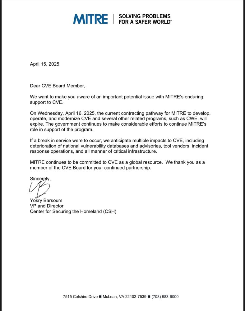
![[The AI Show Episode 144]: ChatGPT’s New Memory, Shopify CEO’s Leaked “AI First” Memo, Google Cloud Next Releases, o3 and o4-mini Coming Soon & Llama 4’s Rocky Launch](https://www.marketingaiinstitute.com/hubfs/ep%20144%20cover.png)


![Is this too much for a modular monolith system? [closed]](https://i.sstatic.net/pYL1nsfg.png)


_Andreas_Prott_Alamy.jpg?width=1280&auto=webp&quality=80&disable=upscale#)


![What features do you get with Gemini Advanced? [April 2025]](https://i0.wp.com/9to5google.com/wp-content/uploads/sites/4/2024/02/gemini-advanced-cover.jpg?resize=1200%2C628&quality=82&strip=all&ssl=1)


![Apple Shares Official Trailer for 'Long Way Home' Starring Ewan McGregor and Charley Boorman [Video]](https://www.iclarified.com/images/news/97069/97069/97069-640.jpg)
![Apple Watch Series 10 Back On Sale for $299! [Lowest Price Ever]](https://www.iclarified.com/images/news/96657/96657/96657-640.jpg)
![EU Postpones Apple App Store Fines Amid Tariff Negotiations [Report]](https://www.iclarified.com/images/news/97068/97068/97068-640.jpg)
![Apple Slips to Fifth in China's Smartphone Market with 9% Decline [Report]](https://www.iclarified.com/images/news/97065/97065/97065-640.jpg)


Making GPay Smarter with Tags: UX for Real-World Spending
Introduction Hi, I’m Shivansh, a multidisciplinary designer with a focus on UI/UX, graphic design, logos, product, and brand identity. I’m passionate about building meaningful digital experiences that help brands connect, communicate, and grow. Here in this project I explore a new conceptual feature—Tags—for one of India’s most widely used payment platforms, Google Pay (GPay). The feature aims to improve how users track and organize their transactions through a smart and intuitive tagging system. Disclaimer: This is a self-initiated, personal project. It is not affiliated with or commissioned by Google. What is GPay? Google Pay is a secure, user-friendly digital payments platform developed by Google and built on India’s UPI system. It enables seamless bank transfers, bill payments, and purchases—while ensuring top-tier encryption and integration across the Google ecosystem. Why Google Pay? I chose GPay simply because it’s the app I use every day—just like most people around me. It’s quick, clean, and does exactly what I need without getting in the way. That made it the perfect place to imagine a feature like Tags—something small and helpful that fits naturally into how we already use the app. Project Overview The project centers on integrating a new feature within GPay—Tags—designed to help users group, label, and track payments with more context. Whether it’s a road trip, a birthday dinner, or team expenses, Tags allow users to organize transactions under a single label, invite participants, and set budgets—all without disrupting GPay’s existing flow. This case study dives into the challenges users face with managing scattered transactions and unclear payment histories—especially around group spending. Through structured UX methods like user personas, pain point mapping, wireframing, and visual design, the feature was crafted to solve these gaps while aligning with GPay’s overall simplicity. Beyond UX, the solution also unlocks potential business value: better user retention, increased engagement, and more personalized financial insights—all within a familiar interface. Role UI/UX Designer Tool Used: Figma Problem & Goals The Problem: While GPay excels at quick transactions, it lacks structure for group or purpose-driven payments. Users struggle with: No way to group related payments (like for trips or events). Cluttered transaction feeds with no context or clarity. Lack of tools for budgeting or tracking shared expenses. This leads to confusion, especially when splitting bills or managing recurring group payments. Even you would have gone through it, sitting holding your head at the month end trying to figure out which payment went where. The Solution: Tags offer a lightweight but powerful way to organize payments. They aim to: Group related transactions under custom labels (like “Goa Trip” or “Flat Rent”). Add participants to shared tags for visibility and transparency. Set simple budgets for events or time-bound tags. Enhance GPay’s value without changing how users currently use it. In short, Tags add a contextual layer that brings clarity to spending, without bloating the app’s core experience. Design Process and Flow 1. Research & Discovery It all began with a simple question—why do group payments still feel so messy? From weekend getaways to household grocery expense. It was very difficult to maintain track of expense went toward same cause. To dig deeper, I looked into how people currently manage shared expenses and explored tools like notes app (can you actually believe me). Patterns began to emerge, not just in how users struggled, but also in what they wished for. That’s when I started mapping goals—not just from a user’s point of view. 2. User Insights I crafted user personas based on real-world use cases to build empathy. This phase helped define clear goals—what users needed, what frustrated them, and how Tags could make a difference in real usage. Meet Rahul A 26-year-old marketing executive living in Bangalore. He often pays bills be it Weekend trips or Friday dinners. Rahul uses Gpay daily but constantly struggles to track which payment was paid for what. Most of the time, the transaction history feed gets messy, and he ends up holding is head looking at 100s of payments trying to figure out. A feature like Tags would help him stay organized without switching to another app. Meet Tanvi A 30-year-old freelance designer who handles both personal and work payments on GPay. From paying vendors to managing client expenses, her transaction history is filled with unrelated entries. She wants an easy way to sort payments by project or event so she can stay on top of her finances. Tags would give her the control she needs—without changing how she already uses the app. 3. Wireframing & Ideation I started by developing wireframes, with the goal of seamlessly integrating two new buttons—Create Tag and View Tags—onto GPay’s home
Introduction
Hi, I’m Shivansh, a multidisciplinary designer with a focus on UI/UX, graphic design, logos, product, and brand identity. I’m passionate about building meaningful digital experiences that help brands connect, communicate, and grow.
Here in this project I explore a new conceptual feature—Tags—for one of India’s most widely used payment platforms, Google Pay (GPay). The feature aims to improve how users track and organize their transactions through a smart and intuitive tagging system.
Disclaimer: This is a self-initiated, personal project. It is not affiliated with or commissioned by Google.
What is GPay?
Google Pay is a secure, user-friendly digital payments platform developed by Google and built on India’s UPI system. It enables seamless bank transfers, bill payments, and purchases—while ensuring top-tier encryption and integration across the Google ecosystem.
Why Google Pay?
I chose GPay simply because it’s the app I use every day—just like most people around me. It’s quick, clean, and does exactly what I need without getting in the way. That made it the perfect place to imagine a feature like Tags—something small and helpful that fits naturally into how we already use the app.
Project Overview
The project centers on integrating a new feature within GPay—Tags—designed to help users group, label, and track payments with more context. Whether it’s a road trip, a birthday dinner, or team expenses, Tags allow users to organize transactions under a single label, invite participants, and set budgets—all without disrupting GPay’s existing flow.
This case study dives into the challenges users face with managing scattered transactions and unclear payment histories—especially around group spending. Through structured UX methods like user personas, pain point mapping, wireframing, and visual design, the feature was crafted to solve these gaps while aligning with GPay’s overall simplicity.
Beyond UX, the solution also unlocks potential business value: better user retention, increased engagement, and more personalized financial insights—all within a familiar interface.
Role
UI/UX Designer
Tool Used: Figma
Problem & Goals
The Problem:
While GPay excels at quick transactions, it lacks structure for group or purpose-driven payments. Users struggle with:
- No way to group related payments (like for trips or events).
- Cluttered transaction feeds with no context or clarity.
- Lack of tools for budgeting or tracking shared expenses.
This leads to confusion, especially when splitting bills or managing recurring group payments. Even you would have gone through it, sitting holding your head at the month end trying to figure out which payment went where.
The Solution:
Tags offer a lightweight but powerful way to organize payments. They aim to:
- Group related transactions under custom labels (like “Goa Trip” or “Flat Rent”).
- Add participants to shared tags for visibility and transparency.
- Set simple budgets for events or time-bound tags.
- Enhance GPay’s value without changing how users currently use it.
In short, Tags add a contextual layer that brings clarity to spending, without bloating the app’s core experience.
Design Process and Flow
1. Research & Discovery
It all began with a simple question—why do group payments still feel so messy? From weekend getaways to household grocery expense. It was very difficult to maintain track of expense went toward same cause. To dig deeper, I looked into how people currently manage shared expenses and explored tools like notes app (can you actually believe me). Patterns began to emerge, not just in how users struggled, but also in what they wished for. That’s when I started mapping goals—not just from a user’s point of view.
2. User Insights
I crafted user personas based on real-world use cases to build empathy. This phase helped define clear goals—what users needed, what frustrated them, and how Tags could make a difference in real usage.
Meet Rahul
A 26-year-old marketing executive living in Bangalore. He often pays bills be it Weekend trips or Friday dinners. Rahul uses Gpay daily but constantly struggles to track which payment was paid for what. Most of the time, the transaction history feed gets messy, and he ends up holding is head looking at 100s of payments trying to figure out. A feature like Tags would help him stay organized without switching to another app.Meet Tanvi
A 30-year-old freelance designer who handles both personal and work payments on GPay. From paying vendors to managing client expenses, her transaction history is filled with unrelated entries. She wants an easy way to sort payments by project or event so she can stay on top of her finances. Tags would give her the control she needs—without changing how she already uses the app.
3. Wireframing & Ideation
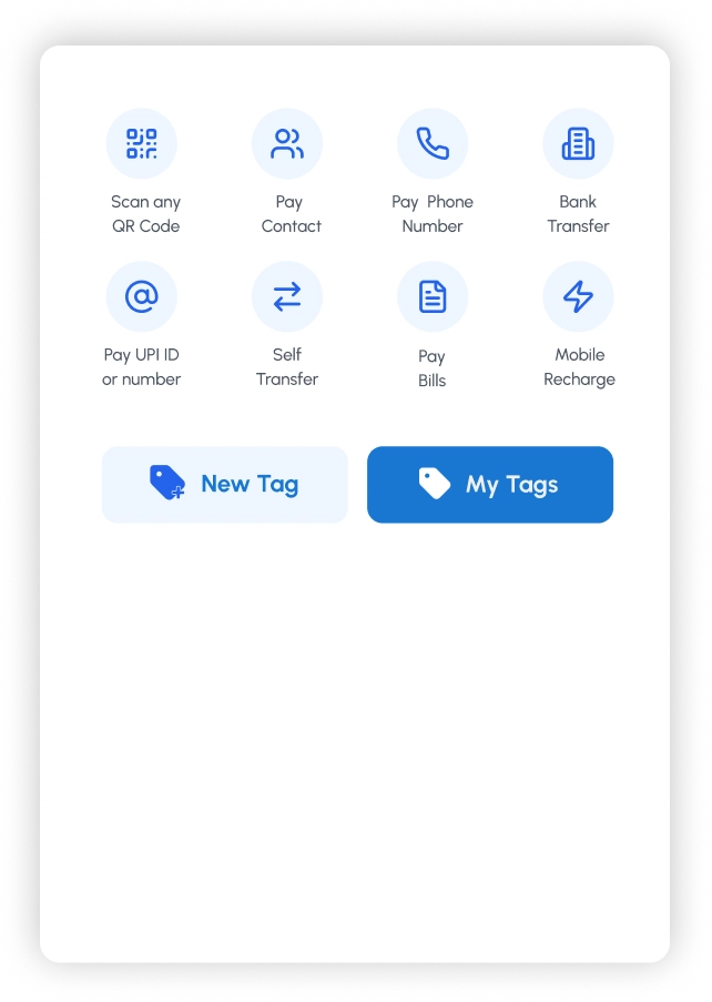
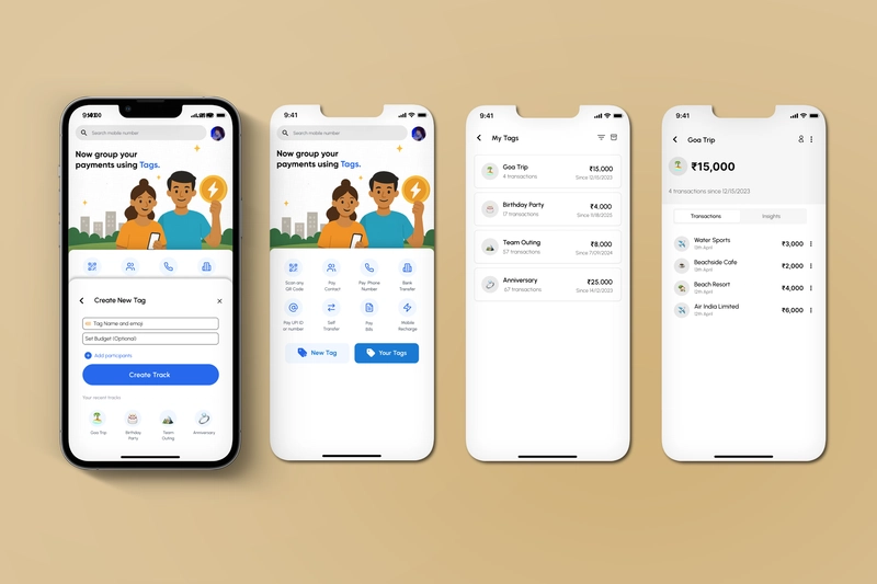
I started by developing wireframes, with the goal of seamlessly integrating two new buttons—Create Tag and View Tags—onto GPay’s home screen. Placing them on the main screen was intentional. The idea was to make the feature feel like a natural part of the app, encouraging everyday use and making tag-based payments more accessible from the start.
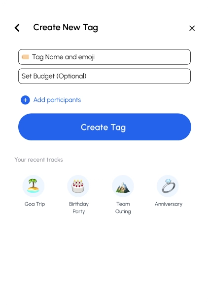
Next was the task of creating a tag screen the entry point for tag ecosystem for users, This screen was designed to let users quickly create a Tag without feeling overwhelmed. I kept the layout minimal—just a name, optional budget, and participant field—to reduce friction and keep it lightweight. The rounded “Create Track” button draws focus, and recent tags at the bottom encourage reuse and familiarity.
My goal was to make this feel like a natural extension of GPay, not a new tool—so it blends with the existing UI while subtly introducing utility.
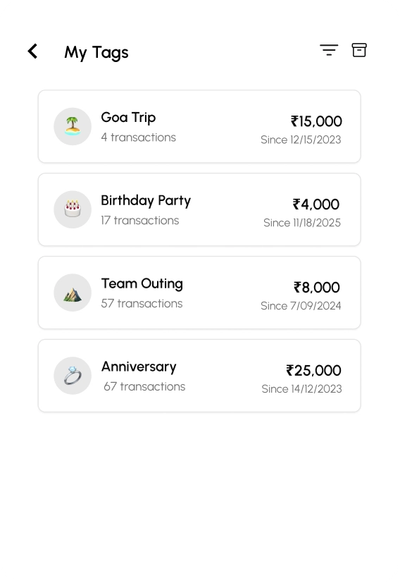
Next was my tags screen. this shows all active tags in one place—like a dashboard for past spending. Each tag neatly displays the total amount, number of transactions, and when it started. It’s designed to feel familiar, almost like viewing a folder of grouped expenses. The goal here was quick recall and a clean overview without digging through your feed.
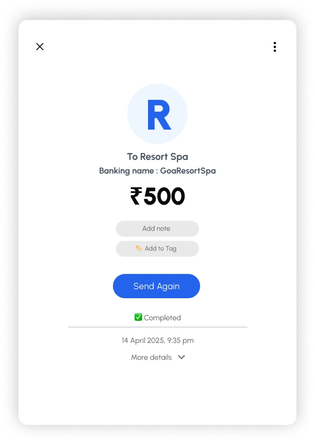
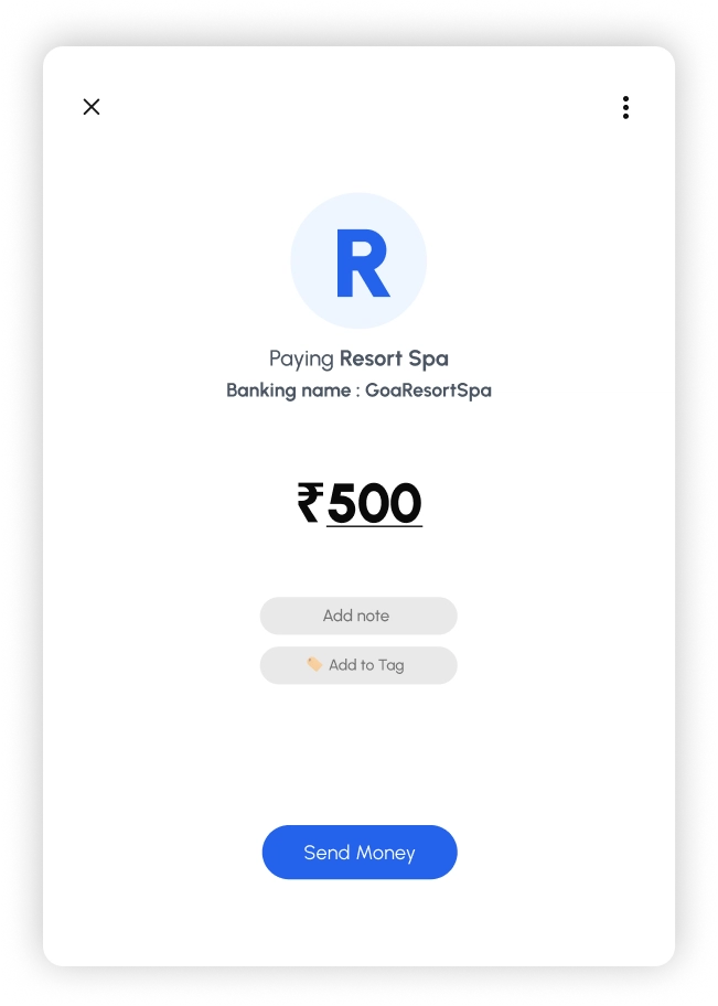
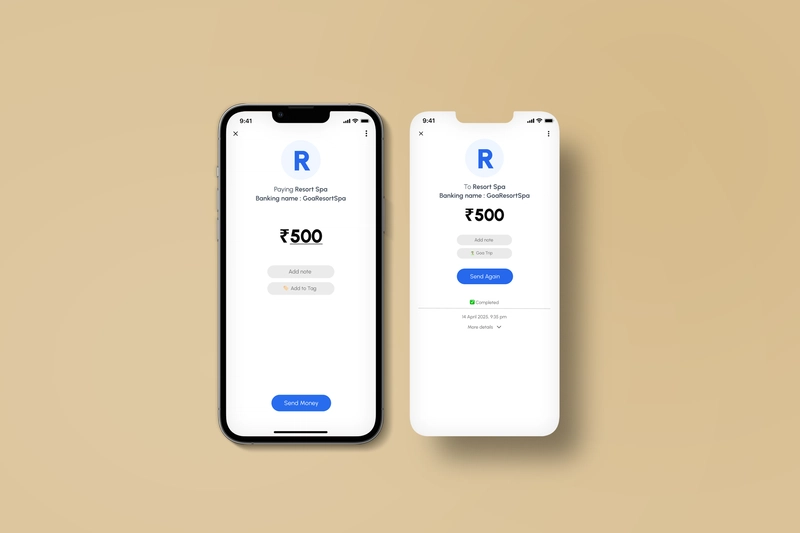
Next, I designed the flow where users can add a tag to a transaction—either while making the payment or afterward. The idea was to keep it next to the existing “Note” field for familiarity.
Now about Notes: they’re useful for one-off context, but they fall short when payments start piling up. Notes don’t group transactions or help track shared spending over time. That’s where Tags step in—to bring structure, recall, and meaning when things scale.
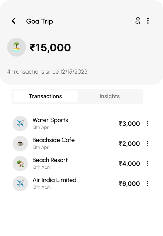
View Tags screen. this screen shows the dedicated view for a tag. Once a tag is created, all related transactions show up here—sorted and grouped for clarity. It's a cleaner way to revisit your spending, whether for a trip, rent, or any category . Instead of scrolling through a long payment history, everything tied to that purpose lives here—simple and organized.
Final Results
Final Thoughts
Tags was my attempt to bring a little more sense and structure to everyday payments. It’s simple, contextual, and fits right into how people already use GPay—without adding friction.
A small idea, but one that could make payment tracking a lot more human.
— Shivansh