


![[The AI Show Episode 143]: ChatGPT Revenue Surge, New AGI Timelines, Amazon’s AI Agent, Claude for Education, Model Context Protocol & LLMs Pass the Turing Test](https://www.marketingaiinstitute.com/hubfs/ep%20143%20cover.png)


.jpg?#)


_Muhammad_R._Fakhrurrozi_Alamy.jpg?width=1280&auto=webp&quality=80&disable=upscale#)
_NicoElNino_Alamy.jpg?width=1280&auto=webp&quality=80&disable=upscale#)


![M4 MacBook Air Drops to Just $849 - Act Fast! [Lowest Price Ever]](https://www.iclarified.com/images/news/97140/97140/97140-640.jpg)
![Apple Smart Glasses Not Close to Being Ready as Meta Targets 2025 [Gurman]](https://www.iclarified.com/images/news/97139/97139/97139-640.jpg)
![iPadOS 19 May Introduce Menu Bar, iOS 19 to Support External Displays [Rumor]](https://www.iclarified.com/images/news/97137/97137/97137-640.jpg)


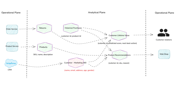
From spaghetti code to structured architecture: visualizing complex codebases
If you’ve ever opened a legacy codebase and quietly whispered “What f*ck is this?”, you’re not the only one. At some point, every engineer inherits a tangled mess of global state, leaky abstractions, and mystery functions with names like processStuffFinalV3(). You already know, this must something like “spaghetti code.” But behind the nickname is a real problem: as systems grow, they become impossible to reason about. And that is a structural issue. Without a clear view of your software’s architecture, you’re operating in the dark. So let’s talk about how to turn on the lights. The real cost of a messy codebase Poor architecture drags entire teams underwater: Onboarding a new dev? Expect a 2-month ramp-up as they reverse-engineer the system. Refactor a core module? Better hope you don’t trigger a hidden circular dependency. Break a monolith? Without a structural map, you’re playing Jenga in production. In larger orgs, especially those scaling fast or dealing with legacy systems, this invisibility turns into a real money issue. Technical debt is no longer just “future work”; it’s a tax on innovation. Visual architecture: more than a pretty diagram Enter architecture visualization. Not as a buzzword, but as a practical tool in your dev workflow. When you generate a live dependency graph or a component interaction map, something happens: the code starts making sense again. You’re no longer guessing what utils.js touches or where that AuthService ends up being used. You can see it. Here’s what that unlocks: Faster impact analysis before making changes Safe extraction of services or modules Better conversations between devs and architects More confidence in CI/CD automation Think of it like going from Google Street View to satellite mode. Sometimes, you need the 10,000-foot view. A real-world story: refactoring with a map Let me give you an example. We recently took on a 500K-line Node.js monolith that had organically evolved over 8 years. No tests. No documentation. Multiple contributors over time. You get the picture. Trying to refactor this without a map would’ve been asking for pain. So we used a static analysis tool to: Generate a full dependency graph Identify critical hotspots (files with the most inbound calls) Highlight tight coupling that would block modularization From there, we started slicing services. The visual map acted like a refactor compass, it showed us what could safely move without breaking the ecosystem. Result? We extracted three services in under two weeks. Previously, the team had spent three months debating just where to start. Tools that help There are tools in this space (from IDE plugins to heavyweight static analyzers) but many are either too shallow or too complex for daily use. That’s why NanoAPI is worth checking out. It’s a CLI-first architecture intelligence tool that gives you a visual “Code Manifest” and lets you explore your system like a blueprint. Even if you’re working solo, it’ll give you an edge in understanding structure and risk. Takeaways If you’re dealing with a legacy system, a growing monolith, or just a codebase that’s starting to feel like an archaeological dig, don’t go in blind. Map it. Visualize it. Use tooling that gives you architectural leverage. Because once you see the system, you can finally fix it.

If you’ve ever opened a legacy codebase and quietly whispered “What f*ck is this?”, you’re not the only one.
At some point, every engineer inherits a tangled mess of global state, leaky abstractions, and mystery functions with names like processStuffFinalV3().
You already know, this must something like “spaghetti code.” But behind the nickname is a real problem: as systems grow, they become impossible to reason about. And that is a structural issue. Without a clear view of your software’s architecture, you’re operating in the dark.
So let’s talk about how to turn on the lights.
The real cost of a messy codebase
Poor architecture drags entire teams underwater:
- Onboarding a new dev? Expect a 2-month ramp-up as they reverse-engineer the system.
- Refactor a core module? Better hope you don’t trigger a hidden circular dependency.
- Break a monolith? Without a structural map, you’re playing Jenga in production.
In larger orgs, especially those scaling fast or dealing with legacy systems, this invisibility turns into a real money issue. Technical debt is no longer just “future work”; it’s a tax on innovation.
Visual architecture: more than a pretty diagram
Enter architecture visualization. Not as a buzzword, but as a practical tool in your dev workflow.
When you generate a live dependency graph or a component interaction map, something happens: the code starts making sense again. You’re no longer guessing what utils.js touches or where that AuthService ends up being used. You can see it.
Here’s what that unlocks:
- Faster impact analysis before making changes
- Safe extraction of services or modules
- Better conversations between devs and architects
- More confidence in CI/CD automation
Think of it like going from Google Street View to satellite mode. Sometimes, you need the 10,000-foot view.
A real-world story: refactoring with a map
Let me give you an example.
We recently took on a 500K-line Node.js monolith that had organically evolved over 8 years. No tests. No documentation. Multiple contributors over time. You get the picture.
Trying to refactor this without a map would’ve been asking for pain. So we used a static analysis tool to:
- Generate a full dependency graph
- Identify critical hotspots (files with the most inbound calls)
- Highlight tight coupling that would block modularization
From there, we started slicing services. The visual map acted like a refactor compass, it showed us what could safely move without breaking the ecosystem.
Result? We extracted three services in under two weeks. Previously, the team had spent three months debating just where to start.
Tools that help
There are tools in this space (from IDE plugins to heavyweight static analyzers) but many are either too shallow or too complex for daily use.
That’s why NanoAPI is worth checking out. It’s a CLI-first architecture intelligence tool that gives you a visual “Code Manifest” and lets you explore your system like a blueprint. Even if you’re working solo, it’ll give you an edge in understanding structure and risk.
Takeaways
If you’re dealing with a legacy system, a growing monolith, or just a codebase that’s starting to feel like an archaeological dig, don’t go in blind.
Map it.
Visualize it.
Use tooling that gives you architectural leverage.
Because once you see the system, you can finally fix it.