


![[The AI Show Episode 142]: ChatGPT’s New Image Generator, Studio Ghibli Craze and Backlash, Gemini 2.5, OpenAI Academy, 4o Updates, Vibe Marketing & xAI Acquires X](https://www.marketingaiinstitute.com/hubfs/ep%20142%20cover.png)


![[DEALS] The Premium Learn to Code Certification Bundle (97% off) & Other Deals Up To 98% Off – Offers End Soon!](https://www.javacodegeeks.com/wp-content/uploads/2012/12/jcg-logo.jpg)

![From drop-out to software architect with Jason Lengstorf [Podcast #167]](https://cdn.hashnode.com/res/hashnode/image/upload/v1743796461357/f3d19cd7-e6f5-4d7c-8bfc-eb974bc8da68.png?#)


.png?#)


_Christophe_Coat_Alamy.jpg?#)
 (1).webp?#)


![Apple Considers Delaying Smart Home Hub Until 2026 [Gurman]](https://www.iclarified.com/images/news/96946/96946/96946-640.jpg)
![iPhone 17 Pro Won't Feature Two-Toned Back [Gurman]](https://www.iclarified.com/images/news/96944/96944/96944-640.jpg)
![Tariffs Threaten Apple's $999 iPhone Price Point in the U.S. [Gurman]](https://www.iclarified.com/images/news/96943/96943/96943-640.jpg)


Ensure your website is mobile-optimized
Making your website responsive is important to ensure that it looks good on a variety of screen sizes — from phones to tablets to desktops. Instead of having to resize your broswer window each time to test out different resolutions, here are a few ways to do so with ease. But first... ...how do you make your site responsive? By using @media in your CSS. For example, #item { width: 50px; } @media (max-width: 900px) { #item { width: 30px; } } Here, if the width of the viewport is greater than 900px, the width of #item is 50px. But if it is less, the width of #item is 30px. You can also specify different widths for different viewport sizes. @media (max-width: 500px) { #item { width: 10px; } } Test it out On Firefox-based browsers, use the shortcut ctrl + shift + m to enter responsive design mode. On Chromium-based browsers, use the shortcut ctrl + shift + i ctrl + shift + m to enter device mode. From the top left dropdown, choose the device you want to emulate. Alternatively, grab the corners of the viewport and resize. Note that this may not exactly show the behavior of your site on mobile. For example, on my website, I've noticed that the effect that's supposed to happen on hover happens on click on mobile. To see how your site actually behaves on mobile, you'll have to localhost your site and view it on your mobile device. Open a terminal in your project folder and run python3 -m http.server The output will contain the port number. In my case, it's 8000. Next, find your local IP address by running hostname -I In my case, it's 10.10.10.10. Access the site on your phone connected to the same network by visiting IP:port. For me, it will be 10.10.10.10:8000. Make sure your desktop firewall allows incoming traffic for the site to be accessible by another device. Conclusion Use your browser's mobile viewport simulation thingy during development to test how your site would look on mobile. Ensure it actually works properly by viewing it on an actual mobile device before publishing. Additionally, test it out on both Firefox and Chromium-based browsers as well.
Making your website responsive is important to ensure that it looks good on a variety of screen sizes — from phones to tablets to desktops. Instead of having to resize your broswer window each time to test out different resolutions, here are a few ways to do so with ease.
But first...
...how do you make your site responsive? By using @media in your CSS. For example,
#item {
    width: 50px;
}

@media (max-width: 900px) {
    #item {
        width: 30px;
    }
}
Here, if the width of the viewport is greater than 900px, the width of #item is 50px. But if it is less, the width of #item is 30px. You can also specify different widths for different viewport sizes.
@media (max-width: 500px) {
    #item {
        width: 10px;
    }
}
Test it out
On Firefox-based browsers, use the shortcut ctrl + shift + m to enter responsive design mode.
On Chromium-based browsers, use the shortcut ctrl + shift + i ctrl + shift + m to enter device mode.
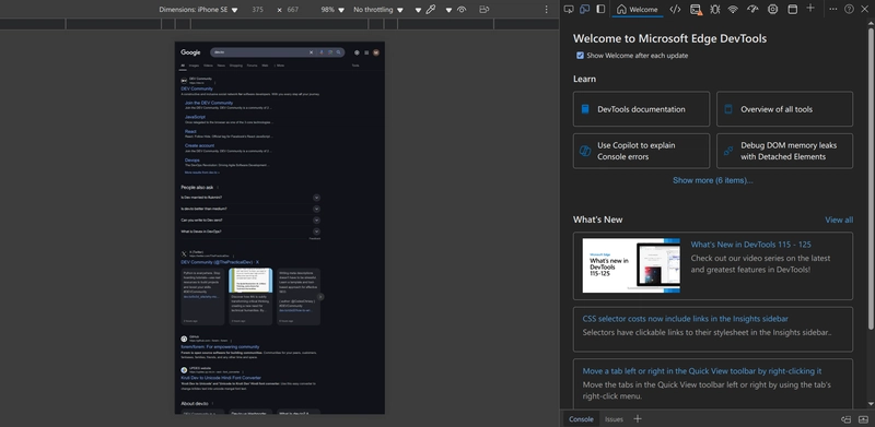
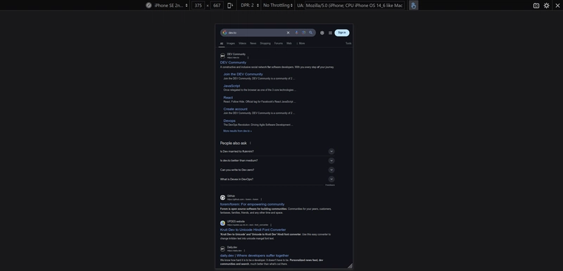
From the top left dropdown, choose the device you want to emulate. Alternatively, grab the corners of the viewport and resize.
Note that this may not exactly show the behavior of your site on mobile. For example, on my website, I've noticed that the effect that's supposed to happen on hover happens on click on mobile. To see how your site actually behaves on mobile, you'll have to localhost your site and view it on your mobile device.
Open a terminal in your project folder and run
python3 -m http.server
The output will contain the port number. In my case, it's 8000. Next, find your local IP address by running
hostname -I
In my case, it's 10.10.10.10. Access the site on your phone connected to the same network by visiting IP:port. For me, it will be 10.10.10.10:8000. Make sure your desktop firewall allows incoming traffic for the site to be accessible by another device.
Conclusion
Use your browser's mobile viewport simulation thingy during development to test how your site would look on mobile. Ensure it actually works properly by viewing it on an actual mobile device before publishing. Additionally, test it out on both Firefox and Chromium-based browsers as well.