


![[The AI Show Episode 143]: ChatGPT Revenue Surge, New AGI Timelines, Amazon’s AI Agent, Claude for Education, Model Context Protocol & LLMs Pass the Turing Test](https://www.marketingaiinstitute.com/hubfs/ep%20143%20cover.png)


![From drop-out to software architect with Jason Lengstorf [Podcast #167]](https://cdn.hashnode.com/res/hashnode/image/upload/v1743796461357/f3d19cd7-e6f5-4d7c-8bfc-eb974bc8da68.png?#)


.jpg?#)


_ArtemisDiana_Alamy.jpg?#)


 (1).webp?#)


-xl.jpg)


![Yes, the Gemini icon is now bigger and brighter on Android [U]](https://i0.wp.com/9to5google.com/wp-content/uploads/sites/4/2025/02/Gemini-on-Galaxy-S25.jpg?resize=1200%2C628&quality=82&strip=all&ssl=1)


![Apple Rushes Five Planes of iPhones to US Ahead of New Tariffs [Report]](https://www.iclarified.com/images/news/96967/96967/96967-640.jpg)
![Apple Vision Pro 2 Allegedly in Production Ahead of 2025 Launch [Rumor]](https://www.iclarified.com/images/news/96965/96965/96965-640.jpg)


Enhancing Sales Data Visualization: Advanced Interactivity with CanvasJS and React Table
This article builds upon the foundation laid in my previous piece, "Visualizing Sales Data with CanvasJS and React Table", where we explored the basics of setting up a sales dashboard using @tanstack/react-table for tabular data and @canvasjs/react-charts for graphical representation. In that article, we focused on rendering sales data effectively in both table and chart formats. Now, we'll take it a step further by diving into advanced interactive features—row highlighting in tables and dynamic tooltips in charts—to create a more engaging and user-friendly experience. These enhancements will help users better navigate and analyze sales data, making the dashboard not just a display tool but an interactive exploration platform. Why Interactivity Matters Interactivity is a cornerstone of modern data visualization, particularly in sales dashboards where users need to quickly pinpoint trends, outliers, or specific data points. Features like row highlighting and interactive tooltips provide visual cues and additional context, making the data more accessible without overwhelming the user. In this continuation, we’ll enhance our previous dashboard by implementing these features using @tanstack/react-table and @canvasjs/react-charts, seamlessly integrating them to elevate the user experience. Highlighting Rows in @tanstack/react-table A simple yet powerful way to improve table usability is to highlight rows when users hover over them. This visual feedback helps users track data across columns more easily. We will use the hoveredRowIndex state to highlight rows dynamically when a user hovers over them. The useState hook is used to track the currently hovered row index. When the mouse enters a row, the onMouseEnter event updates the state, changing the row's background color. When the mouse leaves, the onMouseLeave event resets the state, restoring the default background. The smooth transition effect ensures a seamless user experience. ... handleRowHover(index)} onMouseLeave={handleRowLeave} style={{ backgroundColor: hoveredRowIndex === index ? '#E8EAF6' : 'white', transition: 'background-color 0.3s', cursor: 'pointer', }} > {row.getVisibleCells().map((cell) => ( {flexRender(cell.column.columnDef.cell, cell.getContext())} ))} ... Adding Interactivity to @canvasjs/react-charts CanvasJS charts include built-in interactivity, such as tooltips that appear on hover to display detailed information about data points. To synchronize the chart with the table, we can programmatically control tooltips using CanvasJS methods like showAtX on hovering over table rows. Additionally, to highlight a row in the React table, we can leverage the shown and hidden events of CanvasJS, which are triggered whenever a tooltip is displayed or hidden, ensuring seamless interaction between the chart and the table. ... toolTip: { updated: handleTooltipShown, hidden: handleTooltipHidden, } const handleTooltipShown = (e) => { if (e.entries && e.entries.length > 0) { const index = e.entries[0].dataPointIndex; handleRowHover(index, e.chart); } }; const handleTooltipHidden = () => { handleRowLeave(); }; const handleRowHover = (index, chart = null) => { setHoveredRowIndex(index); if (chart) { if (revenueChart === chart) salesChart.toolTip.showAtX(revenueChart.data[0].dataPoints[index].x); else { revenueChart.toolTip.showAtX(revenueChart.data[0].dataPoints[index].x); } } else { revenueChart.toolTip.showAtX(revenueChart.data[0].dataPoints[index].x); salesChart.toolTip.showAtX(revenueChart.data[0].dataPoints[index].x); } }; ... Conclusion In this continuation, we've transformed our basic sales dashboard into an interactive powerhouse by adding row highlighting in @tanstack/react-table and dynamic tooltips in @canvasjs/react-charts. These features make it easier for users to explore and interpret sales data, enhancing both usability and engagement. By synchronizing the table and chart, we’ve created a seamless experience that invites deeper analysis. I encourage you to take these ideas and experiment with them in your own projects—interactivity is the key to unlocking the full potential of your data visualizations!
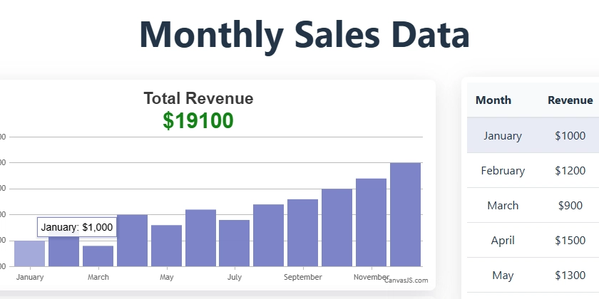
This article builds upon the foundation laid in my previous piece, "Visualizing Sales Data with CanvasJS and React Table", where we explored the basics of setting up a sales dashboard using @tanstack/react-table for tabular data and @canvasjs/react-charts for graphical representation. In that article, we focused on rendering sales data effectively in both table and chart formats. Now, we'll take it a step further by diving into advanced interactive features—row highlighting in tables and dynamic tooltips in charts—to create a more engaging and user-friendly experience. These enhancements will help users better navigate and analyze sales data, making the dashboard not just a display tool but an interactive exploration platform.
Why Interactivity Matters
Interactivity is a cornerstone of modern data visualization, particularly in sales dashboards where users need to quickly pinpoint trends, outliers, or specific data points. Features like row highlighting and interactive tooltips provide visual cues and additional context, making the data more accessible without overwhelming the user. In this continuation, we’ll enhance our previous dashboard by implementing these features using @tanstack/react-table and @canvasjs/react-charts, seamlessly integrating them to elevate the user experience.
Highlighting Rows in @tanstack/react-table
A simple yet powerful way to improve table usability is to highlight rows when users hover over them. This visual feedback helps users track data across columns more easily. We will use the hoveredRowIndex state to highlight rows dynamically when a user hovers over them. The useState hook is used to track the currently hovered row index. When the mouse enters a row, the onMouseEnter event updates the state, changing the row's background color. When the mouse leaves, the onMouseLeave event resets the state, restoring the default background. The smooth transition effect ensures a seamless user experience.
...
<tr
  key={row.id}
  onMouseEnter={() => handleRowHover(index)}
  onMouseLeave={handleRowLeave}
  style={{
    backgroundColor: hoveredRowIndex === index ? '#E8EAF6' : 'white',
    transition: 'background-color 0.3s',
    cursor: 'pointer',
  }}
  >
  {row.getVisibleCells().map((cell) => (
  <td
    key={cell.id}
    style={{
      padding: '12px',
      borderBottom: '1px solid #dee2e6',
    }}
  >
    {flexRender(cell.column.columnDef.cell, cell.getContext())}
  td>
  ))}
</tr>
...
Adding Interactivity to @canvasjs/react-charts
CanvasJS charts include built-in interactivity, such as tooltips that appear on hover to display detailed information about data points. To synchronize the chart with the table, we can programmatically control tooltips using CanvasJS methods like showAtX on hovering over table rows. Additionally, to highlight a row in the React table, we can leverage the shown and hidden events of CanvasJS, which are triggered whenever a tooltip is displayed or hidden, ensuring seamless interaction between the chart and the table.
...
toolTip: {
  updated: handleTooltipShown,
  hidden: handleTooltipHidden,
}

const handleTooltipShown = (e) => {
  if (e.entries && e.entries.length > 0) {
    const index = e.entries[0].dataPointIndex;
    handleRowHover(index, e.chart);
  }
};

const handleTooltipHidden = () => {
  handleRowLeave();
};

const handleRowHover = (index, chart = null) => {
  setHoveredRowIndex(index);
  if (chart) {
    if (revenueChart === chart)
      salesChart.toolTip.showAtX(revenueChart.data[0].dataPoints[index].x);
    else {
      revenueChart.toolTip.showAtX(revenueChart.data[0].dataPoints[index].x);
    }
  } else {
    revenueChart.toolTip.showAtX(revenueChart.data[0].dataPoints[index].x);
    salesChart.toolTip.showAtX(revenueChart.data[0].dataPoints[index].x);
  }
};
...
Conclusion
In this continuation, we've transformed our basic sales dashboard into an interactive powerhouse by adding row highlighting in @tanstack/react-table and dynamic tooltips in @canvasjs/react-charts. These features make it easier for users to explore and interpret sales data, enhancing both usability and engagement. By synchronizing the table and chart, we’ve created a seamless experience that invites deeper analysis. I encourage you to take these ideas and experiment with them in your own projects—interactivity is the key to unlocking the full potential of your data visualizations!