


![[The AI Show Episode 142]: ChatGPT’s New Image Generator, Studio Ghibli Craze and Backlash, Gemini 2.5, OpenAI Academy, 4o Updates, Vibe Marketing & xAI Acquires X](https://www.marketingaiinstitute.com/hubfs/ep%20142%20cover.png)


![[DEALS] The Premium Learn to Code Certification Bundle (97% off) & Other Deals Up To 98% Off – Offers End Soon!](https://www.javacodegeeks.com/wp-content/uploads/2012/12/jcg-logo.jpg)

![From drop-out to software architect with Jason Lengstorf [Podcast #167]](https://cdn.hashnode.com/res/hashnode/image/upload/v1743796461357/f3d19cd7-e6f5-4d7c-8bfc-eb974bc8da68.png?#)


.png?#)


_Christophe_Coat_Alamy.jpg?#)


.webp?#)


![Apple Considers Delaying Smart Home Hub Until 2026 [Gurman]](https://www.iclarified.com/images/news/96946/96946/96946-640.jpg)
![iPhone 17 Pro Won't Feature Two-Toned Back [Gurman]](https://www.iclarified.com/images/news/96944/96944/96944-640.jpg)
![Tariffs Threaten Apple's $999 iPhone Price Point in the U.S. [Gurman]](https://www.iclarified.com/images/news/96943/96943/96943-640.jpg)


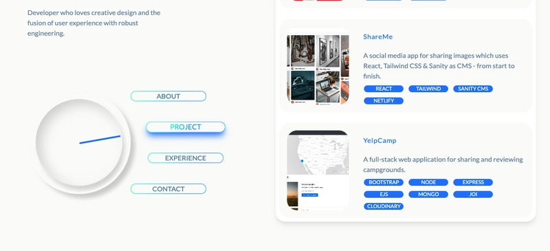
Creating an Interactive Navigation Circle with React
A Deep Dive into Scroll-Based Animations Have you ever wanted to create a unique navigation experience that combines smooth scrolling with visual feedback? In this article, I'll walk you through how I implemented an interactive navigation system featuring a rotating clock animation that responds to both button clicks and scroll positions. The Navigation System: More Than Just Buttons The navigation system consists of two main parts: A set of gradient buttons for different sections ("About", "Project", "Experience", "Contact") - for more about gradient buttons visit reactbits A circular clock-like indicator that rotates to point at the currently active section. Navigation Implementation The navigation buttons are implemented using a combination of React components and the react-scroll library. Here's the key part from the Home component: {["about", "project", "experience", "contact"].map((section) => ( handleClick(`link-${section}`)} tabIndex={0} onKeyDown={(e) => { if (e.key === "Enter") handleClick(`link-${section}`); }} > {section.charAt(0).toUpperCase() + section.slice(1)} ))} What makes this special? The the the smooth={true} property ensures smooth scrolling animation Each button triggers two actions: Scrolls to the target section Updates the activeId state which controls the circle rotati on The Magic Circle The circle indicator is where things get interesting. The Circle.jsx component listens for changes to the id prop (which represents the active section). Based on this prop, it adjusts the rotation of the inner circle to correspond to the section. This is done through simple CSS transforms, allowing the circle to rotate based on which section is active. const getRotation = (id) => { switch (id) { case "link-about": return `rotate(145deg)`; case "link-project": return `rotate(170deg)`; case "link-experience": return `rotate(190deg)`; case "link-contact": return `rotate(215deg)`; default: return `rotate(0deg)`; } }; The clever part: The rotation values are carefully calibrated to point at each section's button position, creating a seamless connection between the indicator and navigation. Scroll-Based Updates The system doesn't just respond to clicks - it also updates based on scroll position using the Intersection Observer API. In RightSection.jsx: const sections = ["about", "project", "experience", "contact"]; const activeSection = useIntersectionObserver(sections); useEffect(() => { if (activeSection) { onSectionChange(`link-${activeSection}`); } }, [activeSection, onSectionChange]); Why this matters: This creates a two-way connection where both scrolling and clicking update the navigation state, ensuring the UI always reflects the user's current position. Bonus: What Could Be Better Progressive Animation: Implement velocity-based animation for more natural movement Performance Improvements: Implement virtual scrolling for longer content sections Optimize the Intersection Observer thresholds for smoother transitions 3.** Accessibility Enhancements: ** Thanks for reading! Follow me: LinkedIn | GitHub | Portfolio
A Deep Dive into Scroll-Based Animations
Have you ever wanted to create a unique navigation experience that combines smooth scrolling with visual feedback? In this article, I'll walk you through how I implemented an interactive navigation system featuring a rotating clock animation that responds to both button clicks and scroll positions.
The Navigation System: More Than Just Buttons
The navigation system consists of two main parts:
- A set of gradient buttons for different sections ("About", "Project", "Experience", "Contact") - for more about gradient buttons visit reactbits
- A circular clock-like indicator that rotates to point at the currently active section.
Navigation Implementation
The navigation buttons are implemented using a combination of React components and the react-scroll library. Here's the key part from the Home component:
{["about", "project", "experience", "contact"].map((section) => (

     handleClick(`link-${section}`)}
      tabIndex={0}
      onKeyDown={(e) => {
        if (e.key === "Enter") handleClick(`link-${section}`);
      }}
    >

        {section.charAt(0).toUpperCase() + section.slice(1)}


))}
What makes this special?
- The the the
smooth={true}property ensures smooth scrolling animation - Each button triggers two actions:
- Scrolls to the target section
- Updates the
activeIdstate which controls the circle rotati on
The Magic Circle
The circle indicator is where things get interesting. The Circle.jsx component listens for changes to the id prop (which represents the active section). Based on this prop, it adjusts the rotation of the inner circle to correspond to the section. This is done through simple CSS transforms, allowing the circle to rotate based on which section is active.
const getRotation = (id) => {
  switch (id) {
    case "link-about": return `rotate(145deg)`;
    case "link-project": return `rotate(170deg)`;
    case "link-experience": return `rotate(190deg)`;
    case "link-contact": return `rotate(215deg)`;
    default: return `rotate(0deg)`;
  }
};
The clever part: The rotation values are carefully calibrated to point at each section's button position, creating a seamless connection between the indicator and navigation.
Scroll-Based Updates
The system doesn't just respond to clicks - it also updates based on scroll position using the Intersection Observer API. In RightSection.jsx:
const sections = ["about", "project", "experience", "contact"];
const activeSection = useIntersectionObserver(sections);

useEffect(() => {
  if (activeSection) {
    onSectionChange(`link-${activeSection}`);
  }
}, [activeSection, onSectionChange]);
Why this matters: This creates a two-way connection where both scrolling and clicking update the navigation state, ensuring the UI always reflects the user's current position.
Bonus: What Could Be Better
- Progressive Animation: Implement velocity-based animation for more natural movement
- Performance Improvements: Implement virtual scrolling for longer content sections Optimize the Intersection Observer thresholds for smoother transitions 3.** Accessibility Enhancements: **
Thanks for reading!