


![[The AI Show Episode 145]: OpenAI Releases o3 and o4-mini, AI Is Causing “Quiet Layoffs,” Executive Order on Youth AI Education & GPT-4o’s Controversial Update](https://www.marketingaiinstitute.com/hubfs/ep%20145%20cover.png)


![[DEALS] Microsoft 365: 1-Year Subscription (Family/Up to 6 Users) (23% off) & Other Deals Up To 98% Off – Offers End Soon!](https://www.javacodegeeks.com/wp-content/uploads/2012/12/jcg-logo.jpg)


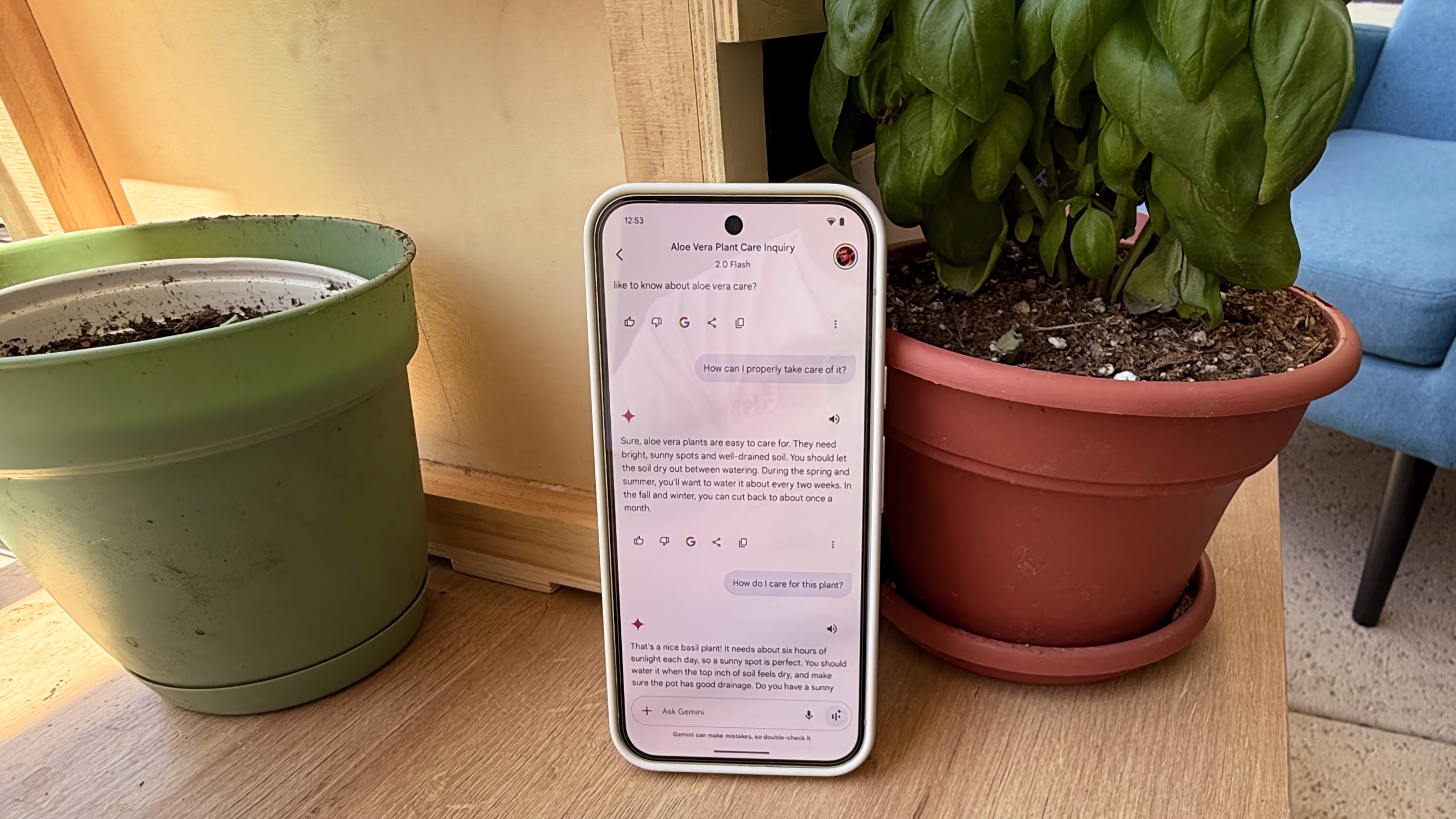
![From Art School Drop-out to Microsoft Engineer with Shashi Lo [Podcast #170]](https://cdn.hashnode.com/res/hashnode/image/upload/v1746203291209/439bf16b-c820-4fe8-b69e-94d80533b2df.png?#)


(1).jpg?#)


_Inge_Johnsson-Alamy.jpg?width=1280&auto=webp&quality=80&disable=upscale#)


![Apple to Split iPhone Launches Across Fall and Spring in Major Shakeup [Report]](https://www.iclarified.com/images/news/97211/97211/97211-640.jpg)
![Apple to Move Camera to Top Left, Hide Face ID Under Display in iPhone 18 Pro Redesign [Report]](https://www.iclarified.com/images/news/97212/97212/97212-640.jpg)
![Apple Developing Battery Case for iPhone 17 Air Amid Battery Life Concerns [Report]](https://www.iclarified.com/images/news/97208/97208/97208-640.jpg)
![AirPods 4 On Sale for $99 [Lowest Price Ever]](https://www.iclarified.com/images/news/97206/97206/97206-640.jpg)


![[Updated] Samsung’s 65-inch 4K Smart TV Just Crashed to $299 — That’s Cheaper Than an iPad](https://www.androidheadlines.com/wp-content/uploads/2025/05/samsung-du7200.jpg)


Create a Universal Button With React + TailwindCSS
As your project grows in size, component reusability becomes more and more important. There are times when it makes sense to make universal components, and there are times when you need more specialized components. Knowing when to use which is crucial. If you try to make too many universal components that do too many things, then your product will end up with a lot of bloat. But if you use too few universal components, you will go crazy keeping track of them all. Today we're going to learn how to create a very useful component: a React universal button component that can be either a or element depending on the props passed to it. We will also be using TailwindCSS for styling. The demo project (link at bottom) was spun up using pnpm create vite@latest, selecting React + Typescript template. We'll also need to install Tailwind and some additional utilities: pnpm i -D tailwindcss @tailwindcss/vite tailwind-merge clsx Next, we'll add Tailwind to our vite.config.ts: import { defineConfig } from "vite"; import react from "@vitejs/plugin-react-swc"; import tailwindcss from "@tailwindcss/vite"; // https://vite.dev/config/ export default defineConfig({ plugins: [react(), tailwindcss()], }); Then replace everything in index.css with: @import "tailwindcss"; Now we need to create a helper function to help us deal with variable Tailwind classes (src/lib/cn.ts): import { clsx, type ClassValue } from "clsx"; import { twMerge } from "tailwind-merge"; export function cn(...inputs: ClassValue[]) { return twMerge(clsx(inputs)); } If this looks familiar, it's the same function that ShadCN uses to merge class names. Next, we'll create our button component at src/components/button.tsx: import { cn } from "../lib/cn"; import type { ButtonHTMLAttributes, AnchorHTMLAttributes } from "react"; type ButtonAsButton = ButtonHTMLAttributes & { type: "button"; title: string; }; type ButtonAsAnchor = AnchorHTMLAttributes & { type: "a"; href: string; title: string; }; type ButtonProps = ButtonAsButton | ButtonAsAnchor; export default function Button(props: ButtonProps) { const { className, type, ...rest } = props; const classes = cn( "bg-blue-500 hover:brightness-120 cursor-pointer transition-all duration-200 ease-in-out text-white px-4 py-2 rounded-md text-center", className ); if (type === "button") { return ; } return ; } This component does several useful things: It provides strict type safety based on the type attribute It provides a default base style that you can use as your default button It allows any other Tailwind background color to be used without having to specify a hover background color, thanks to brightness-120 class We return a or element depending on type prop. You could also supply a React Router or Next.js component as well. Below are several examples of various ways this component can be used: import { useState } from "react"; import Button from "./components/button"; export default function App() { const [displayText, setDisplayText] = useState("Choose your button wisely!"); return ( React + Tailwind CSS - Universal Button Demo {displayText} { setDisplayText("Default Button, a safe choice!"); }} > Default Button { setDisplayText("Red Button, a risky choice!"); }} > Red Button { setDisplayText("Green Button, NO NOT THAT ONE!"); }} > Green Button { setDisplayText("Link Button, it's a link and a button!"); }} > Link Button ); } Links GitHub Repo Demo Site Thank You! Thank you for taking the time to read my article and I hope you found it useful (or at the very least, mildly entertaining). For more great information about web dev, systems administration and cloud computing, please read the Designly Blog. Also, please leave your comments! I love to hear thoughts from my readers. If you want to support me, please follow me on Spotify or SoundCloud! Current Projects Snoozle.io- An AI app that generates bedtime stories for kids ❤️ react-poptart - A React Notification / Alerts Library (under 20kB) Spectravert - A cross-platform video converter (ffmpeg GUI) Smartname.app - An AI name generator for a variety of purposes Looking for a web developer? I'm available for hire! To inquire, please fill out a contact form.
As your project grows in size, component reusability becomes more and more important. There are times when it makes sense to make universal components, and there are times when you need more specialized components. Knowing when to use which is crucial.
If you try to make too many universal components that do too many things, then your product will end up with a lot of bloat. But if you use too few universal components, you will go crazy keeping track of them all.
Today we're going to learn how to create a very useful component: a React universal button component that can be either a or element depending on the props passed to it. We will also be using TailwindCSS for styling.
The demo project (link at bottom) was spun up using pnpm create vite@latest, selecting React + Typescript template.
We'll also need to install Tailwind and some additional utilities:
pnpm i -D tailwindcss @tailwindcss/vite tailwind-merge clsx
Next, we'll add Tailwind to our vite.config.ts:
import { defineConfig } from "vite";
import react from "@vitejs/plugin-react-swc";
import tailwindcss from "@tailwindcss/vite";

// https://vite.dev/config/
export default defineConfig({
  plugins: [react(), tailwindcss()],
});
Then replace everything in index.css with:
@import "tailwindcss";
Now we need to create a helper function to help us deal with variable Tailwind classes (src/lib/cn.ts):
import { clsx, type ClassValue } from "clsx";
import { twMerge } from "tailwind-merge";

export function cn(...inputs: ClassValue[]) {
  return twMerge(clsx(inputs));
}
If this looks familiar, it's the same function that ShadCN uses to merge class names.
Next, we'll create our button component at src/components/button.tsx:
import { cn } from "../lib/cn";
import type { ButtonHTMLAttributes, AnchorHTMLAttributes } from "react";

type ButtonAsButton = ButtonHTMLAttributes<HTMLButtonElement> & {
  type: "button";
  title: string;
};

type ButtonAsAnchor = AnchorHTMLAttributes<HTMLAnchorElement> & {
  type: "a";
  href: string;
  title: string;
};

type ButtonProps = ButtonAsButton | ButtonAsAnchor;

export default function Button(props: ButtonProps) {
  const { className, type, ...rest } = props;

  const classes = cn(
    "bg-blue-500 hover:brightness-120 cursor-pointer transition-all duration-200 ease-in-out text-white px-4 py-2 rounded-md text-center",
    className
  );

  if (type === "button") {
    return <button className={classes} {...(rest as ButtonAsButton)} />;
  }

  return <a className={classes} {...(rest as ButtonAsAnchor)} />;
}
This component does several useful things:
- It provides strict type safety based on the
typeattribute - It provides a default base style that you can use as your default button
- It allows any other Tailwind background color to be used without having to specify a hover background color, thanks to
brightness-120class - We return a
orelement depending ontypeprop. You could also supply a React Router or Next.jscomponent as well.
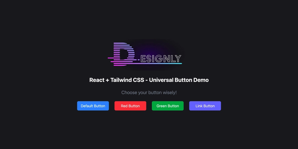
Below are several examples of various ways this component can be used:
import { useState } from "react";

import Button from "./components/button";

export default function App() {
  const [displayText, setDisplayText] = useState("Choose your button wisely!");

  return (
    <>
      <main className="flex flex-col justify-center items-center bg-zinc-900 h-screen text-gray-50">
        <img
          src="https://cdn.designly.biz/images/designly-logo-trans.svg"
          alt="Designly Logo"
          className="mb-6 w-96"
        />
        <h1 className="mb-6 font-bold text-2xl">
          React + Tailwind CSS - Universal Button Demo
        </h1>
        <p className="mb-6 text-gray-500 text-xl">{displayText}</p>
        <div className="gap-6 grid md:grid-cols-4 grild-cols-2">
          <Button
            type="button"
            title="Default Button"
            onClick={() => {
              setDisplayText("Default Button, a safe choice!");
            }}
          >
            Default Button
          </Button>
          <Button
            type="button"
            className="bg-red-500"
            title="Red Button"
            onClick={() => {
              setDisplayText("Red Button, a risky choice!");
            }}
          >
            Red Button
          </Button>
          <Button
            type="button"
            className="bg-green-600"
            title="Green Button"
            onClick={() => {
              setDisplayText("Green Button, NO NOT THAT ONE!");
            }}
          >
            Green Button
          </Button>
          <Button
            type="a"
            className="bg-indigo-500"
            title="Link Button"
            href="https://blog.designly.biz"
            target="_blank"
            onClick={() => {
              setDisplayText("Link Button, it's a link and a button!");
            }}
          >
            Link Button
          </Button>
        </div>
      </main>
    </>
  );
}
Links
Thank You!
Thank you for taking the time to read my article and I hope you found it useful (or at the very least, mildly entertaining). For more great information about web dev, systems administration and cloud computing, please read the Designly Blog. Also, please leave your comments! I love to hear thoughts from my readers.
If you want to support me, please follow me on Spotify or SoundCloud!
Current Projects
- Snoozle.io- An AI app that generates bedtime stories for kids ❤️
- react-poptart - A React Notification / Alerts Library (under 20kB)
- Spectravert - A cross-platform video converter (ffmpeg GUI)
- Smartname.app - An AI name generator for a variety of purposes
Looking for a web developer? I'm available for hire! To inquire, please fill out a contact form.