


![[The AI Show Episode 142]: ChatGPT’s New Image Generator, Studio Ghibli Craze and Backlash, Gemini 2.5, OpenAI Academy, 4o Updates, Vibe Marketing & xAI Acquires X](https://www.marketingaiinstitute.com/hubfs/ep%20142%20cover.png)


![[DEALS] The Premium Learn to Code Certification Bundle (97% off) & Other Deals Up To 98% Off – Offers End Soon!](https://www.javacodegeeks.com/wp-content/uploads/2012/12/jcg-logo.jpg)

![From drop-out to software architect with Jason Lengstorf [Podcast #167]](https://cdn.hashnode.com/res/hashnode/image/upload/v1743796461357/f3d19cd7-e6f5-4d7c-8bfc-eb974bc8da68.png?#)


.png?#)


_Christophe_Coat_Alamy.jpg?#)
 (1).webp?#)


![Apple Considers Delaying Smart Home Hub Until 2026 [Gurman]](https://www.iclarified.com/images/news/96946/96946/96946-640.jpg)
![iPhone 17 Pro Won't Feature Two-Toned Back [Gurman]](https://www.iclarified.com/images/news/96944/96944/96944-640.jpg)
![Tariffs Threaten Apple's $999 iPhone Price Point in the U.S. [Gurman]](https://www.iclarified.com/images/news/96943/96943/96943-640.jpg)


如何在鸿蒙Next开发中实现一个带箭头的菜单
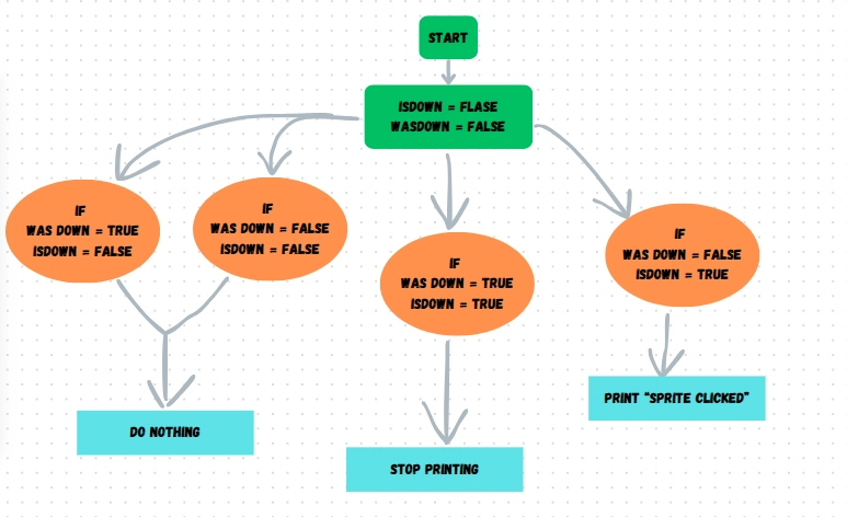
之前在微信项目中有过这么一个组件,但是项目太大没有办法详细讲解,今天就专门写一篇文章做一个带箭头的菜单。 这个菜单可以分为两个部分,三角形和列表,我们先从简单的开始,先做列表。 List(){ ListItem(){ MenuRow({imagePath:'/images/menu_group.png',titleString:'发起群聊'}) } ListItem(){ MenuRow({imagePath:'/images/menu_add.png',titleString:'添加朋友'}) } ListItem(){ MenuRow({imagePath:'/images/menu_scan.png',titleString:'扫一扫'}) } ListItem(){ MenuRow({imagePath:'/images/menu_purchase.png',titleString:'收付款'}) } } .edgeEffect(EdgeEffect.None) .borderRadius(5) .padding({left:12}) .divider({ strokeWidth: 1, color: 'rgb(130,130,130)', startMargin: 20, endMargin: 0 }) // 每行之间的分界线 .backgroundColor('rgb(76,76,76)') .width(130) .height(180) @Component struct MenuRow { imagePath:string titleString:string build(){ Flex({direction:FlexDirection.Row,alignItems:ItemAlign.Center}){ Image(this.imagePath) .width(21) .height(21) Text(this.titleString) .fontColor(Color.White) .fontSize(18) .margin({left:8}) } .height(44) } } 列表完成了: 接下来用Path画一个三角形: Path() .width(20) .height(20) .commands('M30 0 L60 60 L0 60 Z') .fill('rgb(76,76,76)') .stroke('rgb(76,76,76)') 这段代码中比较难理解是commands参数: .commands('M30 0 L60 60 L0 60 Z') 意思是从坐标(30,0)开始,绘制一条到(60,60)的直线,然后从(60,60)绘制一条到(0,60)的直线,再绘制一条从(0,60)到(30,0)的直线,形成一个封闭的三角形。看下效果: 三角形已经绘制出来了,给它调整一下位置: .margin({left:90}) 完成。 完整的代码如下: @Entry @Component struct TestPage { @State menuOpacity:number = 1 build() { Row() { Column() { Flex({direction:FlexDirection.Column,justifyContent:FlexAlign.Center}){ Path() .width(20) .height(20) .commands('M30 0 L60 60 L0 60 Z') .fill('rgb(76,76,76)') .stroke('rgb(76,76,76)') .margin({left:90}) List(){ ListItem(){ MenuRow({imagePath:'/images/menu_group.png',titleString:'发起群聊'}) } ListItem(){ MenuRow({imagePath:'/images/menu_add.png',titleString:'添加朋友'}) } ListItem(){ MenuRow({imagePath:'/images/menu_scan.png',titleString:'扫一扫'}) } ListItem(){ MenuRow({imagePath:'/images/menu_purchase.png',titleString:'收付款'}) } } .edgeEffect(EdgeEffect.None) .borderRadius(5) .padding({left:12}) .divider({ strokeWidth: 1, color: 'rgb(130,130,130)', startMargin: 20, endMargin: 0 }) // 每行之间的分界线 .backgroundColor('rgb(76,76,76)') .width(130) .height(180) } .width(130) .height(200) } .width('100%') } .height('100%') } } @Component struct MenuRow { imagePath:string titleString:string build(){ Flex({direction:FlexDirection.Row,alignItems:ItemAlign.Center}){ Image(this.imagePath) .width(21) .height(21) Text(this.titleString) .fontColor(Color.White) .fontSize(18) .margin({left:8}) } .height(44) } }
之前在微信项目中有过这么一个组件,但是项目太大没有办法详细讲解,今天就专门写一篇文章做一个带箭头的菜单。
这个菜单可以分为两个部分,三角形和列表,我们先从简单的开始,先做列表。
List(){
            ListItem(){
              MenuRow({imagePath:'/images/menu_group.png',titleString:'发起群聊'})
            }
            ListItem(){
              MenuRow({imagePath:'/images/menu_add.png',titleString:'添加朋友'})
            }
            ListItem(){
              MenuRow({imagePath:'/images/menu_scan.png',titleString:'扫一扫'})
            }
            ListItem(){
              MenuRow({imagePath:'/images/menu_purchase.png',titleString:'收付款'})
            }
          }
          .edgeEffect(EdgeEffect.None)
          .borderRadius(5)
          .padding({left:12})
          .divider({ strokeWidth: 1, color: 'rgb(130,130,130)', startMargin: 20, endMargin: 0 }) // 每行之间的分界线
          .backgroundColor('rgb(76,76,76)')
          .width(130)
          .height(180)


@Component
struct MenuRow {
  imagePath:string
  titleString:string
  build(){
    Flex({direction:FlexDirection.Row,alignItems:ItemAlign.Center}){
      Image(this.imagePath)
        .width(21)
        .height(21)

      Text(this.titleString)
        .fontColor(Color.White)
        .fontSize(18)
        .margin({left:8})
    }
    .height(44)
  }
}
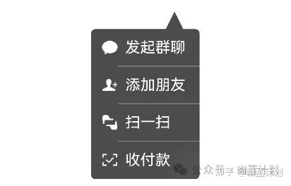
列表完成了:
接下来用Path画一个三角形:
Path()
  .width(20)
  .height(20)
  .commands('M30 0 L60 60 L0 60 Z')
  .fill('rgb(76,76,76)')
  .stroke('rgb(76,76,76)')
这段代码中比较难理解是commands参数:
.commands('M30 0 L60 60 L0 60 Z')
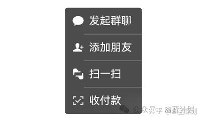
意思是从坐标(30,0)开始,绘制一条到(60,60)的直线,然后从(60,60)绘制一条到(0,60)的直线,再绘制一条从(0,60)到(30,0)的直线,形成一个封闭的三角形。看下效果:

三角形已经绘制出来了,给它调整一下位置:
.margin({left:90})

完成。
完整的代码如下:
@Entry
@Component
struct TestPage {
  @State menuOpacity:number = 1

  build() {
    Row() {
      Column() {

        Flex({direction:FlexDirection.Column,justifyContent:FlexAlign.Center}){
          Path()
            .width(20)
            .height(20)
            .commands('M30 0 L60 60 L0 60 Z')
            .fill('rgb(76,76,76)')
            .stroke('rgb(76,76,76)')
            .margin({left:90})

          List(){
            ListItem(){
              MenuRow({imagePath:'/images/menu_group.png',titleString:'发起群聊'})
            }
            ListItem(){
              MenuRow({imagePath:'/images/menu_add.png',titleString:'添加朋友'})
            }
            ListItem(){
              MenuRow({imagePath:'/images/menu_scan.png',titleString:'扫一扫'})
            }
            ListItem(){
              MenuRow({imagePath:'/images/menu_purchase.png',titleString:'收付款'})
            }
          }
          .edgeEffect(EdgeEffect.None)
          .borderRadius(5)
          .padding({left:12})
          .divider({ strokeWidth: 1, color: 'rgb(130,130,130)', startMargin: 20, endMargin: 0 }) // 每行之间的分界线
          .backgroundColor('rgb(76,76,76)')
          .width(130)
          .height(180)

        }
        .width(130)
        .height(200)
      }
      .width('100%')
    }
    .height('100%')
  }
}

@Component
struct MenuRow {
  imagePath:string
  titleString:string
  build(){
    Flex({direction:FlexDirection.Row,alignItems:ItemAlign.Center}){
      Image(this.imagePath)
        .width(21)
        .height(21)

      Text(this.titleString)
        .fontColor(Color.White)
        .fontSize(18)
        .margin({left:8})
    }
    .height(44)
  }
}