


![[The AI Show Episode 142]: ChatGPT’s New Image Generator, Studio Ghibli Craze and Backlash, Gemini 2.5, OpenAI Academy, 4o Updates, Vibe Marketing & xAI Acquires X](https://www.marketingaiinstitute.com/hubfs/ep%20142%20cover.png)


![[DEALS] The Premium Learn to Code Certification Bundle (97% off) & Other Deals Up To 98% Off – Offers End Soon!](https://www.javacodegeeks.com/wp-content/uploads/2012/12/jcg-logo.jpg)

![From drop-out to software architect with Jason Lengstorf [Podcast #167]](https://cdn.hashnode.com/res/hashnode/image/upload/v1743796461357/f3d19cd7-e6f5-4d7c-8bfc-eb974bc8da68.png?#)


.png?#)


_Christophe_Coat_Alamy.jpg?#)


.webp?#)


![Apple Considers Delaying Smart Home Hub Until 2026 [Gurman]](https://www.iclarified.com/images/news/96946/96946/96946-640.jpg)
![iPhone 17 Pro Won't Feature Two-Toned Back [Gurman]](https://www.iclarified.com/images/news/96944/96944/96944-640.jpg)
![Tariffs Threaten Apple's $999 iPhone Price Point in the U.S. [Gurman]](https://www.iclarified.com/images/news/96943/96943/96943-640.jpg)


Unlocking the Power of CSS Grid: Create Responsive Layouts with Ease
In the ever-evolving world of front-end engineering, building responsive and visually appealing layouts is key to engaging users and saving various headaches. If you haven't yet explored CSS Grid, now's the perfect time, read along! CSS Grid revolutionizes the way we design web pages, making it easier than ever to craft complex, adaptable layouts with clean, minimal code. Why CSS Grid? CSS Grid introduces a two-dimensional layout system that lets you design web pages with rows and columns effortlessly. Unlike traditional layout methods (like floats or even Flexbox, which excels at one-dimensional layouts), CSS Grid gives you precise control over both rows and columns. This means you can create sophisticated designs that adjust seamlessly across various screen sizes—from mobile to desktop. Key Benefits: Simplicity & Flexibility: Layouts that once required intricate hacks can now be accomplished in a few lines of code. Responsive Design: Easily adjust your grid structure using media queries or CSS Grid's auto-placement features. Maintainability: Cleaner code means easier maintenance and faster iteration on your designs. Diving into the Basics At its core, using CSS Grid involves defining a container element as a grid and then positioning child items within that grid. Here's a simple example to get you started: css: /* Define a grid container */ .container { display: grid; grid-template-columns: repeat(auto-fit, minmax(250px, 1fr)); gap: 20px; } /* Style for individual grid items */ .item { background-color: #f0f0f0; padding: 20px; border-radius: 5px; } And in your HTML: Content Block 1 Content Block 2 Content Block 3 Content Block 4 This setup creates a fluid layout where the grid adjusts the number of columns based on the available viewport width. The auto-fit keyword combined with minmax() makes your design responsive without extensive media queries. Tips and Tricks for Mastery Embrace Implicit Grids CSS Grid automatically creates rows or columns if you add more items than defined. This feature simplifies dynamic content layouts. Experiment with different configurations to see how your grid adapts! Use Named Grid Areas For more complex layouts, naming your grid areas can be a game-changer. This allows you to design layouts in a more intuitive and semantic way: .container { display: grid; grid-template-areas: "header header" "sidebar content" "footer footer"; grid-gap: 10px; } .header { grid-area: header; } .sidebar { grid-area: sidebar; } .content { grid-area: content; } .footer { grid-area: footer; } Combine with Flexbox While CSS Grid handles two-dimensional layouts superbly, Flexbox is perfect for aligning content within a grid item. The combination of both makes it easier to build intricate layouts that remain both responsive and accessible. Real-World Applications Whether you're designing a portfolio website, a blog, or a complex web application dashboard, CSS Grid's capabilities let you iterate quickly and design with confidence. Many modern frameworks and component libraries already integrate CSS Grid techniques, so familiarizing yourself with this technology not only enhances your toolkit but also prepares you for the future of web design. Conclusion CSS Grid is a must-have tool in the modern front-end engineer’s arsenal. Its power to simplify responsive design, paired with its flexibility and ease of use, makes it an essential technology for creating dynamic, user-friendly interfaces. Give it a try in your next project, you might be surprised at how much cleaner and efficient your code becomes! Dive in, experiment, and share your breakthroughs with the community. Happy coding!
In the ever-evolving world of front-end engineering, building responsive and visually appealing layouts is key to engaging users and saving various headaches. If you haven't yet explored CSS Grid, now's the perfect time, read along! CSS Grid revolutionizes the way we design web pages, making it easier than ever to craft complex, adaptable layouts with clean, minimal code.
Why CSS Grid?
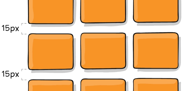
CSS Grid introduces a two-dimensional layout system that lets you design web pages with rows and columns effortlessly. Unlike traditional layout methods (like floats or even Flexbox, which excels at one-dimensional layouts), CSS Grid gives you precise control over both rows and columns. This means you can create sophisticated designs that adjust seamlessly across various screen sizes—from mobile to desktop.
Key Benefits:
Simplicity & Flexibility: Layouts that once required intricate hacks can now be accomplished in a few lines of code.
Responsive Design: Easily adjust your grid structure using media queries or CSS Grid's auto-placement features.
Maintainability: Cleaner code means easier maintenance and faster iteration on your designs.
Diving into the Basics
At its core, using CSS Grid involves defining a container element as a grid and then positioning child items within that grid. Here's a simple example to get you started:
css:
/* Define a grid container */
.container {
  display: grid;
  grid-template-columns: repeat(auto-fit, minmax(250px, 1fr));
  gap: 20px;
}

/* Style for individual grid items */
.item {
  background-color: #f0f0f0;
  padding: 20px;
  border-radius: 5px;
}
And in your HTML:
  Content Block 1
  Content Block 2
  Content Block 3
  Content Block 4
This setup creates a fluid layout where the grid adjusts the number of columns based on the available viewport width. The auto-fit keyword combined with minmax() makes your design responsive without extensive media queries.
Tips and Tricks for Mastery
Embrace Implicit Grids
CSS Grid automatically creates rows or columns if you add more items than defined. This feature simplifies dynamic content layouts. Experiment with different configurations to see how your grid adapts!Use Named Grid Areas
For more complex layouts, naming your grid areas can be a game-changer. This allows you to design layouts in a more intuitive and semantic way:
.container {
  display: grid;
  grid-template-areas:
    "header header"
    "sidebar content"
    "footer footer";
  grid-gap: 10px;
}

.header   { grid-area: header; }
.sidebar  { grid-area: sidebar; }
.content  { grid-area: content; }
.footer   { grid-area: footer; }
- Combine with Flexbox While CSS Grid handles two-dimensional layouts superbly, Flexbox is perfect for aligning content within a grid item. The combination of both makes it easier to build intricate layouts that remain both responsive and accessible.
Real-World Applications
Whether you're designing a portfolio website, a blog, or a complex web application dashboard, CSS Grid's capabilities let you iterate quickly and design with confidence. Many modern frameworks and component libraries already integrate CSS Grid techniques, so familiarizing yourself with this technology not only enhances your toolkit but also prepares you for the future of web design.
Conclusion
CSS Grid is a must-have tool in the modern front-end engineer’s arsenal. Its power to simplify responsive design, paired with its flexibility and ease of use, makes it an essential technology for creating dynamic, user-friendly interfaces. Give it a try in your next project, you might be surprised at how much cleaner and efficient your code becomes!
Dive in, experiment, and share your breakthroughs with the community. Happy coding!