


![[The AI Show Episode 143]: ChatGPT Revenue Surge, New AGI Timelines, Amazon’s AI Agent, Claude for Education, Model Context Protocol & LLMs Pass the Turing Test](https://www.marketingaiinstitute.com/hubfs/ep%20143%20cover.png)


![Is this too much for a modular monolith system? [closed]](https://i.sstatic.net/pYL1nsfg.png)


![M4 MacBook Air Drops to Just $849 - Act Fast! [Lowest Price Ever]](https://www.iclarified.com/images/news/97140/97140/97140-640.jpg)


_roibu_Alamy.jpg?width=1280&auto=webp&quality=80&disable=upscale#)


 CISO’s Core Focus.webp?#)


![Apple Smart Glasses Not Close to Being Ready as Meta Targets 2025 [Gurman]](https://www.iclarified.com/images/news/97139/97139/97139-640.jpg)
![iPadOS 19 May Introduce Menu Bar, iOS 19 to Support External Displays [Rumor]](https://www.iclarified.com/images/news/97137/97137/97137-640.jpg)


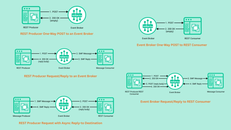
The Problem of Trun...
Imagine that you're in an unfamiliar location. You can see a signpost, but it's old, and most of the letters of the words have been scratched off. The names in the signs all seem similar, given the couple of letters you can see. And you need to get somewhere, but the signpost is not helping at all. You're lost. As the title gives away, I'm writing about something starting with "trun". I could be writing about the problems of trunkfish. They seem a bit lost, so the topic could be that. Or I could be writing about truncheons and the issues caused by them. But no, this time, it's about truncation, specifically when truncation has not been implemented correctly. Texts in applications are like those signs in a signpost. They most often lead to somewhere, give some instructions or necessary information, or are otherwise relevant. Texts wouldn't be in the app if they weren't meaningful. Problem of Truncation Done Wrong We have this widely spread pattern on Android, where the words are truncated with an ellipsis if they don't fit the container, without any way to expand the missing part of the text. For example, when you have a font size that is big enough, app names are truncated. The following image shows an example from accessibility settings and font size selection in Pixel: And okay, one could argue that if you install an app, you should be familiar with it and be able to recognize it even when you just get three letters from the name with the icon. But it's not that straightforward - what if it's an app you've used a year ago? Or what if you have memory issues due to something permanent or due to stress? Or any of the number of reasons why recognizing the app only with a partial name and an icon is not possible - let alone the cognitive load it creates. And it's not just the app icons; it's everywhere in the apps: The bottom navigation, buttons, links, titles... All these are places where the user would need the context of "What will happen if I press this item?" or "What is this section about?" or similar questions. The problem of truncation done wrong is about preventing access to information for users who use, for example, larger font sizes, smaller display sizes, or a combination that makes text truncate. And when we're building apps, we're thinking about the users, right? And building the apps for them? Material Design 3 Perspective But if this "truncate text with ellipsis and leave it at that" is so widespread pattern, it must be part of Material Design specifications, right? Let's look at what Material Design 3 says about text and truncation. You can find all this information in Accessibility writing & text - Text truncation. The page referred to before mentions: Information should always be available to readers, even if text is truncated or wrapped. And If there's an ellipsis, but no way to show the truncated text, it is not accessible There you have it. Even Material Design agrees with me - if there is no mechanism to see the text without truncation, it's not accessible. And in this case, I would equate it to not being usable. So, What's the Option? Yes, the long text can still be a problem that needs to be solved somehow. So here are some options listed - first, some recommended ones, and then some I don't recommend doing. Don't Truncate the Text with Ellipsis My first advice is - don't truncate the text with ellipsis. Just let it take the space it needs and make your overall app UI responsive so that the text is not cut in any way. In many places, this strategy would work perfectly, and the only reason why it's not used is that someone decides that "this text needs to be on one line, and the UI can't be responsive". The decision is often unconscious, just not realizing that not truncating the text is an option. Add "Expand"-option There are cases when the whole text can't be visible. One option for this case would be to add an "Expand" button, which then displays the whole text - either as a modal or by displaying the rest of the text by expanding it. This strategy is also recommended by Material 3. Use basicMarquee - But Make It Accessible What about the basicMarquee-modifier? Wouldn't it be a perfect way to display shorter texts which don't fit on one line? Now, if you haven't encountered the basicMarquee modifier before, it works so that when a text is wider than its container, it scrolls horizontally, displaying the whole text that way. You can define how many times it does the scroll; the default is three. After iterations, it displays as much from the title as the container's width allows, hiding the rest. Sounds great, right? For many, it is. But basicMarquee doesn't respect the "Remove animations"-setting. That can cause a lot of problems for folks who use that setting - for example, for me, these marquee-styled animations are the worst triggers for my symptoms. There are ways to make
Imagine that you're in an unfamiliar location. You can see a signpost, but it's old, and most of the letters of the words have been scratched off. The names in the signs all seem similar, given the couple of letters you can see.
And you need to get somewhere, but the signpost is not helping at all. You're lost.
As the title gives away, I'm writing about something starting with "trun". I could be writing about the problems of trunkfish. They seem a bit lost, so the topic could be that. Or I could be writing about truncheons and the issues caused by them.
But no, this time, it's about truncation, specifically when truncation has not been implemented correctly.
Texts in applications are like those signs in a signpost. They most often lead to somewhere, give some instructions or necessary information, or are otherwise relevant. Texts wouldn't be in the app if they weren't meaningful.
Problem of Truncation Done Wrong
We have this widely spread pattern on Android, where the words are truncated with an ellipsis if they don't fit the container, without any way to expand the missing part of the text.
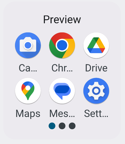
For example, when you have a font size that is big enough, app names are truncated. The following image shows an example from accessibility settings and font size selection in Pixel:
And okay, one could argue that if you install an app, you should be familiar with it and be able to recognize it even when you just get three letters from the name with the icon.
But it's not that straightforward - what if it's an app you've used a year ago? Or what if you have memory issues due to something permanent or due to stress? Or any of the number of reasons why recognizing the app only with a partial name and an icon is not possible - let alone the cognitive load it creates.
And it's not just the app icons; it's everywhere in the apps: The bottom navigation, buttons, links, titles... All these are places where the user would need the context of "What will happen if I press this item?" or "What is this section about?" or similar questions.
The problem of truncation done wrong is about preventing access to information for users who use, for example, larger font sizes, smaller display sizes, or a combination that makes text truncate.
And when we're building apps, we're thinking about the users, right? And building the apps for them?
Material Design 3 Perspective
But if this "truncate text with ellipsis and leave it at that" is so widespread pattern, it must be part of Material Design specifications, right? Let's look at what Material Design 3 says about text and truncation. You can find all this information in Accessibility writing & text - Text truncation.
The page referred to before mentions:
Information should always be available to readers, even if text is truncated or wrapped.
And
If there's an ellipsis, but no way to show the truncated text, it is not accessible
There you have it. Even Material Design agrees with me - if there is no mechanism to see the text without truncation, it's not accessible. And in this case, I would equate it to not being usable.
So, What's the Option?
Yes, the long text can still be a problem that needs to be solved somehow. So here are some options listed - first, some recommended ones, and then some I don't recommend doing.
Don't Truncate the Text with Ellipsis
My first advice is - don't truncate the text with ellipsis. Just let it take the space it needs and make your overall app UI responsive so that the text is not cut in any way.
In many places, this strategy would work perfectly, and the only reason why it's not used is that someone decides that "this text needs to be on one line, and the UI can't be responsive". The decision is often unconscious, just not realizing that not truncating the text is an option.
Add "Expand"-option
There are cases when the whole text can't be visible. One option for this case would be to add an "Expand" button, which then displays the whole text - either as a modal or by displaying the rest of the text by expanding it. This strategy is also recommended by Material 3.
Use basicMarquee - But Make It Accessible
What about the basicMarquee-modifier? Wouldn't it be a perfect way to display shorter texts which don't fit on one line?
Now, if you haven't encountered the basicMarquee modifier before, it works so that when a text is wider than its container, it scrolls horizontally, displaying the whole text that way. You can define how many times it does the scroll; the default is three. After iterations, it displays as much from the title as the container's width allows, hiding the rest.
Sounds great, right? For many, it is. But basicMarquee doesn't respect the "Remove animations"-setting. That can cause a lot of problems for folks who use that setting - for example, for me, these marquee-styled animations are the worst triggers for my symptoms.
There are ways to make the basicMarquee modifier more accessible, and I've written a blog post about that: Making basicMarquee-Modifier More Accessible.
Non-recommended Ways
There are also some ways to "solve" the problems of truncation that I don't recommend. The first one is not to do anything, but as we care about our users, we're not using that strategy, right?
Another option would be preventing font scaling. While there might be some corner cases where preventing font scaling is acceptable, from an accessibility perspective, I'd say never do that. Users who use larger fonts use them for a reason, and if you prevent font scaling, it means that the text is way smaller than they can, for example, see. That, in turn, means that your app (or part of it) might become unusable for them.
Wrapping Up
This blog post looked into the problem of truncation and how to solve the issues text truncation might present. I presented a couple of recommended ways and then two non-recommended ones.
Have you run into problems with text truncation?