


![[Webinar] AI Is Already Inside Your SaaS Stack — Learn How to Prevent the Next Silent Breach](https://blogger.googleusercontent.com/img/b/R29vZ2xl/AVvXsEiOWn65wd33dg2uO99NrtKbpYLfcepwOLidQDMls0HXKlA91k6HURluRA4WXgJRAZldEe1VReMQZyyYt1PgnoAn5JPpILsWlXIzmrBSs_TBoyPwO7hZrWouBg2-O3mdeoeSGY-l9_bsZB7vbpKjTSvG93zNytjxgTaMPqo9iq9Z5pGa05CJOs9uXpwHFT4/s1600/ai-cyber.jpg?#)


![[The AI Show Episode 144]: ChatGPT’s New Memory, Shopify CEO’s Leaked “AI First” Memo, Google Cloud Next Releases, o3 and o4-mini Coming Soon & Llama 4’s Rocky Launch](https://www.marketingaiinstitute.com/hubfs/ep%20144%20cover.png)


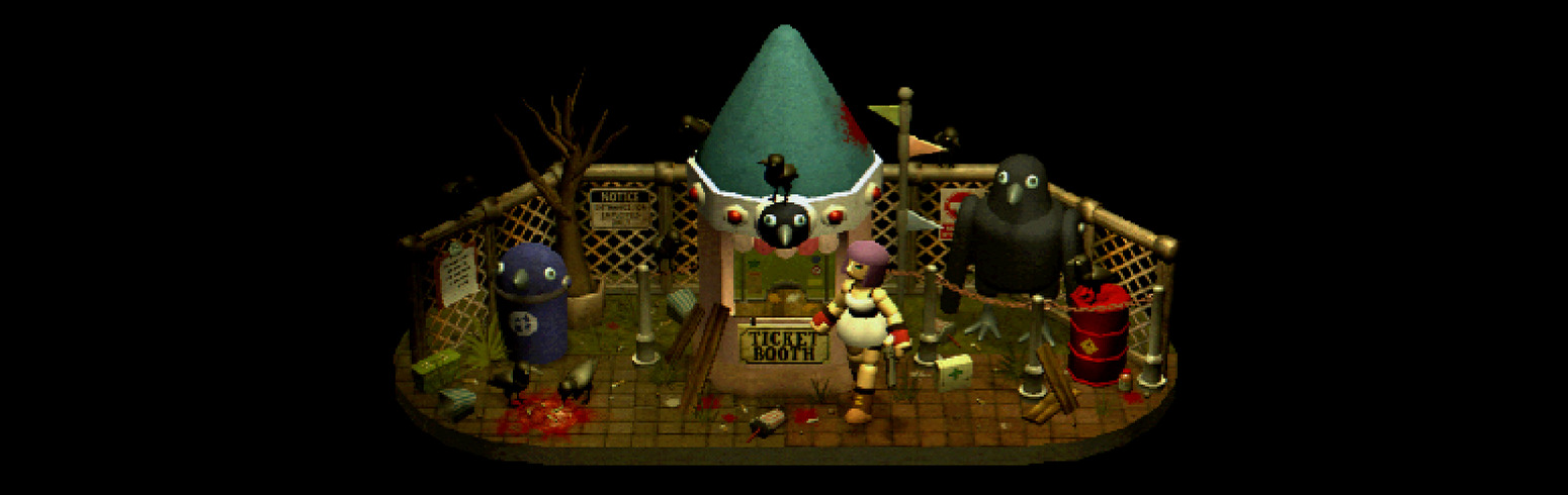
![Rogue Company Elite tier list of best characters [April 2025]](https://media.pocketgamer.com/artwork/na-33136-1657102075/rogue-company-ios-android-tier-cover.jpg?#)


_Andreas_Prott_Alamy.jpg?width=1280&auto=webp&quality=80&disable=upscale#)


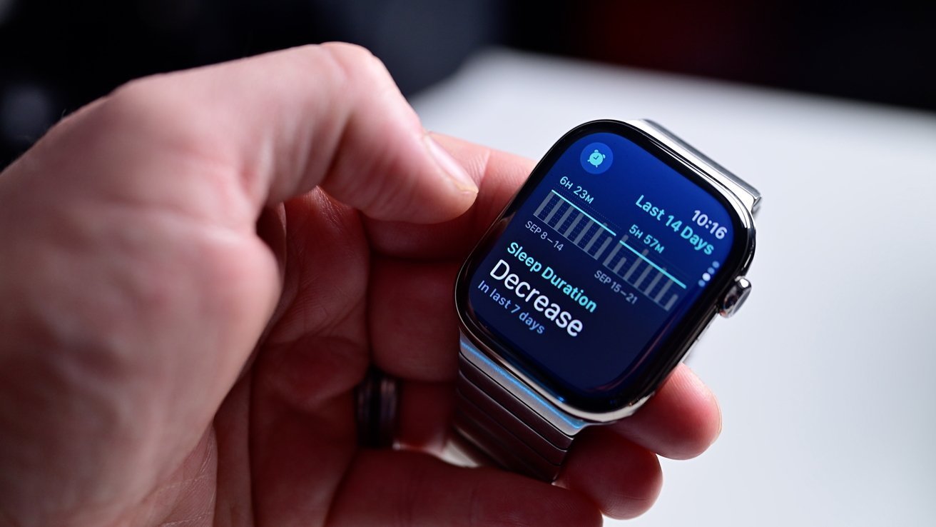
![Apple Watch Series 10 Back On Sale for $299! [Lowest Price Ever]](https://www.iclarified.com/images/news/96657/96657/96657-640.jpg)
![EU Postpones Apple App Store Fines Amid Tariff Negotiations [Report]](https://www.iclarified.com/images/news/97068/97068/97068-640.jpg)
![Apple Slips to Fifth in China's Smartphone Market with 9% Decline [Report]](https://www.iclarified.com/images/news/97065/97065/97065-640.jpg)


SVG essentials. Embedded image and filter effects
What if we need a shadow for the shape in SVG? If we use CSS box-shadow on SVG elements, it won't have any effect. As you may know, we have filter and backdrop-filter properties in CSS, and they are actually a subset of SVG filters! We can use SVG filters externally by using this property like this: filter: url(#filterId). Table of contents Embedded image Basic structure of SVG filter Filter primitives Filter primitive attributes feDisplacementMap feDropShadow feGaussianBlur feMorphology Embedded image If we embed an image inside SVG, we will be able to clip, mask and apply filter on it. Basic structure of SVG filter Let's look at how to apply a filter effect on some SVG shape (for example circle): The filter effect can consist of multiple filter primitives. All filter primitives names start with fe, which stands for "filter effect". Filter primitives We won't discuss every filter primitive, only stopping at the most needed ones. The full list can be found here. Filter primitive attributes All filter primitives can have the following attributes: x, y (default 0, 0) are the minimum coordinates for the subregion of the filter primitive; width, height define dimensions for the subregion of the filter primitive; result="" assigns a name for the filter primitive, which can be referenced by an in attribute on another filter primitive. Most filter primitives can take other ones as input with the following attribute: in="". If no value is specified, in takes SourceGraphic (original image) as one. feDisplacementMap This effect allows us to change the texture of the image by taking it from another image or effect. Here, we used another filter effect feTurbulence to get the texture. scale (default 0) defines the amount of displacement; in="SourceGraphic" specifies what image needs to be changed; in2 is used to displace the pixels in the image from the in attribute. feDropShadow dx, dy (default is 2) set offset of the drop shadow; stdDeviation (default is 2) sets blur of the drop shadow. feGaussianBlur stdDeviation (default 0) defines the amount of blur. It can be equal to two numbers for x and y axes. We can achieve the same output by defining a filter in SVG and applying it in CSS: /* style.css */ img { filter: url(#blur); } feMorphology operator takes values: erode (default) makes the source graphic thinner; dilate makes it fatter. radius (default 0) regulates the impact of the operator. It can be equal to two numbers for x and y axes. feTurbulence type: turbulence (default) performs turbulence function; fractalNoise performs noise function. baseFrequency (default 0) specifies frequency for the noise function. It can take two values for x and y axes. numOctaves (default 1) is the parameter for the noise function. The higher the value is, the more noise you get.
What if we need a shadow for the shape in SVG? If we use CSS box-shadow on SVG elements, it won't have any effect.
As you may know, we have filter and backdrop-filter properties in CSS, and they are actually a subset of SVG filters! We can use SVG filters externally by using this property like this: filter: url(#filterId).
Table of contents
- Embedded image
- Basic structure of SVG filter
-
Filter primitives
- Filter primitive attributes
- feDisplacementMap
- feDropShadow
- feGaussianBlur
- feMorphology
Embedded image
If we embed an image inside SVG, we will be able to clip, mask and apply filter on it.
 xmlns="http://www.w3.org/2000/svg" viewBox="0 0 100 100">

  x="5"
  y="5"
  width="90"
  height="90"
  href="https://picsum.photos/id/33/400"
 />
Basic structure of SVG filter
Let's look at how to apply a filter effect on some SVG shape (for example circle):
 xmlns="..." viewBox="...">

   id="filterId">


  filter="url(#filterId)" />
The filter effect can consist of multiple filter primitives. All filter primitives names start with fe, which stands for "filter effect".
Filter primitives
We won't discuss every filter primitive, only stopping at the most needed ones. The full list can be found here.
Filter primitive attributes
All filter primitives can have the following attributes:
-
x,y(default 0, 0) are the minimum coordinates for the subregion of the filter primitive; -
width,heightdefine dimensions for the subregion of the filter primitive; -
result="assigns a name for the filter primitive, which can be referenced by an" inattribute on another filter primitive.
Most filter primitives can take other ones as input with the following attribute:
-
in=". If no value is specified," intakesSourceGraphic(original image) as one.
feDisplacementMap
This effect allows us to change the texture of the image by taking it from another image or effect.
 xmlns="http://www.w3.org/2000/svg" viewBox="0 0 200 200">

   id="morph">
    baseFrequency="0.05" numOctaves="2" result="turbulence" />
    in="SourceGraphic" in2="turbulence" scale="20" />


  width="180" href="https://picsum.photos/id/33/200" filter="url(#morph)" />
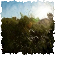
Here, we used another filter effect feTurbulence to get the texture.
-
scale(default 0) defines the amount of displacement; -
in="SourceGraphic"specifies what image needs to be changed; -
in2is used to displace the pixels in the image from theinattribute.
feDropShadow
 xmlns="http://www.w3.org/2000/svg" viewBox="0 0 100 100">

   id="shadow">
    />


  points="10,50 40,60 50,90 60,60 90,50 60,40 50,10 40,40"
  fill="teal"
  filter="url(#shadow)"
 />

-
dx,dy(default is 2) set offset of the drop shadow; -
stdDeviation(default is 2) sets blur of the drop shadow.
feGaussianBlur
 xmlns="http://www.w3.org/2000/svg" viewBox="0 0 100 100">

   id="blur">
    stdDeviation="1" />


  href="https://picsum.photos/id/33/100"
  filter="url(#blur)"
 />
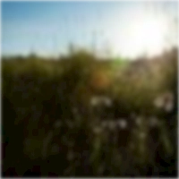
-
stdDeviation(default 0) defines the amount of blur. It can be equal to two numbers forxandyaxes.
We can achieve the same output by defining a filter in SVG and applying it in CSS:
 xmlns="http://www.w3.org/2000/svg" viewBox="0 0 100 100" width="0" height="0">

   id="blur">
    stdDeviation="2" />


  src="https://picsum.photos/id/33/100" />
/* style.css */
img {
 filter: url(#blur);
}
feMorphology
 xmlns="http://www.w3.org/2000/svg" viewBox="0 0 400 400">

   id="morph">
    operator="dilate" radius="10" />


  href="https://picsum.photos/id/33/400" filter="url(#morph)" />
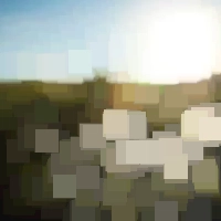
-
operatortakes values:-
erode(default) makes the source graphic thinner; -
dilatemakes it fatter.
-
-
radius(default 0) regulates the impact of the operator. It can be equal to two numbers forxandyaxes.
feTurbulence
 xmlns="http://www.w3.org/2000/svg" viewBox="0 0 200 200">

   id="morph">
    baseFrequency="0.05" numOctaves="2" />


  href="https://picsum.photos/id/33/200" filter="url(#morph)" />
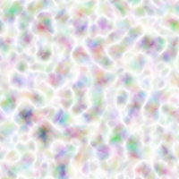
-
type:-
turbulence(default) performs turbulence function; -
fractalNoiseperforms noise function.
-
-
baseFrequency(default 0) specifies frequency for the noise function. It can take two values for x and y axes. -
numOctaves(default 1) is the parameter for the noise function. The higher the value is, the more noise you get.