


![[Webinar] AI Is Already Inside Your SaaS Stack — Learn How to Prevent the Next Silent Breach](https://blogger.googleusercontent.com/img/b/R29vZ2xl/AVvXsEiOWn65wd33dg2uO99NrtKbpYLfcepwOLidQDMls0HXKlA91k6HURluRA4WXgJRAZldEe1VReMQZyyYt1PgnoAn5JPpILsWlXIzmrBSs_TBoyPwO7hZrWouBg2-O3mdeoeSGY-l9_bsZB7vbpKjTSvG93zNytjxgTaMPqo9iq9Z5pGa05CJOs9uXpwHFT4/s1600/ai-cyber.jpg?#)


![[The AI Show Episode 144]: ChatGPT’s New Memory, Shopify CEO’s Leaked “AI First” Memo, Google Cloud Next Releases, o3 and o4-mini Coming Soon & Llama 4’s Rocky Launch](https://www.marketingaiinstitute.com/hubfs/ep%20144%20cover.png)


![Rogue Company Elite tier list of best characters [April 2025]](https://media.pocketgamer.com/artwork/na-33136-1657102075/rogue-company-ios-android-tier-cover.jpg?#)


_Andreas_Prott_Alamy.jpg?width=1280&auto=webp&quality=80&disable=upscale#)


![What’s new in Android’s April 2025 Google System Updates [U: 4/18]](https://i0.wp.com/9to5google.com/wp-content/uploads/sites/4/2025/01/google-play-services-3.jpg?resize=1200%2C628&quality=82&strip=all&ssl=1)


![Apple Watch Series 10 Back On Sale for $299! [Lowest Price Ever]](https://www.iclarified.com/images/news/96657/96657/96657-640.jpg)
![EU Postpones Apple App Store Fines Amid Tariff Negotiations [Report]](https://www.iclarified.com/images/news/97068/97068/97068-640.jpg)
![Apple Slips to Fifth in China's Smartphone Market with 9% Decline [Report]](https://www.iclarified.com/images/news/97065/97065/97065-640.jpg)


Redesign for the registration screen of an open source platform - part 1
Today, I resumed my contributions to the technology community. I'd been thinking about how to do it for a while, and here comes the perfect opportunity: an acquaintance launches a new open source Pix platform, with the proposal of facilitating payments for developers through SaaS registration. As I already used his other service - a similar platform, but with a focus on alerts and a digital wallet for streamers - I wasted no time in checking it out, trying it out and analyzing the UX. As it happens, I really admire his work and the energy that an IT community provides, both for our personal development and for the way we collaborate! On Sunday, I dedicated myself to analyzing the site from end to end, looking for something I could help with. And didn't I find it? The “Sign in” and “Sign up” pages looked identical and had no links between them. Another issue was the post-registration onboarding, whose space seemed to be poorly used. In addition, the mobile version didn't have the same timeline of steps to guide the user. In view of this, I made some adaptations, preserving other elements See more this on my twitter: vitoriazzp
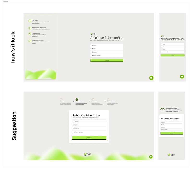
Today, I resumed my contributions to the technology community. I'd been thinking about how to do it for a while, and here comes the perfect opportunity: an acquaintance launches a new open source Pix platform, with the proposal of facilitating payments for developers through SaaS registration.
As I already used his other service - a similar platform, but with a focus on alerts and a digital wallet for streamers - I wasted no time in checking it out, trying it out and analyzing the UX. As it happens, I really admire his work and the energy that an IT community provides, both for our personal development and for the way we collaborate! On Sunday, I dedicated myself to analyzing the site from end to end, looking for something I could help with. And didn't I find it?
The “Sign in” and “Sign up” pages looked identical and had no links between them. Another issue was the post-registration onboarding, whose space seemed to be poorly used. In addition, the mobile version didn't have the same timeline of steps to guide the user. In view of this, I made some adaptations, preserving other elements
See more this on my twitter: vitoriazzp