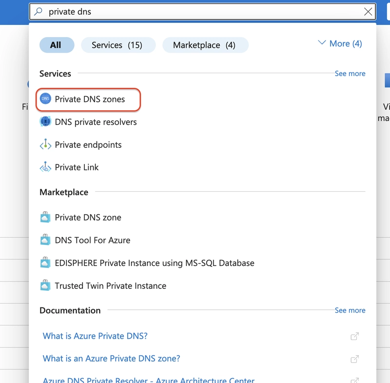
.jpg)


![[The AI Show Episode 143]: ChatGPT Revenue Surge, New AGI Timelines, Amazon’s AI Agent, Claude for Education, Model Context Protocol & LLMs Pass the Turing Test](https://www.marketingaiinstitute.com/hubfs/ep%20143%20cover.png)


![[Research] Starting Web App in 2025: Vibe-coding, AI Agents….](https://media2.dev.to/dynamic/image/width%3D1000,height%3D500,fit%3Dcover,gravity%3Dauto,format%3Dauto/https:%2F%2Fdev-to-uploads.s3.amazonaws.com%2Fuploads%2Farticles%2Fby8z0auultdpyfrx5tx8.png)


![[DEALS] Koofr Cloud Storage: Lifetime Subscription (1TB) (80% off) & Other Deals Up To 98% Off – Offers End Soon!](https://www.javacodegeeks.com/wp-content/uploads/2012/12/jcg-logo.jpg)


-RTAガチ勢がSwitch2体験会でゼルダのラスボスを撃破して世界初のEDを流してしまう...【ゼルダの伝説ブレスオブザワイルドSwitch2-Edition】-00-06-05.png?width=1920&height=1920&fit=bounds&quality=70&format=jpg&auto=webp#)


_roibu_Alamy.jpg?width=1280&auto=webp&quality=80&disable=upscale#)


.webp?#)


![M4 MacBook Air Drops to Just $849 - Act Fast! [Lowest Price Ever]](https://www.iclarified.com/images/news/97140/97140/97140-640.jpg)
![Apple Smart Glasses Not Close to Being Ready as Meta Targets 2025 [Gurman]](https://www.iclarified.com/images/news/97139/97139/97139-640.jpg)
![iPadOS 19 May Introduce Menu Bar, iOS 19 to Support External Displays [Rumor]](https://www.iclarified.com/images/news/97137/97137/97137-640.jpg)


Knowing the name of things helps think better about the project's experience and interface.
For a while now, I’ve been thinking about how to write about design and frontend in a way that’s useful to both sides. Without a wall in between, because here, there should be no wall. I reflected on various experiences I’ve had in a handoff context—the exchange between design and development. I saw value in many of them, so I’ll start with one that I think is useful to open minds and this virtual space we’re in. Some time ago, in a review meeting for interface and project alignment, a comment from the client stuck in my mind: “It’s amazing how you designers know the name of every icon, every little thing...” By the way, besides being the company’s founder, he was also one of the product developers. I took it well at the time, laughing, but it stayed with me. This type of comment says a lot about mastering the language of what we build. Knowing that that icon is a chevron-down and not "the little arrow pointing down" might seem like a small detail. But when we're designing in Figma, coding in VS Code, or integrating with a UI library, it makes a huge difference: it saves time, avoids communication noise, and brings teams closer together. It could be an arrow-right, a plus-circle, an x, or even a hamburger. Having those names clear in mind, along with the functions and variations of each component, gives me flow when presenting an interface, defending a design choice, or aligning with developers on what's going to production. And this doesn't stop at icons. Whether it's a modal, a drawer, a card, a badge, a tooltip, a chip, or an accordion, each carries meaning that organizes the conversation and the product development process all the way to the final touchpoint with the user. Knowing the name of things completely changes the game. Understanding this "vocabulary" takes us out of the place of "I think it's that little square with rounded corners" and puts us in a spot where the team speaks the same language, where the product flows without noise. That's it. And understanding the name of these pieces is just the first step. Behind every component, there is a logic, an intention of use, a reason why. And that’s where another layer comes in: design as building meaning. When we arrive on the internet, it's not just wild. It seems obvious, but sometimes we forget: everything we see in an interface has been thought through. Buttons, icons, spacing, visual hierarchies. None of that is there by chance. One of the best managers I had the honor of working with taught me, early in my career, that interface design is about understanding the why behind things. It's the invisible logic that makes us look at a button and know it’s clickable. It’s the visual weight that separates what’s important from what’s secondary. It’s the flow that guides the experience without the user needing to stop and think. This has a name: affordance. There’s a concept in design that explains exactly this phenomenon, and it's indispensable for creating great interfaces. Affordance is when design suggests how something should be used just by the way it appears. An arrow points forward. A button with a shadow looks ready to be pressed. A link in underlined text calls to be clicked. And so on. When we ignore these cues, the interface becomes noise. When we respect them, the experience becomes fluid. And that's where the importance of studying UI and UX comes in—to have a theoretical foundation when building something. UI isn't just about making things look pretty. UI is about designing functionality, hierarchy, clarity. UX isn't just about making journey maps. UX is about creating the experience that facilitates, that shortens the path, that respects how people feel while interacting. And the deeper I dive into this, the more I realize: knowing the names of icons, components, patterns... is still just the surface. It invites us to open a door to understand the thinking that came before. Yes, before. Want to dive into this tide? Since I started in interface design, I’ve always been driven by the curiosity to understand the why behind things, motivated by people who inspired me. I spent hours and hours studying libraries, design systems, icon families, accessibility best practices, even though I had no idea I’d one day be working so closely with code. And in a time when it was hard to find well-organized materials! Today, I see that this drive to understand patterns was what built my bridges: between Design and Development, between Product and People. So that's it: the internet is already waiting for us with fundamentals ready to be understood. If you want to learn the names of components, icons, and web design fundamentals, there are amazing places to study and build that vocabulary. Here are some I believe are great foundations and good reinforcements that can help you:
For a while now, I’ve been thinking about how to write about design and frontend in a way that’s useful to both sides. Without a wall in between, because here, there should be no wall.
I reflected on various experiences I’ve had in a handoff context—the exchange between design and development. I saw value in many of them, so I’ll start with one that I think is useful to open minds and this virtual space we’re in.
Some time ago, in a review meeting for interface and project alignment, a comment from the client stuck in my mind:
“It’s amazing how you designers know the name of every icon, every little thing...”
By the way, besides being the company’s founder, he was also one of the product developers. I took it well at the time, laughing, but it stayed with me.
This type of comment says a lot about mastering the language of what we build.
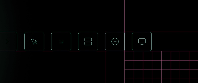
Knowing that that icon is a chevron-down and not "the little arrow pointing down" might seem like a small detail. But when we're designing in Figma, coding in VS Code, or integrating with a UI library, it makes a huge difference: it saves time, avoids communication noise, and brings teams closer together.
It could be an arrow-right, a plus-circle, an x, or even a hamburger. Having those names clear in mind, along with the functions and variations of each component, gives me flow when presenting an interface, defending a design choice, or aligning with developers on what's going to production.
And this doesn't stop at icons. Whether it's a modal, a drawer, a card, a badge, a tooltip, a chip, or an accordion, each carries meaning that organizes the conversation and the product development process all the way to the final touchpoint with the user.
Knowing the name of things completely changes the game.
Understanding this "vocabulary" takes us out of the place of "I think it's that little square with rounded corners" and puts us in a spot where the team speaks the same language, where the product flows without noise. That's it.
And understanding the name of these pieces is just the first step. Behind every component, there is a logic, an intention of use, a reason why.
And that’s where another layer comes in: design as building meaning.
When we arrive on the internet, it's not just wild.
It seems obvious, but sometimes we forget: everything we see in an interface has been thought through.
Buttons, icons, spacing, visual hierarchies. None of that is there by chance.
One of the best managers I had the honor of working with taught me, early in my career, that interface design is about understanding the why behind things.
It's the invisible logic that makes us look at a button and know it’s clickable. It’s the visual weight that separates what’s important from what’s secondary. It’s the flow that guides the experience without the user needing to stop and think.
This has a name: affordance.
There’s a concept in design that explains exactly this phenomenon, and it's indispensable for creating great interfaces.
Affordance is when design suggests how something should be used just by the way it appears. An arrow points forward. A button with a shadow looks ready to be pressed. A link in underlined text calls to be clicked. And so on.
When we ignore these cues, the interface becomes noise. When we respect them, the experience becomes fluid. And that's where the importance of studying UI and UX comes in—to have a theoretical foundation when building something.
UI isn't just about making things look pretty. UI is about designing functionality, hierarchy, clarity.
UX isn't just about making journey maps. UX is about creating the experience that facilitates, that shortens the path, that respects how people feel while interacting.
And the deeper I dive into this, the more I realize: knowing the names of icons, components, patterns... is still just the surface. It invites us to open a door to understand the thinking that came before.
Yes, before.
Want to dive into this tide?
Since I started in interface design, I’ve always been driven by the curiosity to understand the why behind things, motivated by people who inspired me.
I spent hours and hours studying libraries, design systems, icon families, accessibility best practices, even though I had no idea I’d one day be working so closely with code. And in a time when it was hard to find well-organized materials!
Today, I see that this drive to understand patterns was what built my bridges: between Design and Development, between Product and People.
So that's it: the internet is already waiting for us with fundamentals ready to be understood.
If you want to learn the names of components, icons, and web design fundamentals, there are amazing places to study and build that vocabulary.
Here are some I believe are great foundations and good reinforcements that can help you: