


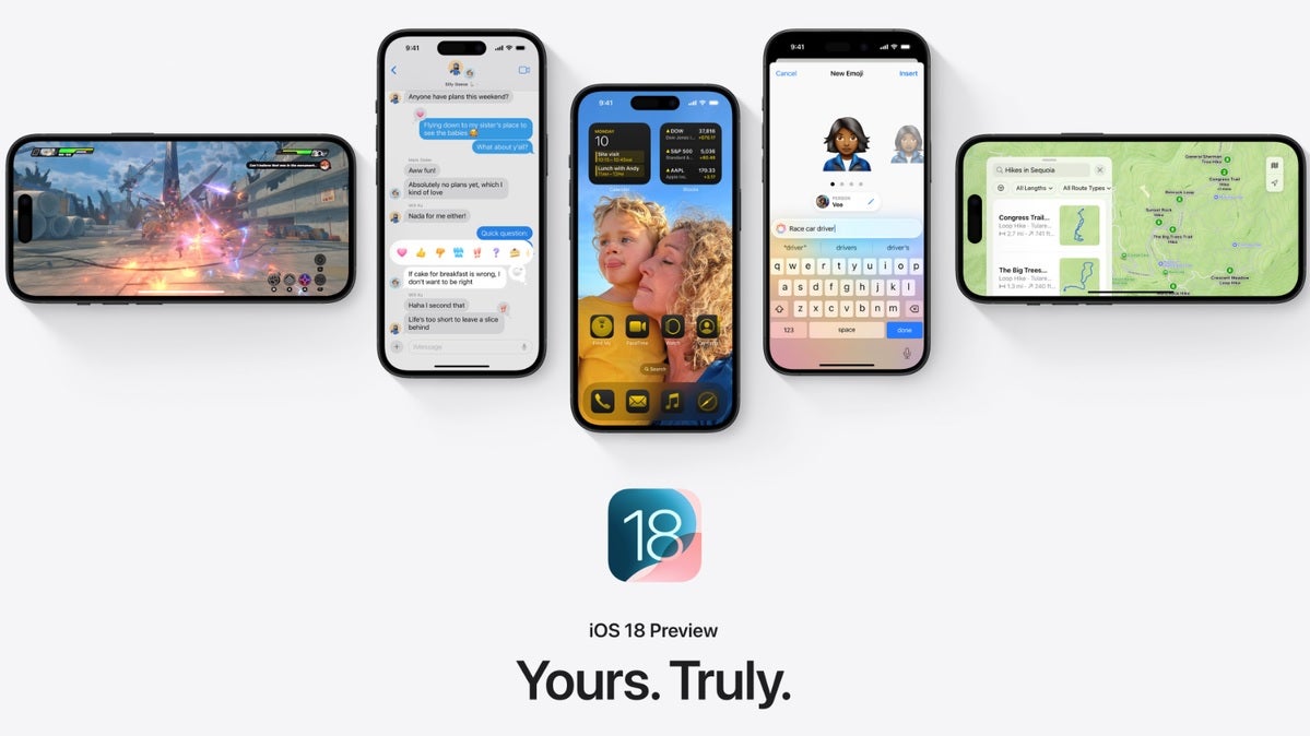
![[The AI Show Episode 144]: ChatGPT’s New Memory, Shopify CEO’s Leaked “AI First” Memo, Google Cloud Next Releases, o3 and o4-mini Coming Soon & Llama 4’s Rocky Launch](https://www.marketingaiinstitute.com/hubfs/ep%20144%20cover.png)


![Blue Archive tier list [April 2025]](https://media.pocketgamer.com/artwork/na-33404-1636469504/blue-archive-screenshot-2.jpg?#)


.png?#)


-Baldur’s-Gate-3-The-Final-Patch---An-Animated-Short-00-03-43.png?width=1920&height=1920&fit=bounds&quality=70&format=jpg&auto=webp#)


![Alleged Pixel 10 series wallpapers leak with vibrant colors and a strange new theme [Gallery]](https://i0.wp.com/9to5google.com/wp-content/uploads/sites/4/2025/04/pixel-10-wallpaper-leak-1.jpg?resize=1200%2C628&quality=82&strip=all&ssl=1)


![Apple to Split Enterprise and Western Europe Roles as VP Exits [Report]](https://www.iclarified.com/images/news/97032/97032/97032-640.jpg)
![Nanoleaf Announces New Pegboard Desk Dock With Dual-Sided Lighting [Video]](https://www.iclarified.com/images/news/97030/97030/97030-640.jpg)

![Apple's Foldable iPhone May Cost Between $2100 and $2300 [Rumor]](https://www.iclarified.com/images/news/97028/97028/97028-640.jpg)


How-To: Twist Cards using Tailwind CSS
What are Twist Cards? Twist cards are interactive elements that combine smooth rotation and scaling animations when users hover over them. Unlike traditional hover effects, twist cards create a three-dimensional sensation through precise rotation angles and coordinated transforms. Most commonly found in event showcases, team galleries, and product displays, twist cards add a layer of sophistication without overwhelming your interface. Benefits of Twist Cards Twist cards offer several advantages for enhancing your website's user experience: They create a subtle yet captivating 3D effect that draws users' attention naturally The combination of rotation and scaling provides depth that makes content feel more tangible and interactive They're particularly effective for highlighting time-sensitive content like events or limited-time offers The animation is smooth and predictable, making it accessible and non-disruptive to users When implemented thoughtfully, twist cards can transform standard content sections into engaging, interactive experiences that encourage exploration while maintaining professional polish. Similar to our 3D Flip Cards tutorial, we'll show you how to create these sophisticated animations using Tailwind CSS step by step. The technique we'll cover combines transform properties with smooth transitions to achieve a natural, fluid motion that enhances rather than overshadows your content. What We're Building We'll create an event showcase using twist cards that feature: Smooth Transform Effects 12-degree rotation on hover Scale increase for depth Coordinated animations on both the card and its gradient backdrop Professional UI Elements Clean event card layout Dynamic status tags ("Limited Seats", "Early Bird", "Sold Out") Responsive image container Gradient background that animates with the twist Responsive Design Adapts from single column to three-column grid Maintains smooth animations across devices Optimized spacing and scaling at all breakpoints Want to see it in action? Live Demo GitHub Repository Let's dive in and see how it's done! To begin with we will create a new Next.js app using npx create-next-app@latest and selecting Tailwind CSS from the setup instructions. We will then need to create a new folder called 'components'. Inside of our new components folder we will create a new file TwistCardComponent.tsx 1. Set Up the Section Wrapper and Mock Data Firt let's set up our base structure with some demo data: Data Structure Breakdown: const events = [ { id: 1, title: "Web Dev Summit 2024", date: "Dec 15-17 • San Francisco", image: "https://images.unsplash.com/photo-1645323927890-ebc1462c12c8?q=80&w=2929&auto=format&fit=crop&ixlib=rb-4.0.3&ixid=M3wxMjA3fDB8MHxwaG90by1wYWdlfHx8fGVufDB8fHx8fA%3D%3D", tags: ["Limited Seats", "Early Bird"], }, { id: 2, title: "Design Thinking 2024", date: "Jan 15-17 • New York", image: "https://images.unsplash.com/photo-1645323927890-ebc1462c12c8?q=80&w=2929&auto=format&fit=crop&ixlib=rb-4.0.3&ixid=M3wxMjA3fDB8MHxwaG90by1wYWdlfHx8fGVufDB8fHx8fA%3D%3D", tags: ["Sold Out", "Sold Out"], }, { id: 3, title: "Product Management 2024", date: "Feb 15-17 • Los Angeles", image: "https://images.unsplash.com/photo-1645323927890-ebc1462c12c8?q=80&w=2929&auto=format&fit=crop&ixlib=rb-4.0.3&ixid=M3wxMjA3fDB8MHxwaG90by1wYWdlfHx8fGVufDB8fHx8fA%3D%3D", tags: ["Limited Seats", "Early Bird"], }, ]; Each event object contains: id: Unique identifier for React key prop title: Event name display date: Formatted date and location string image: URL for event preview image tags: Array of status indicators that determine styling Now, let's set up our main section wrapper with responsive padding and container settings: const TwistCard = () => { return ( Upcoming Events {/* Grid container will go here */} ); }; Let's break this down and examine each container: Outer Section className="py-8 bg-slate-200 mx-auto sm:py-12 md:py-16" Base styling: bg-slate-200: Light gray background mx-auto: Center horizontally Responsive padding: py-8: 2rem padding on mobile sm:py-12: 3rem padding on small screens md:py-16: 4rem padding on medium screens Inner Container className="container mx-auto px-4" Layout: container: Max-width constraint mx-auto: Center horizontally px-4: Consistent horizontal padding Content Wrapper className="flex justify-center object-center flex-col gap-8 sm:gap-12" Layout: flex flex-col: Vertical stack justify-center: Center content vertically object-center: Center aligned objects Spacing: gap-8: 2rem gap on mobile sm:gap-12: 3rem gap on larger screens Heading className="text-3xl md:text-4xl lg:text-5xl xl:text-6xl font-semibold text
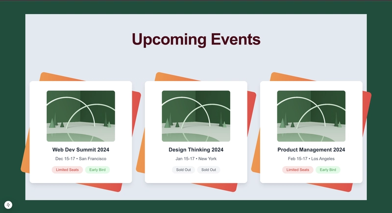
What are Twist Cards?
Twist cards are interactive elements that combine smooth rotation and scaling animations when users hover over them. Unlike traditional hover effects, twist cards create a three-dimensional sensation through precise rotation angles and coordinated transforms. Most commonly found in event showcases, team galleries, and product displays, twist cards add a layer of sophistication without overwhelming your interface.
Benefits of Twist Cards
Twist cards offer several advantages for enhancing your website's user experience:
- They create a subtle yet captivating 3D effect that draws users' attention naturally
- The combination of rotation and scaling provides depth that makes content feel more tangible and interactive
- They're particularly effective for highlighting time-sensitive content like events or limited-time offers
- The animation is smooth and predictable, making it accessible and non-disruptive to users
When implemented thoughtfully, twist cards can transform standard content sections into engaging, interactive experiences that encourage exploration while maintaining professional polish.
Similar to our 3D Flip Cards tutorial, we'll show you how to create these sophisticated animations using Tailwind CSS step by step. The technique we'll cover combines transform properties with smooth transitions to achieve a natural, fluid motion that enhances rather than overshadows your content.
What We're Building
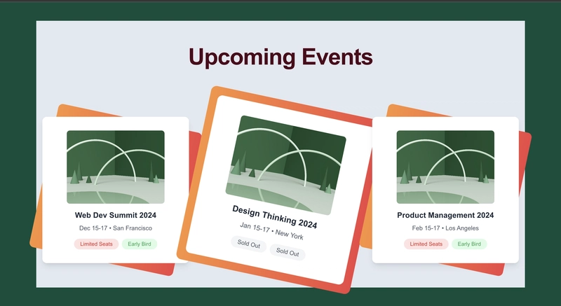
We'll create an event showcase using twist cards that feature:
-
Smooth Transform Effects
- 12-degree rotation on hover
- Scale increase for depth
- Coordinated animations on both the card and its gradient backdrop
-
Professional UI Elements
- Clean event card layout
- Dynamic status tags ("Limited Seats", "Early Bird", "Sold Out")
- Responsive image container
- Gradient background that animates with the twist
-
Responsive Design
- Adapts from single column to three-column grid
- Maintains smooth animations across devices
- Optimized spacing and scaling at all breakpoints
Want to see it in action?
Let's dive in and see how it's done!
To begin with we will create a new Next.js app using npx create-next-app@latest and selecting Tailwind CSS from the setup instructions.
We will then need to create a new folder called 'components'.
Inside of our new components folder we will create a new file TwistCardComponent.tsx
1. Set Up the Section Wrapper and Mock Data
Firt let's set up our base structure with some demo data:
Data Structure Breakdown:
const events = [
  {
    id: 1,
    title: "Web Dev Summit 2024",
    date: "Dec 15-17 • San Francisco",
    image:
      "https://images.unsplash.com/photo-1645323927890-ebc1462c12c8?q=80&w=2929&auto=format&fit=crop&ixlib=rb-4.0.3&ixid=M3wxMjA3fDB8MHxwaG90by1wYWdlfHx8fGVufDB8fHx8fA%3D%3D",
    tags: ["Limited Seats", "Early Bird"],
  },
  {
    id: 2,
    title: "Design Thinking 2024",
    date: "Jan 15-17 • New York",
    image:
      "https://images.unsplash.com/photo-1645323927890-ebc1462c12c8?q=80&w=2929&auto=format&fit=crop&ixlib=rb-4.0.3&ixid=M3wxMjA3fDB8MHxwaG90by1wYWdlfHx8fGVufDB8fHx8fA%3D%3D",
    tags: ["Sold Out", "Sold Out"],
  },
  {
    id: 3,
    title: "Product Management 2024",
    date: "Feb 15-17 • Los Angeles",
    image:
      "https://images.unsplash.com/photo-1645323927890-ebc1462c12c8?q=80&w=2929&auto=format&fit=crop&ixlib=rb-4.0.3&ixid=M3wxMjA3fDB8MHxwaG90by1wYWdlfHx8fGVufDB8fHx8fA%3D%3D",
    tags: ["Limited Seats", "Early Bird"],
  },
];
Each event object contains:
-
id: Unique identifier for React key prop -
title: Event name display -
date: Formatted date and location string -
image: URL for event preview image -
tags: Array of status indicators that determine styling
Now, let's set up our main section wrapper with responsive padding and container settings:
const TwistCard = () => {
  return (
    <section className="py-8 bg-slate-200 mx-auto sm:py-12 md:py-16">
  <div className="container mx-auto px-4">
    <div className="flex justify-center object-center flex-col gap-8 sm:gap-12">
      <h2 className="text-3xl md:text-4xl lg:text-5xl xl:text-6xl font-semibold text-center text-rose-950 tracking-tight pb-8 md:pb-12 lg:pb-20">
        Upcoming Events
      h2>
      {/* Grid container will go here */}
    div>
  div>
section>
  );
};
Let's break this down and examine each container:
-
Outer Section
className="py-8 bg-slate-200 mx-auto sm:py-12 md:py-16"
- Base styling:
-
bg-slate-200: Light gray background -
mx-auto: Center horizontally
-
- Responsive padding:
-
py-8: 2rem padding on mobile -
sm:py-12: 3rem padding on small screens -
md:py-16: 4rem padding on medium screens
-
-
Inner Container
className="container mx-auto px-4"
- Layout:
-
container: Max-width constraint -
mx-auto: Center horizontally -
px-4: Consistent horizontal padding
-
-
Content Wrapper
className="flex justify-center object-center flex-col gap-8 sm:gap-12"
- Layout:
-
flex flex-col: Vertical stack -
justify-center: Center content vertically -
object-center: Center aligned objects
-
- Spacing:
-
gap-8: 2rem gap on mobile -
sm:gap-12: 3rem gap on larger screens
-
-
Heading
className="text-3xl md:text-4xl lg:text-5xl xl:text-6xl font-semibold text-center text-rose-950 tracking-tight pb-8 md:pb-12 lg:pb-20"
- Typography:
-
text-3xl: Base font size -
md:text-4xl: Larger on medium screens -
lg:text-5xl: Larger on large screens -
xl:text-6xl: Largest on extra-large screens -
font-semibold: Bold weight -
tracking-tight: Tighter letter spacing
-
- Styling:
-
text-center: Center alignment -
text-rose-950: Deep rose color
-
- Spacing:
-
pb-8: Base bottom padding -
md:pb-12: Increased on medium screens -
lg:pb-20: Largest on large screens
-
2. Create the Grid Layout
Next, let's add our responsive grid container for the cards:
<div className="grid grid-cols-1 gap-8 md:gap-12 lg:grid-cols-2 xl:grid-cols-3 justify-items-center">
  {events.map((event) => (
    <div
      key={event.id}
      className="group h-[380px] w-[320px] sm:h-[480px] sm:w-96 md:h-96"
    >
      {/* Card content will go here */}
    div>
  ))}
div>
Let's break down these classes:
-
Grid Container
className="grid grid-cols-1 gap-8 md:gap-12 lg:grid-cols-2 xl:grid-cols-3 justify-items-center"
- Layout:
-
grid: Establishes grid layout -
grid-cols-1: Single column on mobile -
lg:grid-cols-2: Two columns on large screens -
xl:grid-cols-3: Three columns on extra-large screens
-
- Spacing:
-
gap-8: Base gap of 2rem (32px) -
md:gap-12: Increases to 3rem (48px) on medium screens
-
- Alignment:
-
justify-items-center: Centers cards within their grid areas
-
-
Card Wrapper
className="group h-[380px] w-[320px] sm:h-[480px] sm:w-96 md:h-96"
- Base functionality:
-
group: Enables hover state targeting for child elements
-
- Mobile dimensions:
-
h-[380px]: Fixed height of 380px -
w-[320px]: Fixed width of 320px
-
- Responsive sizes:
-
sm:h-[480px]: Height increases to 480px on small screens -
sm:w-96: Width increases to 24rem on small screens -
md:h-96: Height adjusts to 24rem on medium screens
-
Key features of our grid:
- Starts as single column on mobile (
grid-cols-1) - Expands to 2 columns on large screens (
lg:grid-cols-2) - Reaches 3 columns on extra-large screens (
xl:grid-cols-3) - Consistent gap spacing that increases with screen size
- Cards are centered in their grid areas (
justify-items-center)
3. Build the Card Container
The card container is where we create our twist effect through multiple coordinated layers. Let's break down each layer and understand their roles:
{/* Card Group Container */}
<div
  key={event.id}
  className="group h-[380px] w-[320px] sm:h-[480px] sm:w-96 md:h-96"
>
  <div className="relative w-full h-full bg-gray-100 rounded-xl shadow-lg transform transition duration-500 ease-in-out hover:scale-110 hover:rotate-12">
    {/* Gradient background layer */}
    <div className="absolute top-0 left-0 w-full h-full rounded-xl bg-gradient-to-r from-orange-400 to-red-500 transform rotate-12 group-hover:rotate-0 group-hover:scale-110 transition duration-500 ease-in-out">div>
    {/* Content container */}
    <div className="relative flex flex-col justify-center items-center w-full h-full py-6 md:py-8 rounded-xl bg-white">
      {/* Card content will go here */}
    div>
  div>
div>
Let's examine each container and its classes:
- Outer Group Container
className="group h-[380px] w-[320px] sm:h-[480px] sm:w-96 md:h-96"
-
group: Enables hover targeting for nested elements - Base dimensions (mobile):
-
h-[380px]: Fixed height -
w-[320px]: Fixed width
-
- Responsive sizing:
-
sm:h-[480px] sm:w-96: Larger on tablets -
md:h-96: Adjusted height for desktop
-
- Transform Container
className="relative w-full h-full bg-gray-100 rounded-xl shadow-lg transform transition duration-500 ease-in-out hover:scale-110 hover:rotate-12"
- Positioning:
-
relative: Creates positioning context -
w-full h-full: Fills parent container
-
- Styling:
-
bg-gray-100: Light background -
rounded-xl: Rounded corners -
shadow-lg: Large shadow for depth
-
- Transform properties:
-
transform: Enables transform effects -
transition duration-500: Half-second animation -
ease-in-out: Smooth animation curve -
hover:scale-110: 10% size increase on hover -
hover:rotate-12: 12-degree rotation on hover
-
- Gradient Background Layer
className="absolute top-0 left-0 w-full h-full rounded-xl bg-gradient-to-r from-orange-400 to-red-500 transform rotate-12 group-hover:rotate-0 group-hover:scale-110 transition duration-500 ease-in-out"
- Positioning:
-
absolute top-0 left-0: Positions over parent -
w-full h-full: Matches parent size
-
- Styling:
-
rounded-xl: Matches parent rounding -
bg-gradient-to-r: Right-direction gradient -
from-orange-400 to-red-500: Gradient colors
-
- Animation:
-
transform rotate-12: Initial rotation -
group-hover:rotate-0: Straightens on hover -
group-hover:scale-110: Matches parent scale -
transition duration-500: Timing match -
ease-in-out: Smooth animation
-
- Content Container
className="relative flex flex-col justify-center items-center w-full h-full py-6 md:py-8 rounded-xl bg-white"
- Layout:
-
relative: New stacking context -
flex flex-col: Vertical stack -
justify-center items-center: Center content -
w-full h-full: Fill parent
-
- Styling:
-
py-6 md:py-8: Responsive padding -
rounded-xl: Rounded corners -
bg-white: White background
-
The layering creates a coordinated animation where:
- The white content layer stays on top
- The gradient background rotates independently
- All transforms sync through group hover
- Transitions match for smooth animation
4. Add the Card Content
Let's build out the interior of our card with the image, title, date, and tags:
{/* Image Container */}
<div className="w-[85%] sm:w-64 h-36 sm:h-48 overflow-hidden rounded-lg mb-4">
 <img
   src={event.image}
   alt={`${event.title} Image`}
   className="w-full h-full object-cover transform transition duration-500 ease-in-out group-hover:scale-105"
 />
div>
Image container breakdown:
-
w-[85%] sm:w-64: Responsive width, using percentage on mobile -
h-36 sm:h-48: Height increases on larger screens -
overflow-hidden: Contains the image scale animation -
group-hover:scale-105: Subtle zoom effect on parent hover
Next, let's add the event details:
{/* Event Title */}
<h3 className="text-lg sm:text-xl font-bold text-gray-800 px-4 text-center">
  {event.title}
h3>

{/* Event Date */}
<p className="text-gray-600 mt-2 px-4 text-center text-sm sm:text-base">
  {event.date}
p>
Text styling breakdown:
- Responsive font sizes using
sm:breakpoint - Consistent padding and centering
- Color hierarchy with
text-gray-800andtext-gray-600
5. Implement the Tag System
Now for our dynamic tag system that handles different states:
<div className="mt-4 flex flex-wrap justify-center items-center gap-2 px-4">
  {event.tags.map((tag, index) => (
    <div
      key={index}
      className={`px-3 sm:px-4 py-1 rounded-full text-xs sm:text-sm ${
        tag === "Sold Out"
          ? "bg-gray-100 text-gray-600"
          : tag === "Limited Seats"
          ? "bg-red-100 text-red-600"
          : "bg-green-100 text-green-600"
      }`}
    >
      {tag}
    div>
  ))}
div>
Tag system breakdown:
- Flexible container with
flex-wrapfor multiple tags - Dynamic color coding based on tag type:
- Sold Out: Gray theme
- Limited Seats: Red theme
- Early Bird: Green theme
- Responsive padding and font sizes
- Rounded-full for pill-shaped appearance
6. Animation Fine-Tuning
The magic of our twist cards comes from carefully coordinated transitions. Let's look at how they work together:
- Parent Card Transform:
transform transition duration-500 ease-in-out hover:scale-110 hover:rotate-12 - Scales up by 10%
- Rotates 12 degrees
Smooth 500ms transition
Gradient Background:
transform rotate-12 group-hover:rotate-0 group-hover:scale-110 transition duration-500 ease-in-out
- Starts rotated, straightens on hover
- Scales with parent
- Matches parent transition timing
- Image Scale:
transform transition duration-500 ease-in-out group-hover:scale-105
- Subtle zoom effect
- Coordinated with parent hover
- Same transition timing for consistency
7. Complete Component
Here's our finished component with all the pieces together:
import React from "react";

const events = [
  {
    id: 1,
    title: "Web Dev Summit 2024",
    date: "Dec 15-17 • San Francisco",
    image:
      "https://images.unsplash.com/photo-1645323927890-ebc1462c12c8?q=80&w=2929&auto=format&fit=crop&ixlib=rb-4.0.3&ixid=M3wxMjA3fDB8MHxwaG90by1wYWdlfHx8fGVufDB8fHx8fA%3D%3D",
    tags: ["Limited Seats", "Early Bird"],
  },
  {
    id: 2,
    title: "Design Thinking 2024",
    date: "Jan 15-17 • New York",
    image:
      "https://images.unsplash.com/photo-1645323927890-ebc1462c12c8?q=80&w=2929&auto=format&fit=crop&ixlib=rb-4.0.3&ixid=M3wxMjA3fDB8MHxwaG90by1wYWdlfHx8fGVufDB8fHx8fA%3D%3D",
    tags: ["Sold Out", "Sold Out"],
  },
  {
    id: 3,
    title: "Product Management 2024",
    date: "Feb 15-17 • Los Angeles",
    image:
      "https://images.unsplash.com/photo-1645323927890-ebc1462c12c8?q=80&w=2929&auto=format&fit=crop&ixlib=rb-4.0.3&ixid=M3wxMjA3fDB8MHxwaG90by1wYWdlfHx8fGVufDB8fHx8fA%3D%3D",
    tags: ["Limited Seats", "Early Bird"],
  },
];

const TwistCard = () => {
  return (
    <section className="py-8 bg-slate-200 mx-auto sm:py-12 md:py-16">
      <div className="container mx-auto px-4">
        <div className="flex justify-center object-center flex-col gap-8 sm:gap-12">
          <h2 className="text-3xl md:text-4xl lg:text-5xl xl:text-6xl font-semibold text-center text-rose-950 tracking-tight pb-8 md:pb-12 lg:pb-20">
            Upcoming Events
          h2>
          {/* Grid container*/}
          <div className="grid grid-cols-1 gap-8 md:gap-12 lg:grid-cols-2 xl:grid-cols-3 justify-items-center">
            {events.map((event) => (
              <div
                key={event.id}
                className="group h-[380px] w-[320px] sm:h-[480px] sm:w-96 md:h-96"
              >
                <div className="relative w-full h-full bg-gray-100 rounded-xl shadow-lg transform transition duration-500 ease-in-out hover:scale-110 hover:rotate-12">
                  {/* Gradient background layer */}
                  <div className="absolute top-0 left-0 w-full h-full rounded-xl bg-gradient-to-r from-orange-400 to-red-500 transform rotate-12 group-hover:rotate-0 group-hover:scale-110 transition duration-500 ease-in-out">div>
                  {/* Content container */}
                  <div className="relative flex flex-col justify-center items-center w-full h-full py-6 md:py-8 rounded-xl bg-white">
                    {/* Card content*/}

                    {/* Image Container */}
                    <div className="w-[85%] sm:w-64 h-36 sm:h-48 overflow-hidden rounded-lg mb-4">
                      <img
                        src={event.image}
                        alt={`${event.title} Image`}
                        className="w-full h-full object-cover transform transition duration-500 ease-in-out group-hover:scale-105"
                      />
                    div>
                    {/* Event Title */}
                    <h3 className="text-lg sm:text-xl font-bold text-gray-800 px-4 text-center">
                      {event.title}
                    h3>

                    {/* Event Date */}
                    <p className="text-gray-600 mt-2 px-4 text-center text-sm sm:text-base">
                      {event.date}
                    p>
                    <div className="mt-4 flex flex-wrap justify-center items-center gap-2 px-4">
                      {event.tags.map((tag, index) => (
                        <div
                          key={index}
                          className={`px-3 sm:px-4 py-1 rounded-full text-xs sm:text-sm ${
                            tag === "Sold Out"
                              ? "bg-gray-100 text-gray-600"
                              : tag === "Limited Seats"
                              ? "bg-red-100 text-red-600"
                              : "bg-green-100 text-green-600"
                          }`}
                        >
                          {tag}
                        div>
                      ))}
                    div>
                  div>
                div>
              div>
            ))}
          div>
        div>
      div>
    section>
  );
};

export default TwistCard;
Recap
By adding interactive elements to your website you can increase user engagement while also providing valuable information to users in an easy to consume manner. If you found this helpful you can visit our site Zephyr Pixels for more tips on web development and Next.js. Cheers