


![[The AI Show Episode 144]: ChatGPT’s New Memory, Shopify CEO’s Leaked “AI First” Memo, Google Cloud Next Releases, o3 and o4-mini Coming Soon & Llama 4’s Rocky Launch](https://www.marketingaiinstitute.com/hubfs/ep%20144%20cover.png)


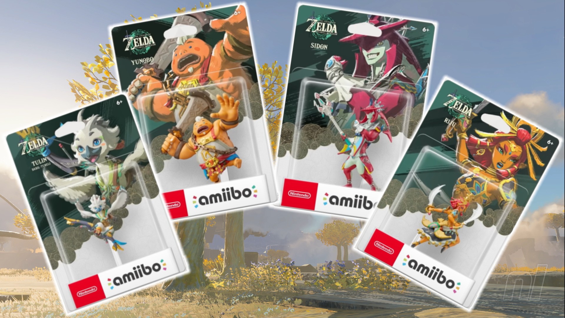
![[DEALS] The All-in-One Microsoft Office Pro 2019 for Windows: Lifetime License + Windows 11 Pro Bundle (89% off) & Other Deals Up To 98% Off](https://www.javacodegeeks.com/wp-content/uploads/2012/12/jcg-logo.jpg)


![Is this too much for a modular monolith system? [closed]](https://i.sstatic.net/pYL1nsfg.png)


_Andreas_Prott_Alamy.jpg?width=1280&auto=webp&quality=80&disable=upscale#)


![What features do you get with Gemini Advanced? [April 2025]](https://i0.wp.com/9to5google.com/wp-content/uploads/sites/4/2024/02/gemini-advanced-cover.jpg?resize=1200%2C628&quality=82&strip=all&ssl=1)


![Apple Shares Official Trailer for 'Long Way Home' Starring Ewan McGregor and Charley Boorman [Video]](https://www.iclarified.com/images/news/97069/97069/97069-640.jpg)
![Apple Watch Series 10 Back On Sale for $299! [Lowest Price Ever]](https://www.iclarified.com/images/news/96657/96657/96657-640.jpg)
![EU Postpones Apple App Store Fines Amid Tariff Negotiations [Report]](https://www.iclarified.com/images/news/97068/97068/97068-640.jpg)
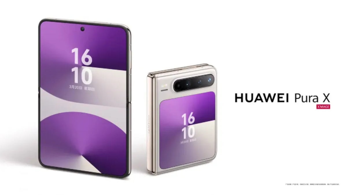
![Apple Slips to Fifth in China's Smartphone Market with 9% Decline [Report]](https://www.iclarified.com/images/news/97065/97065/97065-640.jpg)


How to Apply Blur, Shadow, and Color Effects to Images Using SVG Filters
Want to add advanced visual effects like blur, shadows, or grayscale to images and HTML elements without relying on JavaScript or external libraries? SVG filters provide a native, high-performance solution that works in all modern browsers. In this guide, you'll learn how to create and apply custom SVG filters step by step. 1. What Are SVG Filters? SVG filters are graphical effects defined within SVG markup. These effects can be used to manipulate images, text, and other HTML elements with a wide range of visual enhancements like blur, drop shadow, color changes, and more. 2. Basic Blur Filter This will blur your image with a standard deviation of 4. 3. Drop Shadow Filter Hello with Shadow 4. Grayscale Color Filter This turns any image into grayscale using a color matrix. 5. Combining Multiple Effects 6. Important Tips Keep filter complexity low for better performance. Test across browsers (Chrome, Firefox, Safari, Edge) for consistent visuals. Inline SVG definitions must be in the same document to apply the filter via CSS. Conclusion SVG filters give you precise control over the look and feel of images and elements. Whether you're building custom UI components or designing interactive web art, they’re a must-have in your frontend toolkit. If this guide helped you, consider supporting me here: buymeacoffee.com/hexshift

Want to add advanced visual effects like blur, shadows, or grayscale to images and HTML elements without relying on JavaScript or external libraries? SVG filters provide a native, high-performance solution that works in all modern browsers. In this guide, you'll learn how to create and apply custom SVG filters step by step.
1. What Are SVG Filters?
SVG filters are graphical effects defined within SVG markup. These effects can be used to manipulate images, text, and other HTML elements with a wide range of visual enhancements like blur, drop shadow, color changes, and more.
2. Basic Blur Filter

This will blur your image with a standard deviation of 4.
3. Drop Shadow Filter
Hello with Shadow
4. Grayscale Color Filter
This turns any image into grayscale using a color matrix.
5. Combining Multiple Effects
6. Important Tips
- Keep filter complexity low for better performance.
- Test across browsers (Chrome, Firefox, Safari, Edge) for consistent visuals.
- Inline SVG definitions must be in the same document to apply the filter via CSS.
Conclusion
SVG filters give you precise control over the look and feel of images and elements. Whether you're building custom UI components or designing interactive web art, they’re a must-have in your frontend toolkit.
If this guide helped you, consider supporting me here: buymeacoffee.com/hexshift