


![[The AI Show Episode 142]: ChatGPT’s New Image Generator, Studio Ghibli Craze and Backlash, Gemini 2.5, OpenAI Academy, 4o Updates, Vibe Marketing & xAI Acquires X](https://www.marketingaiinstitute.com/hubfs/ep%20142%20cover.png)


![[DEALS] The Premium Learn to Code Certification Bundle (97% off) & Other Deals Up To 98% Off – Offers End Soon!](https://www.javacodegeeks.com/wp-content/uploads/2012/12/jcg-logo.jpg)

![From drop-out to software architect with Jason Lengstorf [Podcast #167]](https://cdn.hashnode.com/res/hashnode/image/upload/v1743796461357/f3d19cd7-e6f5-4d7c-8bfc-eb974bc8da68.png?#)


.png?#)


.webp?#)


_Christophe_Coat_Alamy.jpg?#)
 (1).webp?#)


![Apple Considers Delaying Smart Home Hub Until 2026 [Gurman]](https://www.iclarified.com/images/news/96946/96946/96946-640.jpg)
![iPhone 17 Pro Won't Feature Two-Toned Back [Gurman]](https://www.iclarified.com/images/news/96944/96944/96944-640.jpg)
![Tariffs Threaten Apple's $999 iPhone Price Point in the U.S. [Gurman]](https://www.iclarified.com/images/news/96943/96943/96943-640.jpg)


Digital Clocks in CSS
In my previous post, I looked into clocks and watches, mimicking classic, analog watches. Now, how about digital watches in CSS? The JavaScript initialization is identical, but that’s where the similarities stop. Let’s look into how we can animate numbers, automatically switch between “am” and “pm” for 12-hour clocks — and much, much more, using only CSS! Initial First, we’ll create a web component to keep all logic wrapped up in a single instance. Feel free to simplify it later! The inner, shadow-structure is like this: In the web component, we’ll later add logic not to render specific elements. For now, let’s focus on the CSS. First, we set 3 custom properties, set with @property, allowing us to animate them: @property --seconds { syntax: ""; initial-value: 0; inherits: false; } @property --minutes { syntax: ""; initial-value: 0; inherits: false; } @property --hours { syntax: ""; initial-value: 0; inherits: false; } Next, we calculate — in JavaScript, from the current time and timezone — animation delays for these: #updateClock() { const time = new Date(); const tzOffset = this.#roundTzOffset(this.getAttribute('timezone') || '0'); const utc = time.getTime() + (time.getTimezoneOffset() * 60000); const tzTime = new Date(utc + (3600000 * tzOffset)); const hours = tzTime.getHours() * 3600; const minutes = tzTime.getMinutes() * 60; const seconds = tzTime.getSeconds(); this.style.setProperty('--delay-hours', `-${hours + minutes + seconds}s`); this.style.setProperty('--delay-minutes', `-${minutes + seconds}s`); this.style.setProperty('--delay-seconds', `-${seconds}s`); this.style.setProperty('--number-system', this.getAttribute('number-system') || 'decimal-leading-zero'); } The animations are simple enough — we go from 0 to 24 hours, and 0 to 60 minutes (and seconds): @keyframes hours { from { --hours: 0; } to { --hours: 24; } } @keyframes minutes { from { --minutes: 0; } to { --minutes: 60; } } @keyframes seconds { from { --seconds: 0;} to { --seconds: 60; } } Animating numbers And now for the tricky part! To animate numbers we’re going to use CSS counters. For hours, minutes and seconds we create a custom counter, and then re-set them with the values we get from the keyframe animations. For seconds, that’s: :host::part(seconds) { animation: seconds 60s steps(60, end) infinite; animation-delay: var(--delay-seconds, 0s); counter-reset: seconds var(--seconds); } So what’s going on here? Let’s break it down: The keyframe animation increments the --seconds custom property from 0 to 60 over exactly 60 seconds The steps(60, end) timing function creates 60 discrete jumps (one per second) rather than a smooth transition Each time --seconds changes, the counter-reset property immediately updates the CSS counter named "seconds" The counter is displayed using a pseudo-element: :host::part(seconds)::after { content: counter(seconds, var(--number-system, decimal-leading-zero)) ' '; } The animation-delay with a negative value (calculated in JavaScript) synchronizes the animation with the current time, so when the animation shows “42”, it matches the actual 42nd second of the current minute. This approach ensures the clock runs entirely through the browser’s animation engine with no further JavaScript needed. This eliminates timing drift that can occur with setInterval() or setTimeout() and requires no ongoing DOM manipulation. The same principle applies to minutes and hours, each with appropriate durations and step counts. For hours, the animation runs for 24 hours (86,400 seconds) with 24 steps; for minutes, it’s 60 minutes (3,600 seconds) with 60 steps. The counter() method’s second parameter defines the list-style-type or “number system” used to display the values. We default to decimal-leading-zero, but this can be customized through the number-system attribute. 12-hour clocks: am and pm To display time in 12-hour-format, we can use a few CSS tricks! To tell the clock we want 12-hour-format, we add the string “12hour” to the time-attribute of the web component. Next, we use the existing hours counter for the counter-reset, as we only want to update this when the hour change. To convert 24-hour time to 12-hour format, we use modulus. Modern CSS makes this easy with the mod() function: :host([time*="12hour"])::part(hours) { counter-reset: hours calc(mod(var(--hours) - 1, 12) + 1); } We subtract 1 from the hour (shifting 1-24 to 0-23) Apply modulo 12 (giving us 0-11) Add 1 back (giving us 1-12) This ensures that 0 becomes 12, 13 becomes 1, 23 becomes 11, etc. To show ”am” or ”pm” after the time, we create a custom counter: @counter-style am-pm { system: cyclic; symbols: "am" "am" "am" "am" "am" "am" "am" "am" "am" "am" "am" "pm" "pm" "pm" "pm" "pm" "pm" "pm" "pm" "pm" "pm" "pm" "pm" "am"; } The

In my previous post, I looked into clocks and watches, mimicking classic, analog watches. Now, how about digital watches in CSS? The JavaScript initialization is identical, but that’s where the similarities stop.
Let’s look into how we can animate numbers, automatically switch between “am” and “pm” for 12-hour clocks — and much, much more, using only CSS!
Initial
First, we’ll create a web component to keep all logic wrapped up in a single instance. Feel free to simplify it later!
timezone="+1">
The inner, shadow-structure is like this:
 part="label">
 part="date">
 part="time">
   part="hours">
   part="minutes">
   part="seconds">
   part="ampm">
In the web component, we’ll later add logic not to render specific elements.
For now, let’s focus on the CSS. First, we set 3 custom properties, set with @property, allowing us to animate them:
@property --seconds {
syntax: "" ;
initial-value: 0;
inherits: false;
}
@property --minutes {
syntax: "" ;
initial-value: 0;
inherits: false;
}
@property --hours {
syntax: "" ;
initial-value: 0;
inherits: false;
}
Next, we calculate — in JavaScript, from the current time and timezone — animation delays for these:
#updateClock() {
  const time = new Date();
  const tzOffset = this.#roundTzOffset(this.getAttribute('timezone') || '0');
  const utc = time.getTime() + (time.getTimezoneOffset() * 60000);
  const tzTime = new Date(utc + (3600000 * tzOffset));

  const hours = tzTime.getHours() * 3600;
  const minutes = tzTime.getMinutes() * 60;
  const seconds = tzTime.getSeconds();

  this.style.setProperty('--delay-hours', `-${hours + minutes + seconds}s`);
  this.style.setProperty('--delay-minutes', `-${minutes + seconds}s`);
  this.style.setProperty('--delay-seconds', `-${seconds}s`);
  this.style.setProperty('--number-system', this.getAttribute('number-system') || 'decimal-leading-zero');
}
The animations are simple enough — we go from 0 to 24 hours, and 0 to 60 minutes (and seconds):
@keyframes hours {
  from { --hours: 0; }
  to { --hours: 24; }
}
@keyframes minutes {
  from { --minutes: 0; }
  to { --minutes: 60; }
}
@keyframes seconds {
  from { --seconds: 0;}
  to { --seconds: 60; }
}
Animating numbers
And now for the tricky part! To animate numbers we’re going to use CSS counters. For hours, minutes and seconds we create a custom counter, and then re-set them with the values we get from the keyframe animations.
For seconds, that’s:
:host::part(seconds) {
  animation: seconds 60s steps(60, end) infinite;
  animation-delay: var(--delay-seconds, 0s);
  counter-reset: seconds var(--seconds);
}
So what’s going on here? Let’s break it down:
- The keyframe animation increments the
--secondscustom property from 0 to 60 over exactly 60 seconds - The
steps(60, end)timing function creates 60 discrete jumps (one per second) rather than a smooth transition - Each time
--secondschanges, thecounter-resetproperty immediately updates the CSS counter named "seconds" - The counter is displayed using a pseudo-element:
:host::part(seconds)::after {
  content: counter(seconds, var(--number-system, decimal-leading-zero)) ' ';
}
The animation-delay with a negative value (calculated in JavaScript) synchronizes the animation with the current time, so when the animation shows “42”, it matches the actual 42nd second of the current minute.
This approach ensures the clock runs entirely through the browser’s animation engine with no further JavaScript needed. This eliminates timing drift that can occur with setInterval() or setTimeout() and requires no ongoing DOM manipulation.
The same principle applies to minutes and hours, each with appropriate durations and step counts. For hours, the animation runs for 24 hours (86,400 seconds) with 24 steps; for minutes, it’s 60 minutes (3,600 seconds) with 60 steps.
The counter() method’s second parameter defines the list-style-type or “number system” used to display the values. We default to decimal-leading-zero, but this can be customized through the number-system
attribute.
12-hour clocks: am and pm
To display time in 12-hour-format, we can use a few CSS tricks! To tell the clock we want 12-hour-format, we add the string “12hour” to the time-attribute of the web component.
Next, we use the existing hours counter for the counter-reset, as we only want to update this when the hour change.
To convert 24-hour time to 12-hour format, we use modulus. Modern CSS makes this easy with the mod() function:
:host([time*="12hour"])::part(hours) {
  counter-reset: hours calc(mod(var(--hours) - 1, 12) + 1);
}
- We subtract 1 from the hour (shifting 1-24 to 0-23)
- Apply modulo 12 (giving us 0-11)
- Add 1 back (giving us 1-12)
This ensures that 0 becomes 12, 13 becomes 1, 23 becomes 11, etc.
To show ”am” or ”pm” after the time, we create a custom counter:
@counter-style am-pm {
  system: cyclic;
  symbols: "am" "am" "am" "am" "am" "am" "am" "am" "am" "am" "am" "pm"
           "pm" "pm" "pm" "pm" "pm" "pm" "pm" "pm" "pm" "pm" "pm" "am";
}
The cyclic system cycles through these values as hours increment, ensuring the correct am/pm indicator is shown for each hour of the day. Note that the 12th string is pm and 24th is am, so 12 (noon) becomes 12pm and 12 (midnight) becomes 12am.
To show it:
:host::part(ampm)::after {
  content: counter(hours, am-pm);
}
Using the DigitalClock Web Component
Wrapping the code in a
Installation & Usage
Install via npm:
npm i @browser.style/digital-clock
Or use directly via CDN:
Then, simply add the component to your HTML — here, a basic clock with UTC time:
The DigitalClock component offers several attributes for customization:
Available Attributes
- timezone: Sets the timezone offset (e.g., "+1", "-4")
- label: Adds a text label before the clock (e.g., "Berlin,")
- date: Shows the date in different formats: "full", "short", or "narrow"
- lang: Sets the language for date formatting (e.g., "en-US", "ja-JP")
- time: Configures time display format, options include "12hour" and "short" (no seconds)
- number-system: Changes number display format (e.g., "decimal-leading-zero", "arabic-indic", "hiragana")
Usage Examples
Clock with timezone, label and full date:
  label="Berlin"
  lang="de"
  date="full"
  timezone="+1">
12-hour format with short time (no seconds):
  label="New York"
  lang="en-US"
  date="short"
  timezone="-4"
  time="12hour short">

Different number systems
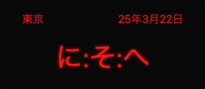
Now the cool thing about CSS list-types are the many different number systems that just work out-of-the-box.
Let's add some color and create some cool examples:
  label="東京"
  lang="ja-JP"
  number-system="hiragana"
  timezone="+9">
  label="الرياض"
  lang="ar-SA"
  date="full"
  number-system="arabic-indic"
  timezone="+3">

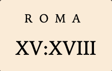
Or how about a clock with roman numerals?
  label="Roma"
  number-system="upper-roman"
  timezone="+2">
Styling
The component exposes several CSS custom properties for styling — I might add more later (let me know if you need more control):
-
--digital-clock-bg: Background color -
--digital-clock-bdrs: Border radius -
--digital-clock-gap: Gap between elements -
--digital-clock-p: Padding -
--digital-clock-fs: Font size -
--digital-clock-fw: Font weight -
--digital-clock-date-ff/fs/fw: Font properties for the date -
--digital-clock-label-ff/fs/fw: Font properties for the label
All the parts (pun intended) of the clock have ::parts, so you can easily style the shadow parts from outside:
.hiragana {
  background: #080808;
  color: #ff1a1a;
  font-family: ui-sans-serif, system-ui;
  width: 300px;
  &::part(time) {
    text-shadow: 0 0 5px rgba(255, 26, 26, 0.7);
  }
}
Demo
Here’s a CodePen with all the clocks we've been making (and a few extra!):