


![[Webinar] AI Is Already Inside Your SaaS Stack — Learn How to Prevent the Next Silent Breach](https://blogger.googleusercontent.com/img/b/R29vZ2xl/AVvXsEiOWn65wd33dg2uO99NrtKbpYLfcepwOLidQDMls0HXKlA91k6HURluRA4WXgJRAZldEe1VReMQZyyYt1PgnoAn5JPpILsWlXIzmrBSs_TBoyPwO7hZrWouBg2-O3mdeoeSGY-l9_bsZB7vbpKjTSvG93zNytjxgTaMPqo9iq9Z5pGa05CJOs9uXpwHFT4/s1600/ai-cyber.jpg?#)


![[The AI Show Episode 144]: ChatGPT’s New Memory, Shopify CEO’s Leaked “AI First” Memo, Google Cloud Next Releases, o3 and o4-mini Coming Soon & Llama 4’s Rocky Launch](https://www.marketingaiinstitute.com/hubfs/ep%20144%20cover.png)


![[FREE EBOOKS] Machine Learning Hero, AI-Assisted Programming for Web and Machine Learning & Four More Best Selling Titles](https://www.javacodegeeks.com/wp-content/uploads/2012/12/jcg-logo.jpg)


![Rogue Company Elite tier list of best characters [April 2025]](https://media.pocketgamer.com/artwork/na-33136-1657102075/rogue-company-ios-android-tier-cover.jpg?#)


_Andreas_Prott_Alamy.jpg?width=1280&auto=webp&quality=80&disable=upscale#)


![What’s new in Android’s April 2025 Google System Updates [U: 4/18]](https://i0.wp.com/9to5google.com/wp-content/uploads/sites/4/2025/01/google-play-services-3.jpg?resize=1200%2C628&quality=82&strip=all&ssl=1)


![Apple Watch Series 10 Back On Sale for $299! [Lowest Price Ever]](https://www.iclarified.com/images/news/96657/96657/96657-640.jpg)
![EU Postpones Apple App Store Fines Amid Tariff Negotiations [Report]](https://www.iclarified.com/images/news/97068/97068/97068-640.jpg)
![Apple Slips to Fifth in China's Smartphone Market with 9% Decline [Report]](https://www.iclarified.com/images/news/97065/97065/97065-640.jpg)


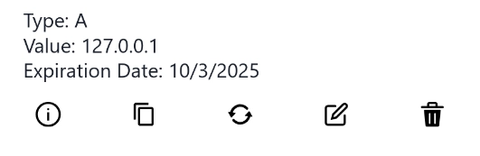
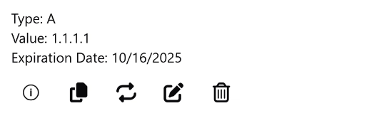
Sprint 5 - Chakra UI v3 Migration
For the last sprint I focused on Starchart since I haven't got a response from Hurl just yet. This week I saw more and more CVEs popping up for Chakra UI v2's dependencies So I gave it a second attempt to migrate to v3. Spoiler alert: It was a nightmare. [WIP] Upgrade chakra-ui to v3 #895 theoforger posted on Apr 03, 2025 Description chakra-ui version 3 introduced many breaking changes. This PR is an attempt to upgrade Changes Removed @emotion/styled, framer-motion, @chakra-ui/icons(migrated to react-icons since chakra stopped supporting their icons library) Modified tsconfig.json to target ESNext. Add code snippet from chakra Refactored theme to use systems instead Changed component names and structures (the migration guide is not complete on this matter) Dropped useToast hook in favor of toaster from the code snippet View on GitHub What Changes Did I Encounter? In short, everything has changed. From dependencies, components, props, to syntax, configuration schema, even font size and theme. It was essentially a rewrite. Dependencies Chakra UI v3 doesn't rely on framer-motion for animation anymore. It needed to be removed, among some other changes npm uninstall @emotion/styled framer-motion npm install @chakra-ui/react@latest @emotion/react@latest They also introduced some code snippet to supplement some of the changes in this update. I'll go through them later, but here's how you add the snippet: npx @chakra-ui/cli snippet add Component Names and Behavior Component Changes happened all across the board. Generally, namespaces are used to replace child components. Some are simple name changes, for example: v2 v3 However, many of them also has different behavior and expect different structures. For instance: v2 v3 One Two Three one! two! three! one two three one! two! three! As you can see, Tabs in v2 sequentially maps a from to in , while in v3 it requires a value, in addition to all the name changes. There are many other changes like these. Unfortunately the only way to handle them is to look at the documentation for both versions and compare the differences. Props There are changes in both the name of some props, and what props are expected for certain components. For one, some boolean typed props now have a simpler name. For example, isOpen became open. The other type of change is also the more challenging type. For example the component changed the available variants you can use, and silently dropped support for some styling props like align. Some of them are related to some other grand schema changes, but just like the components, the only way to figure them out is to compare the documentation. Theme Configuration In Chakra UI v3, themes are included as a part of system, as apposed to a standalone configuration option in v2. The new theme object expects a completely different schema too. In addition, component-specific style override in v2 is replaced by recipes. So for the Starchart project, the configuration went from: const theme = extendTheme( { styles, colors, breakpoints, components: { Link: defineStyleConfig({ baseStyle: { color: 'brand.500', textDecor: 'underline', }, }), }, }, withDefaultColorScheme({ colorScheme: 'brand' }) ); to const theme = createSystem(defaultConfig, { theme: { recipes: { link: defineRecipe({ base: { textDecor: 'underline', }, }), }, tokens: { colors, breakpoints, }, semanticTokens: { colors: { brand: { solid: { value: '{colors.brand.500}' }, contrast: { value: 'white' }, fg: { value: '{colors.brand.700}' }, muted: { value: '{colors.brand.100}' }, subtle: { value: '{colors.brand.200}' }, emphasized: { value: '{colors.brand.300}' }, focusRing: { value: '{colors.brand.500}' }, }, brand_gray: { solid: { value: '{colors.brand_gray.500}' }, contrast: { value: 'colors.brand_gray.100' }, fg: { value: '{colors.brand_gray.700}' }, muted: { value: '{colors.brand_gray.100}' }, subtle: { value: '{colors.brand_gray.200}' }, emphasized: { value: '{colors.brand_gray.300}' }, focusR
For the last sprint I focused on Starchart since I haven't got a response from Hurl just yet. This week I saw more and more CVEs popping up for Chakra UI v2's dependencies So I gave it a second attempt to migrate to v3. Spoiler alert: It was a nightmare.
[WIP] Upgrade chakra-ui to v3
#895
Description
chakra-ui version 3 introduced many breaking changes. This PR is an attempt to upgrade
Changes
- Removed
@emotion/styled,framer-motion,@chakra-ui/icons(migrated toreact-iconssince chakra stopped supporting their icons library) - Modified
tsconfig.jsonto targetESNext. - Add code snippet from chakra
- Refactored theme to use systems instead
- Changed component names and structures (the migration guide is not complete on this matter)
- Dropped
useToasthook in favor oftoasterfrom the code snippet
What Changes Did I Encounter?
In short, everything has changed. From dependencies, components, props, to syntax, configuration schema, even font size and theme. It was essentially a rewrite.
Dependencies
Chakra UI v3 doesn't rely on framer-motion for animation anymore. It needed to be removed, among some other changes
npm uninstall @emotion/styled framer-motion
npm install @chakra-ui/react@latest @emotion/react@latest
They also introduced some code snippet to supplement some of the changes in this update. I'll go through them later, but here's how you add the snippet:
npx @chakra-ui/cli snippet add
Component Names and Behavior
Component Changes happened all across the board. Generally, namespaces are used to replace child components. Some are simple name changes, for example:
| v2 | v3 | |||
|---|---|---|---|---|
|
|
|
However, many of them also has different behavior and expect different structures. For instance:
| v2 | v3 |
|---|---|
|
|
As you can see, Tabs in v2 sequentially maps a from to in , while in v3 it requires a value, in addition to all the name changes.
There are many other changes like these. Unfortunately the only way to handle them is to look at the documentation for both versions and compare the differences.
Props
There are changes in both the name of some props, and what props are expected for certain components.
For one, some boolean typed props now have a simpler name. For example, isOpen became open.
The other type of change is also the more challenging type. For example the align. Some of them are related to some other grand schema changes, but just like the components, the only way to figure them out is to compare the documentation.
Theme Configuration
In Chakra UI v3, themes are included as a part of system, as apposed to a standalone configuration option in v2. The new theme object expects a completely different schema too.
In addition, component-specific style override in v2 is replaced by recipes.
So for the Starchart project, the configuration went from:
const theme = extendTheme(
  {
    styles,
    colors,
    breakpoints,
    components: {
      Link: defineStyleConfig({
        baseStyle: {
          color: 'brand.500',
          textDecor: 'underline',
        },
      }),
    },
  },
  withDefaultColorScheme({ colorScheme: 'brand' })
);
to
const theme = createSystem(defaultConfig, {
  theme: {
    recipes: {
      link: defineRecipe({
        base: {
          textDecor: 'underline',
        },
      }),
    },
    tokens: {
      colors,
      breakpoints,
    },
    semanticTokens: {
      colors: {
        brand: {
          solid: { value: '{colors.brand.500}' },
          contrast: { value: 'white' },
          fg: { value: '{colors.brand.700}' },
          muted: { value: '{colors.brand.100}' },
          subtle: { value: '{colors.brand.200}' },
          emphasized: { value: '{colors.brand.300}' },
          focusRing: { value: '{colors.brand.500}' },
        },
        brand_gray: {
          solid: { value: '{colors.brand_gray.500}' },
          contrast: { value: 'colors.brand_gray.100' },
          fg: { value: '{colors.brand_gray.700}' },
          muted: { value: '{colors.brand_gray.100}' },
          subtle: { value: '{colors.brand_gray.200}' },
          emphasized: { value: '{colors.brand_gray.300}' },
          focusRing: { value: '{colors.brand_gray.500}' },
        },
      },
    },
  },
  globalCss: styles,
});
Toast
In Chakra UI v2, Toast is used via a hook. However, in v3 it's replaced by the toaster code snippet. In the new version, you need to import both Toaster and toaster from the snippet, place the toaster to trigger them. For example:
import { Toaster, toaster } from '~/components/ui/toaster';
...
  useEffect(() => {
    if (clipboard.copied) {
      toaster.create({
        title: `${title} was copied to the clipboard`,
        type: 'success',
      });
    }
  }, [title, clipboard.copied]);
...
return (
  <>
    // page content...
    <Toaster />
  <>
)
Dropping chakra-ui/icon
@chakra-ui/icons is deprecated in Chakra UI v3. There are a couple of replacements but I decided to migrate to react-icons, since it was already in use for other parts of the project.
To migrate, you need to wrap the icon component from your library of choice with .... For example:
// Download icon
<Icon fontSize="md" onClick={handler}>
  <FaDownload />
Icon>
What's Still Broken?
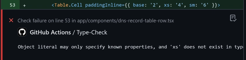
Custom Breakpoints
In Chakra UI, you can define custom breakpoints like so:
const breakpoints = {
  'xs': { value: '20em' },
  'sm': { value: '30em' },
  'md': { value: '48em' },
  'lg': { value: '62em' },
  'xl': { value: '80em' },
  '2xl': { value: '96em' },
};
However, despite including this configuration in my custom theme, I still get type error in places where custom breakpoints are used:
Animation
Animation is broken after this upgrade, possibly due to the deprecation of framer-motion. However, from my testing, the animation issue does not seem to persist once React is updated to 19.
Mobile Layout
Other than some inconsistent breakpoints behavior, some UI elements are not in the correct place in mobile layout. For example:
| Before | After |
|---|---|
 |
 |
The Real Problem
The most difficult aspect of this migration was not the changes themselves. It was the lack of documentation for them. Although they provide a migration guide, it's far from complete.
Just to name a few:
- The guide doesn't cover most changes in the component names. Some components have completely overhauled their structures (For example
- Many components changed the props they expect, most of which are not mentioned in the guide.
-
- Font sizes are completely changed, which is not mentioned in the guide.
-
- Component-specific style override is replaced by recipes. It's not covered by the guide. ...
Of course, this section is not meant as an attack on the Chakra UI project, but a reminder that a significant upgrade like this really needs a comprehensive migration guide. An automation tool would also be nice, like what React did with react-codemod.