


![[Webinar] AI Is Already Inside Your SaaS Stack — Learn How to Prevent the Next Silent Breach](https://blogger.googleusercontent.com/img/b/R29vZ2xl/AVvXsEiOWn65wd33dg2uO99NrtKbpYLfcepwOLidQDMls0HXKlA91k6HURluRA4WXgJRAZldEe1VReMQZyyYt1PgnoAn5JPpILsWlXIzmrBSs_TBoyPwO7hZrWouBg2-O3mdeoeSGY-l9_bsZB7vbpKjTSvG93zNytjxgTaMPqo9iq9Z5pGa05CJOs9uXpwHFT4/s1600/ai-cyber.jpg?#)


![[The AI Show Episode 144]: ChatGPT’s New Memory, Shopify CEO’s Leaked “AI First” Memo, Google Cloud Next Releases, o3 and o4-mini Coming Soon & Llama 4’s Rocky Launch](https://www.marketingaiinstitute.com/hubfs/ep%20144%20cover.png)


![[FREE EBOOKS] Machine Learning Hero, AI-Assisted Programming for Web and Machine Learning & Four More Best Selling Titles](https://www.javacodegeeks.com/wp-content/uploads/2012/12/jcg-logo.jpg)


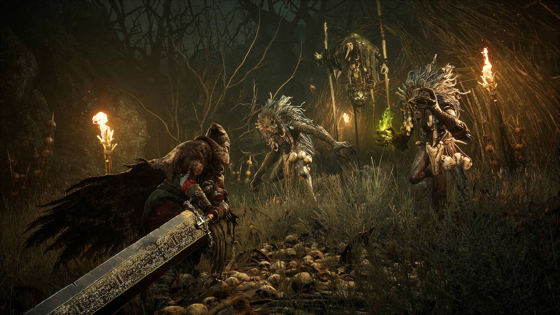
![Rogue Company Elite tier list of best characters [April 2025]](https://media.pocketgamer.com/artwork/na-33136-1657102075/rogue-company-ios-android-tier-cover.jpg?#)


_Andreas_Prott_Alamy.jpg?width=1280&auto=webp&quality=80&disable=upscale#)


![What’s new in Android’s April 2025 Google System Updates [U: 4/18]](https://i0.wp.com/9to5google.com/wp-content/uploads/sites/4/2025/01/google-play-services-3.jpg?resize=1200%2C628&quality=82&strip=all&ssl=1)


![Apple Watch Series 10 Back On Sale for $299! [Lowest Price Ever]](https://www.iclarified.com/images/news/96657/96657/96657-640.jpg)
![EU Postpones Apple App Store Fines Amid Tariff Negotiations [Report]](https://www.iclarified.com/images/news/97068/97068/97068-640.jpg)
![Apple Slips to Fifth in China's Smartphone Market with 9% Decline [Report]](https://www.iclarified.com/images/news/97065/97065/97065-640.jpg)


Skeleton loaders with styled-components: How to improve UX on loading
No one likes staring at a blank screen while waiting for data to load. When we show nothing (or just a spinner), it creates uncertainty — users wonder if something’s broken. A better solution is to use skeleton loaders: visual placeholders that mimic the final layout while content is loading. Today I'll show you how to build simple and reusable skeleton loaders using styled-components. ✅ The Problem: Empty states while loading Imagine this: You’re building a list of cards that loads from an API. During loading, the page looks like this: [ Loading... ] But what users really want is to see structure — something like: [ ▓▓▓▓▓▓▓▓▓▓▓▓▓▓▓▓ ] [ ] [ ▓▓▓▓▓▓▓▓▓▓▓▓▓▓▓ ] [ ▓▓▓▓▓▓▓▓▓ ] Skeleton loaders give a visual cue of what’s coming and make the app feel faster.

No one likes staring at a blank screen while waiting for data to load.
When we show nothing (or just a spinner), it creates uncertainty — users wonder if something’s broken. A better solution is to use skeleton loaders: visual placeholders that mimic the final layout while content is loading.
Today I'll show you how to build simple and reusable skeleton loaders using styled-components.
✅ The Problem: Empty states while loading
Imagine this:
You’re building a list of cards that loads from an API. During loading, the page looks like this:
[ Loading... ]
But what users really want is to see structure — something like:
[ ▓▓▓▓▓▓▓▓▓▓▓▓▓▓▓▓ ]
[                  ]
[ ▓▓▓▓▓▓▓▓▓▓▓▓▓▓▓  ]
[ ▓▓▓▓▓▓▓▓▓        ]
Skeleton loaders give a visual cue of what’s coming and make the app feel faster.