


![[The AI Show Episode 144]: ChatGPT’s New Memory, Shopify CEO’s Leaked “AI First” Memo, Google Cloud Next Releases, o3 and o4-mini Coming Soon & Llama 4’s Rocky Launch](https://www.marketingaiinstitute.com/hubfs/ep%20144%20cover.png)


![[DEALS] Sterling Stock Picker: Lifetime Subscription (85% off) & Other Deals Up To 98% Off – Offers End Soon!](https://www.javacodegeeks.com/wp-content/uploads/2012/12/jcg-logo.jpg)


_Olekcii_Mach_Alamy.jpg?width=1280&auto=webp&quality=80&disable=upscale#)


![Some Pixel Tablet accessories we can’t live without [Video]](https://i0.wp.com/9to5google.com/wp-content/uploads/sites/4/2024/10/Pixel-Tablet-Header.jpg?resize=1200%2C628&quality=82&strip=all&ssl=1)


![M4 MacBook Air Drops to New All-Time Low of $912 [Deal]](https://www.iclarified.com/images/news/97108/97108/97108-640.jpg)
![New iPhone 17 Dummy Models Surface in Black and White [Images]](https://www.iclarified.com/images/news/97106/97106/97106-640.jpg)


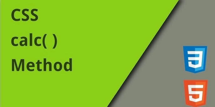
Mastering `height: calc()` in CSS: Dynamic Layouts Made Easy
In modern web design, flexibility is key. Whether you're building a responsive dashboard, a single-page app, or just a neat landing page, CSS's calc() function can be a lifesaver. In this blog post, we'll explore how height: calc() works, why it's useful, and how you can harness its power for dynamic layouts. What is calc() in CSS? calc() is a built-in CSS function that lets you perform calculations directly within your stylesheets. It supports addition (+), subtraction (-), multiplication (*), and division (/). This is especially useful when combining different units like percentages (%), pixels (px), and viewport units (vh, vw). Example: height: calc(100% - 50px); This tells the browser to take 100% of the parent element's height and subtract 50 pixels. Why Use height: calc()? Web layouts often involve fixed-size headers, footers, or sidebars, with content that needs to dynamically fill the remaining space. Instead of hardcoding values or relying on JavaScript, calc() allows you to let CSS do the math. Example Layout: body, html { height: 100%; margin: 0; } .header { height: 60px; } .content { height: calc(100% - 60px); overflow-y: auto; } With this setup, the .content area always fills the remaining height after the header, regardless of screen size. Tips for Using calc() Always add spaces between values and operators: calc(100% - 50px) not calc(100%-50px). Use calc() with viewport units to create responsive sections: height: calc(100vh - 4rem); Works well with flexbox and grid layouts too, especially when you want fixed and flexible parts to coexist. Common Use Cases Sticky footers: height: calc(100% - footerHeight) Centered elements with offsets Sidebar + content layouts Mobile-first designs where certain areas shrink or grow dynamically Final Thoughts The calc() function brings math into your stylesheets in a seamless way. It reduces your dependency on JavaScript and lets you write more maintainable and responsive CSS. If you're not already using calc(), it's time to add it to your toolkit. Got any cool layout tricks using calc()? Share them in the comments!
In modern web design, flexibility is key. Whether you're building a responsive dashboard, a single-page app, or just a neat landing page, CSS's calc() function can be a lifesaver. In this blog post, we'll explore how height: calc() works, why it's useful, and how you can harness its power for dynamic layouts.
What is calc() in CSS?
calc() is a built-in CSS function that lets you perform calculations directly within your stylesheets. It supports addition (+), subtraction (-), multiplication (*), and division (/). This is especially useful when combining different units like percentages (%), pixels (px), and viewport units (vh, vw).
Example:
height: calc(100% - 50px);
This tells the browser to take 100% of the parent element's height and subtract 50 pixels.
Why Use height: calc()?
Web layouts often involve fixed-size headers, footers, or sidebars, with content that needs to dynamically fill the remaining space. Instead of hardcoding values or relying on JavaScript, calc() allows you to let CSS do the math.
Example Layout:
body, html {
  height: 100%;
  margin: 0;
}

.header {
  height: 60px;
}

.content {
  height: calc(100% - 60px);
  overflow-y: auto;
}
With this setup, the .content area always fills the remaining height after the header, regardless of screen size.
Tips for Using calc()
-
Always add spaces between values and operators:
calc(100% - 50px)notcalc(100%-50px). - Use
calc()with viewport units to create responsive sections:
height: calc(100vh - 4rem);
- Works well with flexbox and grid layouts too, especially when you want fixed and flexible parts to coexist.
Common Use Cases
- Sticky footers:
height: calc(100% - footerHeight) - Centered elements with offsets
- Sidebar + content layouts
- Mobile-first designs where certain areas shrink or grow dynamically
Final Thoughts
The calc() function brings math into your stylesheets in a seamless way. It reduces your dependency on JavaScript and lets you write more maintainable and responsive CSS. If you're not already using calc(), it's time to add it to your toolkit.
Got any cool layout tricks using calc()? Share them in the comments!