
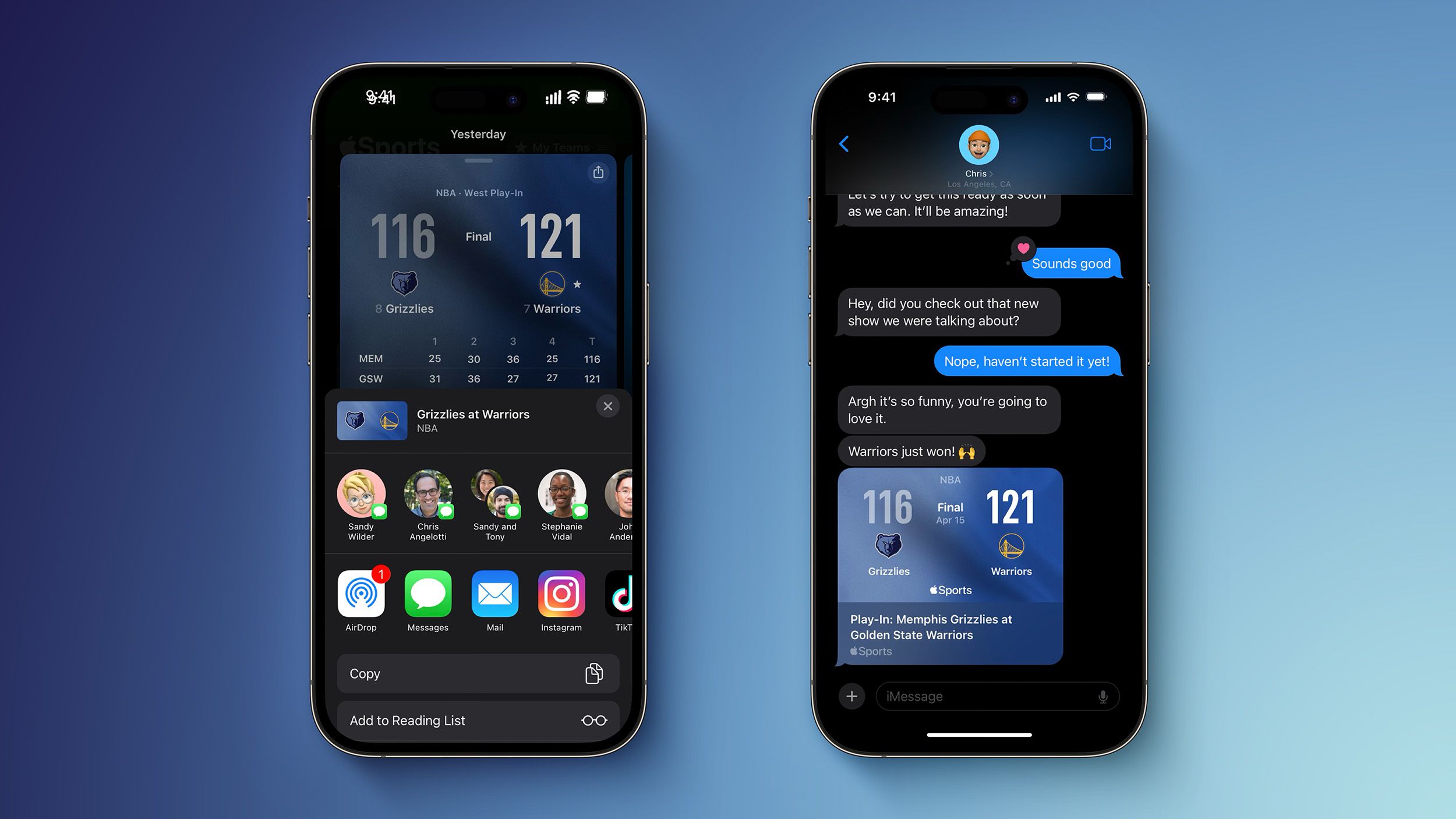


![[Webinar] AI Is Already Inside Your SaaS Stack — Learn How to Prevent the Next Silent Breach](https://blogger.googleusercontent.com/img/b/R29vZ2xl/AVvXsEiOWn65wd33dg2uO99NrtKbpYLfcepwOLidQDMls0HXKlA91k6HURluRA4WXgJRAZldEe1VReMQZyyYt1PgnoAn5JPpILsWlXIzmrBSs_TBoyPwO7hZrWouBg2-O3mdeoeSGY-l9_bsZB7vbpKjTSvG93zNytjxgTaMPqo9iq9Z5pGa05CJOs9uXpwHFT4/s1600/ai-cyber.jpg?#)


![[The AI Show Episode 144]: ChatGPT’s New Memory, Shopify CEO’s Leaked “AI First” Memo, Google Cloud Next Releases, o3 and o4-mini Coming Soon & Llama 4’s Rocky Launch](https://www.marketingaiinstitute.com/hubfs/ep%20144%20cover.png)


![[FREE EBOOKS] Machine Learning Hero, AI-Assisted Programming for Web and Machine Learning & Four More Best Selling Titles](https://www.javacodegeeks.com/wp-content/uploads/2012/12/jcg-logo.jpg)


![Rogue Company Elite tier list of best characters [April 2025]](https://media.pocketgamer.com/artwork/na-33136-1657102075/rogue-company-ios-android-tier-cover.jpg?#)


_Andreas_Prott_Alamy.jpg?width=1280&auto=webp&quality=80&disable=upscale#)


![What’s new in Android’s April 2025 Google System Updates [U: 4/18]](https://i0.wp.com/9to5google.com/wp-content/uploads/sites/4/2025/01/google-play-services-3.jpg?resize=1200%2C628&quality=82&strip=all&ssl=1)


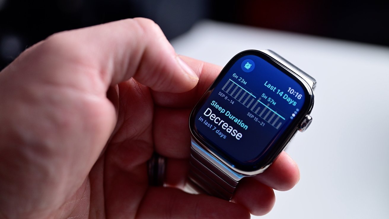
![Apple Watch Series 10 Back On Sale for $299! [Lowest Price Ever]](https://www.iclarified.com/images/news/96657/96657/96657-640.jpg)
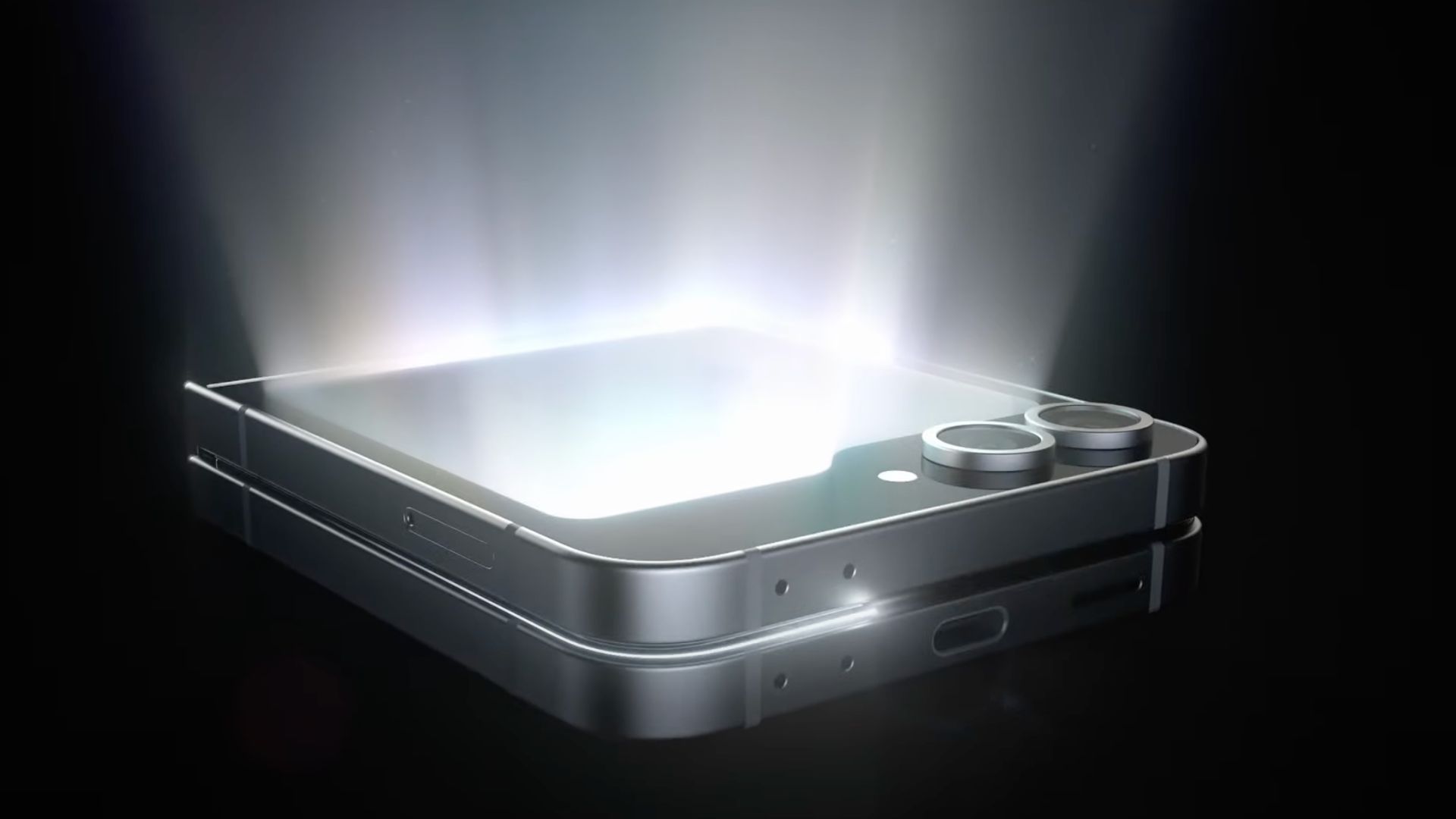
![EU Postpones Apple App Store Fines Amid Tariff Negotiations [Report]](https://www.iclarified.com/images/news/97068/97068/97068-640.jpg)
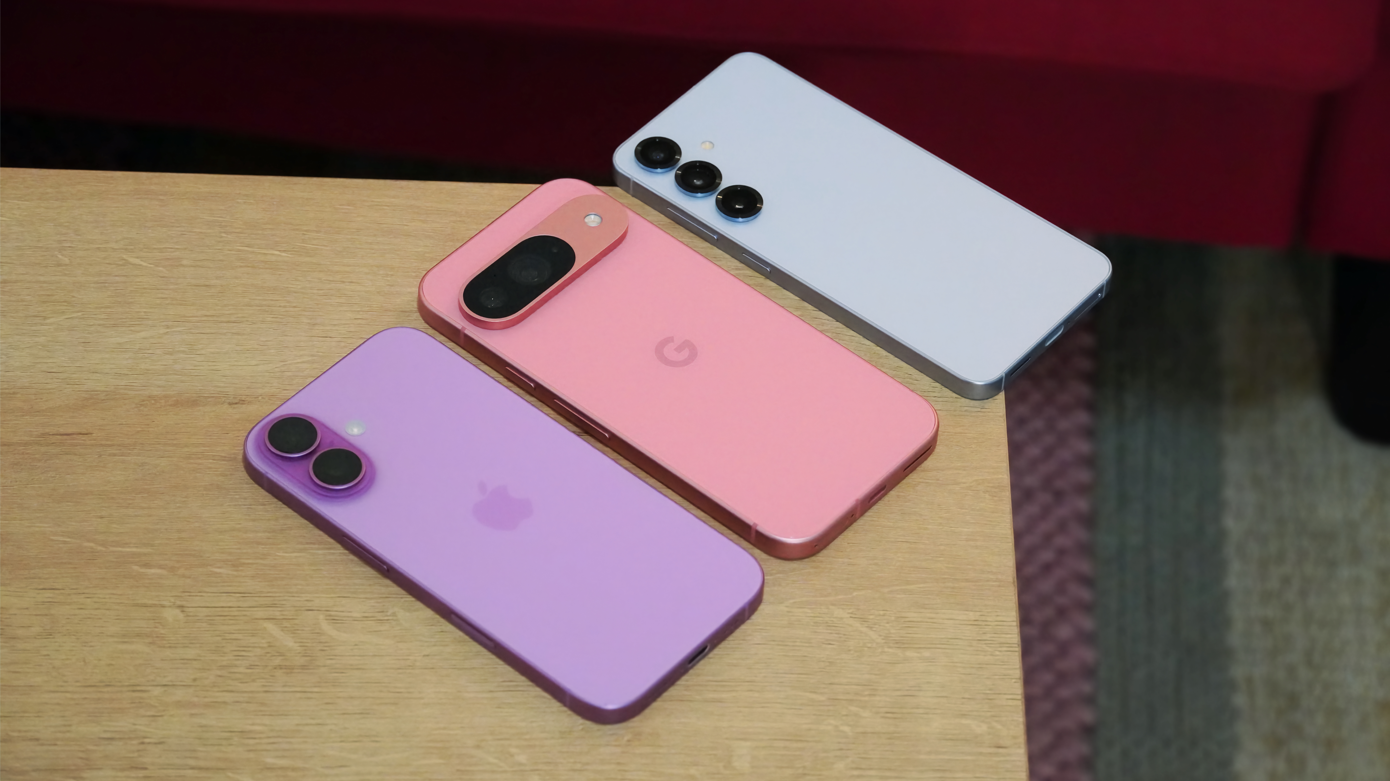
![Apple Slips to Fifth in China's Smartphone Market with 9% Decline [Report]](https://www.iclarified.com/images/news/97065/97065/97065-640.jpg)


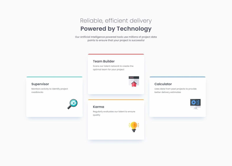
Four-Card Feature Section – Frontend Mentor Challenge (HTML & CSS)
INTRODUCTION This is my attempt at the four-card feature section challenge on Frontend Mentor. I’ll be building this project using only HTML and vanilla CSS to keep things simple and beginner-friendly. My focus is on creating a clean and well-structured design while making the code easy to understand. If you’d like to follow along, you can download the starter files for the project at Frontend Mentor. THE GOAL The goal is to build both the desktop version using css grid layout for multiple column and the mobile version of this challenge . For this challenge, I will be taking the mobile-first approach to design. THE HTML Four card feature section Reliable, efficient delivery Powered by Technology Our Artificial Intelligence powered tools use millions of project data points to ensure that your project is successful Supervisor Monitors activity to identify project roadblocks Team Builder Scans our talent network to create the optimal team for your project Karma Regularly evaluates our talent to ensure quality Calculator Uses data from past projects to provide better delivery estimates Challenge by Frontend Mentor. Coded by thelastmedici. For the markup, I wrapped everything inside a div with the class container within the body. I used the header tag to structure the head section of the design. Each card was placed inside its own div for easier styling, and I used h1, h3, and p tags to differentiate between text elements The CSS Mobile Design For the styling, I followed a mobile-first approach, initially stacking the cards in a single-column layout. I also imported a Google Font to select the specified typography from the style guide. Below is the code for the mobile version @import url('https://fonts.googleapis.com/css2?family=Poppins:ital,wght@0,100;0,200;0,300;0,400;0,500;0,600;0,700;0,800;0,900;1,100;1,200;1,300;1,400;1,500;1,600;1,700;1,800;1,900&display=swap'); *{ margin: 0; padding: 0; box-sizing: border-box; } body{ font-size: 16px; font-family: 'Poppins', sans-serif; display: flex; justify-content: center; align-items: center; flex-direction: column; } .container { margin-top: 40px; max-width: 310px; min-height: 100vh; display: flex; flex-direction: column; align-items: center; } header{ padding: 15px; } header p{ text-align: center; font-weight: 500; font-size: 14px; font-family: 'Poppins'; padding-top: 10px; line-height: 1.25rem; color: hsl(212, 6%, 44%); } h1{ font-size: 22px; } h1 span{ color: hsl(212, 6%, 44%); font-weight: 400; } .supervisor, .team-builder, .karma, .calculator{ padding: 22px; margin: 20px; border-radius:5px; box-sizing: border-box; } .supervisor{ border-top: 5px solid hsl(180, 62%, 55%); box-shadow: 0px 15px 19px -2px hsl(212, 66%, 93%); } .team-builder{ border-top: 5px solid hsl(0, 78%, 62%); box-shadow: 0px 15px 19px -2px hsl(212, 66%, 93%); } .karma{ border-top: 5px solid hsl(45, 100%, 50%); box-shadow: 0px 15px 19px -2px hsl(212, 66%, 93%); } .calculator{ border-top: 5px solid hsl(212, 86%, 64%); box-shadow: 0px 15px 19px -2px hsl(212, 66%, 93%); } .supervisor p{ color: hsl(212, 6%, 44%); font-size: 0.7rem; font-weight: 400; } .supervisor .image{ padding-left: 150px; } .team-builder p{ color: hsl(212, 6%, 44%); font-size: 0.7rem; font-weight: 400; } .team-builder .image{ padding-left: 150px; } .karma p{ color: hsl(212, 6%, 44%); font-size: 0.7rem; font-weight: 400; } .karma .image{ padding-left: 150px; } .calculator p{ color: hsl(212, 6%, 44%); font-size: 0.7rem; font-weight: 400; } .calculator .image{ padding-left: 150px; } Desktop Design Designing the desktop version, I used the grid system. Splitting the grid into three columns and setting the grid to auto rows to automatically create rows as needed with a width that doesnt grow beyond 1000px, placing everything in the container div. .container{ display: grid; grid-template-columns: repeat(3, 1fr); grid-template-rows: auto auto; max-width: 1000px; margin-top: 0px; overflow-y: hidden; } For the header section, I placed it in the first column and made it span three columns, just like the goal image, so that the header can be well centered, giving the h1 a font size of 32px so as to make it bold and adding all necessary styling for the paragraph text too, as shown in the goal project. The header section's code is shown below. header {
INTRODUCTION
This is my attempt at the four-card feature section challenge on Frontend Mentor. I’ll be building this project using only HTML and vanilla CSS to keep things simple and beginner-friendly. My focus is on creating a clean and well-structured design while making the code easy to understand. If you’d like to follow along, you can download the starter files for the project at Frontend Mentor.
THE GOAL
The goal is to build both the desktop version using css grid layout for multiple column
and the mobile version of this challenge
 . For this challenge, I will be taking the mobile-first approach to design.
THE HTML
Four card feature section
Reliable, efficient delivery
Powered by Technology
Our Artificial Intelligence powered tools use millions of project data points
to ensure that your project is successful
Supervisor
Monitors activity to identify project roadblocks

Team Builder
Scans our talent network to create the optimal team for your project

Karma
Regularly evaluates our talent to ensure quality

Calculator
Uses data from past projects to provide better delivery estimates

For the markup, I wrapped everything inside a div with the class container within the body. I used the header tag to structure the head section of the design. Each card was placed inside its own div for easier styling, and I used h1, h3, and p tags to differentiate between text elements
The CSS
Mobile Design
For the styling, I followed a mobile-first approach, initially stacking the cards in a single-column layout. I also imported a Google Font to select the specified typography from the style guide. Below is the code for the mobile version
@import url('https://fonts.googleapis.com/css2?family=Poppins:ital,wght@0,100;0,200;0,300;0,400;0,500;0,600;0,700;0,800;0,900;1,100;1,200;1,300;1,400;1,500;1,600;1,700;1,800;1,900&display=swap');
*{
    margin: 0;
    padding: 0;
    box-sizing: border-box;
}

body{
      font-size: 16px;
      font-family: 'Poppins', sans-serif;
      display: flex;
      justify-content: center;
      align-items: center;
      flex-direction: column;
}

.container {
    margin-top: 40px;
    max-width: 310px;
    min-height: 100vh;
    display: flex;
    flex-direction: column;
    align-items: center;
}

header{
    padding: 15px;
}

header p{
    text-align: center;
    font-weight: 500;
    font-size: 14px;
    font-family: 'Poppins';
    padding-top: 10px;
    line-height: 1.25rem;
    color:  hsl(212, 6%, 44%);
}

h1{
    font-size: 22px;
}

h1 span{
    color: hsl(212, 6%, 44%);
    font-weight: 400;
}

.supervisor, .team-builder, .karma, .calculator{
    padding: 22px;
    margin: 20px;
    border-radius:5px;
    box-sizing: border-box;
}
.supervisor{
    border-top: 5px solid hsl(180, 62%, 55%);
    box-shadow: 0px 15px 19px -2px hsl(212, 66%, 93%);

}
.team-builder{
    border-top: 5px solid hsl(0, 78%, 62%);
    box-shadow: 0px 15px 19px -2px hsl(212, 66%, 93%);
}
.karma{
    border-top: 5px solid hsl(45, 100%, 50%);
    box-shadow: 0px 15px 19px -2px hsl(212, 66%, 93%);
}
.calculator{
    border-top: 5px solid hsl(212, 86%, 64%);
    box-shadow: 0px 15px 19px -2px hsl(212, 66%, 93%);
}

.supervisor p{
    color: hsl(212, 6%, 44%);
    font-size: 0.7rem;
    font-weight: 400;
}

.supervisor .image{
    padding-left: 150px;
}

.team-builder p{
    color: hsl(212, 6%, 44%);
    font-size: 0.7rem;
    font-weight: 400;
}
.team-builder .image{
    padding-left: 150px;
}

.karma p{
    color: hsl(212, 6%, 44%);
    font-size: 0.7rem;
    font-weight: 400;
}
.karma .image{
    padding-left: 150px;
}
.calculator p{
    color: hsl(212, 6%, 44%);
    font-size: 0.7rem;
    font-weight: 400;
}
.calculator .image{
    padding-left: 150px;
}
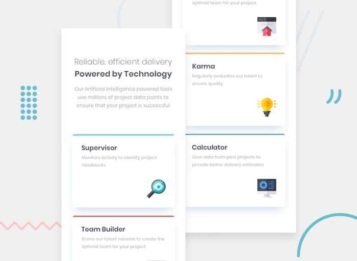
Desktop Design
Designing the desktop version, I used the grid system. Splitting the grid into three columns and setting the grid to auto rows to automatically create rows as needed with a width that doesnt grow beyond 1000px, placing everything in the container div.
.container{
        display: grid;
        grid-template-columns: repeat(3, 1fr);
        grid-template-rows: auto auto;
        max-width: 1000px;
        margin-top: 0px;
        overflow-y: hidden;
    }
For the header section, I placed it in the first column and made it span three columns, just like the goal image, so that the header can be well centered, giving the h1 a font size of 32px so as to make it bold and adding all necessary styling for the paragraph text too, as shown in the goal project. The header section's code is shown below.
header {
        grid-column: 1 / span 3;
        text-align: center;
        max-width: 750px;
        margin: 0 auto;
        margin-left: 40px;
        padding-left: 197px;
        margin-top: -114px;
        margin-bottom: -161px;
    }

    h1{
        font-size: 32px;
    }
    header p {
        text-align: center;
        font-weight: 500;
        font-size: 14px;
        font-family: 'Poppins';
        padding-top: 10px;
        padding-left: -3pc;
        margin-left: 42px;
        margin-right: 13px;
        line-height: 1.25rem;
        color: hsl(212, 6%, 44%);
    }
Like the code below described in the target image, each testimonial part is positioned in its appropriate grid location.
karma {
        grid-column: 2;
        grid-row: 3;
        margin-bottom: 74px;
        margin-top: -364px;
    }
    .team-builder{
        margin-top: -165px;
    }
    .supervisor{
        margin-left: 20px;
    }
To guarantee a smooth transition from mobile to desktop, the desktop screen was constructed with a 1024px media query.
@media (min-width: 1024px)
Conclusion
Overall, this project is suitable for beginners who want to put their skills at building multi-column CSS grids and responsive layouts to the test.
Links to my solution:
1) https://github.com/thelastmedici/four-card-feature-section
2) live-link