


![[The AI Show Episode 142]: ChatGPT’s New Image Generator, Studio Ghibli Craze and Backlash, Gemini 2.5, OpenAI Academy, 4o Updates, Vibe Marketing & xAI Acquires X](https://www.marketingaiinstitute.com/hubfs/ep%20142%20cover.png)


![From drop-out to software architect with Jason Lengstorf [Podcast #167]](https://cdn.hashnode.com/res/hashnode/image/upload/v1743796461357/f3d19cd7-e6f5-4d7c-8bfc-eb974bc8da68.png?#)


.png?#)


_Christophe_Coat_Alamy.jpg?#)
 (1).webp?#)


![Apple Considers Delaying Smart Home Hub Until 2026 [Gurman]](https://www.iclarified.com/images/news/96946/96946/96946-640.jpg)
![iPhone 17 Pro Won't Feature Two-Toned Back [Gurman]](https://www.iclarified.com/images/news/96944/96944/96944-640.jpg)
![Tariffs Threaten Apple's $999 iPhone Price Point in the U.S. [Gurman]](https://www.iclarified.com/images/news/96943/96943/96943-640.jpg)


Fast vs. Slow Thinking: Designing UX for Both Brains
Have you ever clicked on a button almost instinctively, without thinking, only to realize later that it wasn’t what you wanted? Or maybe you’ve spent several minutes analyzing a complex form, making sure every detail is correct before hitting submit. These two types of thinking—fast and intuitive versus slow and deliberate—are at the core of Dual Process Theory, a psychological concept that has big implications for UX design. The Two Systems of Thinking Dual Process Theory suggests that the human brain operates using two different modes of thinking: System 1: Fast, Intuitive, and Automatic Think of System 1 as your gut instinct. It helps you: Make snap decisions based on experience and emotions. Recognize patterns and react without much effort. Navigate familiar interfaces almost automatically. Example: When you see a red notification badge on your favorite app, you instinctively know it means you have a message. You don’t stop to analyze it—you just click. System 2: Slow, Logical, and Deliberate System 2, on the other hand, is your deep thinker. It’s what you use when: Filling out a tax form and double-checking every field. Making a high-stakes decision that requires careful thought. Understanding a brand-new interface or workflow. Example: If an app asks you to set complex privacy permissions for different data types, you’ll likely slow down and engage System 2 to ensure accuracy. Designing for Both Systems Great UX design considers both types of thinking. Here’s how you can design experiences that cater to both System 1 and System 2 users: 1. Make Tasks Simple and Intuitive System 1 thrives on ease. The more intuitive a design, the less cognitive effort users need. Use familiar UI patterns and clear call-to-action buttons. Minimize unnecessary complexity. Example: Google’s search page is incredibly simple—just a search bar and a button. No distractions, no confusion. 2. Use Visual Cues to Guide Users System 1 relies on quick pattern recognition. Icons, colors, and typography help users quickly grasp what they need to do. Example: A trash bin icon universally signals “delete,” so users don’t have to stop and think. 3. Minimize Errors with Smart Design System 1 is prone to mistakes, but well-designed interfaces can help prevent them. Use error prevention techniques like constraints, real-time feedback, and undo options. Example: Gmail warns you if you mention an attachment in an email but forget to attach a file. That’s System 2 saving System 1 from a mistake. 4. Accommodate Different Thinking Styles Some users rely more on System 1, while others engage System 2 more often. Offer multiple ways to accomplish tasks. Some users prefer quick shortcuts, while others appreciate detailed explanations. Example: A simple toggle for “Basic” and “Advanced” settings in an app lets users choose their preferred experience. 5. Test, Iterate, and Improve Real users behave unpredictably. Testing ensures your design works for both systems of thinking. Conduct usability testing to see if users can accomplish tasks efficiently. If they’re getting stuck, your design might be engaging System 2 too much. Example: If users keep hesitating before clicking a button, they might not be sure what it does. A clearer label or better positioning could solve the problem. Final Thoughts By understanding how Dual Process Theory influences decision-making, we can design experiences that feel natural, intuitive, and frustration-free. System 1 wants speed and ease, while System 2 needs clarity and control—a well-designed UX balances both. So next time you're designing a UI, ask yourself: Can users navigate effortlessly using System 1? When they need to think carefully, does System 2 have enough support? Get these right, and you’ll create experiences that feel just right. If you are interested in exploring such new techniques and technologies, take a look at LiveAPI. Its a Super-Convenient tool which you can use to generate Interactive API docs instantly! So if you are exploring a codebase, and it doesn't have a documentation ready, you can just use this to get it generated, and refer it for getting a better idea and saving time. You can instantly try it out here!
Have you ever clicked on a button almost instinctively, without thinking, only to realize later that it wasn’t what you wanted? Or maybe you’ve spent several minutes analyzing a complex form, making sure every detail is correct before hitting submit.
These two types of thinking—fast and intuitive versus slow and deliberate—are at the core of Dual Process Theory, a psychological concept that has big implications for UX design.
The Two Systems of Thinking
Dual Process Theory suggests that the human brain operates using two different modes of thinking:
System 1: Fast, Intuitive, and Automatic
Think of System 1 as your gut instinct. It helps you:
- Make snap decisions based on experience and emotions.
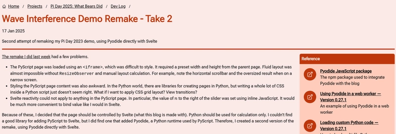
- Recognize patterns and react without much effort.
- Navigate familiar interfaces almost automatically.
Example: When you see a red notification badge on your favorite app, you instinctively know it means you have a message. You don’t stop to analyze it—you just click.
System 2: Slow, Logical, and Deliberate
System 2, on the other hand, is your deep thinker. It’s what you use when:
- Filling out a tax form and double-checking every field.
- Making a high-stakes decision that requires careful thought.
- Understanding a brand-new interface or workflow.
Example: If an app asks you to set complex privacy permissions for different data types, you’ll likely slow down and engage System 2 to ensure accuracy.
Designing for Both Systems
Great UX design considers both types of thinking. Here’s how you can design experiences that cater to both System 1 and System 2 users:
1. Make Tasks Simple and Intuitive
System 1 thrives on ease. The more intuitive a design, the less cognitive effort users need.
- Use familiar UI patterns and clear call-to-action buttons.
- Minimize unnecessary complexity.
Example: Google’s search page is incredibly simple—just a search bar and a button. No distractions, no confusion.
2. Use Visual Cues to Guide Users
System 1 relies on quick pattern recognition.
- Icons, colors, and typography help users quickly grasp what they need to do.
Example: A trash bin icon universally signals “delete,” so users don’t have to stop and think.
3. Minimize Errors with Smart Design
System 1 is prone to mistakes, but well-designed interfaces can help prevent them.
- Use error prevention techniques like constraints, real-time feedback, and undo options.
Example: Gmail warns you if you mention an attachment in an email but forget to attach a file. That’s System 2 saving System 1 from a mistake.
4. Accommodate Different Thinking Styles
Some users rely more on System 1, while others engage System 2 more often.
- Offer multiple ways to accomplish tasks. Some users prefer quick shortcuts, while others appreciate detailed explanations.
Example: A simple toggle for “Basic” and “Advanced” settings in an app lets users choose their preferred experience.
5. Test, Iterate, and Improve
Real users behave unpredictably. Testing ensures your design works for both systems of thinking.
- Conduct usability testing to see if users can accomplish tasks efficiently. If they’re getting stuck, your design might be engaging System 2 too much.
Example: If users keep hesitating before clicking a button, they might not be sure what it does. A clearer label or better positioning could solve the problem.
Final Thoughts
By understanding how Dual Process Theory influences decision-making, we can design experiences that feel natural, intuitive, and frustration-free. System 1 wants speed and ease, while System 2 needs clarity and control—a well-designed UX balances both.
So next time you're designing a UI, ask yourself:
- Can users navigate effortlessly using System 1?
- When they need to think carefully, does System 2 have enough support?
Get these right, and you’ll create experiences that feel just right.
If you are interested in exploring such new techniques and technologies, take a look at LiveAPI.
Its a Super-Convenient tool which you can use to generate Interactive API docs instantly! So if you are exploring a codebase, and it doesn't have a documentation ready, you can just use this to get it generated, and refer it for getting a better idea and saving time.
You can instantly try it out here!