


![[Webinar] AI Is Already Inside Your SaaS Stack — Learn How to Prevent the Next Silent Breach](https://blogger.googleusercontent.com/img/b/R29vZ2xl/AVvXsEiOWn65wd33dg2uO99NrtKbpYLfcepwOLidQDMls0HXKlA91k6HURluRA4WXgJRAZldEe1VReMQZyyYt1PgnoAn5JPpILsWlXIzmrBSs_TBoyPwO7hZrWouBg2-O3mdeoeSGY-l9_bsZB7vbpKjTSvG93zNytjxgTaMPqo9iq9Z5pGa05CJOs9uXpwHFT4/s1600/ai-cyber.jpg?#)


![[The AI Show Episode 144]: ChatGPT’s New Memory, Shopify CEO’s Leaked “AI First” Memo, Google Cloud Next Releases, o3 and o4-mini Coming Soon & Llama 4’s Rocky Launch](https://www.marketingaiinstitute.com/hubfs/ep%20144%20cover.png)


![[FREE EBOOKS] Machine Learning Hero, AI-Assisted Programming for Web and Machine Learning & Four More Best Selling Titles](https://www.javacodegeeks.com/wp-content/uploads/2012/12/jcg-logo.jpg)


![Rogue Company Elite tier list of best characters [April 2025]](https://media.pocketgamer.com/artwork/na-33136-1657102075/rogue-company-ios-android-tier-cover.jpg?#)


_Andreas_Prott_Alamy.jpg?width=1280&auto=webp&quality=80&disable=upscale#)


![What’s new in Android’s April 2025 Google System Updates [U: 4/18]](https://i0.wp.com/9to5google.com/wp-content/uploads/sites/4/2025/01/google-play-services-3.jpg?resize=1200%2C628&quality=82&strip=all&ssl=1)


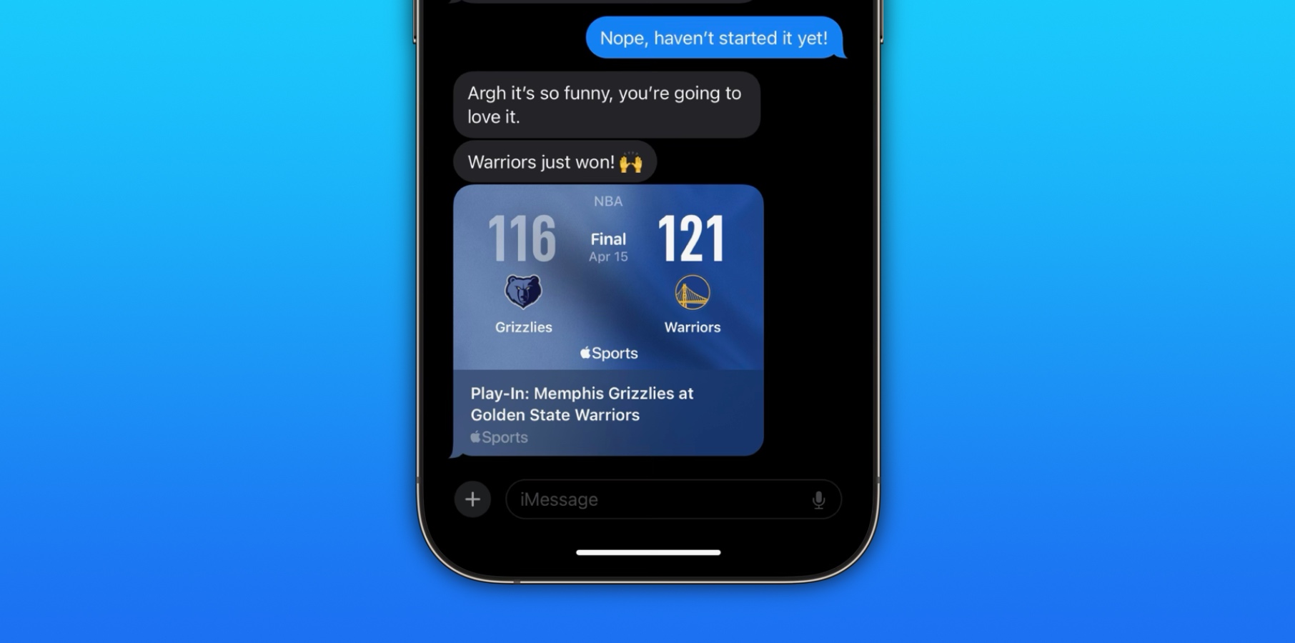
![Apple Watch Series 10 Back On Sale for $299! [Lowest Price Ever]](https://www.iclarified.com/images/news/96657/96657/96657-640.jpg)
![EU Postpones Apple App Store Fines Amid Tariff Negotiations [Report]](https://www.iclarified.com/images/news/97068/97068/97068-640.jpg)
![Apple Slips to Fifth in China's Smartphone Market with 9% Decline [Report]](https://www.iclarified.com/images/news/97065/97065/97065-640.jpg)


Custom Theming in Ant Design v5 with Dynamic Theme Switching
Ant Design v5 introduced a powerful theming system built around design tokens, making it easier than ever to apply consistent styling across your entire app from a single configuration. In this blog, we'll explore how to create a custom global theme, override component-specific styles, and implement support for multiple dynamic themes using React. Why Theming Matters A unified design language makes your app look professional and easier to maintain. With v5, AntD replaces LESS variables with Component Tokens and Global Tokens which are configurable via React context using ConfigProvider. Step 1: Set Up Ant Design v5 Install the necessary packages: npm install antd Import styles in your main entry file (e.g., main.tsx or index.tsx): import 'antd/dist/reset.css'; Step 2: Define Global and Component Tokens Create a file to store your theme configuration: // theme.ts export const lightTheme = { token: { colorPrimary: '#00b96b', borderRadius: 8, fontSize: 14, }, components: { Button: { colorPrimary: '#00b96b', controlHeight: 40, }, Checkbox: { colorPrimary: '#1890ff', }, }, }; export const darkTheme = { token: { colorPrimary: '#722ed1', colorBgBase: '#141414', colorText: '#ffffff', }, components: { Button: { colorPrimary: '#722ed1', }, }, }; Step 3: Implement Theme Switcher Use React Context or simple state to toggle themes: // App.tsx import React, { useState } from 'react'; import { ConfigProvider, Button, Checkbox } from 'antd'; import { lightTheme, darkTheme } from './theme'; const App: React.FC = () => { const [isDarkMode, setIsDarkMode] = useState(false); return ( setIsDarkMode(!isDarkMode)}> Toggle Theme Sample Checkbox ); }; export default App; Bonus: Create More Themes Easily Want a high-contrast, pastel, or corporate theme? Just create new theme objects following the same structure and add toggling logic for them. export const pastelTheme = { token: { colorPrimary: '#ff85c0', borderRadius: 16, }, components: { Button: { colorPrimary: '#ff85c0', }, }, }; Final Thoughts Ant Design v5's token system allows for centralized, scalable, and powerful styling management. With dynamic switching, you can offer users light/dark mode or even let them pick their favorite theme. Build your own design system with full control — all from a single place.

Ant Design v5 introduced a powerful theming system built around design tokens, making it easier than ever to apply consistent styling across your entire app from a single configuration. In this blog, we'll explore how to create a custom global theme, override component-specific styles, and implement support for multiple dynamic themes using React.
Why Theming Matters
A unified design language makes your app look professional and easier to maintain. With v5, AntD replaces LESS variables with Component Tokens and Global Tokens which are configurable via React context using ConfigProvider.
Step 1: Set Up Ant Design v5
Install the necessary packages:
npm install antd
Import styles in your main entry file (e.g., main.tsx or index.tsx):
import 'antd/dist/reset.css';
Step 2: Define Global and Component Tokens
Create a file to store your theme configuration:
// theme.ts
export const lightTheme = {
  token: {
    colorPrimary: '#00b96b',
    borderRadius: 8,
    fontSize: 14,
  },
  components: {
    Button: {
      colorPrimary: '#00b96b',
      controlHeight: 40,
    },
    Checkbox: {
      colorPrimary: '#1890ff',
    },
  },
};

export const darkTheme = {
  token: {
    colorPrimary: '#722ed1',
    colorBgBase: '#141414',
    colorText: '#ffffff',
  },
  components: {
    Button: {
      colorPrimary: '#722ed1',
    },
  },
};
Step 3: Implement Theme Switcher
Use React Context or simple state to toggle themes:
// App.tsx
import React, { useState } from 'react';
import { ConfigProvider, Button, Checkbox } from 'antd';
import { lightTheme, darkTheme } from './theme';

const App: React.FC = () => {
  const [isDarkMode, setIsDarkMode] = useState(false);

  return (
    <ConfigProvider theme={isDarkMode ? darkTheme : lightTheme}>
      <div style={{ padding: 20 }}>
        <Button onClick={() => setIsDarkMode(!isDarkMode)}>
          Toggle Theme
        Button>
        <div style={{ marginTop: 20 }}>
          <Checkbox>Sample CheckboxCheckbox>
        div>
      div>
    ConfigProvider>
  );
};

export default App;
Bonus: Create More Themes Easily
Want a high-contrast, pastel, or corporate theme? Just create new theme objects following the same structure and add toggling logic for them.
export const pastelTheme = {
  token: {
    colorPrimary: '#ff85c0',
    borderRadius: 16,
  },
  components: {
    Button: {
      colorPrimary: '#ff85c0',
    },
  },
};
Final Thoughts
Ant Design v5's token system allows for centralized, scalable, and powerful styling management. With dynamic switching, you can offer users light/dark mode or even let them pick their favorite theme.
Build your own design system with full control — all from a single place.