


![[The AI Show Episode 144]: ChatGPT’s New Memory, Shopify CEO’s Leaked “AI First” Memo, Google Cloud Next Releases, o3 and o4-mini Coming Soon & Llama 4’s Rocky Launch](https://www.marketingaiinstitute.com/hubfs/ep%20144%20cover.png)


![BPMN-procesmodellering [closed]](https://i.sstatic.net/l7l8q49F.png)
![Roll Based Web App [closed]](https://cdn.sstatic.net/Sites/softwareengineering/Img/apple-touch-icon@2.png?v=1ef7363febba)


![[DEALS] The All-in-One Microsoft Office Pro 2019 for Windows: Lifetime License + Windows 11 Pro Bundle (89% off) & Other Deals Up To 98% Off](https://www.javacodegeeks.com/wp-content/uploads/2012/12/jcg-logo.jpg)


.jpg?#)


_Tanapong_Sungkaew_via_Alamy.jpg?width=1280&auto=webp&quality=80&disable=upscale#)

_Andreas_Prott_Alamy.jpg?width=1280&auto=webp&quality=80&disable=upscale#)


![Lenovo shows off its next 8.8-inch Legion Tab with vague AI promises [Gallery]](https://i0.wp.com/9to5google.com/wp-content/uploads/sites/4/2025/04/lenovo-legion-tab-y700-2025-1.jpg?resize=1200%2C628&quality=82&strip=all&ssl=1)


![OnePlus 13T has a 6,260 mAh battery as first camera samples arrive [Gallery]](https://i0.wp.com/9to5google.com/wp-content/uploads/sites/4/2025/04/oneplus-13t-teaser-2.jpg?resize=1200%2C628&quality=82&strip=all&ssl=1)


![Samsung Targets Late 2026 Launch for Advanced Texas Chip Fab Following Delays [Report]](https://www.iclarified.com/images/news/97073/97073/97073-640.jpg)
![Apple Shares Official Trailer for 'Long Way Home' Starring Ewan McGregor and Charley Boorman [Video]](https://www.iclarified.com/images/news/97069/97069/97069-640.jpg)
![Apple Watch Series 10 Back On Sale for $299! [Lowest Price Ever]](https://www.iclarified.com/images/news/96657/96657/96657-640.jpg)


![Mobile Legends: Bang Bang [MLBB] Free Redeem Codes April 2025](https://www.talkandroid.com/wp-content/uploads/2024/07/Screenshot_20240704-093036_Mobile-Legends-Bang-Bang.jpg)


CSS Flexbox: Layouts Made Easy
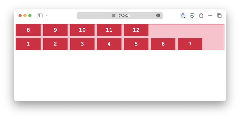
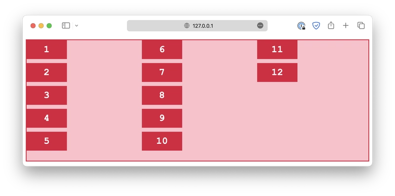
This post was originally published at thedevspace.io. Everything you need to master web development, all in one place. The flexbox is another layout model in CSS that provides an efficient way to design and structure complex layouts, but with a more flexible approach. It is particularly suited for creating one-dimensional layouts, either in a row or a column, as we will see later. Just like a grid layout, a flexbox layout also consists of a flex container and several flex items. The container should have its display property set to flex, and all of its direct children automatically become flex items. 1 2 3 4 5 6 .container { display: flex; gap: 10px; } Flex direction With a flex layout, instead of rows and columns, you must define a flex-direction and a flex-wrap. The flex-direction specifies in which direction the container should stack its flex items. The accepted values are: column .container { flex-direction: column; } column-reverse .container { flex-direction: column-reverse; } row .container { flex-direction: row; } row-reverse .container { flex-direction: row-reverse; } Flex wrap The flex-wrap property determines whether the flex items should wrap, which means automatically change to the following line when there is insufficient space. wrap .container { flex-wrap: wrap; } nowrap .container { flex-wrap: nowrap; } wrap-reverse .container { flex-wrap: wrap-reverse; } The flex-flow is a shorthand for both flex-direction and flex-wrap properties. .container { flex-flow: column wrap; } Read More What is a CSS Selector Rest Parameter and Spread Syntax in JavaScript A Beginner's Guide to Express.js Follow us for daily coding tips:
This post was originally published at thedevspace.io. Everything you need to master web development, all in one place.
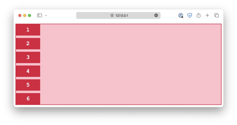
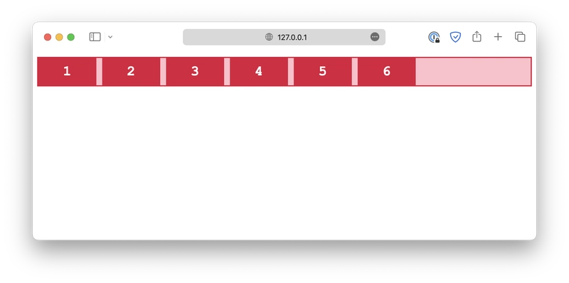
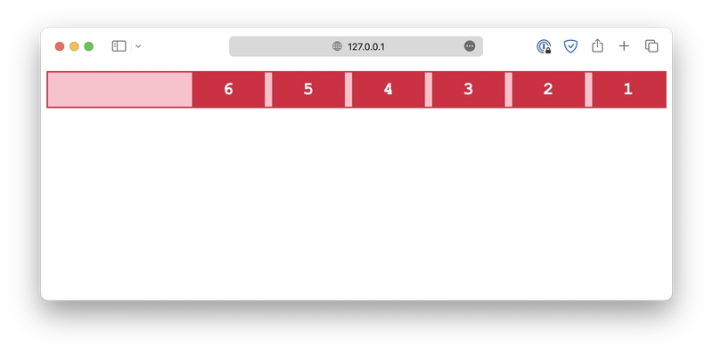
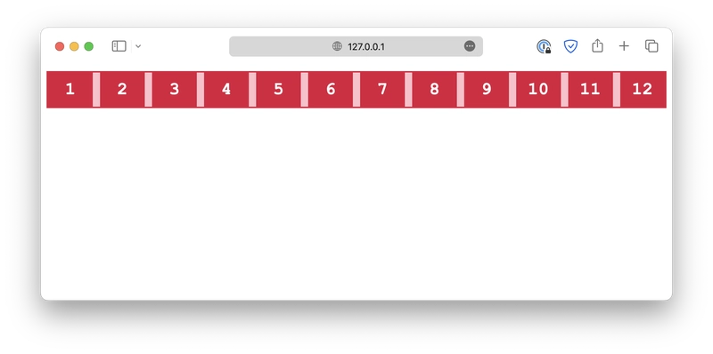
The flexbox is another layout model in CSS that provides an efficient way to design and structure complex layouts, but with a more flexible approach. It is particularly suited for creating one-dimensional layouts, either in a row or a column, as we will see later.
Just like a grid layout, a flexbox layout also consists of a flex container and several flex items. The container should have its display property set to flex, and all of its direct children automatically become flex items.
 class="container">
class="item">1 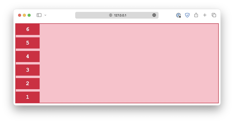
![Clojure Is Awesome!!! [PART 13]](https://media2.dev.to/dynamic/image/width%3D1000,height%3D500,fit%3Dcover,gravity%3Dauto,format%3Dauto/https:%2F%2Fdev-to-uploads.s3.amazonaws.com%2Fuploads%2Farticles%2Funrpkt6px7xwk8o74xcn.jpg)